# Determine the K-nearest neighbor graph
seurat_processed <- FindNeighbors(seurat_processed,
assay = "sketch",
reduction = "pca.sketch",
dims = 1:50)Clustering
Spatial transcriptomics
Clustering
k-nearest neighbors
Leiden
In this lesson, we will use graph-based clustering methods (k-nearest neighbors and Leiden clustering) to define clusters based upon gene expression scores for single-cell datasets. You will examine how parameters like resolution affect cluster size and tissue interpretation.
Keywords
Unsupervised, Tissue regions, Project data
Approximate time: 60 minutes
Learning objectives
In this lesson, we will:
- Compute a neighborhood graph to identify similar phenotypes in bins
- Group bins into clusters based upon their gene expression profiles
- Evaluate the quality of clustering against known biology
Overview of lesson
At this point in the analysis, we have successfully calculated PC scores, thus providing meaningful embeddings of our bins. Using these principal component scores, we can now evaluate the similarity of bins through clustering. This is a two-step process where we first calculate k-nearest neighbors to build a graph structure, linking similar bins together. Then, we will utilize the Leiden algorithm to cluster bins into larger groups. These cluster labels will be reused to identify spatial domains and major cell types in the dataset.
Grouping similar bins together
Now, we want to group similar bins (cell states) together based upon their gene expression profiles with clustering. This is a two-step process that involves:
- Constructing a K-nearest neighbor (KNN) graph based on the PCA space.
- Group bins together based upon the KNN graph to assign cluster labels to each bin.
This graph-based approach allows us to partition the graph of bins into highly interconnected ‘quasi-cliques’ or ‘communities’ that represent clusters of similar bins. A nice in-depth description of clustering methods is provided in the SVI Bioinformatics and Cellular Genomics Lab course.
k-nearest neighbors (kNN)
The first step is to construct a K-nearest neighbor (KNN) graph. As previously mentioned, this is calculated on the PCA space. Recall that we have multiple principal components (PCs) with scores for each one of our bins. We can think of the steps taken like so:
- Each bin is a point in PCA (n-dimensional) space.
- We calculate the distance (euclidean) between each bin and all other bins in this PCA space.
- We then connect bins together (edges) that are close to each other. Bins that are close together in PCA space will have similar gene expression profiles, and thus are likely to be similar.
- To further confirm the similarity of bins, we ask, do these two bins also share nearby neighbors (bins)? These shared neighbors are an additional layer of confirmation that bin A and bin B are similar to one another if they are connected to the same bins (neighbors). We use this to recalculate the edge weights between bins, creating a shared nearest neighbor (SNN) graph.
This means that if two bins are close together in PCA space and have similar neighbors, they will have a stronger connection (higher edge weight) than two bins that are close together but do not share similar neighbors.
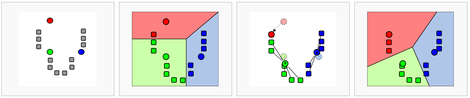
Image source: Analysis of Single cell RNA-seq data.
All of this is done in one step with the Seurat function FindNeighbors(). We will continue writing this code in the script we created last lesson titled 03_dimensionality_reduction_and_clustering.R
The FindNeighbors() function takes in the PCA reduction and calculates the KNN graph. We specify the reduction (sketch) as well as which components (dims) will be used for the calculation. In this case, we will be using the first 50 PCs.
We should now see two graphs in the @graphs slot of seurat_processed. The first in the list is the KNN graph (sketch_nn) and the second is the shared nearest neighbor (SNN) graph (sketch_snn).
seurat_processed@graphs$sketch_nn
A Graph object containing 10000 cells
$sketch_snn
A Graph object containing 10000 cellsWe use the SNN graph because it considers both the distance between two bins and the similarity of their local neighborhoods. This leads to more robust and biologically meaningful connections between bins. In contrast, the KNN graph only considers the distance between two bins, which may not capture the full complexity of the global relationships between many bins at once.
Now that we have this shared nearest neighbor graph, we can begin the clustering step.
Clustering
The next step in the spatial transcriptomics workflow is to group bins into clusters based on the neighborhood graph.
The FindClusters() function iteratively groups bins with the goal of optimizing the standard modularity function (a measure of how well a network is partitioned into clusters). Higher modularity values indicate a clearer cluster structure. In other words, we want clusters to be well-separated from one another, yet, internally, tightly knit. By default, FindClusters() uses the Louvain algorithm, but we will be setting algorithm = 4 to use the Leiden algorithm due to its increased speed and ability to connect communities.
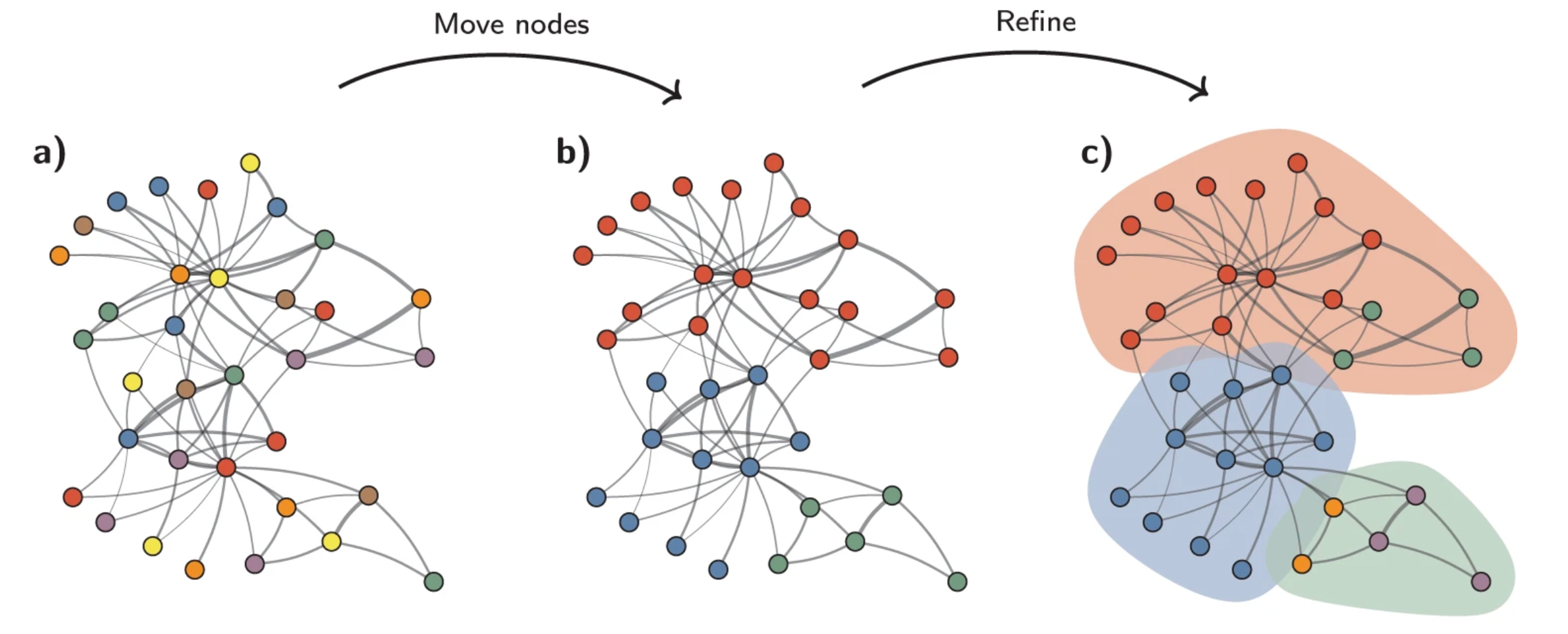
Image source: Traag et al. (2019).
Another key parameter is resolution, which controls the granularity of the clustering and must be tuned for each experiment. Higher resolution values produce more clusters. For a first-pass look at the data, a lower resolution is sufficient to see broad patterns and communities. Typically, we recommend that for datasets on the order of 30,000–50,000 cells/bins, setting a resolution between 0.4 and 1.4 typically yields reasonable clustering. So for a much larger dataset, such as this one, we will be setting a low resolution parameter to start.
Testing different resolution values
We would typically recommend using a variety of different resolutions and select a resolution that best suits your dataset. However, for the sake of time, we will proceed with a resolution = 0.65. We have more detailed explanations of how to test a variety of resolutions at one time.
seurat_processed <- FindClusters(seurat_processed,
cluster.name = "seurat_cluster.sketched",
algorithm = 4,
resolution = 0.65,
random.seed = 12345)If we take a look at the columns in our @meta.data, we see that a new column, seurat_cluster.sketched, was added.
seurat_processed@meta.data %>%
head() %>%
relocate("seurat_cluster.sketched")@meta.data with sketch Leiden clusters.
| seurat_cluster.sketched | orig.ident | nCount_Spatial.008um | nFeature_Spatial.008um | log10GenesPerUMI | mitoRatio | leverage.score | |
|---|---|---|---|---|---|---|---|
| P5CRC_s_008um_00078_00444-1 | NA | P5CRC | 65 | 57 | 0.9685377 | 0.2307692 | 0.1182505 |
| P5CRC_s_008um_00128_00278-1 | NA | P5CRC | 1300 | 906 | 0.9496410 | 0.1730769 | 0.8126225 |
| P5CRC_s_008um_00052_00559-1 | NA | P5CRC | 128 | 121 | 0.9884090 | 0.0234375 | 1.3967893 |
| P5CRC_s_008um_00121_00413-1 | NA | P5CRC | 538 | 326 | 0.9203288 | 0.0092937 | 0.6153956 |
| P5CRC_s_008um_00202_00633-1 | NA | P5CRC | 365 | 232 | 0.9231919 | 0.0657534 | 0.4457335 |
| P5CRC_s_008um_00035_00460-1 | NA | P5CRC | 122 | 100 | 0.9586074 | 0.1639344 | 0.0945122 |
- When we look at the first few rows of our metadata, it appears that there were many cells that do not have a cluster value. Count how many
NA’s are found for ourseurat_cluster.sketchedcolumn withtable()function and use the argument (useNA = "ifany"). Why do you think there are so manyNAvalues?
The FindClusters() function automatically updates the Idents() of our Seurat object. If we take a look at our Idents we can see if that it has changed from orig.ident to seurat_cluster.sketched.
# Check updated idents after running FindClusters()
Idents(seurat_processed) %>% head()P5CRC_s_008um_00078_00444-1 P5CRC_s_008um_00128_00278-1
<NA> <NA>
P5CRC_s_008um_00052_00559-1 P5CRC_s_008um_00121_00413-1
<NA> <NA>
P5CRC_s_008um_00202_00633-1 P5CRC_s_008um_00035_00460-1
<NA> <NA>
Levels: 1 2 3 4 5 6 7 8 9 10 11 12 13 14So if you had previously set a different column as your Idents(), just know that it has automatically been updated at this point.
Visualize clusters on UMAP
We previously calculated UMAP coordinates for our sketch assay and colored the bins by which sample they belonged to. Now, we can visualize the clusters that we just calculated on this UMAP to see how well the clusters are separating.
# Plot UMAP
p <- DimPlot(seurat_processed,
reduction = "umap.sketch", label = T) +
ggtitle("Sketched clustering")
LabelClusters(p, id = "ident", fontface = "bold", size = 5,
bg.colour = "white", bg.r = .2, force = 0)
We would ideally see distinct clusters of bins that are well separated from each other. If we see a lot of overlap between clusters, this may indicate that the clustering is not optimal and we may need to adjust our resolution parameter or re-consider our previous steps (QC, filtration, highly variable gene selection, etc.) to improve the clustering.
Project back to the entire dataset
Recall that we have been calculating all of these steps on our sketched dataset of 10,000 bins. Now, we want to know what the cluster labels are for all of the bins in our full dataset. We can do this with the ProjectData() function.
In essence, this function takes our sketched PCA and extends it out to the rest of the bins in our dataset. In doing so, we calculate a “full” PCA for each bin. From this, we are able to identify bins that are similar to one another and transfer labels from the smaller subset to the full dataset. Thereby “projecting” clustering values from downsampled bins onto the entire dataset.
Run ProjectData()
During this projection step, we provide the sketched information we have just calculated:
sketched.assay= sketch assay name (sketch)sketched.reduction= reduction (PCA) calculated on the sketch assay (pca.sketch)umap.model= UMAP reduction calculated on the sketch assay (umap.sketch)
Then, we specify the assay with the full dataset that we want to project onto (in this case, the Spatial.008um assay). We also specify the full.reduction to name the PCA that will have scores for each bin in the full dataset (full.pca.sketch) as well as the number of principal components to use (dims).
# Increases the size of the default vector (8GB)
options(future.globals.maxSize = 8000 * 1024^2)
# Project from sketch assay onto entire dataset
seurat_processed <- ProjectData(
object = seurat_processed,
sketched.assay = "sketch",
sketched.reduction = "pca.sketch",
umap.model = "umap.sketch",
assay = "Spatial.008um",
full.reduction = "full.pca.sketch",
dims = 1:50,
refdata = list(seurat_cluster.projected = "seurat_cluster.sketched"))Using the sketch PCA and UMAP, the ProjectData function returns a Seurat object that includes:
| Category | Description |
|---|---|
| Dimensional reduction (PCA) | The full.pca.sketch reduction extends the PCA from sketched cells to all bins in the dataset |
| Dimensional reduction (UMAP) | The full.umap.sketch reduction extends the UMAP from sketched cells to all bins in the dataset |
| Cluster labels | The seurat_cluster.projected metadata column labels all cells with cluster labels from sketched cells |
So now when we investigate the @reductions slot, we see that we have two new reductions: full.pca.sketch and full.umap.sketch.
seurat_processed@reductions$pca.sketch
A dimensional reduction object with key PC_
Number of dimensions: 50
Number of cells: 10000
Projected dimensional reduction calculated: FALSE
Jackstraw run: FALSE
Computed using assay: sketch
$umap.sketch
A dimensional reduction object with key umapsketch_
Number of dimensions: 2
Number of cells: 10000
Projected dimensional reduction calculated: FALSE
Jackstraw run: FALSE
Computed using assay: sketch
$full.pca.sketch
A dimensional reduction object with key fullpcasketch_
Number of dimensions: 50
Number of cells: 135798
Projected dimensional reduction calculated: FALSE
Jackstraw run: FALSE
Computed using assay: Spatial.008um
$full.umap.sketch
A dimensional reduction object with key fullumapsketch_
Number of dimensions: 2
Number of cells: 135798
Projected dimensional reduction calculated: FALSE
Jackstraw run: FALSE
Computed using assay: Spatial.008um We also now have a seurat_cluster.projected column with Leiden cluster labels for every bin.
seurat_processed@meta.data %>% head()@meta.data with projected Leiden clusters.
| orig.ident | nCount_Spatial.008um | nFeature_Spatial.008um | log10GenesPerUMI | mitoRatio | leverage.score | seurat_cluster.sketched | seurat_cluster.projected | seurat_cluster.projected.score | |
|---|---|---|---|---|---|---|---|---|---|
| P5CRC_s_008um_00078_00444-1 | P5CRC | 65 | 57 | 0.9685377 | 0.2307692 | 0.1182505 | NA | 3 | 0.9783292 |
| P5CRC_s_008um_00128_00278-1 | P5CRC | 1300 | 906 | 0.9496410 | 0.1730769 | 0.8126225 | NA | 1 | 1.0000000 |
| P5CRC_s_008um_00052_00559-1 | P5CRC | 128 | 121 | 0.9884090 | 0.0234375 | 1.3967893 | NA | 11 | 0.6450775 |
| P5CRC_s_008um_00121_00413-1 | P5CRC | 538 | 326 | 0.9203288 | 0.0092937 | 0.6153956 | NA | 9 | 0.6799116 |
| P5CRC_s_008um_00202_00633-1 | P5CRC | 365 | 232 | 0.9231919 | 0.0657534 | 0.4457335 | NA | 2 | 1.0000000 |
| P5CRC_s_008um_00035_00460-1 | P5CRC | 122 | 100 | 0.9586074 | 0.1639344 | 0.0945122 | NA | 3 | 1.0000000 |
- How many bins are in each cluster with the new projected values? Use the
table()function to count the number of bins in each cluster for each sample.
Visualize projected clusters
This is a good point to pause and inspect our dataset!
We now have UMAP and cluster labels for every bin in our dataset. Earlier, we visualized the sketch UMAP with the cluster labels and saw separation in groups. Now, we can visualize the full UMAP with the projected cluster labels to ensure that the projection step worked and that the clusters are still well separated in the full dataset.
# Switch to full dataset assay
DefaultAssay(seurat_processed) <- "Spatial.008um"
# Change the idents to the projected cluster assignments
Idents(seurat_processed) <- "seurat_cluster.projected"
# Plot UMAP
p <- DimPlot(seurat_processed,
reduction = "full.umap.sketch", label = T) +
ggtitle("Projected clustering")
LabelClusters(p, id = "ident", fontface = "bold", size = 5,
bg.colour = "white", bg.r = .2, force = 0)
My cluster labels are all out of order!
To ensure that our cluster labels are listed in proper numeric order, we are going to make our seurat_cluster.projected a factor and set the levels such that the order is correct.
# Arrange seurat_cluster.projected so that values are in numeric order
cluster_order <- seurat_processed$seurat_cluster.projected %>%
unique() %>% as.numeric() %>%
sort() %>% as.character()
cluster_order [1] "1" "2" "3" "4" "5" "6" "7" "8" "9" "10" "11" "12" "13" "14"# Factorize seurat_cluster.projected with levels in correct numeric order
seurat_processed$seurat_cluster.projected <- seurat_processed$seurat_cluster.projected %>%
factor(levels = cluster_order)
# Print head of seurat_cluster.projected to confirm levels are in correct order
seurat_processed$seurat_cluster.projected %>% head()P5CRC_s_008um_00078_00444-1 P5CRC_s_008um_00128_00278-1
3 1
P5CRC_s_008um_00052_00559-1 P5CRC_s_008um_00121_00413-1
11 9
P5CRC_s_008um_00202_00633-1 P5CRC_s_008um_00035_00460-1
2 3
Levels: 1 2 3 4 5 6 7 8 9 10 11 12 13 14We should now see the levels in numerical order on our UMAP legend.
# Change the idents to the projected cluster assignments
Idents(seurat_processed) <- "seurat_cluster.projected"
# Plot UMAP
p <- DimPlot(seurat_processed,
reduction = "full.umap.sketch", label = T) +
ggtitle("Projected clustering")
LabelClusters(p, id = "ident", fontface = "bold", size = 5,
bg.colour = "white", bg.r = .2, force = 0)
In a typical single-cell analysis, this would a pause point. However, this is a spatial transcriptomics analysis with coordinates associated with each bin. So now we can visualize the clusters superimposed on the tissue image to see how the groups are spatially distributed across the tissue.
This is another litmus test to see if we have generated clusters that are biologically meaningful. For example, if a pathologist were to look at the tissue image, they may be able to identify unique, distinct regions of the tissue. If our clusters are biologically meaningful, we would expect to see that the clusters are spatially separated and correspond to these regions of the tissue (depending on the tissue type and the biological question at hand).
In order to plot the clusters superimposed on our image we use the SpatialDimPlot() function.
SpatialDimPlot(seurat_processed,
pt.size.factor = 16,
image.alpha = 0)
Assessing cluster quality
In the ideal scenario, we expect that the clusters should correspond with the cell types in our dataset at this point. When we began the analysis, we identified the cell types that we expected to see in the dataset.
Here, we have taken that information one step further by finding several well characterized marker genes for each cell type:
| Cell type | Marker genes |
|---|---|
| B cells | IGKC, IGHM, CD79A, MS4A1, MZB1 |
| Endothelial cells | PECAM1, VWF, PLVAP, ENG, KLF2 |
| Fibroblasts | COL1A1, COL3A1, DCN, LUM, COL6A2 |
| Intestinal epithelial cells | CLCA1, FCGBP, MUC2, PIGR, ZG16 |
| Myeloid cells | C1QC, SELENOP, SPP1, LYZ, CD68 |
| Neural cells | NRXN1, L1CAM, NCAM1, VIP, CALB2 |
| Smooth muscle cells | TAGLN, ACTA2, MYH11, MYL9, CNN1 |
| T cells | TRAC, CD3E, TRBC2, IL7R, CD52 |
| Tumor cells | CEACAM6, CEACAM5, EPCAM, KRT8, LCN2 |
So now, for example, we can see how the marker genes for Endothelial cells appear in our seurat_cluster.projected:
VlnPlot(seurat_processed,
features = c("PECAM1", "VWF"),
pt.size = 0.1,
ncol = 1) +
NoLegend()
PECAM1 and VWF for each cluster to potentially identify populations of Endothelial cells.
We can see that there is an uptick of expression of both genes in cluster 8, which is an indication that cluster 8 is likely comprised of Endothelial cells. Because we know these cell type markers, we are able to more concretely tell how well the clustering and QC of our dataset is going. This is why we strongly encourage everyone to go into a single-cell study with a general concept of the broad, expected cell types and marker genes associated with them to save time down the line.
- Use the
DotPlot()function in conjunction withmarker_listto see if clusters correspond well with cell types.
marker_list <- list(
"B cells" = c("IGKC", "IGHM", "CD79A", "MS4A1", "MZB1"),
"Endothelial cells" = c("PECAM1", "VWF", "PLVAP", "ENG", "KLF2"),
"Fibroblasts" = c("COL1A1", "COL3A1", "DCN", "LUM", "COL6A2"),
"Intestinal epithelial cells" = c("CLCA1", "FCGBP", "MUC2", "PIGR", "ZG16"),
"Myeloid cells" = c("C1QC", "SELENOP", "SPP1", "LYZ", "CD68"),
"Neural cells" = c("NRXN1", "L1CAM", "NCAM1", "VIP", "CALB2"),
"Smooth muscle cells" = c("TAGLN", "ACTA2", "MYH11", "MYL9", "CNN1"),
"T cells" = c("TRAC", "CD3E", "TRBC2", "IL7R", "CD52"),
"Tumor cells" = c("CEACAM6", "CEACAM5", "EPCAM", "KRT8", "LCN2")
)- Roughly identify which clusters correspond to which cell types to provide better context for future analyses.
Save!
Now is a great spot to save our seurat_processed object as we have added a lot of new information into our Seurat object, including:
- Sketch HVGs
- Scaled log-normalized counts
- PCA
- k-Nearest neighbors
- Clusters
- UMAP
- Projected clusters
# Save Seurat object
saveRDS(seurat_processed, "data/seurat_processed.RDS")Reuse
CC-BY-4.0