# Normalization and sketch downsampling
# Visium HD spatial transcriptomics workshop
# Author: Harvard Chan Bioinformatics Core
# Created: May 2025
# Load libraries
library(Seurat)
library(tidyverse)
library(scales)
set.seed(12345)
# Load filtered datset
seurat_filtered <- readRDS("data/seurat_filtered.RDS")Normalization and Sketch Downsampling
Spatial transcriptomics
Normalization
Downsampling
In this lesson, we normalize our spatial transcriptomics data, which is crucial to make comparisons between samples and bins. You will also learn how sketch-based downsampling accelerates exploratory analysis on large datasets.
Keywords
Sketch workflow, Leverage score, Highly variable genes
Approximate time: 40 minutes
Learning objectives
In this lesson, we will:
- Discuss why normalizing counts is necessary for accurate comparison between cells
- Identify interesting genes with highly variable gene selection
- Downsample our dataset while retaining the biological complexity
Overview of lesson
Normalization is the process by which we adjust raw counts to account for technical variation. Normalization allows us to make fair comparisons of gene expression across different samples, cells and genes. The counts are affected by many factors, some of which are “interesting” (e.g. the expression of RNA) and some of which are “uninteresting” (e.g. sequencing depth and technical artifacts). Normalization is the process of adjusting raw count values to account for the “uninteresting” factors.
After normalization, we will be able to identify and downsample to a representative subset of our data. This “sketch” downsampling will allow us to eventually run clustering for large datasets in a computationally and biologically efficient manner.
Normalization
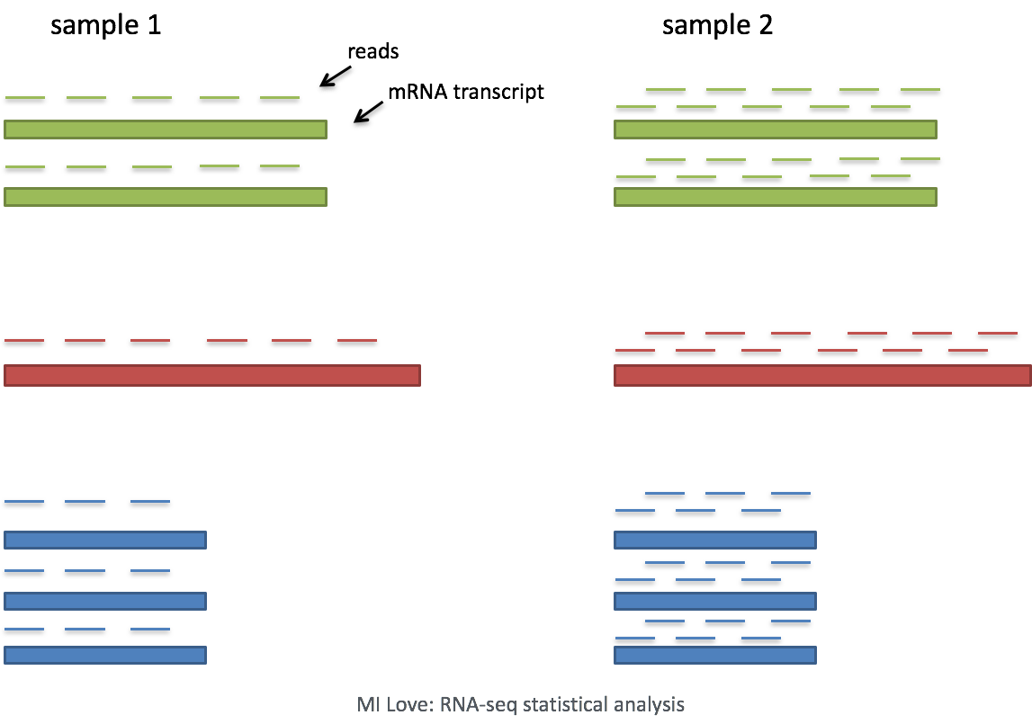
Image source: Mike Love: RNA-seq data analysis
The most common example of an “uninteresting” factor is sequencing depth. This is the total number of reads (UMIs) found in a cell. As seen below, sequencing depth can make it appear as though one cell has higher gene expression than another - simply because it was sequenced more deeply.
In this example, each gene appears to have doubled in expression in cell 2, however this is a consequence of cell 2 having twice the sequencing depth. Therefore, we need to normalize the counts to account for differences in sequencing depth across cells.
Normalization in spatial transcriptomics
Based on this information, we may conclude that normalization is always a necessary step. However, Bhuva et al. (2024) evaluated several normalization strategies and found that normalizing by the number of transcripts detected per bin can negatively affect spatial domain identification. This is due to the fact that total detection per bin can represent real biology. Thus, normalizing by the number of transcripts detected per bin can mask true biological differences between bins.
We can also see that the depth of transcription also varies across different spatial technologies, and even across different tissues.
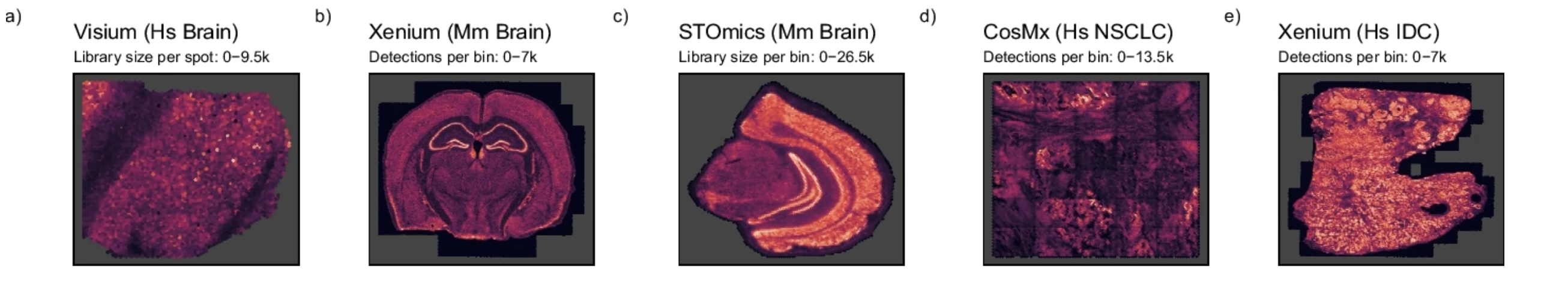
Image source: Bhuva et al. (2024)
We are cognizant of this subtlety, but as discussed earlier, it can be challenging to tease apart technical artifact from a biological signal. Without normalization, this lack of signal will strongly affect clustering regardless of the reason. For this reason, we apply a standard log-transformed library size normalization to our data.
Log-normalization steps
Log-normalization is one of the simplest normalization methods for scRNA-seq data. It is a two-step process that involves scaling and transformation.
1. Scaling
First, we divide each count by the total counts (nCount_Spatial.008um) for that cell. Then, we multiply a scaling factor (default is 10,000). Why would we want to do this? Different cells have different amounts of mRNA; this could be due to differences between cell types or variation within the same cell type depending on how well the kit worked in one bin versus another.
Regardless, we are not interested in comparing these absolute counts between cells. Instead we are interested in comparing concentrations, and scaling helps achieve this.
2. Transformation
The most common transformation is a log transformation, which is applied in the original Seurat workflow. Other transformations, such as a square root transform, are less commonly used.
Perform log-normalization
Now that we are on a new step of our analysis, let us create another R script titled 02_normalization_and_sketch.R that will contain our normalization and sketching code. We will place this R script within our scripts directory. This will help us keep our workflow organized and modular.
After loading the necessary libraries, we will load in the seurat_filtered object we created in the previous lesson.
To avoid making biased comparisons across bins, we will apply a simple normalization with the NormalizeData() function. This function performs log-normalization by default, but it also has other options for normalization methods.
# Normalize the counts
seurat_sketch <- NormalizeData(seurat_filtered)
seurat_sketchAn object of class Seurat
18085 features across 135798 samples within 1 assay
Active assay: Spatial.008um (18085 features, 0 variable features)
2 layers present: counts, data
2 spatial fields of view present: P5CRC.008um P5NAT.008umWhen we examine our Seurat object, seurat_sketch, we see that there is a new addition in the layer line that says data. This is where our log-normalized counts are stored. The original counts are still stored in the counts layer and the data layer contains the normalized counts.
NoteComplex normalization methods
Various methods have been developed specifically for scRNA-seq normalization. Some simpler methods resemble what we have seen with bulk RNA-seq; the application of global scale factors adjusting for a count-depth relationship that is assumed common across all genes. However, if those assumptions are not true then this basic normalization can lead to over-correction for lowly and moderately expressed genes and, in some cases, under-normalization of highly expressed genes (Bacher et al. (2017)).
One such example is the SCTransform method, which models gene expression using a regularized negative binomial regression. This method accounts for technical variation. For more information on this methods, the Introduction to scRNA-seq workshop has a lesson on how apply SCTransform and what is does in detail. For spatial data, it’s reasonable to start with a simpler log‑normalization and use SCTransform only when its extra modeling is needed.
Highly variable genes (HVGs)
Highly variable gene (HVG) selection is a critical step in the analysis of the workflow. We know that not all genes are equally informative. We want to emphasize the effect of genes that are changing across our dataset - rather than giving more weight to genes that remain consistent (less interesting). These genes are oftentimes indicators of biological processes or cell types. Ultimately, we get a list of genes ranked by how much they change across populations.
Most downstream steps are computed only on these highly variable genes. Therefore, understanding which genes are highly variable is important for understanding how the results of downstream analyses are computed.
Calculating HVGs
HVGs are calculated using the FindVariableFeatures() function. Some key arguments supplied to this function are:
FindVariableFeatures() to calculate highly variable genes.
| Argument | Description |
|---|---|
selection.method |
Method used to define and rank variable genes. The default "vst" (variance‑stabilizing transformation) fits a smooth curve to the relationship between mean expression and variance, then identifies genes that show more variability than expected at their average expression level. |
nfeatures |
Number of features to select as top variable features; used when selection.method is dispersion or vst |
# Identify the most variable genes
seurat_sketch <- FindVariableFeatures(seurat_sketch,
selection.method = "vst",
nfeatures = 2000)
seurat_sketchAn object of class Seurat
18085 features across 135798 samples within 1 assay
Active assay: Spatial.008um (18085 features, 2000 variable features)
2 layers present: counts, data
2 spatial fields of view present: P5CRC.008um P5NAT.008umWhen we examine our Seurat object, we see that FindVariableFeatures() has added 2,000 variable features - just as we specified with nfeatures. Seurat allows us to access the ranked highly variable genes with the VariableFeatures() function. Here we print the top 15:
# Identify the 15 most highly variable genes
ranked_variable_genes <- VariableFeatures(seurat_sketch)
top_genes <- ranked_variable_genes[1:15]
top_genes [1] "IGHG1" "IGHM" "SST" "IGLC1" "INSL5" "CHGA" "CXCL8" "GCG" "HBA2"
[10] "IGLC7" "VIP" "IGHG3" "MMP12" "PYY" "IGHA1"
TipExercise 1
- Using GeneCards, look up one of the top genes and read more about its role and how it could possible relate to CRC.
- Visualize one of the top variable genes on the spatial slide with
SpatialFeaturePlot()to see if expression varies across the image.
Sketch downsampling
As high-throughput sequencing has evolved, the number cells/bins in a dataset has increased dramatically. This can make it challenging to run calculations on the full dataset, especially for computationally intensive algorithms such as PCA and clustering. To offset these problems, “sketching” methods have been developed to downsample the dataset while retaining the biological complexity of the data. This allows us to retain the accuracy of our analyses while reducing the time and resources needed to run calculations.
But how do we know which cells to keep when downsampling? We want to make sure that we are not just keeping the most abundant cell types, but also retaining rare populations that may be biologically important.
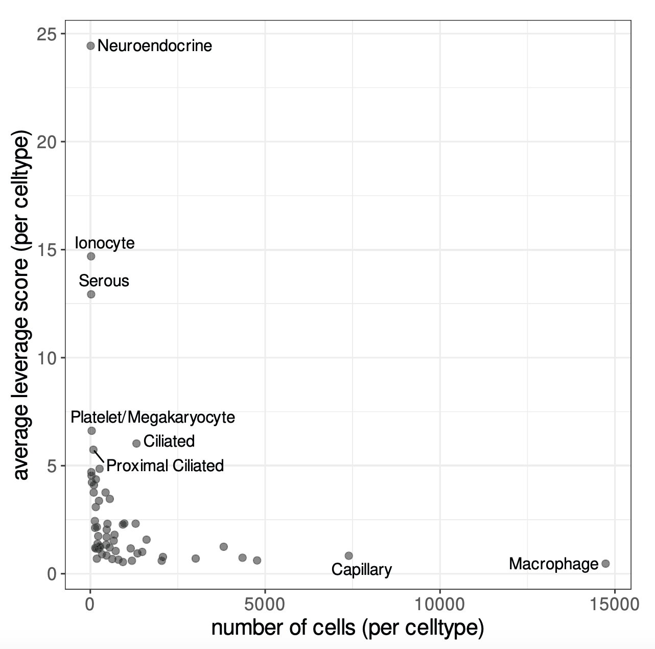
Image source: Hao et al. (2024)
Leverage scores measure how much each bin contributes to the main patterns of variation in the dataset. In order to estimate these leverage scores, we first consider each bin by its expression across highly variable genes and identify a small number of dominant expression patterns (similar to principal components in PCA). Each bin can then be expressed in terms of these patterns. Bins that lie in common, homogeneous regions of expression space and are thus easily “replaceable” have low leverage scores. While bins in rare or extreme regions have high leverage scores, because removing them would noticeably change the dominant patterns.
Therefore, leverage scores reflect the magnitude of a bin’s contribution to the gene-covariance matrix and its importance to the overall dataset. From these leverage scores, bins are selected with probabilities related to their leverage scores and added to the sketch assay. Importantly, because bins are sampled based on leverage scores, the sketched dataset will still contain some common bins, but they will be undersampled. However, rare or extreme bins are more likely to be sampled and will thus be oversampled. This results in a sketch that preserves the biological diversity of the full dataset, particularly for rare populations, while also using far fewer bins.
Downsampling
For our dataset, we are going to downsample our dataset to 10,000 bins using the SketchData() function. The function takes a normalized single-cell dataset containing a set of variable features. Both of which we have calculated in the previous steps. The function then calculates leverage scores for each bin and selects ncells based on these scores to create a new assay called “sketch”.
This step may take a few minutes to run.
# Select 10,000 cells based on leverage scores
# Create a new 'sketch' assay
seurat_sketch <- SketchData(object = seurat_sketch,
assay = 'Spatial.008um',
ncells = 10000,
method = "LeverageScore",
sketched.assay = "sketch")Sketch assay
Let’s take a look at our seurat_sketch object now that we have done the downsampling:
# Seurat callout after sketch downsampling
seurat_sketchAn object of class Seurat
36170 features across 135798 samples within 2 assays
Active assay: sketch (18085 features, 2000 variable features)
2 layers present: counts, data
1 other assay present: Spatial.008um
2 spatial fields of view present: P5CRC.008um P5NAT.008umWe can see that there are four major changes that have taken place:
- The number of features in the second line has doubled, because we have added a new assay
- Accordingly, the number of assays has increased from one to two
- The active assay has change from
Spatial.008umtosketch - There is a new line listing additional assays that exist in the Seurat object
We can also see that the leverage.score has been added as a column to the metadata of our object.
seurat_sketch@meta.data %>% View()@meta.data with leverage.score calculated for bin.
| orig.ident | nCount_Spatial.008um | nFeature_Spatial.008um | log10GenesPerUMI | mitoRatio | leverage.score | |
|---|---|---|---|---|---|---|
| P5CRC_s_008um_00078_00444-1 | P5CRC | 65 | 57 | 0.9685377 | 0.2307692 | 0.1182505 |
| P5CRC_s_008um_00128_00278-1 | P5CRC | 1300 | 906 | 0.9496410 | 0.1730769 | 0.8126225 |
| P5CRC_s_008um_00052_00559-1 | P5CRC | 128 | 121 | 0.9884090 | 0.0234375 | 1.3967893 |
| P5CRC_s_008um_00121_00413-1 | P5CRC | 538 | 326 | 0.9203288 | 0.0092937 | 0.6153956 |
| P5CRC_s_008um_00202_00633-1 | P5CRC | 365 | 232 | 0.9231919 | 0.0657534 | 0.4457335 |
Visualizing leverage scores
We would not like to see a strong bias in leverage scores across samples, as this would indicate that we are preferentially keeping bins from one sample over another. Luckily when we view the histogram of distribution, we are seeing a comparable range of scores across both samples.
# Histogram of leverage scores, split by sample
ggplot(seurat_sketch@meta.data) +
geom_histogram(aes(x=leverage.score,
fill=orig.ident),
alpha=0.5, bins=100) +
theme_classic() +
scale_x_log10(labels = scales::label_number())
We can also visualize the spatial distribution of leverage scores across the slide to see if we can begin identifying spatial patterns in the data with SpatialFeaturePlot().
SpatialFeaturePlot(seurat_sketch,
"leverage.score",
pt.size.factor = 15,
image.alpha = 0,
max.cutoff = 2)
You may notice that many of the bins with higher leverage scores were also the ones we saw in the previous lesson with higher levels of UMIs and genes. This indicates that our spatially unique populations are also going to be represented in our downsampled dataset.
Save!
Now is a great spot to save our seurat_sketch object as we have added a new assay to our Seurat object.
# Save Seurat object
saveRDS(seurat_sketch, "data/seurat_sketch.RDS")Reuse
CC-BY-4.0