# Dimensionality reduction (PCA + UMAP) and clustering
# Visium HD spatial transcriptomics workshop
# Author: Harvard Chan Bioinformatics Core
# Created: May 2026
# Load libraries
library(Seurat)
library(tidyverse)
set.seed(12345)
seurat_sketch <- readRDS("data/seurat_sketch.RDS")Dimensionality Reduction
Spatial transcriptomics
UMAP
PCA
In this lesson, we will apply dimensionality reduction techniques like PCA and UMAP to obtain informative low-dimensional embeddings. This lesson shows how to compute and interpret these embeddings for downstream analysis.
Keywords
Dimensionality, Latent space
Approximate time: 40 minutes
Learning objectives
In this lesson, we will:
- Follow a standard single-cell RNA-seq workflow on our
sketchassay - Identify highly variable genes in the
sketchassay and compare to the full dataset - Perform dimensionality reduction using PCA and UMAP on the
sketchassay
Overview of lesson
At this point, we have loaded our dataset after we ran filtration, normalization, and downsampling. Even though we have reduced the number of bins, ultimately we still have thousands of genes to contend with. The goal is to summarize the information across genes to identify bins that are similar to one another in gene-expression space. We will learn how to reduce the number of dimensions (genes) using principal component analysis (PCA) and UMAP. These embeddings become the backbone for clustering, visualization and downstream analyses in future lessons.
Single-cell RNA-seq (scRNA-seq) workflow
We will be performing a standard scRNA-seq workflow on our sketch assay. For more explicit details on each one of these steps, we have materials on how to conduct a scRNA-seq analysis from start to end.
Here we show the overarching steps that are taken in a classical single-cell analysis.
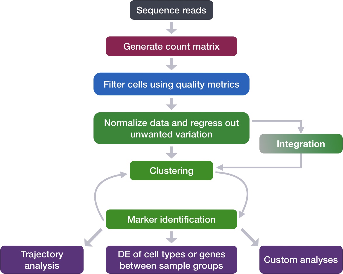
Image source: Intro to scRNA-seq analysis.
The broader principles of this workflow remain the same when working with spatial transcriptomics data. This lesson will cover the following steps:
FindVariableFeatures(): As before, this generates a list of highly variable genes, which may be slightly different for the sketched dataset than for the full dataset.ScaleData(): Highly variable genes will be confounded with the most highly expressed genes, so we need to adjust for this before PCA.RunPCA(): Perform a principal component analysis using our scaled data and variable genes. This will emphasize variation in gene expression as well as similarity across bins.RunUMAP(): Calculate UMAP coordinates for each bin, which will be used for visualization and clustering.
With that being said, there are certain elements that are unique to a spatial dataset that we will highlight as we go through each of these steps.
Variation in the dataset
First we will create a new R script called 03_dimensionality_reduction_and_clustering.R and place it within our scripts directory. We will continue where we left off in the previous lesson and load in the seurat_sketch object. With this sketch assay, we need to once again ask which genes are driving the variation in the dataset?
Therefore, the first step of this workflow will be computing the top variable features, but this time for our sketch assay.
Identify highly variable genes (HVGs)
Recall that when we were working with the entire dataset, we found the following genes to be the most variable:
# Identify the 15 most highly variable genes
ranked_variable_genes <- VariableFeatures(seurat_sketch,
assay = "Spatial.008um")
top_genes <- ranked_variable_genes[1:15]
top_genes [1] "IGHG1" "IGHM" "SST" "IGLC1" "INSL5" "CHGA" "CXCL8" "GCG" "HBA2"
[10] "IGLC7" "VIP" "IGHG3" "MMP12" "PYY" "IGHA1"We are going to run FindVariableFeatures() once more, but this time on our smaller “sketch” assay of 10,000 bins. Note, in the above code how we are pulling our variable genes from our full dataset using assay = "Spatial.008um", while in the code below we are setting assay = "sketch" in order to find variable genes in our “sketch” assay.
# Identify the most variable genes
seurat_processed <- FindVariableFeatures(seurat_sketch,
selection.method = "vst",
nfeatures = 2000,
assay = "sketch")
seurat_processedAn object of class Seurat
36170 features across 135798 samples within 2 assays
Active assay: sketch (18085 features, 2000 variable features)
2 layers present: counts, data
1 other assay present: Spatial.008um
2 spatial fields of view present: P5CRC.008um P5NAT.008um- Do you notice any differences when we calculated HVGs for the entire dataset versus the sketch assay?
# Identify the 15 most highly variable genes
ranked_variable_genes <- VariableFeatures(seurat_processed,
assay="sketch")
ranked_variable_genes[1:15] [1] "IGHG1" "IGHM" "IGLC1" "CHGA" "SST" "CXCL8" "GCG" "INSL5"
[9] "VIP" "PYY" "HBA2" "IGHA1" "REG3A" "GUCA2B" "MMP12" Visualize highly variable genes
We can visualize the dispersion of all genes using Seurat’s VariableFeaturePlot(), which shows a gene’s average expression across all bins on the x-axis and variance on the y-axis. Ideally, we would see genes lay across the entire x-axis, as we want to ensure that we are using genes that are both lowly and highly expressed. From the y-axis, we see genes with high levels of variance (gene expression changes across populations) near the top. These scores are how we identify what are our top variable features.
For the visualization, we are adding labels using LabelPoints() to help us better understand which genes are driving the shape of our data.
# Identify the 15 most highly variable genes
ranked_variable_genes <- VariableFeatures(seurat_processed,
assay = "sketch")
top_genes <- ranked_variable_genes[1:15]
# Plot the average expression and variance of these genes
# With labels to indicate which genes are in the top 15
p <- VariableFeaturePlot(seurat_processed)
LabelPoints(plot = p, points = top_genes, repel = TRUE)
We are now primed to run the next step of the workflow, which is the Principal Component Analysis.
Principal component analysis (PCA)
PCA is a technique used to emphasize variation as well as similarity, and to bring out strong patterns in a dataset; it is one of the methods used for dimensionality reduction.
Video on how PCA is calculated
For a more detailed explanation on PCA, please look over this lesson (adapted from StatQuests/Josh Starmer’s YouTube video). We also strongly encourage you to explore the video StatQuest’s video for a more thorough understanding.
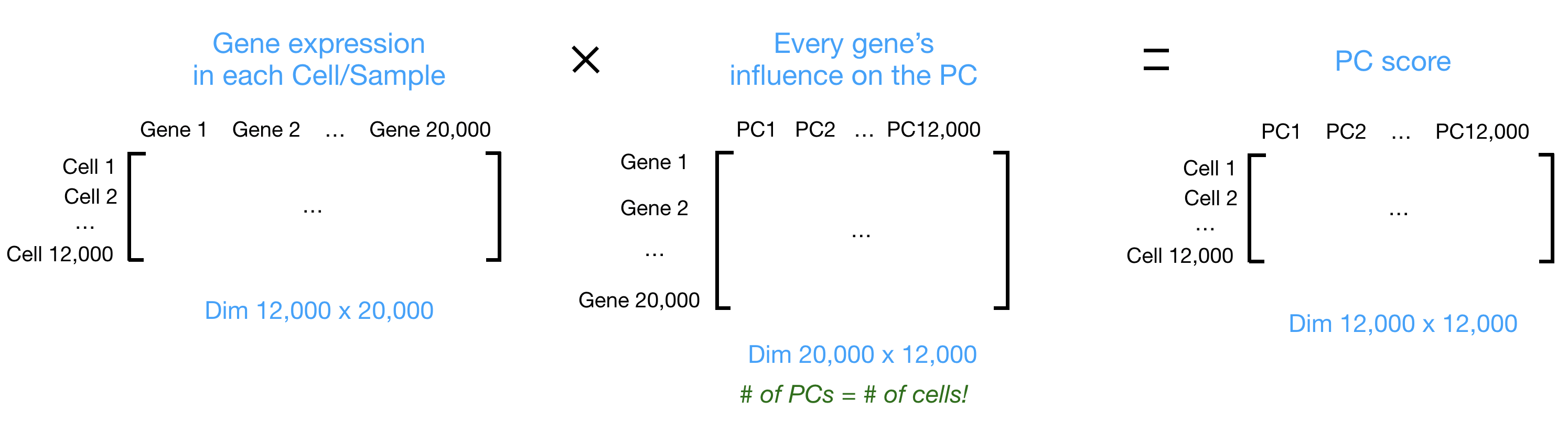
Let’s say you are working with a single-cell RNA-seq dataset with 12,000 cells and you have quantified the expression of 20,000 genes. The schematic below demonstrates how you would go from a cell-by-gene matrix to principal component (PC) scores for each individual cell.
To perform PCA, we need to first choose the most variable features, then scale the data. Since highly expressed genes exhibit the highest amount of variation and we don’t want our ‘highly variable genes’ only to reflect high expression, we need to scale the data to account for the dependence of variation on expression level. The Seurat ScaleData() function will scale the data by:
- Adjusting the expression of each gene to give a mean expression across bins of 0
- Scaling expression of each gene to give a variance across bins of 1
# Scale the log-normalized expression
seurat_processed <- ScaleData(seurat_processed)
seurat_processedAn object of class Seurat
36170 features across 135798 samples within 2 assays
Active assay: sketch (18085 features, 2000 variable features)
3 layers present: counts, data, scale.data
1 other assay present: Spatial.008um
2 spatial fields of view present: P5CRC.008um P5NAT.008umWe have calculated a new layer titled scale.data, where our scaled log-normalized counts now exist. So now we can proceed with calculating our Principal Components with RunPCA().
# Run PCA
seurat_processed <- RunPCA(seurat_processed,
assay = "sketch",
reduction.name = "pca.sketch")PC_ 1
Positive: IGKC, JCHAIN, A2M, CD74, IGHA1, SPARCL1, IGHM, COL3A1, SRGN, ADAMDEC1
Negative: LCN2, CEACAM6, CEACAM5, GPX2, ID1, DPEP1, NQO1, S100P, MDK, FERMT1
PC_ 2
Positive: CD74, SRGN, IFITM3, CD44, REG3A, IFITM2, SPARC, A2M, CDC25B, COL3A1
Negative: MUC12, PIGR, SLC26A3, FABP1, SLC26A2, FXYD3, CKB, TSPAN1, GUCA2A, FCGBP
PC_ 3
Positive: SELENOP, C1QA, C1QC, CD74, C1QB, APOE, SLC40A1, SRGN, LYZ, MS4A6A
Negative: CLCA1, LEFTY1, WFDC2, KIAA1324, NXPE1, VIP, SCG2, MUC5B, SCGN, ITLN1
PC_ 4
Positive: VIP, CALB2, SCG2, SCGN, TUBB2B, CHRNA3, UCHL1, L1CAM, RTN1, NSG2
Negative: CLCA1, CXCL8, G0S2, LEFTY1, ITLN1, WFDC2, MUC2, IL1B, MUC5B, PLA2G2A
PC_ 5
Positive: A2M, COL3A1, JCHAIN, PLVAP, IGFBP7, CXCL14, SPARCL1, COL6A2, SPARC, F3
Negative: CXCL8, G0S2, IL1B, BCL2A1, IL1RN, S100A9, AQP9, S100A8, PLEK, PTGS2 The information printed out shows the top genes that influence a bin’s score for each component. This includes genes that have both a positive and negative weight.
seurat_processedAn object of class Seurat
36170 features across 135798 samples within 2 assays
Active assay: sketch (18085 features, 2000 variable features)
3 layers present: counts, data, scale.data
1 other assay present: Spatial.008um
1 dimensional reduction calculated: pca.sketch
2 spatial fields of view present: P5CRC.008um P5NAT.008umIf we look at our updated seurat_processed object, we can see the PCA results have been stored under dimensional reduction calculated: pca.sketch.
Visualize PCA
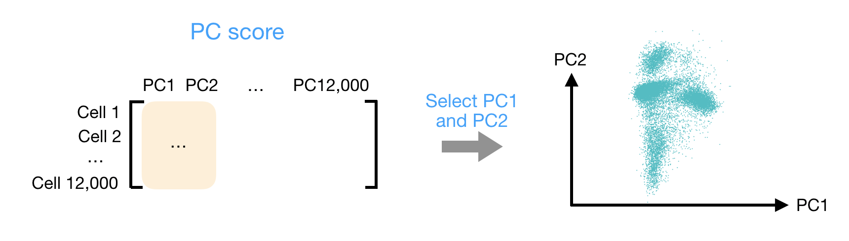
After the PC scores have been calculated, you are looking at a matrix of 12,000 x 12,000 that represents the information about relative gene expression in all the bins. You can select the PC1 and PC2 columns and plot that in a 2-dimensional way.
# Plot PCA
DimPlot(seurat_processed,
group.by = "orig.ident",
reduction = "pca.sketch")
Ultimately, what we have calculated with PCA are values that can represent how similar bins are to one another. We would expect that bins with similar gene expression will have similar PC values. For example, we would anticipate that two bins from Fibroblast cells would have comparable gene expression, which would also result in similar principal component scores. This is why many of the downstream steps use PCA as the input.
Selecting PC dimensions
Each PC essentially represents a “metagene” that combines information across a correlated gene set. Determining how many PCs to include in the clustering step is therefore important to ensure that we are capturing the majority of the variation, or cell types, present in our dataset.
It is useful to explore the PCs prior to deciding which PCs to include for the downstream clustering analysis.
The elbow plot is a helpful way to determine how many PCs to use for clustering so that we are capturing the majority of variation in the data. The elbow plot visualizes the standard deviation of each PC, and we are looking for where the standard deviations begin to plateau. Essentially, where the elbow appears is usually the threshold for identifying the majority of the variation. However, this method can be quite subjective.
Let’s draw an elbow plot using the top 50 PCs:
# Plot the elbow plot
ElbowPlot(object = seurat_processed,
reduction = "pca.sketch",
ndims = 50)
Based on this plot, we could roughly determine the majority of the variation by where the elbow occurs around PC8 - PC10, or one could argue that it should be when the data points start to get close to the X-axis, PC30 or so. This gives us a very rough idea of the number of PCs needed to be included.
A general rule of thumb is to use a minimum of 30 PCs for an analysis. This is to adequately represent the majority of the variation in the data.
We will be using 50 PCs for our downstream steps.
UMAP
To visualize the cell clusters, there are a few different dimensionality reduction techniques that can be helpful. The most popular methods include:
- t-distributed stochastic neighbor embedding: t-SNE
- Uniform manifold approximation and projection: UMAP
- Singular value decomposition: SVD
UMAP vs t-SNE vs SVD
Both UMAP and t-SNE are built under the same general structure of taking a larger dimensional space (PCA) and flattening it to two dimensions using manifolds. UMAP has come out on top between the two due its ability to balance both local and global structures of the dataset. Additionally, it is less sensitive to parameter choice, making it easier to tune. In contrast, the output of t-SNE plots tend to emphasize the local neighborhood to the detriment of the global structure of the data.
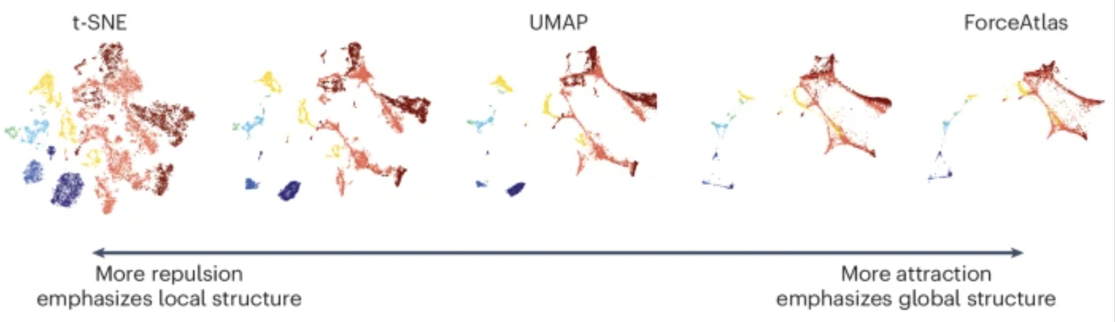
Image source: Marx (2024)
SVD is another form of reduction that is best suited for sparse, scATAC-seq datasets.
Each method aims to place bins with similar local neighborhoods in high-dimensional space together in low-dimensional space. These methods will require you to input the number of PCA dimensions to use for the visualization, we suggest using the same number of PCs as input to the clustering analysis. Here, we will proceed with the UMAP method for visualizing the clusters.
# Run UMAP
seurat_processed <- RunUMAP(seurat_processed,
reduction = "pca.sketch",
reduction.name = "umap.sketch",
return.model = TRUE,
dims = 1:50,
seed.use = 12345)
seurat_processedAn object of class Seurat
36170 features across 135798 samples within 2 assays
Active assay: sketch (18085 features, 2000 variable features)
3 layers present: counts, data, scale.data
1 other assay present: Spatial.008um
2 dimensional reductions calculated: pca.sketch, umap.sketch
2 spatial fields of view present: P5CRC.008um P5NAT.008umThese UMAP coordinates are now stored in the dimensional reductions calculated: pca.sketch, umap.sketch.
# Plot UMAP
DimPlot(seurat_processed,
group.by = "orig.ident",
reduction = "umap.sketch")
My UMAP plot looks rotated!
As with PCA, the values on the UMAP axes are not meaningful. What actually matters is the distance and relative arrangement of points in the UMAP space. Rotations or reflections of the plot do not change these relationships, as the distance will be preserved. This is why many figures omit axis tick labels entirely.
So if you got different UMAP coordinates, that is to be expected as long as the overall structure and patterns are preserved.
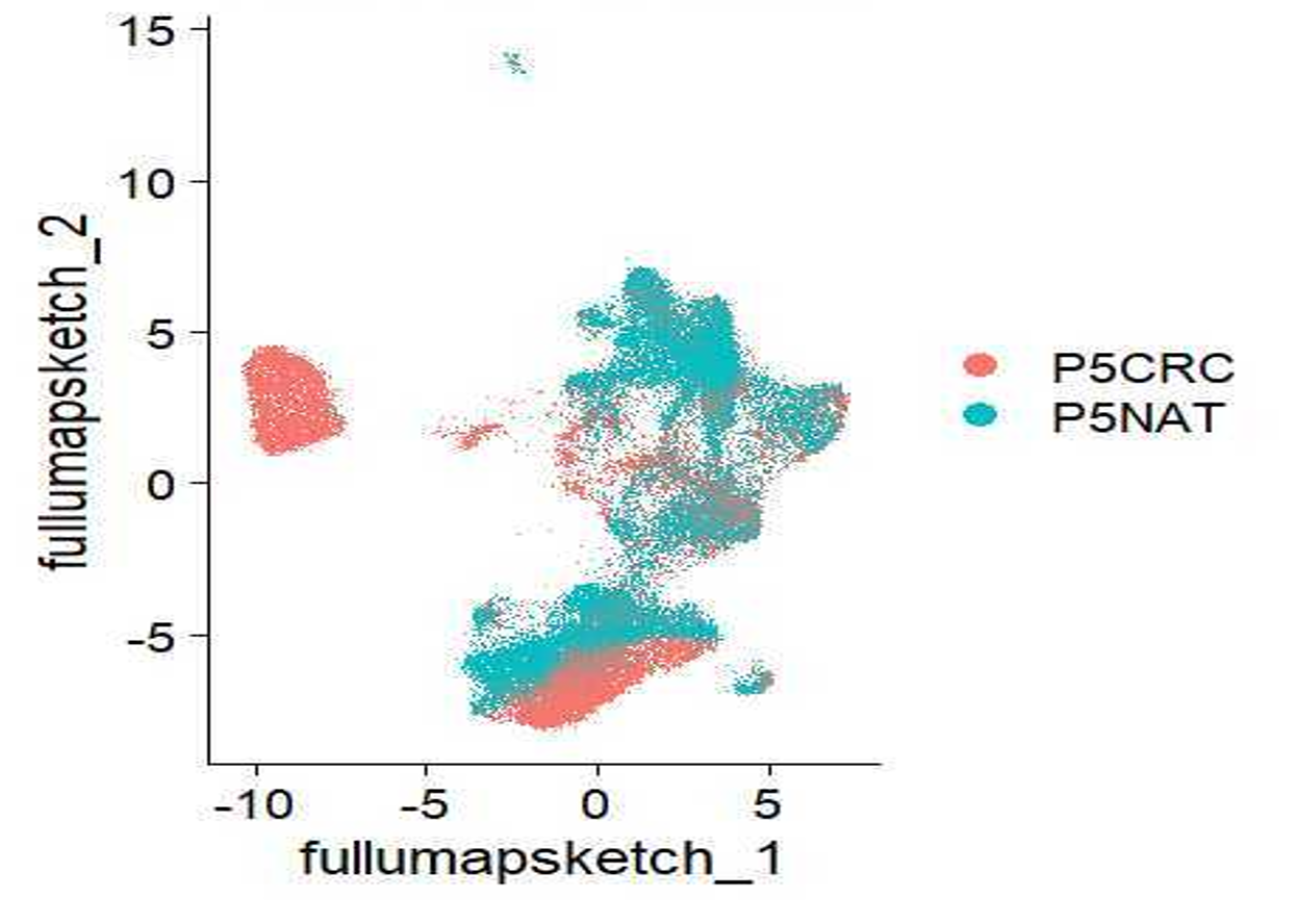
Many papers discuss the difficulties of interpreting results when plotted on a UMAP. So, while we acknowledge the usefulness of a UMAP plot as a first pass look at the data, we encourage you all to utilize other plots (violin plots, dot plots, bar plots, etc.) to showcase your data in a more quantitative manner.
- Plot the
nCount_Spatial.008umon the UMAP withFeaturePlot(). Do you notice any patterns? - Plot the expression of one of the top variable genes on the UMAP also with
FeaturePlot(). What do you notice?
As a sanity check that we have our PCA and UMAP values stored in our Seurat object, we can call the @reduction slot to preview the information retained.
# View dimensionality reduction results
seurat_processed@reductions$pca.sketch
A dimensional reduction object with key PC_
Number of dimensions: 50
Number of cells: 10000
Projected dimensional reduction calculated: FALSE
Jackstraw run: FALSE
Computed using assay: sketch
$umap.sketch
A dimensional reduction object with key umapsketch_
Number of dimensions: 2
Number of cells: 10000
Projected dimensional reduction calculated: FALSE
Jackstraw run: FALSE
Computed using assay: sketch Reuse
CC-BY-4.0