# Plot the UMAP colored by resolution 0.8
DimPlot(seurat_integrated,
group.by = "integrated_snn_res.0.8",
reduction = "umap",
label = TRUE,
label.size = 6)
This lesson covers how to identify marker genes for single-cell RNA-seq clusters. Participants will explore several approaches to marker detection, including identifying all markers per cluster, conserved markers across conditions and markers between specific clusters. The lesson emphasizes interpreting marker lists cautiously, adding gene annotations, using functional programming (map) to iterate over clusters and visualizing markers with feature and violin plots. Finally, it demonstrates re-annotating clusters with cell type labels, subsetting out stressed/unknown cells and using markers to compare cell populations and differential expression between conditions.
R, Python, Seurat, Scanpy, Marker genes, Differential expression, Cluster annotation, Conserved markers, Single-cell RNA-seq, UMAP, FeaturePlot, Violin plot
Approximate time: 75 minutes
In this lesson, we will:
Now that we have identified our desired clusters, we can move on to marker identification. This will allow us to verify the identity of certain clusters and help surmise the identity of any unknown clusters.
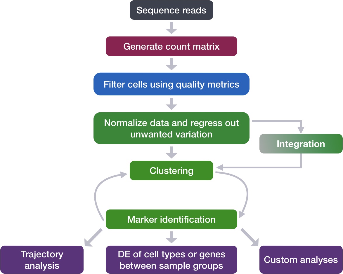
Remember that we had the following questions from the clustering analysis:
Identification of all markers for each cluster: this analysis compares each cluster against all others and outputs the genes that are differentially expressed/present. - Useful for identifying unknown clusters and improving confidence in hypothesized cell types.
Our clustering analysis resulted in the following clusters:
# Plot the UMAP colored by resolution 0.8
DimPlot(seurat_integrated,
group.by = "integrated_snn_res.0.8",
reduction = "umap",
label = TRUE,
label.size = 6)# Plot the UMAP
sc.pl.embedding(adata_integrated,
color = "leiden_0.8",
basis = "umap_scvi",
legend_loc = "on data",
legend_fontsize = 14,
legend_fontoutline = 3)
In order to identify which genes are uniquely expressed in one population over another, we make use of the Wilcoxon rank-sum test (also known as the Mann-Whitney U test). This is a non-parametric statistical method used to determine whether two groups of cells (i.e., cluster A vs. all other cells, or condition 1 vs. condition 2) have significantly different expression levels for a gene. This method does not assume a normal distribution, which is important for the sparse and zero-inflated nature of single-cell sequencing.
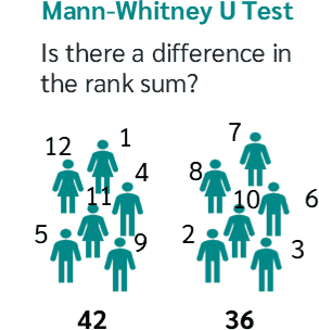
The general steps of how this test is utilized in a single-cell workflow are as follows:
This type of analysis is typically recommended for when evaluating a single sample group/condition. We can compare each cluster against all other clusters to identify potential marker genes. The cells in each cluster are treated as replicates, and essentially a differential expression analysis is performed with a chosen statistical test.
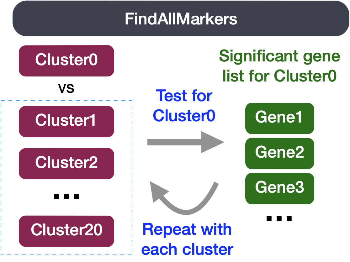
Before we start marker identification, we will explicitly set our default assay. We want to use the normalized data, but not the integrated data.
DefaultAssay(seurat_integrated) <- "RNA"
Idents(seurat_integrated) <- "integrated_snn_res.0.8"The default assay should have already been RNA, because we set it up in the previous clustering quality control lesson. But we encourage you to run this line of code above to be absolutely sure in case the active slot was changed somewhere upstream in your analysis.
Note that the raw and normalized counts are stored in the counts and data slots of RNA assay, respectively. By default, the functions for finding markers will use normalized data if RNA is the DefaultAssay. The number of features in the RNA assay corresponds to all genes in our dataset.
Now if we consider the SCT assay, functions for finding markers would use the scale.data slot which is the pearson residuals that come out of regularized NB regression. Differential expression on these values can be difficult to interpret. Additionally, only the variable features are represented in this assay and so we may not have data for some of our marker genes.
The FindAllMarkers() function has three important arguments which provide thresholds for determining whether a gene is a marker:
| Argument | Description | Cons |
|---|---|---|
logfc.threshold |
Minimum log2 fold change a gene must show between the cluster and all other clusters. Default: 0.25. | - May miss markers only expressed in a small subset of cells within the cluster - May include metabolic/ribosomal genes with small but consistent expression differences that aren’t useful for identifying cell type |
min.diff.pct |
Minimum difference in the percentage of cells expressing the gene between the cluster and all other clusters. | May miss markers that are expressed in most cells but strongly upregulated in one cell type |
min.pct |
Only tests genes detected in at least this fraction of cells in either group being compared. Speeds up the function by skipping rarely-detected genes. Default: 0.1. | Setting this too high may cause false negatives, since genes aren’t always detected in every cell that expresses them |
# Find markers for every cluster compared to all remaining cells, report only the positive ones
markers <- FindAllMarkers(seurat_integrated,
assay = "RNA",
layer = "data",
only.pos = TRUE,
logfc.threshold = 0.25)The tl.rank_genes_groups() function has several important arguments which provide thresholds for determining whether a gene is a marker:
| Parameter | Description |
|---|---|
layer = "log" |
Specifies which layer of the data to use (in this case, log-normalized expression values). |
groupby = "leiden_0.8" |
The cell metadata column used to define groups for comparison, in this case cluster labels from Leiden clustering at resolution 0.8. |
reference = "rest" |
Sets the comparison group. "rest" means each cluster is compared against all other clusters combined, rather than against one specific cluster. |
method = "wilcoxon" |
Specifies the statistical test used to identify differentially expressed genes; here, the Wilcoxon rank-sum (Mann-Whitney U) test. |
corr_method = "benjamini-hochberg" |
The method used to correct p-values for multiple testing across genes; here, the Benjamini-Hochberg procedure, which controls the false discovery rate. |
key_added = "all_clusters" |
The name under which the results will be stored in adata_integrated.uns, allowing this specific analysis run to be retrieved later. |
# Run Wilcoxon test
# Find markers for every cluster compared to all remaining cells
sc.tl.rank_genes_groups(adata_integrated,
layer = "log",
groupby = "leiden_0.8",
reference = "rest",
method = "wilcoxon",
corr_method = "benjamini-hochberg",
key_added = "all_clusters")The output is a dataframe containing a ranked list of putative markers listed by gene ID for each cluster, and associated statistics.
View(markers)| p_val | avg_log2FC | pct.1 | pct.2 | p_val_adj | cluster | gene | |
|---|---|---|---|---|---|---|---|
| RPS6 | 0 | 4.071041 | 0.935 | 0.329 | 0 | 1 | RPS6 |
| RPL13 | 0 | 3.426691 | 0.933 | 0.341 | 0 | 1 | RPL13 |
| RPL32 | 0 | 3.946409 | 0.921 | 0.331 | 0 | 1 | RPL32 |
| RPS14 | 0 | 3.982361 | 0.916 | 0.331 | 0 | 1 | RPS14 |
| RPS18 | 0 | 3.208262 | 0.918 | 0.334 | 0 | 1 | RPS18 |
| RPL7 | 0 | 3.696231 | 0.904 | 0.331 | 0 | 1 | RPL7 |
| Column | Description |
|---|---|
| gene | Gene symbol |
| p_val | P-value (not adjusted for multiple test correction) |
| avg_log2FC | Average log2 fold change between the cluster and all other clusters combined. Positive values indicate the gene is more highly expressed in the cluster. |
| pct.1 | Percentage of cells where the gene is detected in the cluster of interest |
| pct.2 | Percentage of cells where the gene is detected in all other clusters combined |
| p_val_adj | Adjusted p-value, based on Bonferroni correction using all genes in the dataset, used to determine significance |
| cluster | The cluster identity being tested against all remaining cells |
When looking at the output, we suggest looking for markers with large differences in expression between pct.1 and pct.2 and larger fold changes. For instance if pct.1 = 0.90 and pct.2 = 0.80, it may not be as exciting of a marker. However, if pct.2 = 0.1 instead, the bigger difference would be more convincing. Also, of interest is if the majority of cells expressing the marker is in my cluster of interest. If pct.1 is low, such as 0.3, it may not be as interesting. Both of these are also possible parameters to include when running the function, as described above.
# Get the dataframe of top genes per cluster
markers = sc.get.rank_genes_groups_df(adata_integrated,
group = None,
key = "all_clusters")
markers.head()| group | names | scores | logfoldchanges | pvals | pvals_adj | |
|---|---|---|---|---|---|---|
| 0 | 0 | RPS6 | 90.6122 | 1.5099 | 0 | 0 |
| 1 | 0 | RPL32 | 88.8407 | 1.37121 | 0 | 0 |
| 2 | 0 | RPL13 | 87.7327 | 1.3686 | 0 | 0 |
| 3 | 0 | RPS14 | 87.4401 | 1.33361 | 0 | 0 |
| 4 | 0 | RPS18 | 86.1824 | 1.41006 | 0 | 0 |
| Column | Description |
|---|---|
| names | Gene symbol |
| scores | Test statistic (z-score) from the Wilcoxon rank-sum test; higher absolute values indicate stronger evidence of differential expression |
| logfoldchanges | Log2 fold change between the cluster and the reference group. Positive values indicate the gene is more highly expressed in the cluster. |
| pvals | P-value (not adjusted for multiple test correction) |
| pvals_adj | Adjusted p-value, based on the correction method specified in corr_method (e.g., Benjamini-Hochberg), used to determine significance |
| group | The cluster identity being tested against the reference group |
Since each cell is being treated as a replicate this will result in inflated p-values within each group! A gene may have an incredibly low p-value < 1e-50 but that doesn’t translate as a highly reliable marker gene.
You may notice that ribosomal genes are popping up as a lot of the top genes, with genes that start with RPS or RPL. Shifts in metabolic state are quite common and can be useful pieces of information. However, at this step we are attempting to identify the cell types of each cluster. Therefore, these genes are not as informative, so we are going to remove these genes from our dataframes to more clearly see our cell type markers.
# Remove genes that start with "RPL" or "RPS"
markers_filtered <- markers %>%
filter(!grepl("^(RPL|RPS)", gene))
View(markers_filtered)| p_val | avg_log2FC | pct.1 | pct.2 | p_val_adj | cluster | gene | |
|---|---|---|---|---|---|---|---|
| EEF1A1 | 0 | 3.216609 | 0.856 | 0.343 | 0 | 1 | EEF1A1 |
| SELL | 0 | 13.287260 | 0.686 | 0.195 | 0 | 1 | SELL |
| GIMAP7 | 0 | 8.279041 | 0.760 | 0.276 | 0 | 1 | GIMAP7 |
| SARAF | 0 | 6.341270 | 0.773 | 0.307 | 0 | 1 | SARAF |
| CD3D | 0 | 6.329887 | 0.662 | 0.254 | 0 | 1 | CD3D |
| AES | 0 | 4.840609 | 0.497 | 0.137 | 0 | 1 | AES |
# Remove genes that start with "RPL" or "RPS"
markers_filtered = markers[~markers["names"].str.startswith(("RPS", "RPL"))]
markers_filtered.head()| group | names | scores | logfoldchanges | pvals | pvals_adj | |
|---|---|---|---|---|---|---|
| 19 | 0 | EEF1A1 | 72.9754 | 1.05493 | 0 | 0 |
| 20 | 0 | CCR7 | 71.9635 | 2.20127 | 0 | 0 |
| 27 | 0 | GIMAP7 | 70.2996 | 2.05598 | 0 | 0 |
| 37 | 0 | SARAF | 62.8002 | 1.42205 | 0 | 0 |
| 38 | 0 | SELL | 62.0678 | 2.35634 | 0 | 0 |
At this point, we are able to identify which genes of ours are significant by setting an adjusted p-value threshold. However, it can be challenging to keep track of what each gene does and what its gene name stands for. It can be helpful to add columns with gene annotation information. In order to do that we will load in an annotation file located in your data/additional_data/ folder.
If you are interested in knowing how we obtained this annotation file, take a look at the linked materials.
We can load it into our environment like so:
# Load pre-generated annotations file
annotations <- read.csv("data/additional_data/annotation.csv")
View(annotations)| gene_id | gene_name | seq_name | gene_biotype | description |
|---|---|---|---|---|
| ENSG00000223972 | DDX11L1 | 1 | transcribed_unprocessed_pseudogene | DEAD/H-box helicase 11 like 1 [Source:HGNC Symbol;Acc:HGNC:37102] |
| ENSG00000227232 | WASH7P | 1 | unprocessed_pseudogene | WASP family homolog 7, pseudogene [Source:HGNC Symbol;Acc:HGNC:38034] |
| ENSG00000278267 | MIR6859-1 | 1 | miRNA | microRNA 6859-1 [Source:HGNC Symbol;Acc:HGNC:50039] |
| ENSG00000243485 | MIR1302-2HG | 1 | lncRNA | MIR1302-2 host gene [Source:HGNC Symbol;Acc:HGNC:52482] |
| ENSG00000284332 | MIR1302-2 | 1 | miRNA | microRNA 1302-2 [Source:HGNC Symbol;Acc:HGNC:35294] |
| ENSG00000237613 | FAM138A | 1 | lncRNA | family with sequence similarity 138 member A [Source:HGNC Symbol;Acc:HGNC:32334] |
# Load pre-generated annotations file
import pandas as pd
annotations = pd.read_csv("data/additional_data/annotation.csv")
annotations.head()| gene_id | gene_name | seq_name | gene_biotype | description | |
|---|---|---|---|---|---|
| 0 | ENSG00000223972 | DDX11L1 | 1 | transcribed_unprocessed_pseudogene | DEAD/H-box helicase 11 like 1 [Source:HGNC Symbol;Acc:HGNC:37102] |
| 1 | ENSG00000227232 | WASH7P | 1 | unprocessed_pseudogene | WASP family homolog 7, pseudogene [Source:HGNC Symbol;Acc:HGNC:38034] |
| 2 | ENSG00000278267 | MIR6859-1 | 1 | miRNA | microRNA 6859-1 [Source:HGNC Symbol;Acc:HGNC:50039] |
| 3 | ENSG00000243485 | MIR1302-2HG | 1 | lncRNA | MIR1302-2 host gene [Source:HGNC Symbol;Acc:HGNC:52482] |
| 4 | ENSG00000284332 | MIR1302-2 | 1 | miRNA | microRNA 1302-2 [Source:HGNC Symbol;Acc:HGNC:35294] |
Notice that the column gene_name should be able to map well onto our markers_filtered dataframe. So in this next step we will merge together the two tables.
# Add description column to Wilcoxon results
markers_filtered_anno <- markers_filtered %>%
left_join(y = unique(annotations[, c("gene_name", "description")]),
by = c("gene" = "gene_name"))
View(markers_filtered_anno)FindAllMarkers() with description column added from our annotations file.
| p_val | avg_log2FC | pct.1 | pct.2 | p_val_adj | cluster | gene | description |
|---|---|---|---|---|---|---|---|
| 0 | 3.216609 | 0.856 | 0.343 | 0 | 1 | EEF1A1 | eukaryotic translation elongation factor 1 alpha 1 [Source:HGNC Symbol;Acc:HGNC:3189] |
| 0 | 13.287260 | 0.686 | 0.195 | 0 | 1 | SELL | selectin L [Source:HGNC Symbol;Acc:HGNC:10720] |
| 0 | 8.279041 | 0.760 | 0.276 | 0 | 1 | GIMAP7 | GTPase, IMAP family member 7 [Source:HGNC Symbol;Acc:HGNC:22404] |
| 0 | 6.341270 | 0.773 | 0.307 | 0 | 1 | SARAF | store-operated calcium entry associated regulatory factor [Source:HGNC Symbol;Acc:HGNC:28789] |
| 0 | 6.329887 | 0.662 | 0.254 | 0 | 1 | CD3D | CD3d molecule [Source:HGNC Symbol;Acc:HGNC:1673] |
| 0 | 4.840609 | 0.497 | 0.137 | 0 | 1 | AES | NA |
# Add description column to Wilcoxon results
markers_filtered_anno = markers_filtered.merge(
annotations[["gene_name", "description"]].drop_duplicates(),
how="left",
left_on="names",
right_on="gene_name"
)
markers_filtered_anno.head()tl.rank_gene_groups() with description column added from our annotations file.
| group | names | scores | logfoldchanges | pvals | pvals_adj | gene_name | description | |
|---|---|---|---|---|---|---|---|---|
| 0 | 0 | EEF1A1 | 72.9754 | 1.05493 | 0 | 0 | EEF1A1 | eukaryotic translation elongation factor 1 alpha 1 [Source:HGNC Symbol;Acc:HGNC:3189] |
| 1 | 0 | CCR7 | 71.9635 | 2.20127 | 0 | 0 | CCR7 | C-C motif chemokine receptor 7 [Source:HGNC Symbol;Acc:HGNC:1608] |
| 2 | 0 | GIMAP7 | 70.2996 | 2.05598 | 0 | 0 | GIMAP7 | GTPase, IMAP family member 7 [Source:HGNC Symbol;Acc:HGNC:22404] |
| 3 | 0 | SARAF | 62.8002 | 1.42205 | 0 | 0 | SARAF | store-operated calcium entry associated regulatory factor [Source:HGNC Symbol;Acc:HGNC:28789] |
| 4 | 0 | SELL | 62.0678 | 2.35634 | 0 | 0 | SELL | selectin L [Source:HGNC Symbol;Acc:HGNC:10720] |
Since we have samples representing different conditions in our dataset, our best option is to find conserved markers. This function internally separates out cells by sample group/condition, and then performs differential gene expression testing for a single specified cluster against all other clusters (or a second cluster, if specified). Gene-level p-values are computed for each condition and then combined across groups using meta-analysis methods from the MetaDE R package.
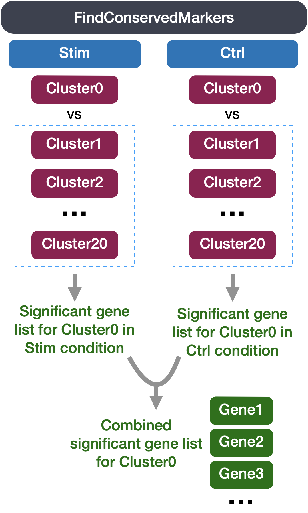
FindConservedMarkers() syntax## DO NOT RUN ##
FindConservedMarkers(seurat_integrated,
ident.1 = cluster,
grouping.var = "sample",
only.pos = TRUE,
min.diff.pct = 0.25,
min.pct = 0.25,
logfc.threshold = 0.25)You will recognize some of the arguments we described previously for the FindAllMarkers() function; this is because internally it is using that function to first find markers within each group. Here, we list some additional arguments which provide for when using FindConservedMarkers():
ident.1: this function only evaluates one cluster at a time; here you would specify the cluster of interest.grouping.var: the variable (column header) in your metadata which specifies the separation of cells into groupsFor our analysis we will be fairly lenient and use only the log fold change threshold greater than 0.25. We will also specify to return only the positive markers for each cluster.
FindConservedMarkers()Let’s test it out on one cluster to see how it works:
cluster1_conserved_markers <- FindConservedMarkers(seurat_integrated,
ident.1 = 1,
grouping.var = "sample",
only.pos = TRUE,
logfc.threshold = 0.25)
# Inspect the output of FindConservedMarkers
View(cluster1_conserved_markers)| stim_p_val | stim_avg_log2FC | stim_pct.1 | stim_pct.2 | stim_p_val_adj | ctrl_p_val | ctrl_avg_log2FC | ctrl_pct.1 | ctrl_pct.2 | ctrl_p_val_adj | max_pval | minimump_p_val | |
|---|---|---|---|---|---|---|---|---|---|---|---|---|
| CCR7 | 0 | 1.3691907 | 0.922 | 0.408 | 0 | 0 | 1.4138279 | 0.835 | 0.346 | 0 | 0 | 0 |
| SELL | 0 | 1.5052185 | 0.828 | 0.350 | 0 | 0 | 2.0738272 | 0.611 | 0.165 | 0 | 0 | 0 |
| GIMAP7 | 0 | 1.1910538 | 0.934 | 0.487 | 0 | 0 | 1.3365262 | 0.804 | 0.360 | 0 | 0 | 0 |
| LDHB | 0 | 1.5012170 | 0.716 | 0.288 | 0 | 0 | 1.2712963 | 0.726 | 0.339 | 0 | 0 | 0 |
| LTB | 0 | 1.4940077 | 0.703 | 0.276 | 0 | 0 | 1.5041451 | 0.769 | 0.305 | 0 | 0 | 0 |
| CD3D | 0 | 1.3477368 | 0.645 | 0.263 | 0 | 0 | 1.2945307 | 0.693 | 0.298 | 0 | 0 | 0 |
| RPL5 | 0 | 0.9160773 | 0.878 | 0.539 | 0 | 0 | 0.6203005 | 0.935 | 0.725 | 0 | 0 | 0 |
| RPL10A | 0 | 0.8570482 | 0.969 | 0.649 | 0 | 0 | 0.5587117 | 0.969 | 0.801 | 0 | 0 | 0 |
| RPSA | 0 | 0.8193034 | 0.909 | 0.602 | 0 | 0 | 0.6442438 | 0.925 | 0.693 | 0 | 0 | 0 |
| RPL36 | 0 | 0.6924961 | 0.900 | 0.652 | 0 | 0 | 0.5455745 | 0.881 | 0.701 | 0 | 0 | 0 |
The output from the FindConservedMarkers() function is a matrix containing a ranked list of putative markers listed by gene ID for the cluster we specified, and associated statistics. Note that the same set of statistics are computed for each group (in our case, Ctrl and Stim) and the last two columns correspond to the combined p-value across the two groups. We describe some of these columns below:
When looking at the output, we suggest looking for markers with large differences in expression between pct.1 and pct.2 and larger fold changes. For instance if pct.1 = 0.90 and pct.2 = 0.80, it may not be as exciting of a marker. However, if pct.2 = 0.1 instead, the bigger difference would be more convincing. Also, of interest is if the majority of cells expressing the marker is in my cluster of interest. If pct.1 is low, such as 0.3, it may not be as interesting. Both of these are also possible parameters to include when running the function, as described above.
The function FindConservedMarkers() accepts a single cluster at a time, and we could run this function as many times as we have clusters. However, this is not very efficient. Instead we will first create a function to find the conserved markers including all the parameters we want to include. We will also add a few lines of code to modify the output. Our function will:
FindConservedMarkers() functionrownames_to_column() functioncbind() function# Create function to get conserved markers for any given cluster
get_conserved <- function(cluster){
FindConservedMarkers(seurat_integrated,
ident.1 = cluster,
grouping.var = "sample",
only.pos = TRUE) %>%
rownames_to_column(var = "gene") %>%
left_join(y = unique(annotations[, c("gene_name", "description")]),
by = c("gene" = "gene_name")) %>%
cbind(cluster_id = cluster, .)
}Now that we have this function created we can use it as an argument to the appropriate map function. We want the output of the map family of functions to be a dataframe with each cluster output bound together by rows, we will use the map_dfr() function.
map family syntax:
## DO NOT RUN ##
map_dfr(inputs_to_function, name_of_function)Now, let’s try this function to find the conserved markers for the clusters that were identified as CD4+ T cells (1, 3, 6, 8) from our use of known marker genes. Let’s see what genes we identify and if there are overlaps or obvious differences that can help us tease this apart a bit more.
# Iterate function across desired clusters
conserved_markers <- map_dfr(c(1, 3, 6, 8), get_conserved) %>%
filter(!grepl("^(RPL|RPS)", gene))
head(conserved_markers)FindConservedMarkers for multiple clusters after wrangling with the custom function get_conserved.
| cluster_id | gene | stim_p_val | stim_avg_log2FC | stim_pct.1 | stim_pct.2 | stim_p_val_adj | ctrl_p_val | ctrl_avg_log2FC | ctrl_pct.1 | ctrl_pct.2 | ctrl_p_val_adj | max_pval | minimump_p_val | description |
|---|---|---|---|---|---|---|---|---|---|---|---|---|---|---|
| 1 | CCR7 | 0 | 1.369191 | 0.922 | 0.408 | 0 | 0 | 1.413828 | 0.835 | 0.346 | 0 | 0 | 0 | C-C motif chemokine receptor 7 [Source:HGNC Symbol;Acc:HGNC:1608] |
| 1 | SELL | 0 | 1.505219 | 0.828 | 0.350 | 0 | 0 | 2.073827 | 0.611 | 0.165 | 0 | 0 | 0 | selectin L [Source:HGNC Symbol;Acc:HGNC:10720] |
| 1 | GIMAP7 | 0 | 1.191054 | 0.934 | 0.487 | 0 | 0 | 1.336526 | 0.804 | 0.360 | 0 | 0 | 0 | GTPase, IMAP family member 7 [Source:HGNC Symbol;Acc:HGNC:22404] |
| 1 | LDHB | 0 | 1.501217 | 0.716 | 0.288 | 0 | 0 | 1.271296 | 0.726 | 0.339 | 0 | 0 | 0 | lactate dehydrogenase B [Source:HGNC Symbol;Acc:HGNC:6541] |
| 1 | LTB | 0 | 1.494008 | 0.703 | 0.276 | 0 | 0 | 1.504145 | 0.769 | 0.305 | 0 | 0 | 0 | lymphotoxin beta [Source:HGNC Symbol;Acc:HGNC:6711] |
| 1 | CD3D | 0 | 1.347737 | 0.645 | 0.263 | 0 | 0 | 1.294531 | 0.693 | 0.298 | 0 | 0 | 0 | CD3d molecule [Source:HGNC Symbol;Acc:HGNC:1673] |
For your data, you may want to run this function on all clusters, in which case you could input 0:20 instead of c(1, 3, 6, 8); however, it would take quite a while to run. Also, it is possible that when you run this function on all clusters, in some cases you will have clusters that do not have enough cells for a particular group - and your function will fail. For these clusters you will need to use FindAllMarkers().
This method of identifying differential genes is not available in the scanpy workflow. In the Seurat, R-based workflow this function is known as FindConservedMarkers()
We would like to use these gene lists to see if we can identify which cell types these clusters identify with. Let’s take a look at the top genes for each of the clusters and see if that gives us any hints. We can view the top 10 markers for each CD4+ T cell cluster for a quick perusal:
# Extract top 10 markers per cluster
top10 <- conserved_markers %>%
group_by(cluster_id) %>%
slice_head(n = 10)
# Visualize top 10 markers per cluster
View(top10)| cluster_id | gene | stim_p_val | stim_avg_log2FC | stim_pct.1 | stim_pct.2 | stim_p_val_adj | ctrl_p_val | ctrl_avg_log2FC | ctrl_pct.1 | ctrl_pct.2 | ctrl_p_val_adj | max_pval | minimump_p_val | description |
|---|---|---|---|---|---|---|---|---|---|---|---|---|---|---|
| 1 | CCR7 | 0 | 1.369191 | 0.922 | 0.408 | 0 | 0 | 1.413828 | 0.835 | 0.346 | 0 | 0 | 0 | C-C motif chemokine receptor 7 [Source:HGNC Symbol;Acc:HGNC:1608] |
| 1 | SELL | 0 | 1.505219 | 0.828 | 0.350 | 0 | 0 | 2.073827 | 0.611 | 0.165 | 0 | 0 | 0 | selectin L [Source:HGNC Symbol;Acc:HGNC:10720] |
| 1 | GIMAP7 | 0 | 1.191054 | 0.934 | 0.487 | 0 | 0 | 1.336526 | 0.804 | 0.360 | 0 | 0 | 0 | GTPase, IMAP family member 7 [Source:HGNC Symbol;Acc:HGNC:22404] |
| 1 | LDHB | 0 | 1.501217 | 0.716 | 0.288 | 0 | 0 | 1.271296 | 0.726 | 0.339 | 0 | 0 | 0 | lactate dehydrogenase B [Source:HGNC Symbol;Acc:HGNC:6541] |
| 1 | LTB | 0 | 1.494008 | 0.703 | 0.276 | 0 | 0 | 1.504145 | 0.769 | 0.305 | 0 | 0 | 0 | lymphotoxin beta [Source:HGNC Symbol;Acc:HGNC:6711] |
| 1 | CD3D | 0 | 1.347737 | 0.645 | 0.263 | 0 | 0 | 1.294531 | 0.693 | 0.298 | 0 | 0 | 0 | CD3d molecule [Source:HGNC Symbol;Acc:HGNC:1673] |
When we look at the entire list, we see clusters 1 and 3 have some overlapping genes, like CCR7 and SELL which correspond to markers of memory T cells. It is possible that these two clusters are more similar to one another and could be merged together as naive T cells. On the other hand, with cluster 3 we observe CREM as one of our top genes; a marker gene of activation. This suggests that perhaps cluster 3 represents activated T cells.
# Grab top 10 genes from CD4+ T cell clusters
top10_markers = (
markers_filtered_anno[markers_filtered_anno["group"].isin(["0", "1", "4", "6"])]
.groupby("group", as_index = False)
.head(10)
.reset_index(drop=True)
)
top10_markers| group | names | scores | logfoldchanges | pvals | pvals_adj | gene_name | description | |
|---|---|---|---|---|---|---|---|---|
| 0 | 0 | EEF1A1 | 72.9754 | 1.05493 | 0 | 0 | EEF1A1 | eukaryotic translation elongation factor 1 alpha 1 [Source:HGNC Symbol;Acc:HGNC:3189] |
| 1 | 0 | CCR7 | 71.9635 | 2.20127 | 0 | 0 | CCR7 | C-C motif chemokine receptor 7 [Source:HGNC Symbol;Acc:HGNC:1608] |
| 2 | 0 | GIMAP7 | 70.2996 | 2.05598 | 0 | 0 | GIMAP7 | GTPase, IMAP family member 7 [Source:HGNC Symbol;Acc:HGNC:22404] |
| 3 | 0 | SARAF | 62.8002 | 1.42205 | 0 | 0 | SARAF | store-operated calcium entry associated regulatory factor [Source:HGNC Symbol;Acc:HGNC:28789] |
| 4 | 0 | SELL | 62.0678 | 2.35634 | 0 | 0 | SELL | selectin L [Source:HGNC Symbol;Acc:HGNC:10720] |
When we look at the entire list, we see clusters 0 and 1 have some overlapping genes, like CCR7 and SELL which correspond to markers of memory T cells. It is possible that these two clusters are more similar to one another and could be merged together as naive T cells. On the other hand, with cluster 1 we observe CREM as one of our top genes; a marker gene of activation. This suggests that perhaps cluster 1 represents activated T cells.
There is also another cluster with high expression values for heat shock and DNA damage genes appear in the top gene list. Based on these markers, it is likely that these are stressed or dying cells. However, if we explore the quality metrics for these cells in more detail (i.e. mitoRatio and nUMI overlayed on the cluster) we do not find much support for this interpretation. There is a breadth of research supporting the association of heat shock proteins with reactive T cells in the induction of anti‐inflammatory cytokines in chronic inflammation. This is a cluster for which we would need a deeper understanding of immune cells to really tease apart the results and make a final conclusion.
| Cell State | Marker |
|---|---|
| Naive T cells | CCR7, SELL |
| Activated T cells | CREM, CD69 |
| Heat shock proteins | HSPH1, HSPE1 |
| DNA damage repair | DNAJB1 |
Let us make a dotplot of each of these genes to more clearly see which populations are highlighting these genes:
# List of identified interesting genes
markers <- list(
"CD4+ T cells" = c("CD3D", "IL7R"),
"Naive T cells" = c("CCR7", "SELL"),
"Activated T cells" = c("CREM", "CD69"),
"Heat shock proteins" = c("HSPH1", "HSPE1"),
"DNA damage repair" = c("DNAJB1"))
# Create dotplot based on RNA expression
DotPlot(seurat_integrated,
markers,
assay = "RNA",
idents = c("1", "3", "6", "8")) +
theme(axis.text.x = element_text(angle = 90, vjust = 0.5, hjust=1))
For cluster 6, we see a lot of heat shock and DNA damage genes appear in the top gene list. Based on these markers, it is likely that these are stressed or dying cells. However, if we explore the quality metrics for these cells in more detail (i.e. mitoRatio and nUMI overlayed on the cluster) we don’t really support for this argument. There is a breadth of research supporting the association of heat shock proteins with reactive T cells in the induction of anti‐inflammatory cytokines in chronic inflammation. This is a cluster for which we would need a deeper understanding of immune cells to really tease apart the results and make a final conclusion.
# Subset the AnnData object to only include clusters 0, 1, 4, and 6
adata_subset = adata_integrated[adata_integrated.obs["leiden_0.8"].isin(["0", "1", "4", "6"])]
# List of identified interesting genes
markers = {
"CD4+ T cells": ["CD3D", "IL7R", "CCR7"],
"Naive T cells": ["CCR7", "SELL"],
"Activated T cells": ["CREM", "CD69"],
"Heat shock proteins": ["HSPH1", "HSPE1"],
"DNA damage repair": ["DNAJB1"]}
# Create dotplot based on RNA expression
sc.pl.dotplot(adata_subset,
markers,
groupby = "leiden_0.8",
swap_axes = True,
figsize=(10, 6))
For cluster 4, we see a lot of heat shock and DNA damage genes appear in the top gene list. Based on these markers, it is likely that these are stressed or dying cells. However, if we explore the quality metrics for these cells in more detail (i.e. mitoRatio and nUMI overlayed on the cluster) we don’t really support for this argument. There is a breadth of research supporting the association of heat shock proteins with reactive T cells in the induction of anti‐inflammatory cytokines in chronic inflammation. This is a cluster for which we would need a deeper understanding of immune cells to really tease apart the results and make a final conclusion.
Sometimes the list of markers returned does not sufficiently some clusters. For instance, we had previously identified multiple clusters as CD4+ T cells, but when looking at marker gene lists we identified markers to help us further subset cells. We were lucky and the signal observed from each cluster helped us differentiate between naive and activated cells. Another option for identifying biologically meaningful differences would be to identify genes that are differentially expressed between two specific clusters.
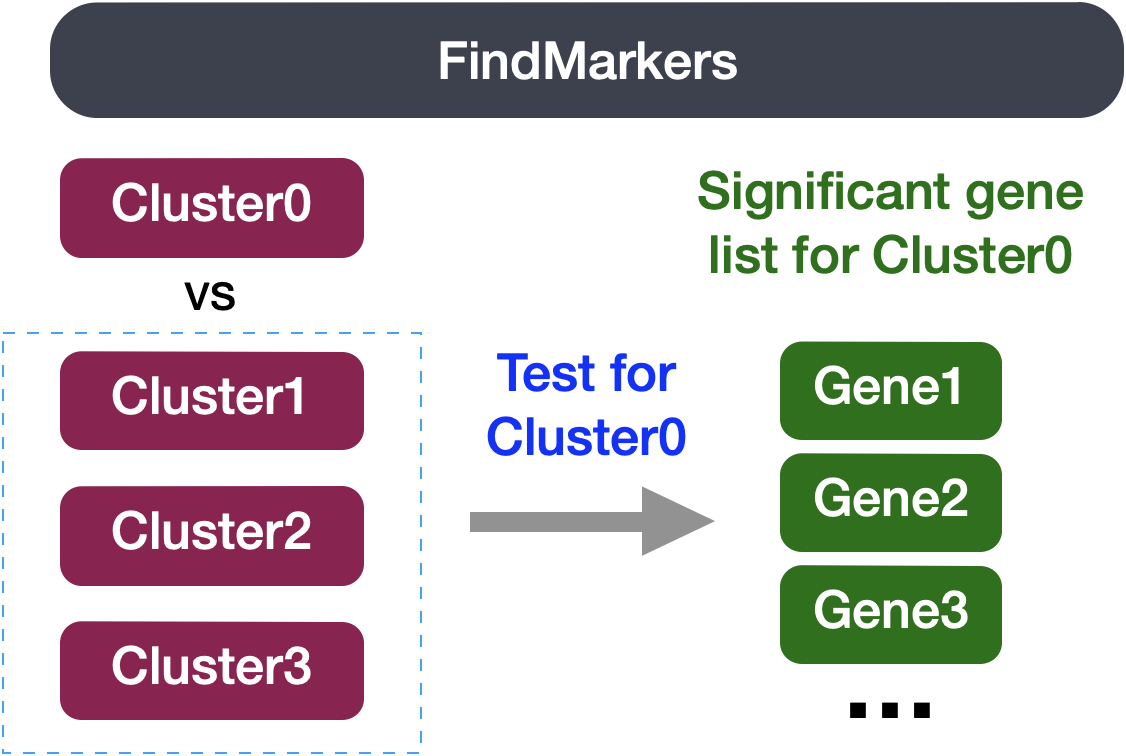
We can try all combinations of comparisons, but we’ll start with cluster 3 versus all other CD4+ T cell clusters:
# Determine differentiating markers for CD4+ T cell
cd4_tcells <- FindMarkers(seurat_integrated,
ident.1 = 3,
ident.2 = c(1, 6, 8))
# Add gene descriptions to the DE table
cd4_tcells <- cd4_tcells %>%
rownames_to_column(var = "gene") %>%
left_join(y = unique(annotations[, c("gene_name", "description")]),
by = c("gene" = "gene_name"))
# Reorder columns and sort by padj
cd4_tcells <- cd4_tcells[, c(1, 3:5,2,6:7)]
cd4_tcells <- cd4_tcells %>%
dplyr::arrange(p_val_adj) # View data
View(cd4_tcells)| gene | avg_log2FC | pct.1 | pct.2 | p_val | p_val_adj | description |
|---|---|---|---|---|---|---|
| SRGN | 0.8553940 | 0.870 | 0.529 | 0 | 0 | serglycin [Source:HGNC Symbol;Acc:HGNC:9361] |
| FTH1 | 0.3723105 | 0.999 | 0.975 | 0 | 0 | ferritin heavy chain 1 [Source:HGNC Symbol;Acc:HGNC:3976] |
| GAPDH | 1.0817811 | 0.723 | 0.376 | 0 | 0 | glyceraldehyde-3-phosphate dehydrogenase [Source:HGNC Symbol;Acc:HGNC:4141] |
| ALOX5AP | 1.5407352 | 0.491 | 0.182 | 0 | 0 | arachidonate 5-lipoxygenase activating protein [Source:HGNC Symbol;Acc:HGNC:436] |
| CREM | 0.9529483 | 0.713 | 0.378 | 0 | 0 | cAMP responsive element modulator [Source:HGNC Symbol;Acc:HGNC:2352] |
| CYBA | 1.1016223 | 0.614 | 0.301 | 0 | 0 | cytochrome b-245 alpha chain [Source:HGNC Symbol;Acc:HGNC:2577] |
| gene | avg_log2FC | pct.1 | pct.2 | p_val | p_val_adj | description | |
|---|---|---|---|---|---|---|---|
| 7 | CCR7 | -0.6527914 | 0.560 | 0.757 | 0 | 0 | C-C motif chemokine receptor 7 [Source:HGNC Symbol;Acc:HGNC:1608] |
| 11 | SELL | -0.8754847 | 0.378 | 0.608 | 0 | 0 | selectin L [Source:HGNC Symbol;Acc:HGNC:10720] |
Of these top genes the CREM gene stands out as a marker of activation with a positive fold change. We also see markers of naive or memory cells include the SELL and CCR7 genes with negative fold changes, which is in line with previous results.
As markers for the naive and activated states both showed up in the marker list, it is helpful to visualize expression. Based on these plots it seems as though clusters 1 are reliably the naive T cells. However, for the activated T cells it is hard to tell. We might say that clusters 3 are activated T cells, but the CD69 expression is not as apparent as CREM. We will label the naive cells and leave the remaining clusters labeled as CD4+ T cells.
We can try all combinations of comparisons, but we’ll start with cluster 1 versus all other CD4+ T cell clusters:
# Determine differentiating markers for CD4+ T cell
# Comparing cluster 1 vs. the rest of the subset (0, 4, 6)
sc.tl.rank_genes_groups(adata_subset,
layer = "log",
groupby = "leiden_0.8",
groups = ["1"],
reference = "rest",
method = "wilcoxon",
corr_method = "benjamini-hochberg",
key_added = "cd4t")
# Get dataframe of genes
cd4_tcells = sc.get.rank_genes_groups_df(adata_subset,
group = "1",
key = "cd4t")
# Remove ribosomal genes that start with "RPL" or "RPS"
cd4_tcells = cd4_tcells[~cd4_tcells["names"].str.startswith(("RPS", "RPL"))]
cd4_tcells| names | scores | logfoldchanges | pvals | pvals_adj | |
|---|---|---|---|---|---|
| 0 | FTH1 | 63.3202 | 1.94641 | 0 | 0 |
| 1 | SRGN | 49.9457 | 1.66087 | 0 | 0 |
| 2 | GAPDH | 46.8142 | 1.93349 | 0 | 0 |
| 3 | TMSB4X | 36.4438 | 0.383904 | 8.62478e-291 | 2.44375e-287 |
| 4 | CREM | 35.8406 | 1.40496 | 2.57461e-281 | 5.21065e-278 |
| names | scores | logfoldchanges | pvals | pvals_adj | |
|---|---|---|---|---|---|
| 14164 | SELL | -35.5293 | -1.52698 | 1.73451e-276 | 3.07161e-273 |
| 14166 | CCR7 | -41.7404 | -1.41181 | 0 | 0 |
Of these top genes the CREM gene stands out as a marker of activation with a positive fold change. We also see markers of naive or memory cells include the SELL and CCR7 genes with negative fold changes, which is in line with previous results.
As markers for the naive and activated states both showed up in the marker list, it is helpful to visualize expression. Based on these plots it seems as though cluster 0 are reliably the naive T cells. However, for the activated T cells it is hard to tell. We might say that clusters 1 and 6 are activated T cells, but the CREM expression is not as apparent as CD69 in 6. We will label the naive cells and leave the remaining clusters labeled as CD4+ T cells.
Now taking all of this information, we can surmise the cell types of the different clusters and plot the cells with cell type labels. Based on the marker-gene analysis, we will assign the following provisional cell-type labels:
| Cluster ID | Cell Type |
|---|---|
| 1 | Naive CD4+ T cells |
| 2 | CD14+ monocytes |
| 3 | Activated T cells |
| 4 | CD14+ monocytes |
| 5 | CD8+ T cells |
| 6 | Stressed cells / Unknown |
| 7 | B cells |
| 8 | CD4+ T cells |
| 9 | NK cells |
| 10 | FCGR3A+ monocytes |
| 11 | B cells |
| 12 | NK cells |
| 13 | Conventional dendritic cells |
| 14 | B cells |
| 15 | Megakaryocytes |
| 16 | Plasmacytoid dendritic cells |
We can then reassign the identity of the clusters to these cell types:
# Make sure idents are set correctly
Idents(seurat_integrated) <- "integrated_snn_res.0.8"
# Rename all identities
seurat_integrated <- RenameIdents(seurat_integrated,
"1" = "Naive CD4+ T cells",
"2" = "CD14+ monocytes",
"3" = "Activated T cells",
"4" = "CD14+ monocytes",
"5" = "CD8+ T cells",
"6" = "Stressed cells / Unknown",
"7" = "B cells",
"8" = "CD4+ T cells",
"9" = "NK cells",
"10" = "FCGR3A+ monocytes",
"11" = "B cells",
"12" = "NK cells",
"13" = "Conventional dendritic cells",
"14" = "B cells",
"15" = "Megakaryocytes",
"16" = "Plasmacytoid dendritic cells"
)
# Plot the UMAP
DimPlot(object = seurat_integrated,
reduction = "umap",
label = TRUE,
label.size = 3,
repel = TRUE)
| Cluster ID | Cell Type |
|---|---|
| 0 | Naive CD4+ T cells |
| 1 | Activated T cells |
| 2 | CD14+ monocytes |
| 3 | Conventional dendritic cells |
| 4 | Stressed cells / Unknown |
| 5 | Plasmacytoid dendritic cells |
| 6 | CD4+ T cells |
| 7 | Stressed cells / Unknown |
| 8 | CD8+ T cells |
| 9 | NK cells |
| 10 | B cells |
| 11 | B cells |
| 12 | CD14+ monocytes |
| 13 | FCGR3A+ monocytes |
| 14 | T cells |
| 15 | Megakaryocytes |
| 16 | T cells |
We can then reassign the identity of the clusters to these cell types:
# Define mapping from leiden_0.8 cluster IDs to cell type labels
cluster_to_celltype = {
"0": "Naive CD4+ T cells",
"1": "Activated T cells",
"2": "CD14+ monocytes",
"3": "Conventional dendritic cells",
"4": "Stressed cells / Unknown",
"5": "Plasmacytoid dendritic cells",
"6": "CD4+ T cells",
"7": "Stressed cells / Unknown",
"8": "CD8+ T cells",
"9": "NK cells",
"10": "B cells",
"11": "B cells",
"12": "CD14+ monocytes",
"13": "FCGR3A+ monocytes",
"14": "T cells",
"15": "Megakaryocytes",
"16": "T cells"
}
# Create new 'celltype' column based on the mapping
adata_integrated.obs["celltype"] = adata_integrated.obs["leiden_0.8"].map(cluster_to_celltype)
# Plot the UMAP
sc.pl.embedding(adata_integrated,
color = "celltype",
basis = "umap_scvi",
legend_loc = "on data",
legend_fontsize = 7,
legend_fontoutline = 2)
If we wanted to remove the potentially stressed cells, we can remove all cells labelled as Stressed cells / Unknown.
# Remove the stressed or dying cells
seurat_subset_labeled <- subset(seurat_integrated,
idents = "Stressed cells / Unknown",
invert = TRUE)
# Re-visualize the clusters
DimPlot(object = seurat_subset_labeled,
reduction = "umap",
label = TRUE,
label.size = 3,
repel = TRUE)
# Remove the stressed or dying cells
adata_subset_labeled = adata_integrated[
adata_integrated.obs["celltype"] != "Stressed cells / Unknown"]
# Plot the UMAP
sc.pl.embedding(adata_subset_labeled,
color = "celltype",
basis = "umap_scvi",
legend_loc = "on data",
legend_fontsize = 7,
legend_fontoutline = 2)
Now we would want to save our final labelled object and session information for future use and reproducibility.
# Save final Seurat object
write_rds(seurat_subset_labeled,
file = "results/seurat_labelled.rds")
# Create and save a text file with sessionInfo
sink("results/sessionInfo_scrnaseq_seurat.txt")
sessionInfo()
sink()# Save final AnnData object
adata_subset_labeled.write_h5ad("results/adata_labelled.h5ad")
# Create and save a text file with sessionInfo
from session_info2 import session_info
session_info_output = session_info(
os=True,
dependencies=True)
# Write out session information to file
with open("results/sessionInfo_scrnaseq_scanpy.txt", "w") as f:
f.write(str(session_info_output))Now that we have our clusters defined and the markers for each of our clusters, we have a few different questions we can answer:
ctrl and stim. Ideally this would be done with replicates to determine if the changes are significant.
ctrl and stim. We can use the FindMarkers() function to do a simple Wilcoxon test to see the difference in gene expression between conditions for the B cells
stim and ctrl from the FindMarkers analysis.