# Normalization and integration
# Introduction to scRNA-seq
# Author: Harvard Chan Bioinformatics Core
# Created: August 2026
# Load libraries
library(Seurat)
library(tidyverse)
library(cowplot)Normalization, Variance, and PCA
R Programming
Python
Single-cell RNA-seq
Dimensionality Reduction
This lesson introduces normalization strategies for single-cell RNA-seq data and how to explore and correct for unwanted sources of variation. Participants will perform simple log normalization, identify highly variable genes, and apply PCA to assess technical and biological covariates such as sequencing depth, mitochondrial content and cell cycle.
Keywords
R, Seurat, SCTransform, Normalization, Unwanted variation, Cell cycle, Mitochondrial genes, PCA, Highly variable genes, Single-cell RNA-seq
Approximate time: 90 minutes
Learning objectives
In this lesson, we will:
- Discuss why normalizing counts is necessary for accurate comparison between cells
- Describe different normalization approaches
- Evaluate the effects from any unwanted sources of variation and correct for them
Overview of lesson
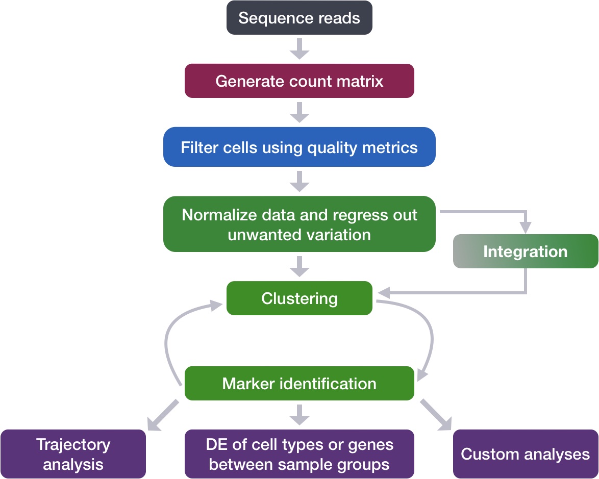
Now that we have our high quality cells, we can explore our data and see if we are able to identify any sources of unwanted variation. Depending on what we observe, we will utilize that information when performing different batch correction methods to remove the effect of these variables on our data.
Normalization
An essential first step in the majority of mRNA expression analyses is normalization, whereby systematic variations are adjusted for to make expression counts comparable across genes and/or samples. The counts of mapped reads for each gene are proportional to the expression of RNA (“interesting”) in addition to many other factors (“uninteresting”). Normalization is the process of adjusting raw count values to account for the “uninteresting” factors.
The main factors often considered during normalization are:
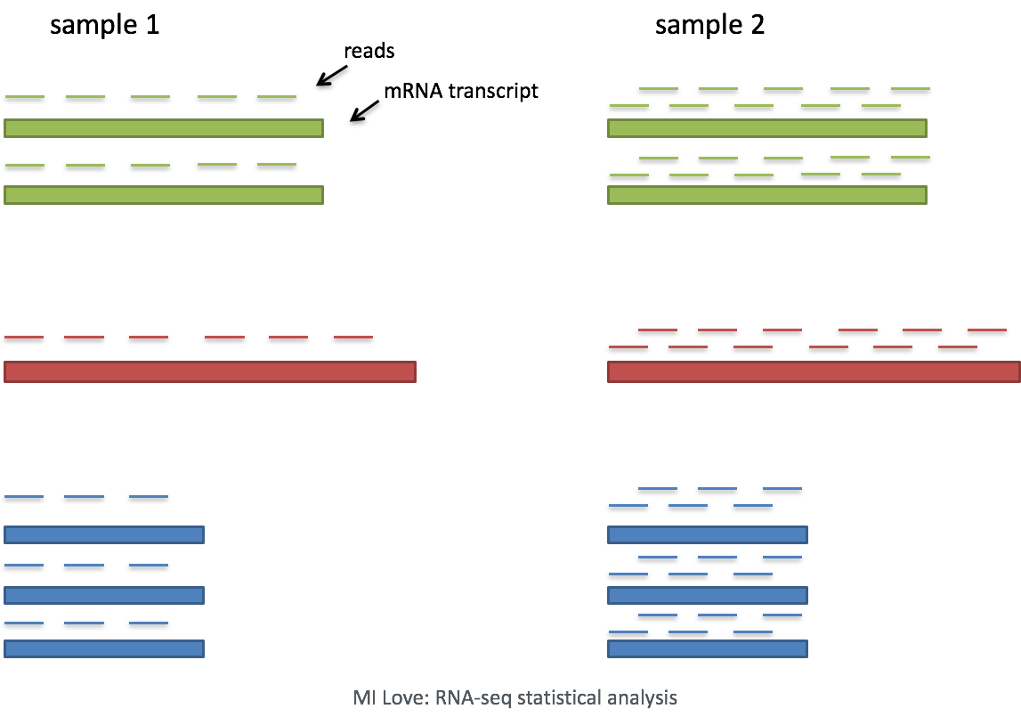
- Sequencing depth: Accounting for sequencing depth is necessary for comparison of gene expression between cells. In the example below, each gene appears to have doubled in expression in cell 2, however this is a consequence of cell 2 having twice the sequencing depth. Each cell in scRNA-seq will have a differing number of reads associated with it. So to accurately compare expression between cells, it is necessary to normalize for sequencing depth.
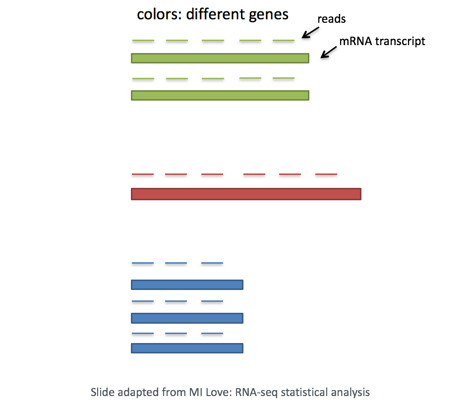
- Gene length: Accounting for gene length is necessary for comparing expression between different genes within the same cell. The number of reads mapped to a longer gene can appear to have equal count/expression as a shorter gene that is more highly expressed.
Droplet vs full-length sequencing normalization
If using a 3’ or 5’ droplet-based method, the length of the gene will not affect the analysis because only the 5’ or 3’ end of the transcript is sequenced. This dataset was sequenced using a 3’ method, meaning it is not necessary to account for gene length.
However, if using full-length sequencing, the transcript length should be accounted for.
Log normalization
Various methods have been developed specifically for scRNA-seq normalization. Some simpler methods resemble what we have seen with bulk RNA-seq; the application of global scale factors adjusting for a count-depth relationship that is assumed common across all genes. However, if those assumptions are not true then this basic normalization can lead to over-correction for lowly and moderately expressed genes and, in some cases, under-normalization of highly expressed genes (Bacher R et al, 2017). More complex methods will apply correction on a per-gene basis. In this lesson we will explore both approaches.
Regardless of which method is used for normalization, it can be helpful to think of it as a two-step process (even though it is often described as a single step in most papers). The first is a scaling step and the second is a transformation.
1. Scaling
The first step in normalization is to multiply each UMI count by a cell specific factor to get all cells to have the same UMI counts. Why would we want to do this? Different cells have different amounts of mRNA; this could be due to differences between cell types or variation within the same cell type depending on how well the chemistry worked in one drop versus another. In either case, we are not interested in comparing these absolute counts between cells. Instead we are interested in comparing concentrations, and scaling helps achieve this.
2. Transformation
The next step is a transformation, and it is at this step where we can distinguish the simpler versus complex methods as mentioned above.
Simple transformations are those which apply the same function to each individual measurement. Common examples include a log transform (which is applied in the original workflow), or a square root transform (less commonly used).
Let’s start by creating a new script for the normalization and integration steps. Create a new script (File -> New File -> R script), and save it as SCT_integration_analysis.R.
For the remainder of the workflow we will be mainly using functions available in the Seurat package. Therefore, we need to load the Seurat library in addition to the tidyverse library and a few others listed below.
The Seurat package will run both the scaling and transformation in a single step with the NormalizeData() function.
# Normalize the counts
seurat_phase <- NormalizeData(filtered_seurat)
seurat_phaseAn object of class Seurat
14065 features across 29629 samples within 1 assay
Active assay: RNA (14065 features, 0 variable features)
2 layers present: counts, dataWhen we print out the basic information about our Seurat object, we can see that we have a new layer called data. This is the counts matrix that holds our log-normalized counts.
Let’s start by creating a new script for the normalization and integration steps. Create a new script titled norm_and_integration.ipynb and load the necessary libraries.
# Normalization and integration
# Introduction to scRNA-seq
# Author: Harvard Chan Bioinformatics Core
# Created: August 2026
import scanpy as sc
import scvi
import seaborn as sns
import numpy as np
import pandas as pd
import matplotlib.pyplot as plt
# Load dataset
filtered_adata = sc.read_h5ad("data/filtered_adata.h5ad")Before we do any normalization, we want to ensure that the raw counts matrix is properly stored as a layer. By default, when we loaded in our dataset, the counts were stored to the .X slot of our object. So now we are going to store it in the layers slot under the name counts for easy reference in the future.
# Create new adata object for normalized results
adata_phase = filtered_adata.copy()
# Saving count data
adata_phase.layers["counts"] = adata_phase.X.copy()
adata_phaseAnnData object with n_obs × n_vars = 29629 × 14167
obs: 'n_genes', 'sample', 'n_genes_by_counts', 'total_counts', 'cells', 'log10GenesPerUMI', 'log1p_n_genes_by_counts', 'log1p_total_counts', 'pct_counts_in_top_50_genes', 'pct_counts_in_top_100_genes', 'pct_counts_in_top_200_genes', 'pct_counts_in_top_500_genes', 'total_counts_mito', 'log1p_total_counts_mito', 'pct_counts_mito', 'mito_ratio'
var: 'gene_ids', 'feature_types', 'n_cells_by_counts', 'mean_counts', 'pct_dropout_by_counts', 'total_counts', 'mito', 'log1p_mean_counts', 'log1p_total_counts', 'n_counts'
layers: None (.X), 'counts'Within the scanpy library, we will make use of two different functions: first to scale with pp.normalize_total(), and then to transform with pp.log1p().
# Normalizing to median total counts
adata_phase.layers["median"] = adata_phase.layers["counts"].copy()
sc.pp.normalize_total(adata_phase, layer = "median")
# Logarithmize the data
adata_phase.layers["log"] = adata_phase.layers["median"].copy()
sc.pp.log1p(adata_phase, layer = "log")
# Print adata information
adata_phaseAnnData object with n_obs × n_vars = 29629 × 14167
obs: 'n_genes', 'sample', 'n_genes_by_counts', 'total_counts', 'cells', 'log10GenesPerUMI', 'log1p_n_genes_by_counts', 'log1p_total_counts', 'pct_counts_in_top_50_genes', 'pct_counts_in_top_100_genes', 'pct_counts_in_top_200_genes', 'pct_counts_in_top_500_genes', 'total_counts_mito', 'log1p_total_counts_mito', 'pct_counts_mito', 'mito_ratio'
var: 'gene_ids', 'feature_types', 'n_cells_by_counts', 'mean_counts', 'pct_dropout_by_counts', 'total_counts', 'mito', 'log1p_mean_counts', 'log1p_total_counts', 'n_counts'
uns: 'log1p'
layers: None (.X), 'counts', 'median', 'log'So now we have three layers, each with the different counts matrices:
- counts
- median
- log
Highly variable genes
Highly variable gene selection is extremely important since many downstream steps are computed only on these genes. We calculate scores based upon how much a gene changes across the total populations of cells. Genes that vary a lot between populations will be ranked the highest.
We can additionally visualize the dispersion of all genes, which shows a gene’s average expression across all cells on the x-axis and variance on the y-axis. Ideally we want to use genes that have high variance since this can indicate a change in expression depending on populations of cells. Adding labels helps us understand which genes will be driving shape of our data.
# Identify the most variable genes
seurat_phase <- FindVariableFeatures(seurat_phase,
selection.method = "vst",
nfeatures = 2000,
verbose = FALSE)
seurat_phaseAn object of class Seurat
14065 features across 29629 samples within 1 assay
Active assay: RNA (14065 features, 2000 variable features)
2 layers present: counts, dataFindVariableFeatures arguments
For the selection.method and nfeatures arguments the values specified are the default settings. Therefore, you do not necessarily need to include these in your code. We have included it here for transparency and to inform you what you are using.
Seurat allows us to access the ranked highly variable genes with the VariableFeatures() function. We can additionally visualize the dispersion of all genes using Seurat’s VariableFeaturePlot(). To finish the visualization, we then label the top 15 genes.
# Identify the 15 most highly variable genes
ranked_variable_genes <- VariableFeatures(seurat_phase)
top_genes <- ranked_variable_genes[1:15]
# Plot the average expression and variance of these genes
# With labels to indicate which genes are in the top 15
p <- VariableFeaturePlot(seurat_phase)
LabelPoints(plot = p, points = top_genes, repel = TRUE)
Highly variable gene selection is extremely important since many downstream steps are computed only on these genes. Scanpy allows us to access the ranked highly variable genes with the highly_variable_genes() function.
The parameters we are specifying refer to:
layer: Which count matrix to use, if.Xis not the matrix we want to use.n_top_genes: Number of highly-variable genes to keep.batch_key: If specified, highly-variable genes are selected within each batch separately and merged. This simple process avoids the selection of batch-specific genes and acts as a lightweight batch correction method.
# Identify the most variable genes
sc.pp.highly_variable_genes(adata_phase,
layer = "counts",
flavor = "seurat_v3",
n_top_genes = 2000,
batch_key = "sample")We can now see which genes are labeled as highly variable from the .var dataframe of our scanpy object. The new columns are:
highly_variable_rank: Rank ordering of genes based on their variabilityhighly_variable: True/False based on if the ranking is within then_top_genesmeans: Average expression of the gene across all cellsvariances: Variance of the gene’s expression across all cellsvariances_norm: Variance normalized for mean–variance dependence (dispersion) to compare genes with different meanshighly_variable_nbatches: Number of batches in which this gene was selected as highly variable (whenbatch_keyis used)
# Show newly compute highly variable columns
adata_phase.var.head()merged_adata.var to show the newly created highly_variable column.
| gene_ids | feature_types | n_cells_by_counts | mean_counts | pct_dropout_by_counts | total_counts | mito | log1p_mean_counts | log1p_total_counts | n_counts | highly_variable | highly_variable_rank | means | variances | variances_norm | highly_variable_nbatches | |
|---|---|---|---|---|---|---|---|---|---|---|---|---|---|---|---|---|
| AL627309.1 | ENSG00000238009 | Gene Expression | 12 | 0.000381631 | 99.9618 | 12 | False | 0.000381558 | 2.56495 | 12 | False | nan | 0.000405009 | 0.000404858 | 0.932602 | 0 |
| AL669831.5 | ENSG00000237491 | Gene Expression | 99 | 0.00321206 | 99.6852 | 101 | False | 0.00320691 | 4.62497 | 99 | False | nan | 0.00334132 | 0.00346528 | 0.920303 | 0 |
| LINC00115 | ENSG00000225880 | Gene Expression | 177 | 0.00591528 | 99.4371 | 186 | False | 0.00589785 | 5.23111 | 170 | False | nan | 0.00573762 | 0.00644744 | 0.964497 | 0 |
| FAM41C | ENSG00000230368 | Gene Expression | 136 | 0.00438875 | 99.5675 | 138 | False | 0.00437915 | 4.93447 | 134 | False | nan | 0.0045226 | 0.0046373 | 0.896561 | 0 |
| NOC2L | ENSG00000188976 | Gene Expression | 2019 | 0.0699339 | 93.5791 | 2199 | False | 0.0675968 | 7.69621 | 2139 | False | nan | 0.0721928 | 0.0824416 | 0.904635 | 0 |
To visualize the variable genes we calculated, we can make use of the scanpy’s pl.highly_variable_genes().
# Default HVG figure
sc.pl.highly_variable_genes(adata_phase)
Alternatively, we can create our own custom plot to represent this data. Where we can visualize the dispersion of all genes, showing a gene’s average expression across all cells on the x-axis and variance on the y-axis. Ideally we want to use genes that have high variance since this can indicate a change in expression depending on populations of cells. Adding labels using the text() helps us understand which genes will be driving shape of our data.
# Grab mean and variance for each gene
mean_expression = adata_phase.var["means"]
norm_variance = adata_phase.var["variances_norm"]
# Create a new canvas to plot on
fig, ax = plt.subplots(figsize = (5, 8), dpi = 150)
# Plot all genes in blue
sns.scatterplot(x = mean_expression,
y = norm_variance,
ax = ax,
color = "blue",
label = "All genes")
# Grab highly variable genes
# values that are True for `highly_variable`
hvg_mask = adata_phase.var["highly_variable"]
# Plot HVGs on top of original plot as red
sns.scatterplot(x = mean_expression[hvg_mask],
y = norm_variance[hvg_mask],
ax = ax,
color = "red",
label = "HVGs")
# Plot axes and titles
ax.set_xlabel("Mean Expression")
ax.set_ylabel("Normalized Variance")
ax.set_title("Mean Expression vs. Normalized Variance of Genes")
# log10 scale x-axis
ax.set_xscale("log")
# Grab top N genes
N = 15
top_genes = adata_phase.var["highly_variable_rank"].nsmallest(N).index
# Add text labels to figure
for gene_name in top_genes:
x_value = mean_expression[gene_name]
y_value = norm_variance[gene_name]
ax.text(x_value, y_value,
gene_name,
fontsize = 8, color = "black")
# Show legend
plt.legend()
Now, we can perform the PCA analysis on the highly variable genes that we just scored.
PCA
Principal Component Analysis (PCA) is a technique used to emphasize variation as well as similarity, and to bring out strong patterns in a dataset; it is one of the methods used for “dimensionality reduction”.
PCA
For a more detailed explanation on PCA, there is a self-learning lesson outlining the method. We also strongly encourage you to explore the video StatQuest’s video as an alternative, step-by-step explanation of PCA.
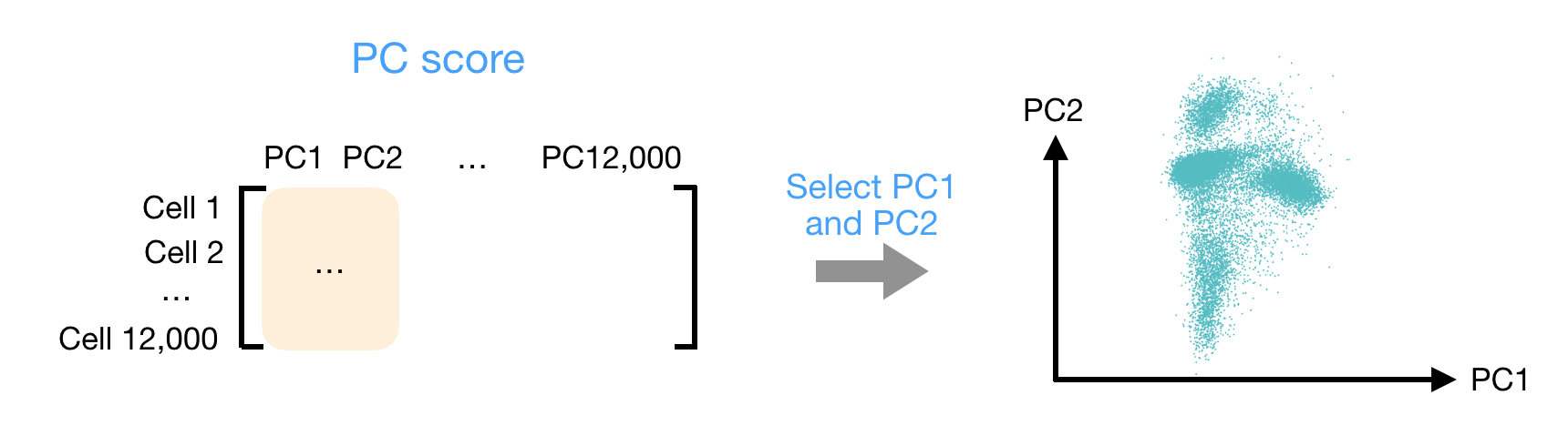
Let’s say you are working with a single-cell RNA-seq dataset with 12,000 cells and you have quantified the expression of 20,000 genes. The schematic below demonstrates how you would go from a cell x gene matrix to principal component (PC) scores for each individual cell.
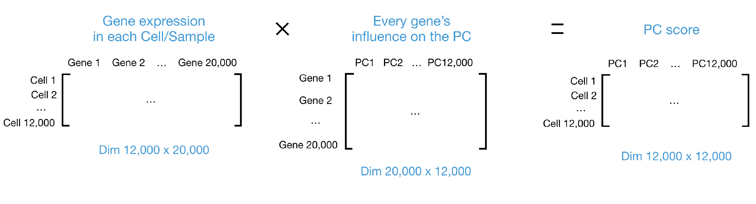
After the PC scores have been calculated, you are looking at a matrix of 12,000 x 12,000 that represents the information about relative gene expression in all the cells. You can select the PC1 and PC2 columns and plot that in a 2D way.
PC visualizations
For datasets with a larger number of cells, only the PC1 and PC2 scores for each cell are usually plotted, or used for visualization. Since these PCs explain the most variation in the dataset, the expectation is that the cells that are more similar to each other will cluster together with PC1 and PC2.
Since highly expressed genes exhibit the highest amount of variation and we don’t want our highly variable genes only to reflect high expression, we need to scale the data to scale variation with expression level.
- Adjusting the expression of each gene to give a mean expression across cells to be 0
- Scaling expression of each gene to give a variance across cells to be 1
The Seurat ScaleData() function will do this scaling automatically.
# Scale the counts
seurat_phase <- ScaleData(seurat_phase)
seurat_phaseAn object of class Seurat
14065 features across 29629 samples within 1 assay
Active assay: RNA (14065 features, 2000 variable features)
3 layers present: counts, data, scale.dataNotice we now have a new layer that was automatically named scale.data
Now, we can perform the PCA analysis with RunPCA() and plot the first two principal components against each other with DimPlot().
# Perform PCA
seurat_phase <- RunPCA(seurat_phase)
# Plot the PCA colored by sample
DimPlot(seurat_phase,
reduction = "pca",
group.by = "sample")
To run PCA, we first want to set our .X default count matrix to be the log-normalized expression. Then, we use the pp.pca() function to compute the PCA scores for the first n_comps principal components. Additionally, we specify that only the expression from the top varaible genes should be used.
# Ensure log-normalized counts are in default .X slot
adata_phase.X = adata_phase.layers["log"].copy()
# Calculate PCA score
sc.pp.pca(adata_phase,
n_comps = 50,
mask_var = "highly_variable")In running this function, we have create 2 new slots in our scanpy object. The obsm (observation matrices) and varm (variable/feature matrices).
# Observe newly created obsm and varm slots
adata_phaseAnnData object with n_obs × n_vars = 29629 × 14167
obs: 'n_genes', 'sample', 'n_genes_by_counts', 'total_counts', 'cells', 'log10GenesPerUMI', 'log1p_n_genes_by_counts', 'log1p_total_counts', 'pct_counts_in_top_50_genes', 'pct_counts_in_top_100_genes', 'pct_counts_in_top_200_genes', 'pct_counts_in_top_500_genes', 'total_counts_mito', 'log1p_total_counts_mito', 'pct_counts_mito', 'mito_ratio'
var: 'gene_ids', 'feature_types', 'n_cells_by_counts', 'mean_counts', 'pct_dropout_by_counts', 'total_counts', 'mito', 'log1p_mean_counts', 'log1p_total_counts', 'n_counts', 'highly_variable', 'highly_variable_rank', 'means', 'variances', 'variances_norm', 'highly_variable_nbatches'
uns: 'hvg', 'log1p', 'pca'
obsm: 'X_pca'
varm: 'PCs'
layers: 'counts', 'log', 'median', None (.X)The X_pca contains the scores for each cell and Principal Component.
# First 5 PC score for first 5 cells in the dataset
adata_phase.obsm["X_pca"][1:5, 1:5]array([[-5.4042416 , 1.4356772 , 1.6136786 , -0.40671685],
[-5.607636 , -1.2920747 , -0.88285303, 0.45439118],
[-5.3116026 , -1.9772357 , -0.5257133 , 1.1217985 ],
[-1.2440737 , -0.17928727, -1.3938763 , 1.870226 ]],
dtype=float32)With these scores, we can plot how the cells lay on PC1 and PC2 with pp.pca where the color argument tells us which metadata column to color the cells by.
# PC1 vs PC2, colored by sample
sc.pl.pca(adata_phase,
color = "sample")
We can clearly see that there is a split in our PC visualization based upon sample. Therefore, we know moving forward that we will have to integrate the samples together as there is technical noise causing our two datasets to not align well together (batch effect). Knowing this, we can also evaluate other metadata that could be contributing to the differences between samples.
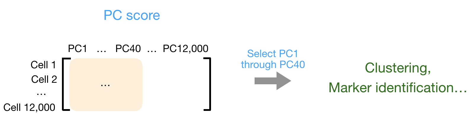
Typically, the first 40 PCs are used for downstream analysis like clustering, marker identification etc., since these represent the majority of the variation in the data. Those steps will be discussed in more depth in future lessons.
Batch effect
Oftentimes we need to apply corrections to ensure that sources of “uninteresting” variation are not introducing batch effects in our dataset. Here, we will explore the data to identify if there are any variables that are introducing such effects in our dataset by making use of the PCA visualizations.
Cell cycle
In single cell RNA-seq, one of the most common biological data corrections is the effects of the cell cycle on the transcriptome. So we will evaluate if this needs to be accounted for as we continue through the workflow.
Identify genes in each cell cycle phase
If you are not working with human data we have additional materials detailing how to acquire cell cycle markers for other organisms of interest with R.
We have provided a list of human cell cycle markers for you in the data folder as an Rdata file called cycle.rda.
This loads in 2 vectors g2m_genes and s_genes that contain genes that are known to have high expression in the different phases of the cell cycle.
# Load cell cycle markers
load("data/additional_data/cycle.rda")
# preview s_genes
s_genes [1] "UBR7" "RFC2" "RAD51" "MCM2" "TIPIN" "MCM6"
[7] "UNG" "POLD3" "WDR76" "CLSPN" "CDC45" "CDC6"
[13] "MSH2" "MCM5" "POLA1" "MCM4" "RAD51AP1" "GMNN"
[19] "RPA2" "CASP8AP2" "HELLS" "E2F8" "GINS2" "PCNA"
[25] "NASP" "BRIP1" "DSCC1" "DTL" "CDCA7" "CENPU"
[31] "ATAD2" "CHAF1B" "USP1" "SLBP" "RRM1" "FEN1"
[37] "RRM2" "EXO1" "CCNE2" "TYMS" "BLM" "PRIM1"
[43] "UHRF1" To assign each cell a score based on its expression of G2/M and S phase markers, we can use the Seurat function CellCycleScoring(). This function calculates cell cycle phase scores based on canonical markers that are required as input.
# Score cells for cell cycle
seurat_phase <- CellCycleScoring(seurat_phase,
g2m.features = g2m_genes,
s.features = s_genes)Let’s inspect our updated metadata:
# View cell cycle scores and phases assigned to cells
View(seurat_phase@meta.data)| cells | orig.ident | nCount_RNA | nFeature_RNA | sample | log10GenesPerUMI | mitoRatio | S.Score | G2M.Score | Phase |
|---|---|---|---|---|---|---|---|---|---|
| ctrl_AAACATACAATGCC-1 | ctrl | 2344 | 874 | ctrl | 0.8728630 | 0.0196246 | 0.0433050 | 0.0542263 | G2M |
| ctrl_AAACATACATTTCC-1 | ctrl | 3124 | 895 | ctrl | 0.8447596 | 0.0179200 | 0.0266190 | 0.0515968 | G2M |
| ctrl_AAACATACCAGAAA-1 | ctrl | 2578 | 725 | ctrl | 0.8384933 | 0.0155159 | -0.0467065 | -0.0484166 | G1 |
| ctrl_AAACATACCAGCTA-1 | ctrl | 3260 | 978 | ctrl | 0.8512622 | 0.0137994 | -0.0583283 | 0.0504596 | G2M |
| ctrl_AAACATACCATGCA-1 | ctrl | 746 | 362 | ctrl | 0.8906861 | 0.0214477 | 0.0392961 | -0.0299551 | S |
g2m_genes = [
"NCAPD2", "ANLN", "TACC3", "HMMR", "GTSE1", "NDC80", "AURKA", "TPX2",
"BIRC5", "G2E3", "CBX5", "RANGAP1", "CTCF", "CDCA3", "TTK", "SMC4",
"ECT2", "CENPA", "CDC20", "NEK2", "CENPF", "TMPO", "HJURP", "CKS2",
"DLGAP5", "PIMREG", "TOP2A", "PSRC1", "CDCA8", "CKAP2", "NUSAP1",
"KIF23", "KIF11", "KIF20B", "CENPE", "GAS2L3", "KIF2C", "NUF2",
"ANP32E", "LBR", "MKI67", "CCNB2", "CDC25C", "HMGB2", "CKAP2L",
"BUB1", "CDK1", "CKS1B", "UBE2C", "CKAP5", "AURKB", "CDCA2",
"TUBB4B", "JPT1"]
s_genes = [
"UBR7", "RFC2", "RAD51", "MCM2", "TIPIN", "MCM6", "UNG", "POLD3",
"WDR76", "CLSPN", "CDC45", "CDC6", "MSH2", "MCM5", "POLA1", "MCM4",
"RAD51AP1", "GMNN", "RPA2", "CASP8AP2", "HELLS", "E2F8", "GINS2",
"PCNA", "NASP", "BRIP1", "DSCC1", "DTL", "CDCA7", "CENPU", "ATAD2",
"CHAF1B", "USP1", "SLBP", "RRM1", "FEN1", "RRM2", "EXO1", "CCNE2",
"TYMS", "BLM", "PRIM1", "UHRF1"]To assign each cell a score based on its expression of G2/M and S phase markers, we can use the function tl.score_genes_cell_cycle(). This function calculates cell cycle phase scores based on canonical markers that required as input.
# Cell cycle scoring
sc.tl.score_genes_cell_cycle(adata_phase,
s_genes,
g2m_genes)Whenever we run a new function, it is a good idea to observe how our scanpy object changes. Since this is a score being calculated for each cell, we can take a look at the metadata to see which new columns have been generated.
In this case, we can see we have new column in our .obs dataframe:
- S_score
- G2M_score
- phase
# Observe newly created cell cycle columns
adata_phase.obs.head()| n_genes | sample | n_genes_by_counts | total_counts | cells | log10GenesPerUMI | log1p_n_genes_by_counts | log1p_total_counts | pct_counts_in_top_50_genes | pct_counts_in_top_100_genes | pct_counts_in_top_200_genes | pct_counts_in_top_500_genes | total_counts_mito | log1p_total_counts_mito | pct_counts_mito | mito_ratio | S_score | G2M_score | phase | |
|---|---|---|---|---|---|---|---|---|---|---|---|---|---|---|---|---|---|---|---|
| AAACATACAATGCC-1_ctrl | 874 | ctrl | 874 | 2344 | AAACATACAATGCC-1_ctrl | 0.872863 | 6.77422 | 7.76004 | 47.5683 | 59.1297 | 69.198 | 84.0444 | 46 | 3.85015 | 1.96246 | 0.0196246 | 0.00593295 | 0.0167371 | G2M |
| AAACATACATTTCC-1_ctrl | 896 | ctrl | 896 | 3125 | AAACATACATTTCC-1_ctrl | 0.84476 | 6.79906 | 8.04751 | 51.904 | 63.456 | 74.08 | 87.328 | 56 | 4.04305 | 1.792 | 0.01792 | 0.00399467 | 0.00314207 | S |
| AAACATACCAGAAA-1_ctrl | 725 | ctrl | 725 | 2578 | AAACATACCAGAAA-1_ctrl | 0.838493 | 6.58755 | 7.85516 | 61.9472 | 69.55 | 78.4329 | 91.2723 | 40 | 3.71357 | 1.55159 | 0.0155159 | -0.0133138 | -0.0328306 | G1 |
| AAACATACCAGCTA-1_ctrl | 979 | ctrl | 979 | 3261 | AAACATACCAGCTA-1_ctrl | 0.851262 | 6.88755 | 8.0901 | 52.8366 | 62.5575 | 71.8798 | 85.3113 | 45 | 3.82864 | 1.37994 | 0.0137994 | -0.0176129 | -0.00156307 | G1 |
| AAACATACCATGCA-1_ctrl | 362 | ctrl | 362 | 746 | AAACATACCATGCA-1_ctrl | 0.890686 | 5.8944 | 6.61607 | 53.8874 | 64.8794 | 78.2842 | 100 | 16 | 2.83321 | 2.14477 | 0.0214477 | 0.0172052 | -0.0321092 | S |
After scoring the cells for cell cycle, we would like to determine whether cell cycle is a major source of variation in our dataset using PCA.
When should cell cycle phase be regressed out?
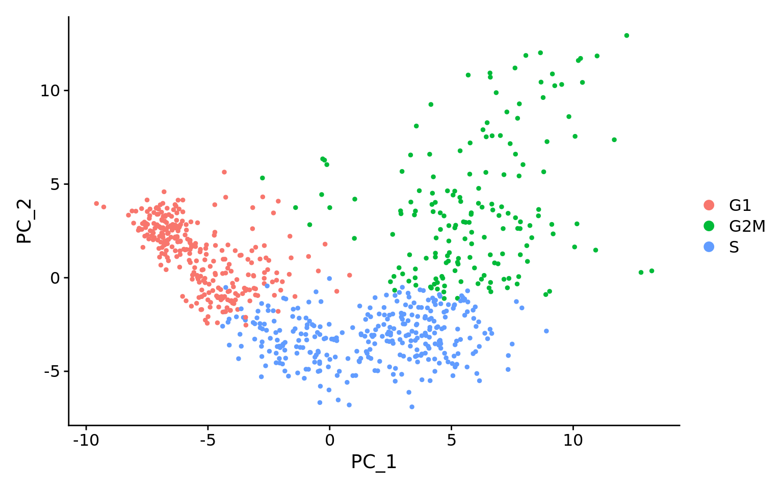
Below are two PCA plots taken from the Seurat vignette dealing with Cell-Cycle Scoring and Regression.
This first plot is similar to what we plotted above, it is a PCA prior to regression to evaluate if the cell cycle is playing a big role in driving PC1 and PC2. Clearly, the cells are separating by cell type in this case, so the vignette suggests regressing out these effects.
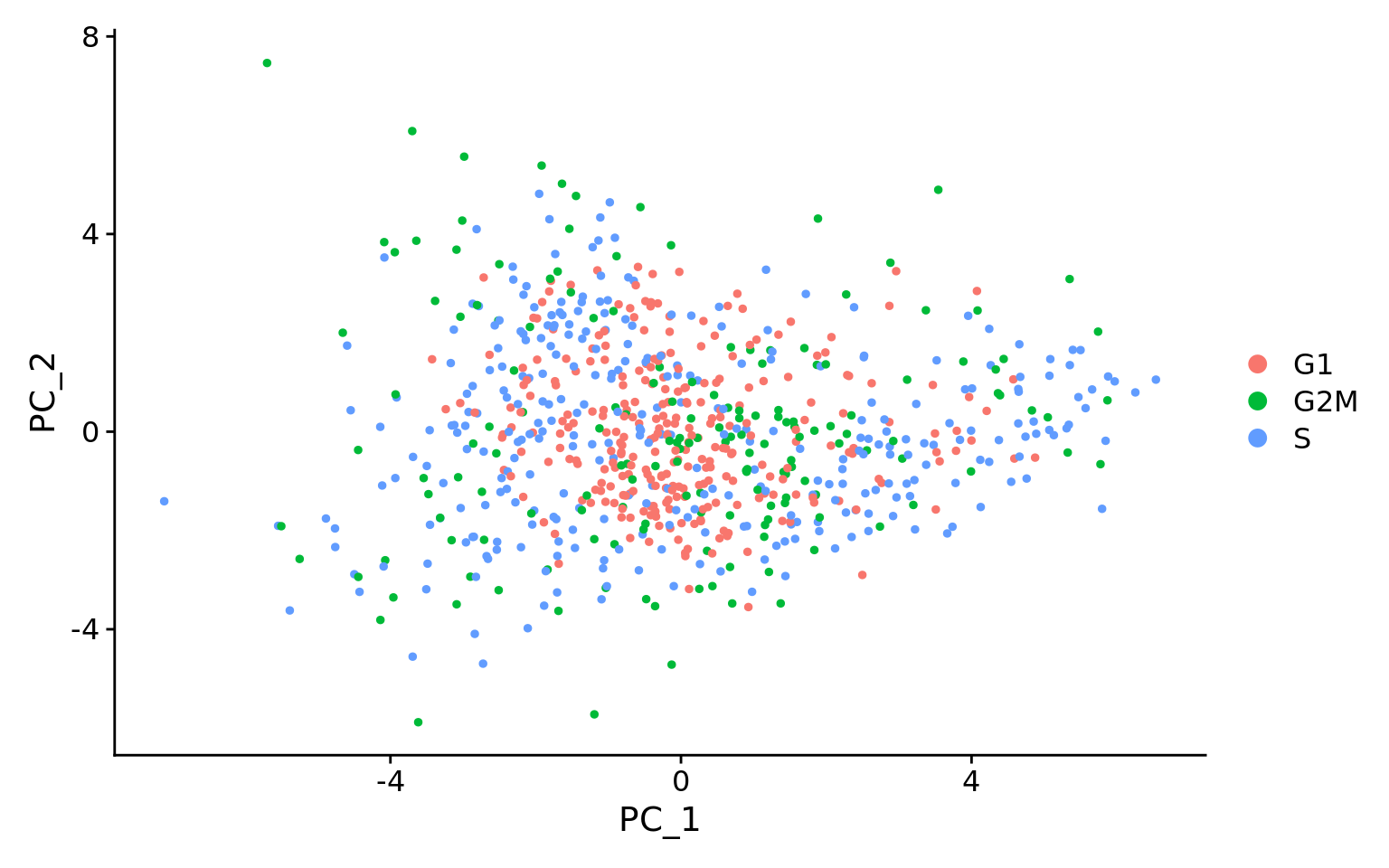
This second PCA plot is post-regression, and displays how effective the regression was in removing the effect we observed.
So now we can take a look at our own dataset to see if we should regress out phase.
We once again plot PC1 vs PC2, but this time color (group.by) each of our cells by which phase of the cell cycle they belong to.
# Plot the PCA colored by cell cycle phase
DimPlot(seurat_phase,
reduction = "pca",
group.by= "Phase")
Another helpful way to visualize these different phase categories is to use the split.by argument to create multiple plots containing each of the unique values of Phase.
# Plot the PCA colored and split by cell cycle phase
DimPlot(seurat_phase,
reduction = "pca",
group.by= "Phase",
split.by = "Phase")
We can see that each phase is well dispersed throughout the PCA space, indicating that we likely do not need to account for cell-cycle in future steps.
We once again plot PC1 vs PC2, but this time color each of our cells by which phase of the cell cycle they belong to.
# PC1 vs PC2, colored by cell cycle phase
sc.pl.pca(adata_phase,
color = "phase")
To more clearly see the distribution for each phase, we can emphasize the groups and put the plots side-by-side as subplots.
# Create plot with the correct dimensions
fig, axes = plt.subplots(1, 3, figsize=(15, 5))
# Plot the PCA colored by cell cycle phase
sc.pl.pca(adata_phase, color = "phase",
groups = "G1", ax = axes[0],
show = False, title = "G1 Phase")
sc.pl.pca(adata_phase, color = "phase",
groups = "G2M", ax = axes[1],
show = False, title = "G2M Phase")
sc.pl.pca(adata_phase, color = "phase",
groups = "S", ax = axes[2],
show = False, title = "S Phase")
plt.tight_layout()
plt.show()
We can see that in the top right quadrant, most of the cells primarily belong to the G1 phase. This is an indication that we may need to account for cell-cycle in our future steps.
If you are unsure whether or not to include or omit a variable from your analysis, try testing both scenarios! Testing different parameters and models is a great way to better understand your dataset.
Mitochondrial ratio
Mitochondrial expression is another factor which can greatly influence clustering. Oftentimes, it is useful to regress out variation due to mitochondrial expression. However, if the differences in mitochondrial gene expression represent a biological phenomenon that may help to distinguish cell clusters, then we advise not regressing this out. In this exercise, we can perform a quick check similar to looking at cell cycle and decide whether or not we want to regress it out.
First, let us turn the mitochondrial ratio variable into a new categorical variable based on quartiles.
# Check quartile values
summary(seurat_phase@meta.data$mitoRatio) Min. 1st Qu. Median Mean 3rd Qu. Max.
0.00000 0.01438 0.01993 0.02139 0.02669 0.14464 # Turn mitoRatio into categorical factor vector based on quartile values
seurat_phase@meta.data$mitoFr <- cut(seurat_phase@meta.data$mitoRatio,
breaks=c(-Inf, 0.0144, 0.0199, 0.0267, Inf),
labels=c("Low", "Medium", "Medium high", "High"))# Calculate quartiles of mitochondrial ratio values
np.percentile(adata_phase.obs["pct_counts_mito"],
[0, 25, 50, 75, 100])array([ 0. , 1.43786371, 1.99296606, 2.66920877, 14.46428585])We then add categorical labels to cells based upon where they fall within the quartiles.
# Group cells into labels based upon mitochondrial ratio scores
adata_phase.obs["mitoFr"] = pd.cut(
adata_phase.obs["pct_counts_mito"],
bins = [-np.inf, 1.44, 1.99, 2.67, np.inf],
labels = ["Low", "Medium", "Medium high", "High"])Next, plot the PCA similar to how we did with cell cycle regression. Hint: use the new
mitoFrvariable to split cells and color them accordingly.Evaluate the PCA plot generated:
- Determine whether or not you observe an effect.
- Describe what you see.
- Would you regress out mitochondrial fraction as a source of unwanted variation?
SCTransform
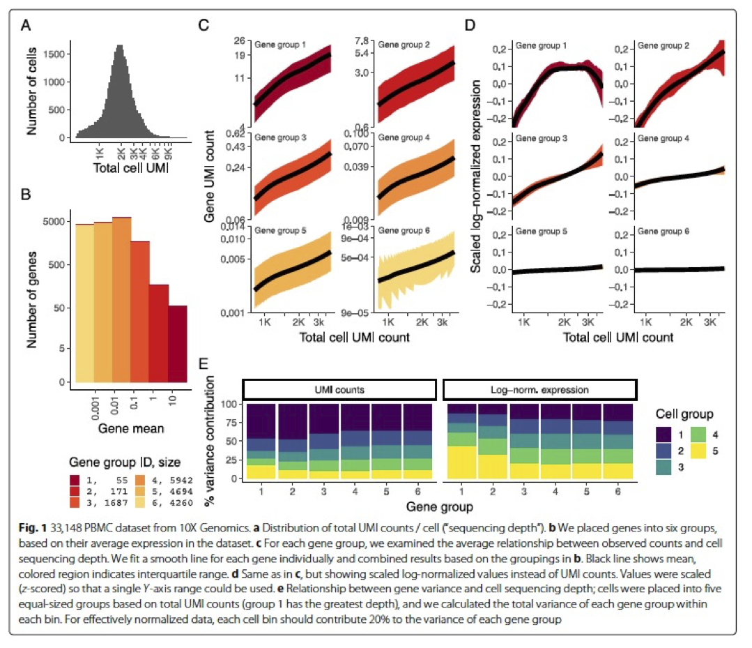
In the Hafemeister and Satija, 2019 paper the authors explored the issues with simple transformations. Specifically they evaluated the standard log normalization approach and found that genes with different abundances are affected differently and that effective normalization (using the log transform) is only observed with low/medium abundance genes (Figure 1D, below). Additionally, substantial imbalances in variance were observed with the log-normalized data (Figure 1E, below). In particular, cells with low total UMI counts exhibited disproportionately higher variance for high-abundance genes, dampening the variance contribution from other gene abundances.
Source: Hafemeister & Satija, 2019
The conclusion is, we cannot treat all genes the same.
The proposed solution was the use of Pearson residuals for transformation, as implemented in Seurat’s SCTransform function. With this approach:
- Measurements are multiplied by a gene-specific weight
- Each gene is weighted based on how much evidence there is that it is non-uniformly expressed across cells
- More evidence == more of a weight; Genes that are expressed in only a small fraction of cells will be favored (useful for finding rare cell populations)
- Not just a consideration of the expression level is, but also the distribution of expression
Why don’t we just run SCTransform to normalize?
While the functions NormalizeData, VariableFeatures and ScaleData can be replaced by the function SCTransform, the latter uses a more sophisticated way to perform the normalization and scaling. We suggest using log normalization because it is good to observe the data and any trends using a simple transformation, as methods like SCT can alter the data in a way that is not as intuitive to interpret.
Now that we have established which effects are observed in our data, we can use the SCTransform method to regress out these effects. The SCTransform method was proposed as a better alternative to the log transform normalization method that we used for exploring sources of unwanted variation. The method not only normalizes data, but it also performs a variance stabilization and allows for additional covariates to be regressed out.
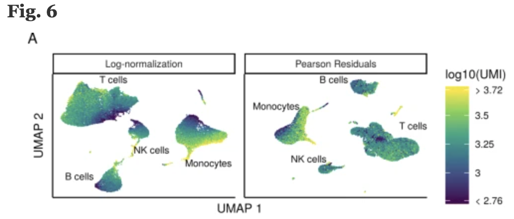
As described earlier, all genes cannot be treated the same. As such, the SCTransform method constructs a generalized linear model (GLM) for each gene with UMI counts as the response and sequencing depth as the explanatory variable. Information is pooled across genes with similar abundances, to regularize parameter estimates and obtain residuals which represent effectively normalized data values which are no longer correlated with sequencing depth.
Source: Hafemeister & Satija, 2019
Regressing out covariates
Since the UMI counts are part of the GLM, the effects are automatically regressed out. The user can include any additional covariates (vars.to.regress) that may have an effect on expression and will be included in the model.
To run the SCTransform we have the code below as an example. Do not run this code, as we prefer to run this for each sample separately in the next section below.
## DO NOT RUN CODE ##
# SCTransform
seurat_phase <- SCTransform(seurat_phase,
vars.to.regress = c("mitoRatio"))Iterating over samples in a dataset
Since we have two samples in our dataset (from two conditions), we want to keep them as separate objects and transform them as that is what is required for integration. We will first split the cells in seurat_phase object into “Control” and “Stimulated”:
# Split seurat object by condition to perform cell cycle scoring and SCT on all samples
split_seurat <- SplitObject(seurat_phase, split.by = "sample")
split_seurat$ctrl
An object of class Seurat
14065 features across 14847 samples within 1 assay
Active assay: RNA (14065 features, 2000 variable features)
3 layers present: counts, data, scale.data
1 dimensional reduction calculated: pca
$stim
An object of class Seurat
14065 features across 14782 samples within 1 assay
Active assay: RNA (14065 features, 2000 variable features)
3 layers present: counts, data, scale.data
1 dimensional reduction calculated: pca
Subsetting samples
If you only wanted to integrate on a subset of your samples (e.g. all Ctrl replicates only), you could select which ones you wanted from the split_seurat object as shown below and move forward with those.
## DO NOT RUN
ctrl_reps <- split_seurat[c("ctrl_1", "ctrl_2")]Now we will use a for loop to run the SCTransform() on each sample, and regress out mitochondrial expression by specifying in the vars.to.regress argument of the SCTransform() function.
Before we run this for loop, we know that the output can generate large R objects/variables in terms of memory. If we have a large dataset, then we might need to adjust the limit for allowable object sizes within R (Default is 500 x 1024 ^2 = 500 Mb) using the following code:
options(future.globals.maxSize = 4000 * 1024^2)Now, we run the following loop to perform the SCTransform on all samples. This may take some time (~10 minutes):
for (i in 1:length(split_seurat)) {
split_seurat[[i]] <- SCTransform(split_seurat[[i]],
vars.to.regress = c("mitoRatio"),
vst.flavor = "v2")
}split_seurat <- readRDS("intermediate/07_split_seurat.RDS")Please note that in the for loop above, we specify that vst.flavor = "v2" to use the updated version of SCT. “v2” was introduced in early 2022, and is now commonly used. This update improves:
- Speed and memory consumption
- The stability of parameter estimates
- Variable feature identification in subsequent steps
For more information, please see the Seurat vignette’s section on SCTransform, v2 regularization.
SCTransform variable features
By default, after normalizing, adjusting the variance, and regressing out uninteresting sources of variation, SCTransform will rank the genes by residual variance and output the 3,000 most variant genes. If the dataset has larger cell numbers, then it may be beneficial to adjust this parameter higher using the variable.features.n argument.
Note, the last line of output specifies “Set default assay to SCT”. This specifies that moving forward we would like to use the data after SCT was implemented. We can view the different assays that we have stored in our seurat object.
# Check which assays are stored in objects
split_seurat$ctrl@assays$RNA
Assay (v5) data with 14065 features for 14847 cells
Top 10 variable features:
HBB, HBA2, CCL4L2, HBA1, IGKC, CCL7, PPBP, CCL4, CCL3, CCL8
Layers:
counts, data, scale.data
$SCT
SCTAssay data with 13799 features for 14847 cells, and 1 SCTModel(s)
Top 10 variable features:
FTL, CCL2, IGKC, GNLY, IGLC2, TIMP1, CCL3, IGHM, CCL4, PPBP Now we can see that in addition to the raw RNA counts, we now have a SCT component in our assays slot. The most variable features will be the only genes stored inside the SCT assay. As we move through the scRNA-seq analysis, we will choose the most appropriate assay to use for the different steps in the analysis.
Are the same assays available for the “stim” samples within the
split_seuratobject? What is the code you used to check that?Any observations for the genes or features listed under “First 10 features:” and the “Top 10 variable features:” for “ctrl” versus “stim”?
The scanpy workflow does not have the exact SCTransform algorithm built into its workflow. However, there is an analagous Analytic Pearson Residuals normalization that follows the same logic.
We will be following an alternative method to deal with integration and batch correction in the next lesson. The technique we will use is called svVI and does not require the output of this normalization step.
Save the object
Before finishing up, let’s save this object to the data/ folder. It can take a while to get back to this stage especially when working with large datasets, it is best practice to save the object as an easily loadable file locally.
# Save the split seurat object
saveRDS(split_seurat, "data/split_seurat.rds")
Loading dataset
To load the .rds file back into your environment you would use the following code:
## DO NOT RUN
# Load the split seurat object into the environment
split_seurat <- readRDS("data/split_seurat.rds")adata_phase.write_h5ad("data/adata_phase.h5ad")
Loading dataset
To load the .h5ad file back into your environment you would use the following code:
## DO NOT RUN
# Load the split seurat object into the environment
adata = sc.read_h5ad("data/adata_phase.h5ad")Reuse
CC-BY-4.0