This lesson introduces machine learning with random forests using a synthetic spatial transcriptomics dataset of the human cortex. You will learn how to prepare features and labels, split data into training and test sets, train a RandomForestClassifier in scikit-learn and interpret model outputs. Along the way, you will visualize spatial patterns of cortical layers and marker genes, inspect an individual decision tree and evaluate model performance using accuracy and confusion matrices.
Authors
Noor Sohail
Will Gammerdinger
Published
March 14, 2026
Keywords
Spatial transcriptomics, Decision trees, Model evaluation
Approximate time: 50 minutes
Learning objectives
In this lesson, we will:
Load a spatial transcriptomics dataset of the human cortex
Train a random forest classifier to predict cortical layer labels based on spatial location and gene expression
Evaluate the performance of the random forest classifier
Overview of lesson
Maching learning and AI are becoming increasingly important tools in the world and the life sciences are no exception. These tools are able to learn patterns from data without the need for a human to define the rules. This makes them powerful for making predictions and uncovering insights from complex datasets.
In this lesson, we will be using a machine learning algorithm called a random forest classifier to predict the cortical layer labels of cells in a spatial transcriptomics dataset. This is a great example of how machine learning can be used to make predictions and uncover insights from biological datasets. We will be using the scikit-learn library in Python to train our random forest classifier and evaluate its performance.
Machine learning
Machine learning is a subfield of artificial intelligence that focuses on training models to learn patterns from data and make predictions without a human explicitly programming the rules. There are many different types of machine learning algorithms, but they all share the same general steps of:
Preparing the training and test datasets
Training the model on the training data
Evaluating the model’s performance on the test data
Using the model to make predictions on new data
These algorithms can be used for a wide range of applications, including image recognition, natural language processing and predictive modeling.
Random forest classifiers
Random forests allow you to predict a categorical variable (cortical layer) based on one or more predictor variables (spatial coordinates and gene expression scores). To do so, the algorithm builds multiple decision trees, which are models that make predictions based on a series of binary decisions (True or False).
Figure 1: Example of a decision tree where the variables are age, weight and smoker to predict risk level of a heart attack. Image source: DataCamp
These decision trees are made up of decision nodes, which are the points where the data is split based on a predictor variable, and leaf nodes, which are the final predictions made by the tree.
The random forest algorithm generates multiple of these decision trees based upon the training data. Each tree is built upon a random subset of the data and variables. This randomness helps to reduce overfitting and improve the generalizability of the model. Therefore, each tree will learn different patterns from the data.
Once the model has been trained, we can supply a new dataset and run it through the model. In this case, the data will run through each of the decision trees in the random forest and make a prediction. Then, a majority vote is taken across the decision of all the trees to make the final prediction.
Figure 2: Example of a random forest with 3 decision trees to generate a prediction based upon majority voting. Image source: GeeksforGeeks
Cortical layer dataset
To provide a real-world example of how to use machine learning in research, we will be using a synthetic Visium HD spatial transcriptomics dataset. In this type of experiment, you take a piece of tissue and lay it on a grid. Then, each spot on the grid is genomically sequenced such that you know both the spatial location and gene expression of each spot.
Figure 3: Example of a Visium spatial transcriptomics dataset, where each spot has two key pieces of information: spatial location and gene expression. Image source: 10x Genomics
The human cortex is a great use case for this technology because the brain is divvied into layers 1-6 and a white matter layer. A good analogy would be to think of them as an onion, where the layers are stacked right on top of each other spatially (x, y coordinates).
The layers are relatively distinct in their spatial locations but also have genes that are expressed highly in one layer and not the others. This makes it a great use case for machine learning because we can use both the spatial location and gene expression to predict which layer a spot belongs to.
Figure 4: Spatial locations of the cortical layers in the human brain. Image source: Rai et al. (2026)
We will be using a synthetic cortical dataset with labelled cortical layers to train a random forest classifier to predict which layer a cell belongs to.
Cortical information
We have created a made-up dataset (as the data has not been published yet) based upon this dataset. Where layers are broken into 6 cortical layers (L1, L2, L3, L4, L5, L6) and a white matter layer.
# Load librariesimport pandas as pdimport seaborn as snsimport matplotlib.pyplot as pltfrom sklearn.ensemble import RandomForestClassifierfrom sklearn.model_selection import train_test_splitfrom sklearn.metrics import accuracy_score, confusion_matrix# Load synthetic cortical datasetdf_cortical = pd.read_csv("data/synthetic_cortex_data.csv")# Inspect the loaded datasetdf_cortical.head()
Table 1: Cortical cells data, where the x and y coordinates represent the spatial locations of each cell as well as the cortical layer they belong to.
Unnamed: 0
cell_barcode
x
y
depth
cortical_layer
AQP4
HPCAL1
FREM3
TRABD2A
KRT17
MOBP
0
0
cell_000000
0.000000
0.0
0.000000
L1
3.574897
1.110201
0.241240
0.00000
0.014254
0.304772
1
1
cell_000001
0.006289
0.0
0.012579
L1
4.463502
2.276650
0.000000
0.00000
0.060432
0.000000
2
2
cell_000002
0.012579
0.0
0.025157
L2
6.194550
3.277692
0.000000
0.17412
0.046238
0.000000
3
3
cell_000003
0.018868
0.0
0.037736
L1
3.576662
4.434999
0.340184
0.00000
0.070848
0.000000
4
4
cell_000004
0.025157
0.0
0.050314
L1
2.029683
0.000000
0.127988
0.00000
0.000000
0.492927
We have the following columns in this dataset:
barcode - A unique identifier for each spot in the dataset
x - The x coordinate of the spot’s spatial location
y - The y coordinate of the spot’s spatial location
layer - The cortical layer that the spot belongs to (L1, L2, L3, L4, L5, L6, WM)
As this is a spatial dataset, we can visualize where on the tissue each spot is located by plotting the x and y coordinates of each spot and coloring the points by the cortical layer that they belong to:
# Initialize a plot with a specific sizeplt.figure(figsize = (8, 6))# Plot the spatial locations of the spots colored by the cortical layer they belong tosns.scatterplot(data=df_cortical, x="x", y="y", hue="cortical_layer", edgecolor=None, palette="tab10")# Add a plot titleplt.title("Brain Cells by Cortical Layer")# Add an x-axis labelplt.xlabel("x coordinate")# Add a y-axis labelplt.ylabel("y coordinate")# Add a title to the legendplt.legend(title="Cortical Layer")# Render the plotplt.show()
Figure 5: Spatial plot of the cortical spots colored by the cortical layer they belong to.
So now we have a better idea of what the cross-section of the cortex looks like and where the different layers are located.
However, just using the x and y coordinates of each spot is not enough. You may have noticed that there appears to be some mixing of layers near the boundaries. Luckily for us, the different cortical layers have known genes that are uniquely expressed in the layers. We can take a quick look at some of these marker genes that are used to identify the different cortical layers in the original paper that this dataset is based on:
Figure 6: Example of the spatial expression of known marker genes for each cortical layer. Image source: Rai et al. (2026)
In the dataset, you have have noted that we also have columns: AQP4, HPCAL1, FREM3, TRABD2A, KRT17 and MOBP. These are the log-normalized expression values for those genes in each spot. Similar to the figure from above, we can visualize the expression of a marker gene in each spot (scatterplot point) across the cortex to see the pattern of values across the different layers. This will give us a better idea of how we can use both the spatial location and gene expression to predict which layer a spot belongs to.
# Initialize a plot with a specific sizeplt.figure(figsize = (8, 6))# Plot the spatial expression of AQP4 across the cortexsns.scatterplot(data = df_cortical, x ="x", y ="y", hue ="AQP4", palette ="viridis", edgecolor =None)# Add a plot titleplt.title("Expression of AQP4 across the cortex")# Render the plotplt.show()
Figure 7: Spatial plot of the gene expression of the Layer 1 marker gene, AQP4, across the cortex.
Making multiple subplots in a loop
Alternatively, we could have plotted all six genes together by doing something like:
# List of marker genes to plotgenes = ["AQP4", "HPCAL1", "FREM3", "TRABD2A", "KRT17", "MOBP"]# Initialize a plot with rows and columns for each genefig, axes = plt.subplots(2, 3, figsize=(15, 8))# Make axes a flat list so we can index easilyaxes = axes.flatten()# Loop through each gene creating a plotfor i, gene inenumerate(genes): ax = axes[i] sns.scatterplot( data=df_cortical, x="x", y="y", hue=gene, palette="viridis", edgecolor=None, ax=ax ) ax.set_title(f"Expression of {gene} across the cortex")# Adjust spacing so that figures fit neatly togetherplt.tight_layout()# Render the plotplt.show()
Figure 8: Spatial plot of the gene expression of known marker genes for each cortical layer.
In the above code, we first initialized a plot with 2 rows and 3 columns - with the goal of plotting each of the 6 genes in our dataset. This creates an 2D array of plots which we can then access to generate each of our plots.
We could have proceeded using the [row, column] indexing we have been using for matrices, but that is more complex as we would need to keep track of both rows and columns in the for loop. Instead, we can use the flatten() method to convert this 2D array of plots into a list of plots, which is easier to index in the for loop.
You will also note that in our for loop there is a comma i, gene. This is because enumerate(genes) will provide the index (i) in addition to the gene name (gene) as it is looping through genes. Because it is returning two variables, we need to assign them to two variables and we use the comma to separate the two variables we are wanting to return values to.
We will be using this synthetic dataset to train a random forest classifier to predict the cortical layer labels based on the spatial location and gene expression of each cell.
Training a random forest classifier
Now that we have a basic understanding of how random forests work, let’s dive into training one with our cortical dataset. We will be using the RandomForestClassifier class from the sklearn.ensemble module to train our model.
Preparing training dataset
The learning of machine learning comes from the fact that these algorithms must first learn patterns. This is accomplished by taking a subset of labelled data, the training set, to train the model. From this, the random forest classifier would learn how to predict the cortical layer of a cell based on its coordinates and gene expression. Additionally, we also need a test set to evaluate the performance of the model. The test set is a subset of the data that the model has not seen during training (but has labels), and it is used to assess the accuracy of the model.
First, we are going to define what is the target label we want to predict (cortical_layer), and what are the predictor variables we want to use to make that prediction, (x coordinates, y coordinates and gene expression). Oftentimes, the predictor features and target label will be referred to as the X and y, respectively.
# Define the predictor feature columnsfeature_cols = ["x", "y", "AQP4", "HPCAL1", "FREM3","TRABD2A", "KRT17", "MOBP"]# Define the target label columntarget_col ="cortical_layer"# Set X for future use in training and predictionX = df_cortical[feature_cols]# Set y for future use in training and predictiony = df_cortical[target_col]
With this information, we can now prepare our training and test dataset with train_test_split() from the sklearn.model_selection module. This function will split our dataset into a training set and a test set.
We will train the model on the training set and then evaluate its performance (accuracy) on the test set. We supply the following parameters into the function:
test_size: proportion of the dataset that we want to use as the test set (30% of the data for testing and 70% for training).
stratify: ensure that the distribution of the target label (cortical_layer) is the same in both the training and test sets. This is to reduce bias due to sampling and ensure that the model is trained on a representative sample of the data.
random_state: random seed for reproducibility.
# Split the dataset into the training and test dataset and also split the predictor variables and target labels X_train, X_test, y_train, y_test = train_test_split( X, y, test_size =0.3, random_state =42, stratify = y)
Assigning output to multiple object
train_test_split will return four objects (X_train, X_test, y_train, y_test), which is why each object is separated by a comma in the assignment. The objects contain: - X_train - The predictor variables, x coordinates, y coordinates along with our gene expression, for our training set - X_test - The predictor variables, x coordinates, y coordinates along with our gene expression, for our testing set - y_train: The target labels for our training set - y_test: The target labels for our testing set
Train random forest classifier
To create the model, first we are going to initialize an instance of the RandomForestClassifier class from the sklearn.ensemble module. We will specify the number of trees in the forest using the n_estimators parameter and set a random seed, random_state, for reproducibility.
# Initialize the random forest classifierrf = RandomForestClassifier(n_estimators =100, random_state =42, class_weight ="balanced")
Next, we will train the model using the fit() method, which takes in the predictor variables (spatial coordinates and gene expression) and the target variable (cortical layer) from the training data.
# Train the random forest classifier modelrf.fit(X_train, y_train)
In a Jupyter environment, please rerun this cell to show the HTML representation or trust the notebook. On GitHub, the HTML representation is unable to render, please try loading this page with nbviewer.org.
Parameters
n_estimators
100
criterion
'gini'
max_depth
None
min_samples_split
2
min_samples_leaf
1
min_weight_fraction_leaf
0.0
max_features
'sqrt'
max_leaf_nodes
None
min_impurity_decrease
0.0
bootstrap
True
oob_score
False
n_jobs
None
random_state
42
verbose
0
warm_start
False
class_weight
'balanced'
ccp_alpha
0.0
max_samples
None
monotonic_cst
None
Now that we have trained a model, we can visualize how one of the decision trees in the random forest is making its predictions. This can help us understand how the model is learning to predict the cortical layer labels based on the spatial location and gene expression of each cell. Here, we see the first few splits in the decision tree:
Visualization of a single decision tree from the random forest model (truncated to depth max_depth).
Predict cortical layer labels
With this model, rf, we can now predict the cortical layer labels of the test dataset using the predict() method. Once again, we are supplying the predictor variables, but this time for the test data instead of the training data. The model will use the patterns it learned from the training data to predict which cortical layer each spot belongs to.
# Predict cortical layers for test datasety_pred = rf.predict(X_test)
So now we have y_pred, but what is this output?
# Inspect the data type of y_predtype(y_pred)
numpy.ndarray
It is a NumPy array! So we can access the first few elements to see what the predicted labels look like:
So we see that the output of the predict() method is an array of predicted cortical layer labels for each spot in the test dataset.
Assessing model performance
At this point, we have the predicted labels for the test dataset, but how do we know if these predictions are accurate? To evaluate the performance of our model, we can compare the predicted labels to the true labels of the test dataset.
Accuracy of model predictions
Now that we have the predicted and true labels of the test dataset, we can calculate the accuracy of our model’s predictions. Accuracy is calculated as the number of correct predictions divided by the total number of predictions.
# Calculate the accuracy of the model's predictionsacc = accuracy_score(y_test, y_pred)# Convert proportion to percentageaccuracy_percentage = acc *100# Print out the accuracyprint(accuracy_percentage)
85.54700568752091
Our accuracy is quite high! This tells us that our model is doing a good job at predicting the cortical layer labels based on the x, y coordinates and gene expression. However, accuracy alone does not always give us the full picture of how well our model is performing.
Confusion matrices
If your accuracy is low, you can look at the confusion matrix to see which classes are being misclassified and potentially adjust your model or data accordingly. Confusion matrices are a common way to evaluate which labels are being correctly predicted and which are being incorrectly predicted. This can help you understand where your model is making mistakes and how to improve it.
# Obtain the data labelsclass_names =sorted(y.unique())# Create a confusion matrix of true and predicted labelscm = confusion_matrix(y_true = y_test, y_pred = y_pred, labels = class_names)# Print out the confusion matrixprint(cm)
This confusion matrix shows the number of correct and incorrect predictions for each class (cortical layer) in the test dataset. Each row is the predicted cortical layer and each column is the true cortical layer. Thus, the diagonal elements represent the number of correct predictions for each class, while the off-diagonal elements represent the number of incorrect predictions.
The easiest way to interpret this confusion matrix is to visualize it as a heatmap, where the intensity of the color represents the number of predictions for each class. This can help you quickly identify which classes are being misclassified and which are being correctly classified.
# Initialize a plot with a specific sizeplt.figure(figsize = (8, 6))# Create a heatmap from the confusion matrixsns.heatmap( data = cm, annot =True, fmt ="g", cmap ="Blues", xticklabels = class_names, yticklabels = class_names)# Add a plot titleplt.title("Random Forest – Confusion Matrix (Test Set)")# Add an x-axis labelplt.xlabel("Predicted label")# Add an y-axis labelplt.ylabel("True label")#plt.tight_layout()# Render the plotplt.show()
Figure 9: Confusion matrix to evaluate the performance of the random forest classifier on the test dataset for each cortical layer.
Our accuracy is quite high, so the diagonal (correct predictions) has the highest values. However, we can see that there are several instances of misclassification (the 15% inaccurate predictions). It makes sense that we see the most error in the prediction when layers are adjacent to one another. This is because the boundary between when one layer starts and another ends is not always clear, and there may be some mixing of layers near the boundaries.
Next steps
With this model, you could try to predict the cortical layer labels of other unlabelled datasets. You could also try to use different predictor variables (e.g., only gene expression or only spatial coordinates) to see how that affects the accuracy of the model’s predictions.
---title: "Machine Learning - Random Forests"description: | This lesson introduces machine learning with random forests using a synthetic spatial transcriptomics dataset of the human cortex. You will learn how to prepare features and labels, split data into training and test sets, train a `RandomForestClassifier` in `scikit-learn` and interpret model outputs. Along the way, you will visualize spatial patterns of cortical layers and marker genes, inspect an individual decision tree and evaluate model performance using accuracy and confusion matrices.author: - Noor Sohail - Will Gammerdingerdate: "2026-03-14"categories: - Python programming - Machine learning - Random forestskeywords: - Spatial transcriptomics - Decision trees - Model evaluationlicense: "CC-BY-4.0"editor_options: markdown: wrap: 72jupyter: intro_python---Approximate time: 50 minutes## Learning objectives In this lesson, we will:- Load a spatial transcriptomics dataset of the human cortex- Train a random forest classifier to predict cortical layer labels based on spatial location and gene expression- Evaluate the performance of the random forest classifier## Overview of lessonMaching learning and AI are becoming increasingly important tools in the world and the life sciences are no exception. These tools are able to learn patterns from data without the need for a human to define the rules. This makes them powerful for making predictions and uncovering insights from complex datasets. In this lesson, we will be using a machine learning algorithm called a **random forest classifier** to predict the cortical layer labels of cells in a spatial transcriptomics dataset. This is a great example of how machine learning can be used to make predictions and uncover insights from biological datasets. We will be using the `scikit-learn` library in Python to train our random forest classifier and evaluate its performance.## Machine learningMachine learning is a subfield of artificial intelligence that focuses on training models to learn patterns from data and make predictions without a human explicitly programming the rules. There are many different types of machine learning algorithms, but they all share the same general steps of:1. Preparing the training and test datasets2. Training the model on the training data3. Evaluating the model's performance on the test data4. Using the model to make predictions on new dataThese algorithms can be used for a wide range of applications, including image recognition, natural language processing and predictive modeling.### Random forest classifiersRandom forests allow you to predict a categorical variable (cortical layer) based on one or more predictor variables (spatial coordinates and gene expression scores). To do so, the algorithm builds multiple decision trees, which are models that make predictions based on a series of binary decisions (`True` or `False`).::: {#fig-decision_tree_example .figure}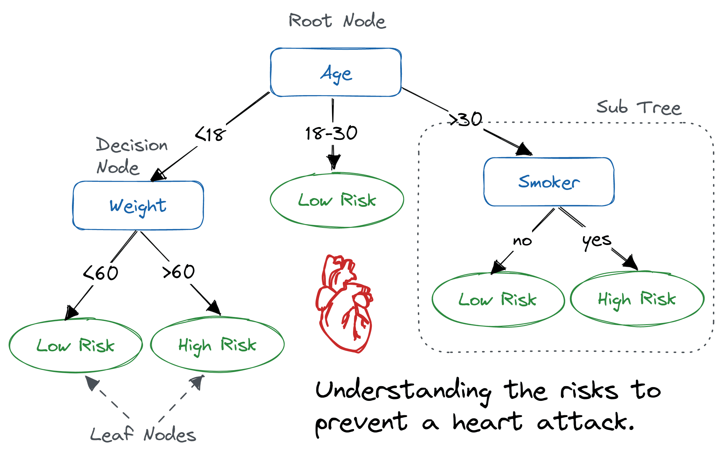{width="80%"}Example of a decision tree where the variables are age, weight and smoker to predict risk level of a heart attack.<br>_Image source: [DataCamp](https://www.datacamp.com/tutorial/decision-tree-classification-python)_:::These decision trees are made up of decision nodes, which are the points where the data is split based on a predictor variable, and leaf nodes, which are the final predictions made by the tree.The random forest algorithm generates multiple of these decision trees based upon the training data. Each tree is built upon a random subset of the data and variables. This randomness helps to reduce overfitting and improve the generalizability of the model. Therefore, each tree will learn different patterns from the data. Once the model has been trained, we can supply a new dataset and run it through the model. In this case, the data will run through each of the decision trees in the random forest and make a prediction. Then, a majority vote is taken across the decision of all the trees to make the final prediction.::: {#fig-random_forest_example .figure}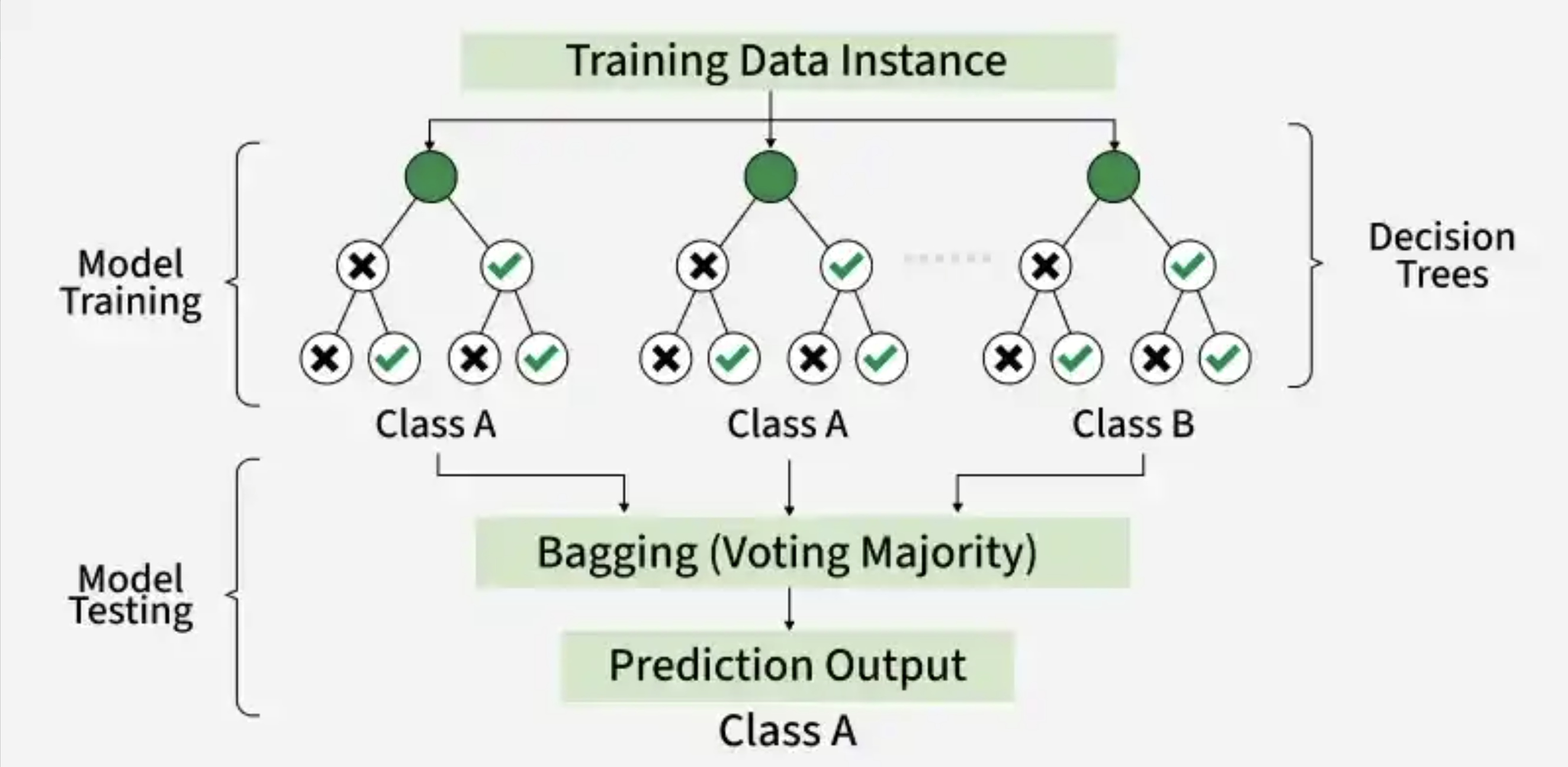{width="80%"}Example of a random forest with 3 decision trees to generate a prediction based upon majority voting.<br>_Image source: [GeeksforGeeks](https://www.geeksforgeeks.org/random-forest-classifier-using-scikit-learn/)_:::## Cortical layer datasetTo provide a real-world example of how to use machine learning in research, we will be using a synthetic [Visium HD](https://www.10xgenomics.com/platforms/visium/product-family) spatial transcriptomics dataset. In this type of experiment, you take a piece of tissue and lay it on a grid. Then, each spot on the grid is genomically sequenced such that you know **both the spatial location and gene expression** of each spot. ::: {#fig-visium_hd .figure}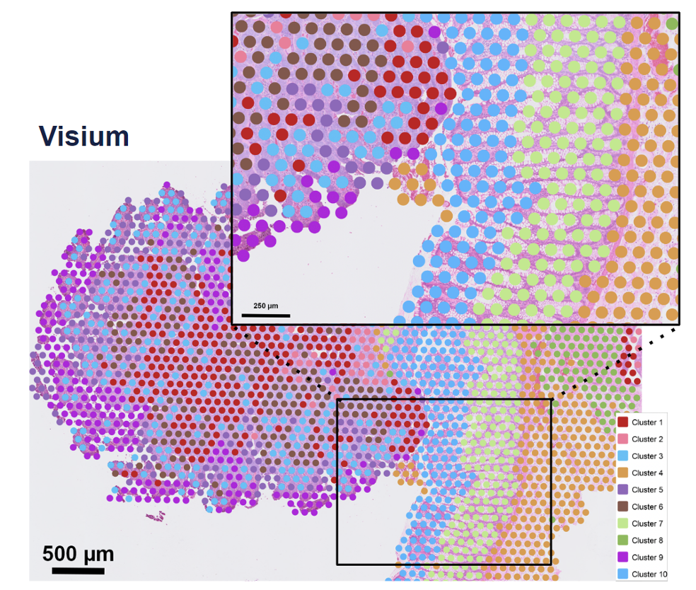{width=300}Example of a Visium spatial transcriptomics dataset, where each spot has two key pieces of information: spatial location and gene expression. <br>_Image source: [10x Genomics](https://www.10xgenomics.com/blog/your-introduction-to-visium-hd-spatial-biology-in-high-definition)_::: ::: columns::: columnThe human cortex is a great use case for this technology because the brain is divvied into layers 1-6 and a white matter layer. A good analogy would be to think of them as an onion, where the layers are stacked right on top of each other spatially (x, y coordinates). The layers are relatively distinct in their spatial locations but also have genes that are expressed highly in one layer and not the others. This makes it a great use case for machine learning because we can use both the spatial location and gene expression to predict which layer a spot belongs to.:::::: column::: {#fig-cortical_layers_paper .figure}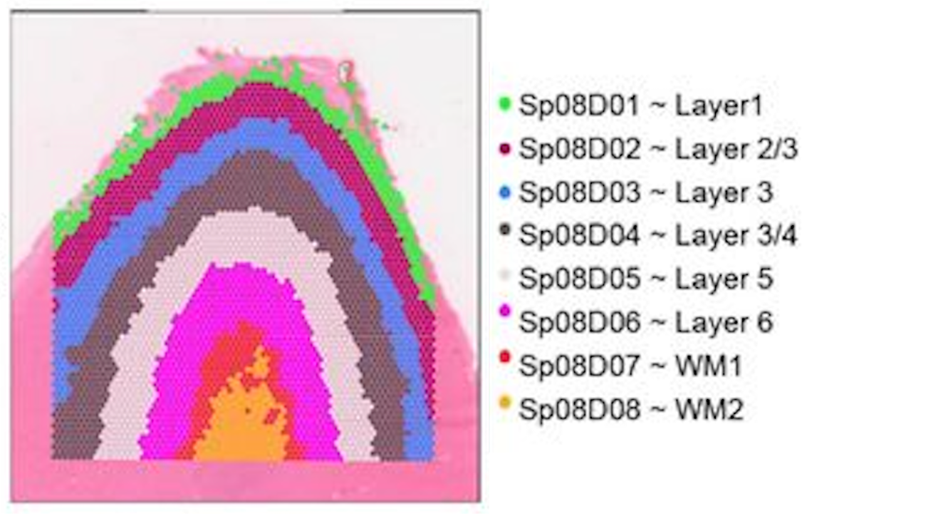{height=50}Spatial locations of the cortical layers in the human brain. <br>_Image source: [Rai et al. (2026)](https://www.biorxiv.org/content/10.64898/2026.01.12.698703v1.full)_:::::::::**We will be using a synthetic cortical dataset with labelled cortical layers to train a random forest classifier to predict which layer a cell belongs to.**### Cortical informationWe have created a made-up dataset (as the data has not been published yet) based upon [this dataset](https://www.biorxiv.org/content/10.64898/2026.01.12.698703v1.full). Where layers are broken into 6 cortical layers (L1, L2, L3, L4, L5, L6) and a white matter layer.```{python}#| label: tbl-load_cortical_data#| tbl-cap: Cortical cells data, where the x and y coordinates represent the spatial locations of each cell as well as the cortical layer they belong to.# Load librariesimport pandas as pdimport seaborn as snsimport matplotlib.pyplot as pltfrom sklearn.ensemble import RandomForestClassifierfrom sklearn.model_selection import train_test_splitfrom sklearn.metrics import accuracy_score, confusion_matrix# Load synthetic cortical datasetdf_cortical = pd.read_csv("data/synthetic_cortex_data.csv")# Inspect the loaded datasetdf_cortical.head()```We have the following columns in this dataset:- `barcode` - A unique identifier for each spot in the dataset- `x` - The x coordinate of the spot's spatial location- `y` - The y coordinate of the spot's spatial location- `layer` - The cortical layer that the spot belongs to (L1, L2, L3, L4, L5, L6, WM)As this is a spatial dataset, we can visualize where on the tissue each spot is located by plotting the x and y coordinates of each spot and coloring the points by the cortical layer that they belong to:```{python}#| label: fig-cortical_layers#| fig-cap: "Spatial plot of the cortical spots colored by the cortical layer they belong to."# Initialize a plot with a specific sizeplt.figure(figsize = (8, 6))# Plot the spatial locations of the spots colored by the cortical layer they belong tosns.scatterplot(data=df_cortical, x="x", y="y", hue="cortical_layer", edgecolor=None, palette="tab10")# Add a plot titleplt.title("Brain Cells by Cortical Layer")# Add an x-axis labelplt.xlabel("x coordinate")# Add a y-axis labelplt.ylabel("y coordinate")# Add a title to the legendplt.legend(title="Cortical Layer")# Render the plotplt.show()```So now we have a better idea of what the cross-section of the cortex looks like and where the different layers are located.However, just using the x and y coordinates of each spot is not enough. You may have noticed that there appears to be some mixing of layers near the boundaries. Luckily for us, the different cortical layers have known genes that are uniquely expressed in the layers. We can take a quick look at some of these marker genes that are used to identify the different cortical layers in the original paper that this dataset is based on:::: {#fig-cortical_marker_genes .figure}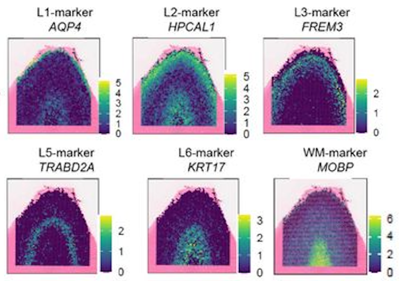{width=550}Example of the spatial expression of known marker genes for each cortical layer. <br>_Image source: [Rai et al. (2026)](https://www.biorxiv.org/content/10.64898/2026.01.12.698703v1.full)_:::In the dataset, you have have noted that we also have columns: `AQP4`, `HPCAL1`, `FREM3`, `TRABD2A`, `KRT17` and `MOBP`. These are the [log-normalized expression](https://hbctraining.github.io/Intro-to-scRNAseq/lessons/07_SCT_normalization.html#normalization) values for those genes in each spot. Similar to the figure from above, we can visualize the expression of a marker gene in each spot (scatterplot point) across the cortex to see the pattern of values across the different layers. This will give us a better idea of how we can use both the spatial location and gene expression to predict which layer a spot belongs to.```{python}#| label: fig-cortical_marker_gene_aqp4#| fig-cap: Spatial plot of the gene expression of the Layer 1 marker gene, AQP4, across the cortex.# Initialize a plot with a specific sizeplt.figure(figsize = (8, 6))# Plot the spatial expression of AQP4 across the cortexsns.scatterplot(data = df_cortical, x ="x", y ="y", hue ="AQP4", palette ="viridis", edgecolor =None)# Add a plot titleplt.title("Expression of AQP4 across the cortex")# Render the plotplt.show()```::: {.callout-note collapse="true"}# Making multiple subplots in a loopAlternatively, we could have plotted all six genes together by doing something like:```{python}#| label: fig-cortical_marker_genes#| fig-cap: Spatial plot of the gene expression of known marker genes for each cortical layer.# List of marker genes to plotgenes = ["AQP4", "HPCAL1", "FREM3", "TRABD2A", "KRT17", "MOBP"]# Initialize a plot with rows and columns for each genefig, axes = plt.subplots(2, 3, figsize=(15, 8))# Make axes a flat list so we can index easilyaxes = axes.flatten()# Loop through each gene creating a plotfor i, gene inenumerate(genes): ax = axes[i] sns.scatterplot( data=df_cortical, x="x", y="y", hue=gene, palette="viridis", edgecolor=None, ax=ax ) ax.set_title(f"Expression of {gene} across the cortex")# Adjust spacing so that figures fit neatly togetherplt.tight_layout()# Render the plotplt.show()```In the above code, we first initialized a plot with 2 rows and 3 columns - with the goal of plotting each of the 6 genes in our dataset. This creates an **2D array of plots** which we can then access to generate each of our plots.We could have proceeded using the `[row, column]` indexing we have been using for matrices, but that is more complex as we would need to keep track of both rows and columns in the for loop. Instead, we can use the `flatten()` method to convert this **2D array of plots into a list of plots**, which is easier to index in the `for` loop.You will also note that in our `for` loop there is a comma `i, gene`. This is because `enumerate(genes)` will provide the index (`i`) in addition to the gene name (`gene`) as it is looping through `genes`. Because it is returning two variables, we need to assign them to two variables and we use the comma to separate the two variables we are wanting to return values to.:::**We will be using this synthetic dataset to train a random forest classifier to predict the cortical layer labels based on the spatial location and gene expression of each cell.**## Training a random forest classifierNow that we have a basic understanding of how random forests work, let's dive into training one with our cortical dataset. We will be using the `RandomForestClassifier` class from the `sklearn.ensemble` module to train our model.### Preparing training datasetThe _learning_ of machine learning comes from the fact that these algorithms must first learn patterns. This is accomplished by taking a subset of labelled data, the **training set**, to train the model. From this, the random forest classifier would learn how to predict the cortical layer of a cell based on its coordinates and gene expression. Additionally, we also need a **test set** to evaluate the performance of the model. The test set is a subset of the data that the model has not seen during training (but has labels), and it is used to assess the accuracy of the model.First, we are going to define what is the target label we want to predict (`cortical_layer`), and what are the predictor variables we want to use to make that prediction, (`x` coordinates, `y` coordinates and gene expression). Oftentimes, the predictor features and target label will be referred to as the `X` and `y`, respectively.```{python}#| label: define_feature_target_cols# Define the predictor feature columnsfeature_cols = ["x", "y", "AQP4", "HPCAL1", "FREM3","TRABD2A", "KRT17", "MOBP"]# Define the target label columntarget_col ="cortical_layer"# Set X for future use in training and predictionX = df_cortical[feature_cols]# Set y for future use in training and predictiony = df_cortical[target_col]```With this information, we can now prepare our training and test dataset with `train_test_split()` from the `sklearn.model_selection` module. This function will split our dataset into a **training set and a test set**. We will train the model on the training set and then evaluate its performance (accuracy) on the test set. We supply the following parameters into the function:- `test_size`: proportion of the dataset that we want to use as the test set (30% of the data for testing and 70% for training).- `stratify`: ensure that the distribution of the target label (`cortical_layer`) is the same in both the training and test sets. This is to reduce bias due to sampling and ensure that the model is trained on a representative sample of the data.- `random_state`: random seed for reproducibility.```{python}#| label: prepare_training_data# Split the dataset into the training and test dataset and also split the predictor variables and target labels X_train, X_test, y_train, y_test = train_test_split( X, y, test_size =0.3, random_state =42, stratify = y)```::: callout-note# Assigning output to multiple object`train_test_split` will return four objects (`X_train`, `X_test`, `y_train`, `y_test`), which is why each object is separated by a comma in the assignment. The objects contain:- `X_train` - The predictor variables, `x` coordinates, `y` coordinates along with our gene expression, for our training set- `X_test` - The predictor variables, `x` coordinates, `y` coordinates along with our gene expression, for our testing set- `y_train`: The target labels for our training set- `y_test`: The target labels for our testing set:::### Train random forest classifierTo create the model, first we are going to initialize an instance of the `RandomForestClassifier` class from the `sklearn.ensemble` module. We will specify the number of trees in the forest using the `n_estimators` parameter and set a random seed, `random_state`, for reproducibility.```{python}#| label: initialize_random_forest# Initialize the random forest classifierrf = RandomForestClassifier(n_estimators =100, random_state =42, class_weight ="balanced")```Next, we will train the model using the `fit()` method, which takes in the predictor variables (spatial coordinates and gene expression) and the target variable (cortical layer) from the training data.```{python}#| label: train_model# Train the random forest classifier modelrf.fit(X_train, y_train)```Now that we have trained a model, we can visualize how **one** of the decision trees in the random forest is making its predictions. This can help us understand how the model is learning to predict the cortical layer labels based on the spatial location and gene expression of each cell. Here, we see the first few splits in the decision tree:```{python}#| label: visualize_decision_tree#| fig-cap: Visualization of a single decision tree from the random forest model (truncated to depth `max_depth`).#| echo: false# Load librariesfrom sklearn.tree import export_graphvizimport graphviz# Unique class names for the target variable (cortical_layer)cn = df_cortical["cortical_layer"].unique()# Export one of the treesdot_data = export_graphviz(rf.estimators_[0], out_file =None, feature_names = feature_cols, class_names = cn, filled =True, rounded =True, special_characters =True, impurity =False, proportion =True, max_depth =3)# Structure the tree for plottinggraph = graphviz.Source(dot_data)# Plot the treegraph```## Predict cortical layer labelsWith this model, `rf`, we can now predict the cortical layer labels of the test dataset using the `predict()` method. Once again, we are supplying the predictor variables, but this time for the **test data** instead of the training data. The model will use the patterns it learned from the training data to predict which cortical layer each spot belongs to.```{python}#| label: predict_cortical_layer# Predict cortical layers for test datasety_pred = rf.predict(X_test)```So now we have `y_pred`, but what is this output?```{python}#| label: type_y_pred# Inspect the data type of y_predtype(y_pred)```It is a NumPy array! So we can access the first few elements to see what the predicted labels look like:```{python}#| label: view_predicted_labels# View the first few predicted labelsy_pred[0:5]```So we see that the output of the `predict()` method is an array of predicted cortical layer labels for each spot in the test dataset. ## Assessing model performanceAt this point, we have the predicted labels for the test dataset, but how do we know if these predictions are accurate? To evaluate the performance of our model, we can compare the predicted labels to the true labels of the test dataset.### Accuracy of model predictionsNow that we have the predicted and true labels of the test dataset, we can calculate the accuracy of our model's predictions. Accuracy is calculated as the number of correct predictions divided by the total number of predictions.```{python}#| label: calculate_accuracy# Calculate the accuracy of the model's predictionsacc = accuracy_score(y_test, y_pred)# Convert proportion to percentageaccuracy_percentage = acc *100# Print out the accuracyprint(accuracy_percentage)```Our accuracy is quite high! This tells us that our model is doing a good job at predicting the cortical layer labels based on the x, y coordinates and gene expression. However, accuracy alone does not always give us the full picture of how well our model is performing.### Confusion matricesIf your accuracy is low, you can look at the confusion matrix to see which classes are being misclassified and potentially adjust your model or data accordingly. Confusion matrices are a common way to evaluate which labels are being correctly predicted and which are being incorrectly predicted. This can help you understand where your model is making mistakes and how to improve it.```{python}#| label: calculate_confusion_matrix# Obtain the data labelsclass_names =sorted(y.unique())# Create a confusion matrix of true and predicted labelscm = confusion_matrix(y_true = y_test, y_pred = y_pred, labels = class_names)# Print out the confusion matrixprint(cm)```This confusion matrix shows the number of correct and incorrect predictions for each class (cortical layer) in the test dataset. Each row is the predicted cortical layer and each column is the true cortical layer. Thus, the diagonal elements represent the number of correct predictions for each class, while the off-diagonal elements represent the number of incorrect predictions.The easiest way to interpret this confusion matrix is to visualize it as a heatmap, where the intensity of the color represents the number of predictions for each class. This can help you quickly identify which classes are being misclassified and which are being correctly classified.```{python}#| label: fig-confusion_matrix#| fig-cap: Confusion matrix to evaluate the performance of the random forest classifier on the test dataset for each cortical layer.# Initialize a plot with a specific sizeplt.figure(figsize = (8, 6))# Create a heatmap from the confusion matrixsns.heatmap( data = cm, annot =True, fmt ="g", cmap ="Blues", xticklabels = class_names, yticklabels = class_names)# Add a plot titleplt.title("Random Forest – Confusion Matrix (Test Set)")# Add an x-axis labelplt.xlabel("Predicted label")# Add an y-axis labelplt.ylabel("True label")#plt.tight_layout()# Render the plotplt.show()```Our accuracy is quite high, so the diagonal (correct predictions) has the highest values. However, we can see that there are several instances of misclassification (the 15% inaccurate predictions). It makes sense that we see the **most error in the prediction when layers are adjacent to one another**. This is because the boundary between when one layer starts and another ends is not always clear, and there may be some mixing of layers near the boundaries. ## Next stepsWith this model, you could try to predict the cortical layer labels of other unlabelled datasets. You could also try to use different predictor variables (e.g., only gene expression or only spatial coordinates) to see how that affects the accuracy of the model's predictions.***[Back to Schedule](../schedule/schedule.qmd)


