Approximate time: 90 minutes
Learning Objectives:
- Evaluate whether clustering artifacts are present
- Determine the quality of clustering with PCA, tSNE and UMAP plots and understand when to re-cluster
- Assess known cell type markers to hypothesize cell type identities of clusters
Single-cell RNA-seq clustering analysis
Now that we have our high quality cells, we want to know the different cell types present within our population of cells.
Goals:
- To generate cell type-specific clusters and use known markers to determine the identities of the clusters.
- To determine whether clusters represent true cell types or cluster due to biological or technical variation, such as clusters of cells in the S phase of the cell cycle, clusters of specific batches, or cells with high mitochondrial content.
Challenges:
- Identifying the cell types of each cluster
- Maintaining patience as this can be a highly iterative process between clustering and marker identification (sometimes even going back to the QC filtering or normalization)
Recommendations:
- Have a good idea of your expectations for the cell types to be present and a handful of marker genes for these cell types. Know whether you expect cell types of low complexity or higher mitochondrial content AND whether the cells are differentiating
- Identify any junk clusters for removal. Possible junk clusters could include those with high mitochondrial content and low UMIs/genes
- If not detecting all cell types as separate clusters, try changing the UMAP resolution, the number of PCs used for clustering, or the number of variable genes used
Exploration of quality control metrics
To determine whether our clusters might be due to artifacts such as cell cycle phase or mitochondrial expression, it can be useful to explore these metrics visually to see if any clusters exhibit enrichment or are different from the other clusters. However, if enrichment or differences are observed for particular clusters it may not be worrisome if it can be explained by the cell type.
To explore and visualize the various quality metrics, we will use the versatile DimPlot() and FeaturePlot() functions from Seurat.
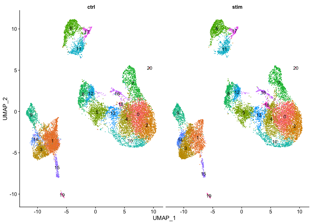
Segregation of clusters by sample
We can start by exploring the distribution of cells per cluster in each sample:
# Extract identity and sample information from seurat object to determine the number of cells per cluster per sample
n_cells <- FetchData(seurat_integrated,
                     vars = c("ident", "orig.ident")) %>%
        dplyr::count(ident, orig.ident) %>%
        tidyr::spread(ident, n)

# View table
View(n_cells)

We can visualize the cells per cluster for each sample using the UMAP:
# UMAP of cells in each cluster by sample
DimPlot(seurat_integrated,
        label = TRUE,
        split.by = "sample")  + NoLegend()
Segregation of clusters by cell cycle phase
Next we can explore whether the cells cluster by the different cell cycle phases. We did not regress out variation due to cell cycle phase when we performed the SCTransform normalization and regression of uninteresting sources of variation. If our cell clusters showed large differences in mitochondrial expression, this would be an indication we would want to re-run the SCTransform and add the S.Score and G2M.Score to our variables to regress, then re-run the rest of the steps.
# Explore whether clusters segregate by cell cycle phase
DimPlot(seurat_integrated,
        label = TRUE,
        split.by = "Phase")  + NoLegend()
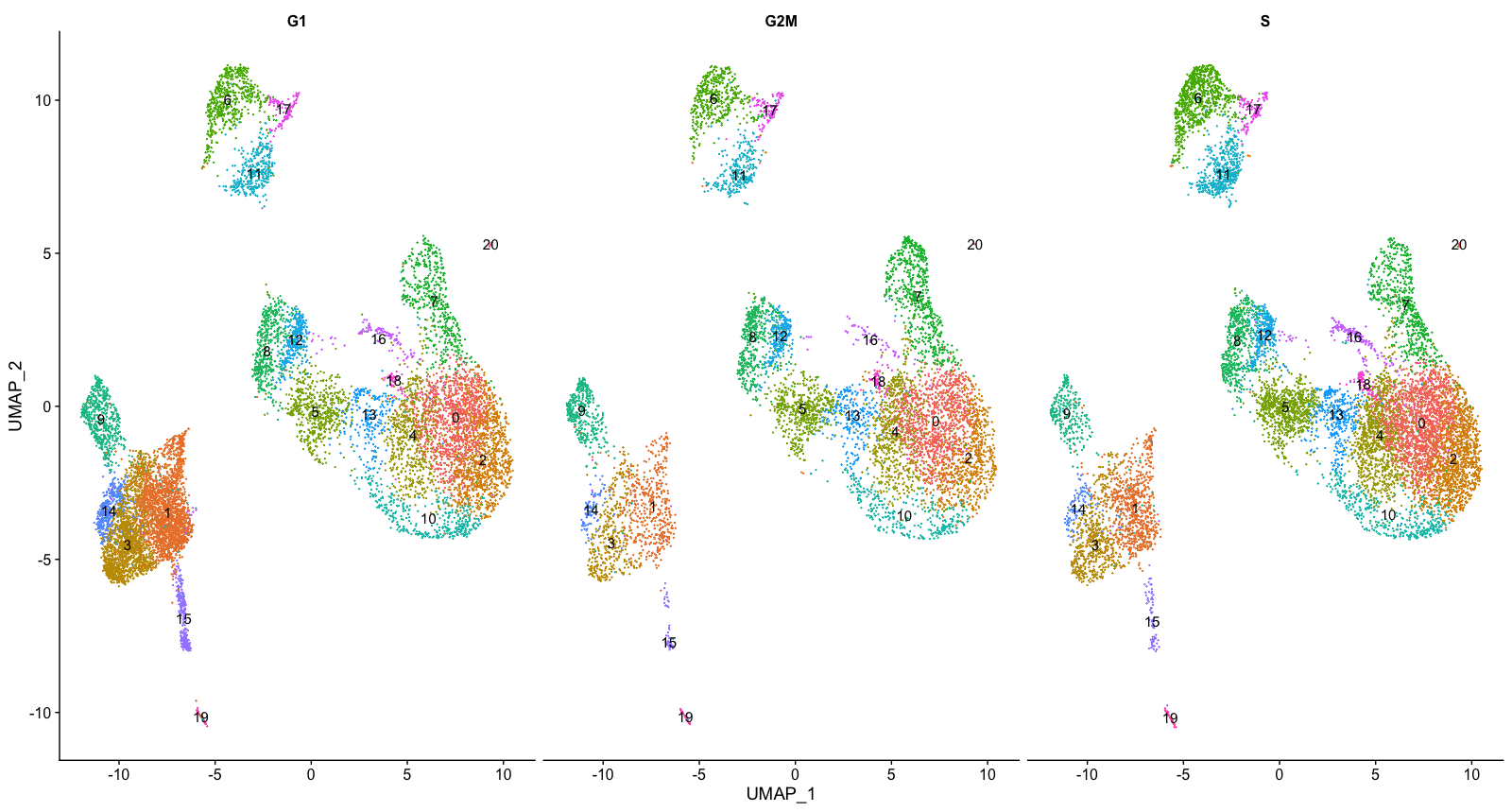
We do not see much clustering by cell cycle score, so we can proceed with the QC.
Segregation of clusters by various sources of uninteresting variation
Next we will explore additional metrics, such as the number of UMIs and genes per cell, S-phase and G2M-phase markers, and mitochondrial gene expression by UMAP. Looking at the individual S and G2M scores can give us additional information to checking the phase as we did previously.
# Determine metrics to plot present in seurat_integrated@meta.data
metrics <-  c("nUMI", "nGene", "S.Score", "G2M.Score", "mitoRatio")

FeaturePlot(seurat_integrated,
            reduction = "umap",
            features = metrics,
            pt.size = 0.4,
            sort.cell = TRUE,
            min.cutoff = 'q10',
            label = TRUE)
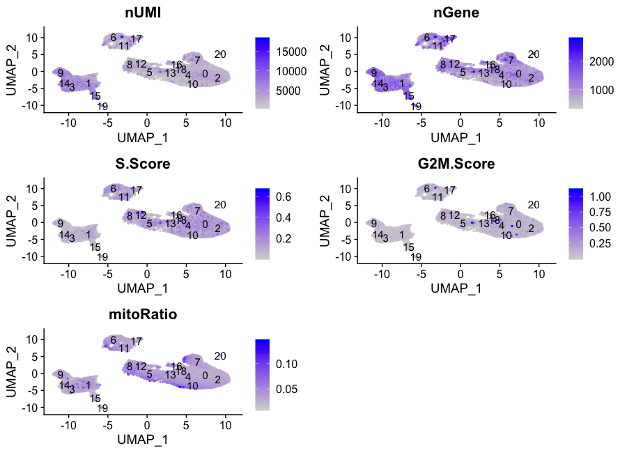
NOTE: The
sort.cellargument will plot the positive cells above the negative cells, while themin.cutoffargument will determine the threshold for shading. Amin.cutoffofq10translates to the 10% of cells with the lowest expression of the gene will not exhibit any purple shading (completely gray).
The metrics seem to be relatively even across the clusters, with the exception of the nUMIs and nGene exhibiting higher values in clusters 3, 9, 14, and 15, and, perhaps, cluster 17. We will keep an eye on these clusters to see whether the cell types may explain the increase.
Exploration of the PCs driving the different clusters
We can also explore how well our clusters separate by the different PCs; we hope that the defined PCs separate the cell types well. To visualize this information, we need to extract the UMAP coordinate information for the cells along with their corresponding scores for each of the PCs to view by UMAP.
First, we identify the information we would like to extract from the Seurat object, then, we can use the FetchData() function to extract it.
# Defining the information in the seurat object of interest
columns <- c(paste0("PC_", 1:16),
            "ident",
            "UMAP_1", "UMAP_2")

# Extracting this data from the seurat object
pc_data <- FetchData(seurat_integrated,
                     vars = columns)
NOTE: How did we know in the
FetchData()function to includeUMAP_1to obtain the UMAP coordinates? The Seurat cheatsheet describes the function as being able to pull any data from the expression matrices, cell embeddings, or metadata.For instance, if you explore the
seurat_integrated@reductionslist object, the first component is for PCA, and includes a slot forcell.embeddings. We can use the column names (PC_1,PC_2,PC_3, etc.) to pull out the coordinates or PC scores corresponding to each cell for each of the PCs.We could do the same thing for UMAP:
# Extract the UMAP coordinates for the first 10 cells
seurat_integrated@reductions$umap@cell.embeddings[1:10, 1:2]
The
FetchData()function just allows us to extract the data more easily.
In the UMAP plots below, the cells are colored by their PC score for each respective principal component.
Let’s take a quick look at the top 16 PCs:
# Adding cluster label to center of cluster on UMAP
umap_label <- FetchData(seurat_integrated,
                        vars = c("ident", "UMAP_1", "UMAP_2"))  %>%
  group_by(ident) %>%
  summarise(x=mean(UMAP_1), y=mean(UMAP_2))

# Plotting a UMAP plot for each of the PCs
map(paste0("PC_", 1:16), function(pc){
        ggplot(pc_data,
               aes(UMAP_1, UMAP_2)) +
                geom_point(aes_string(color=pc),
                           alpha = 0.7) +
                scale_color_gradient(guide = FALSE,
                                     low = "grey90",
                                     high = "blue")  +
                geom_text(data=umap_label,
                          aes(label=ident, x, y)) +
                ggtitle(pc)
}) %>%
        plot_grid(plotlist = .)
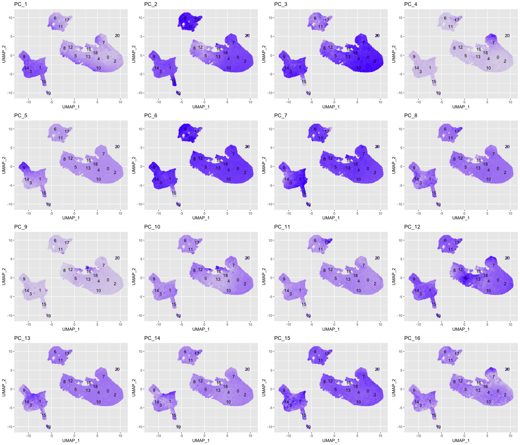
We can see how the clusters are represented by the different PCs. For instance, the genes driving PC_2 exhibit higher expression in clusters 6, 11, and 17 (maybe a bit higher in 15, too). We could look back at our genes driving this PC to get an idea of what the cell types might be:
# Examine PCA results
print(seurat_integrated[["pca"]], dims = 1:5, nfeatures = 5)
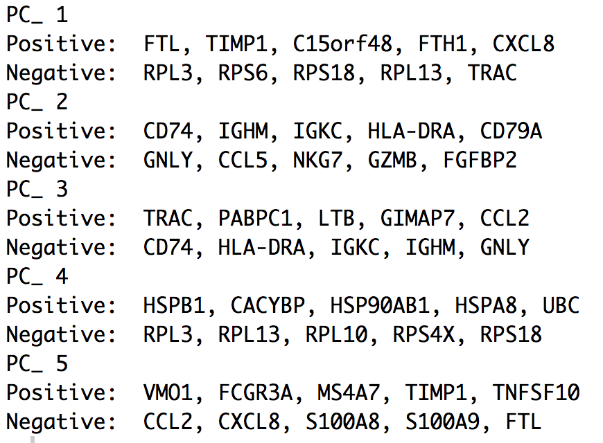
With the CD79A gene and the HLA genes as positive markers of PC_2, we can hypothesize that clusters 6, 11, and 17 correspond to B cells. This just hints at what the clusters identity could be, with the identities of the clusters being determined through a combination of the PCs.
To truly determine the identity of the clusters and whether the resolution is appropriate, it is helpful to explore a handful of known markers for the cell types expected.
Exploring known cell type markers
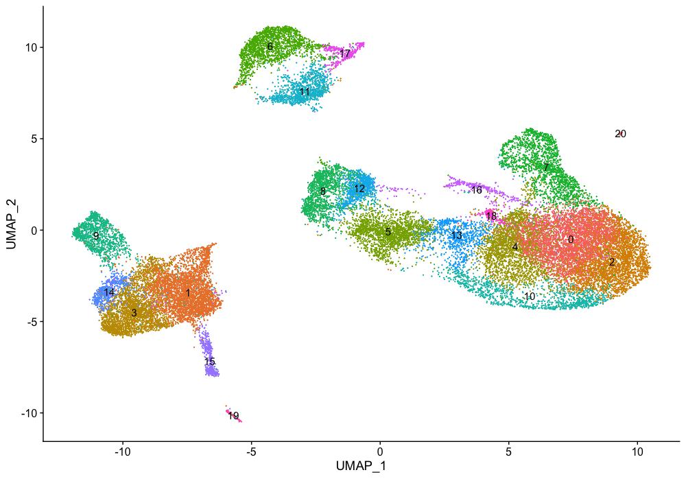
With the cells clustered, we can explore the cell type identities by looking for known markers. The UMAP plot with clusters marked is shown, followed by the different cell types expected.
DimPlot(object = seurat_integrated,
        reduction = "umap",
        label = TRUE) + NoLegend()
The FeaturePlot() function from seurat makes it easy to visualize a handful of genes using the gene IDs stored in the Seurat object. For example if we were interested in exploring known immune cell markers, such as:
| Cell Type | Marker |
|---|---|
| CD14+ monocytes | CD14, LYZ |
| FCGR3A+ monocytes | FCGR3A, MS4A7 |
| Conventional dendritic cells | FCER1A, CST3 |
| Plasmacytoid dendritic cells | IL3RA, GZMB, SERPINF1, ITM2C |
| B cells | CD79A, MS4A1 |
| T cells | CD3D |
| CD4+ T cells | CD3D, IL7R, CCR7 |
| CD8+ T cells | CD3D, CD8A |
| NK cells | GNLY, NKG7 |
| Megakaryocytes | PPBP |
| Erythrocytes | HBB, HBA2 |
Seurat’s FeaturePlot() function let’s us easily explore the known markers on top of our UMAP visualizations. Let’s go through and determine the identities of the clusters. To access the expression levels of all genes, rather than just the 3000 most highly variable genes, we can use the normalized count data stored in the RNA assay slot.
# Select the RNA counts slot to be the default assay
DefaultAssay(seurat_integrated) <- "RNA"

# Normalize RNA data for visualization purposes
seurat_integrated <- NormalizeData(seurat_integrated, verbose = FALSE)
We are looking for consistency of expression of the markers across the clusters. For example, if there are two markers for a cell type and only one of them is expressed in a cluster - then we cannot reliably assign that cluster to the celltype.
CD14+ monocyte markers
FeaturePlot(seurat_integrated,
            reduction = "umap",
            features = c("CD14", "LYZ"),
            sort.cell = TRUE,
            min.cutoff = 'q10',
            label = TRUE)
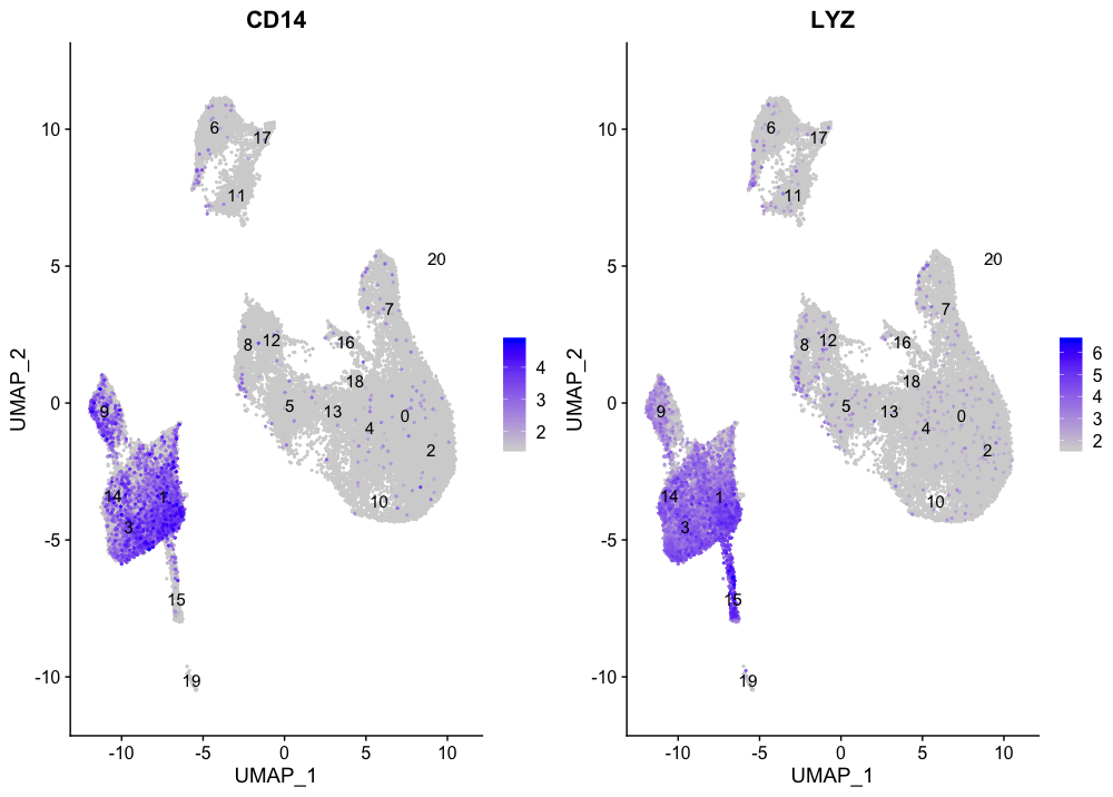
CD14+ monocytes appear to correspond to clusters 1, 3, and 14. We wouldn’t include clusters 9 and 15 because they do not highly express both of these markers.
FCGR3A+ monocyte markers
FeaturePlot(seurat_integrated,
            reduction = "umap",
            features = c("FCGR3A", "MS4A7"),
            sort.cell = TRUE,
            min.cutoff = 'q10',
            label = TRUE)
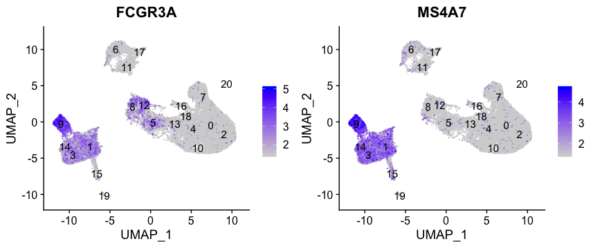
FCGR3A+ monocytes markers distinctly highlight cluster 9.
Macrophages
FeaturePlot(seurat_integrated,
            reduction = "umap",
            features = c("MARCO", "ITGAM", "ADGRE1"),
            sort.cell = TRUE,
            min.cutoff = 'q10',
            label = TRUE)
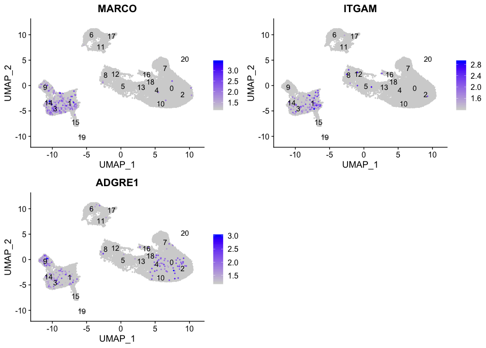
No clusters appear to correspond to macrophages; perhaps cell culture conditions negatively selected for macrophages (more highly adherent).
Conventional dendritic cell markers
FeaturePlot(seurat_integrated,
            reduction = "umap",
            features = c("FCER1A", "CST3"),
            sort.cell = TRUE,
            min.cutoff = 'q10',
            label = TRUE)
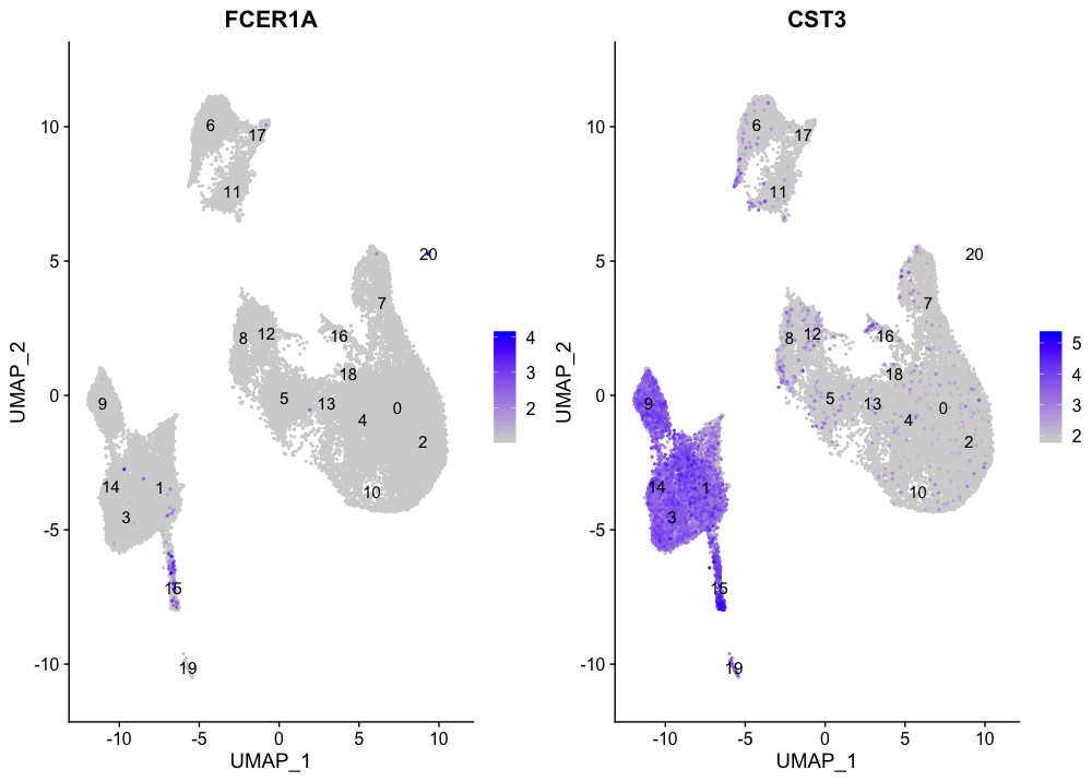
The markers corresponding to conventional dendritic cells identify cluster 15 (both markers consistently show expression).
Plasmacytoid dendritic cell markers
FeaturePlot(seurat_integrated,
            reduction = "umap",
            features = c("IL3RA", "GZMB", "SERPINF1", "ITM2C"),
            sort.cell = TRUE,
            min.cutoff = 'q10',
            label = TRUE)
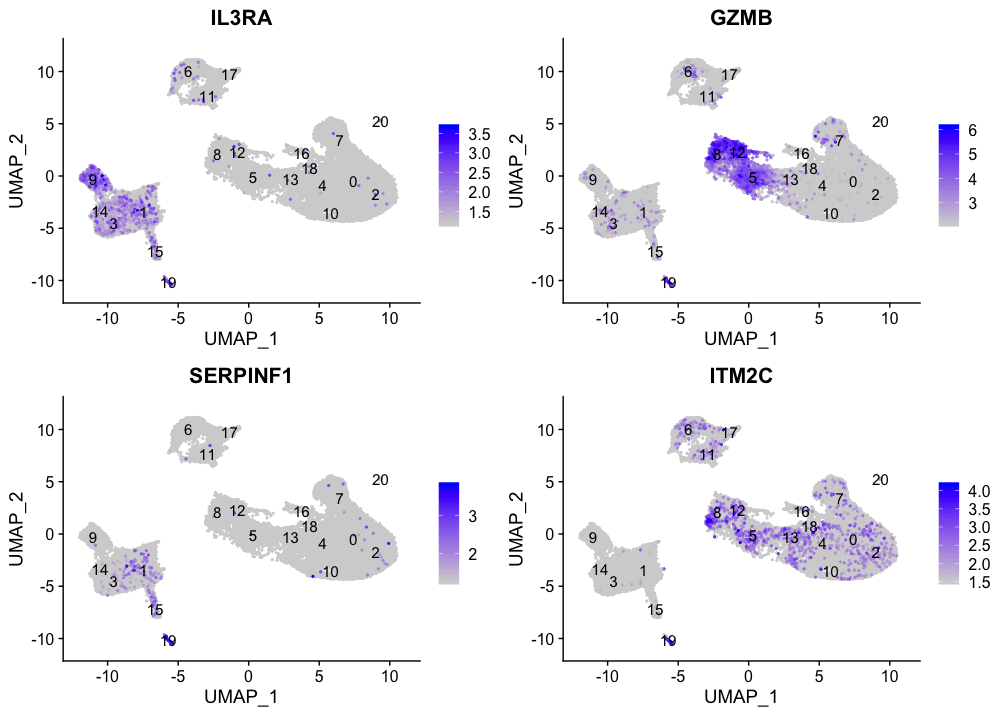
Plasmacytoid dendritic cells represent cluster 19. While there are a lot of differences in the expression of these markers, we see cluster 19 is consistently expressed.
Hypothesize the clusters corresponding to each of the different clusters in the table:
| Cell Type | Clusters |
|---|---|
| CD14+ monocytes | 1, 3, 14 |
| FCGR3A+ monocytes | 9 |
| Conventional dendritic cells | 15 |
| Plasmacytoid dendritic cells | 19 |
| Marcrophages | - |
| B cells | ? |
| T cells | ? |
| CD4+ T cells | ? |
| CD8+ T cells | ? |
| NK cells | ? |
| Megakaryocytes | ? |
| Erythrocytes | ? |
| Unknown | ? |
You can download this excel table to comment on which clusters correspond to each cell type. ***
NOTE: If any cluster appears to contain two separate cell types, it’s helpful to increase our clustering resolution to properly subset the clusters. Alternatively, if we still can’t separate out the clusters using increased resolution, then it’s possible that we had used too few principal components such that we are just not separating out these cell types of interest. To inform our choice of PCs, we could look at our PC gene expression overlapping the UMAP plots and determine whether our cell populations are separating by the PCs included.
Now we have a decent idea as to the cell types corresponding to the majority of the clusters, but some questions remain:
- What are the cell type identities of clusters 7 and 20?
- Do the clusters corresponding to the same cell types have biologically meaningful differences? Are there subpopulations of these cell types?
- Can we acquire higher confidence in these cell type identities by identifying other marker genes for these clusters?
Marker identification analysis can help us address all of these questions!!
The next step will be to perform marker identification analysis, which will output the genes that significantly differ in expression between clusters. Using these genes we can determine or improve confidence in the identities of the clusters/subclusters.
This lesson has been developed by members of the teaching team at the Harvard Chan Bioinformatics Core (HBC). These are open access materials distributed under the terms of the Creative Commons Attribution license (CC BY 4.0), which permits unrestricted use, distribution, and reproduction in any medium, provided the original author and source are credited.
- A portion of these materials and hands-on activities were adapted from the Satija Lab’s Seurat - Guided Clustering Tutorial