Elbow plot: quantitative approach
The elbow plot is helpful when determining how many PCs we need to capture the majority of the variation in the data. The elbow plot visualizes the standard deviation of each PC. Where the elbow appears is usually the threshold for identifying the majority of the variation. However, this method can be a bit subjective about where the elbow is located.
We will try the top 40 dimensions:
# Plot the elbow plot
ElbowPlot(object = seurat_integrated,
          ndims = 40)
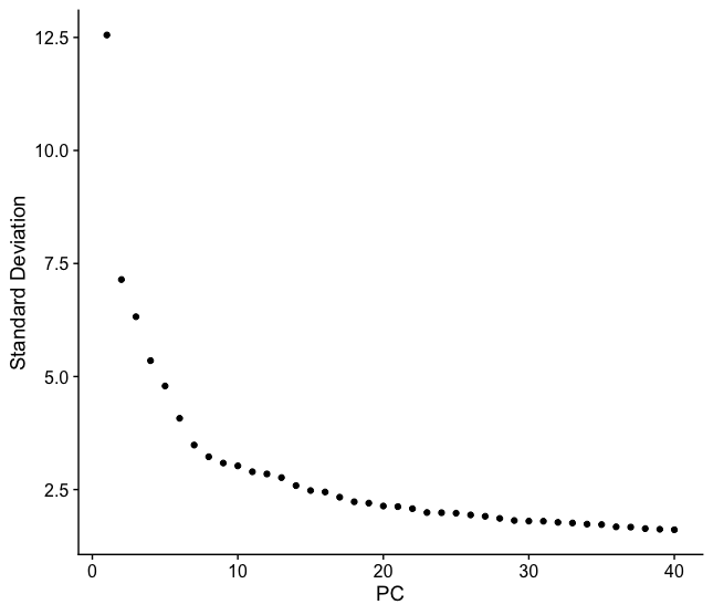
Based on this plot, we could roughly determine the majority of the variation by where the elbow occurs (touches the ground) to be between PC12-PC16. While this gives us a good rough idea of the number of PCs needed to be included, a more quantitative approach may be a bit more reliable. We can calculate where the principal components start to elbow by taking the larger value of:
- The point where the principal components only contribute 5% of standard deviation and the principal components cumulatively contribute 90% of the standard deviation.
- The point where the percent change in variation between the consecutive PCs is less than 0.1%.
We will start by calculating the first metric:
# Determine percent of variation associated with each PC
pct <- seurat_integrated[["pca"]]@stdev / sum(seurat_integrated[["pca"]]@stdev) * 100

# Calculate cumulative percents for each PC
cumu <- cumsum(pct)

# Determine which PC exhibits cumulative percent greater than 90% and % variation associated with the PC as less than 5
co1 <- which(cumu > 90 & pct < 5)[1]

co1
The first metric returns PC42 as the PC matching these requirements. Let’s check the second metric, which identifies the PC where the percent change in variation between consecutive PCs is less than 0.1%:
# Determine the difference between variation of PC and subsequent PC
co2 <- sort(which((pct[1:length(pct) - 1] - pct[2:length(pct)]) > 0.1), decreasing = T)[1] + 1

# last point where change of % of variation is more than 0.1%.
co2
This second metric returns PC18. Usually, we would choose the minimum of these two metrics as the PCs covering the majority of the variation in the data.
# Minimum of the two calculation
pcs <- min(co1, co2)

pcs
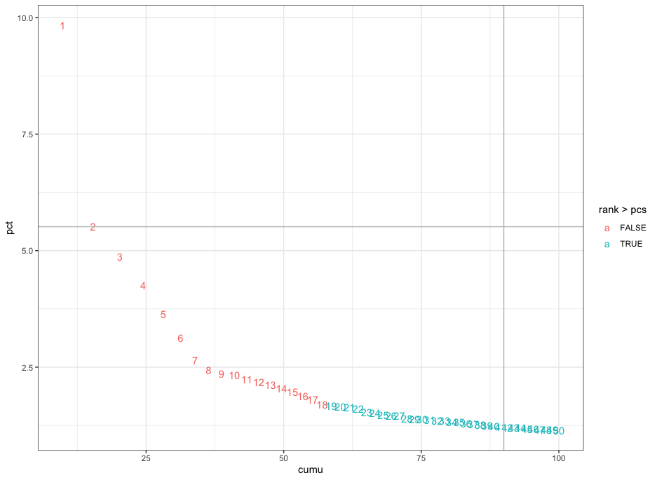
Based on these metrics, for the clustering of cells in Seurat we will use the first eighteen PCs to generate the clusters. We can plot the elbow plot again and overlay the information determined using our metrics:
# Create a dataframe with values
plot_df <- data.frame(pct = pct,
           cumu = cumu,
           rank = 1:length(pct))

# Elbow plot to visualize
  ggplot(plot_df, aes(cumu, pct, label = rank, color = rank > pcs)) +
  geom_text() +
  geom_vline(xintercept = 90, color = "grey") +
  geom_hline(yintercept = min(pct[pct > 5]), color = "grey") +
  theme_bw()
This lesson has been developed by members of the teaching team at the Harvard Chan Bioinformatics Core (HBC). These are open access materials distributed under the terms of the Creative Commons Attribution license (CC BY 4.0), which permits unrestricted use, distribution, and reproduction in any medium, provided the original author and source are credited.