Day 1 Answer key
Quality Control Analysis
1. Extract the new metadata from the filtered Seurat object using the code provided below:
# Save filtered subset to new metadata
metadata_clean <- filtered_seurat@meta.data
2. Perform all of the same QC plots using the filtered data.
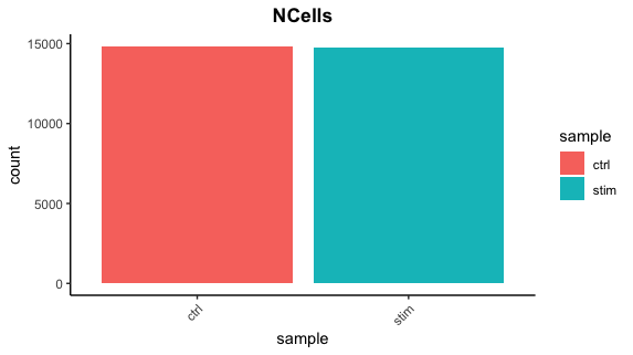
Cell counts
After filtering, we should not have more cells than we sequenced. Generally we aim to have about the number we sequenced or a bit less.
## Cell counts
metadata_clean %>%
  	ggplot(aes(x=sample, fill=sample)) +
  	geom_bar() +
  	theme_classic() +
  	theme(axis.text.x = element_text(angle = 45, vjust = 1, hjust=1)) +
  	theme(plot.title = element_text(hjust=0.5, face="bold")) +
  	ggtitle("NCells")
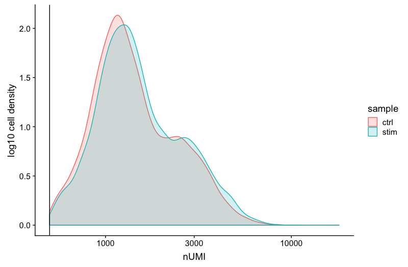
UMI counts
The filtering using a threshold of 500 has removed the cells with low numbers of UMIs from the analysis.
# UMI counts
metadata_clean %>%
  	ggplot(aes(color=sample, x=nUMI, fill= sample)) +
  	geom_density(alpha = 0.2) +
  	scale_x_log10() +
  	theme_classic() +
  	ylab("log10 cell density") +
  	geom_vline(xintercept = 500)
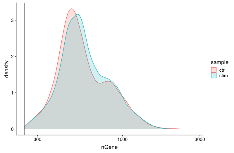
Genes detected
# Genes detected
metadata_clean %>%
  	ggplot(aes(color=sample, x=nGene, fill= sample)) +
  	geom_density(alpha = 0.2) +
  	theme_classic() +
  	scale_x_log10() +
  	geom_vline(xintercept = 250)
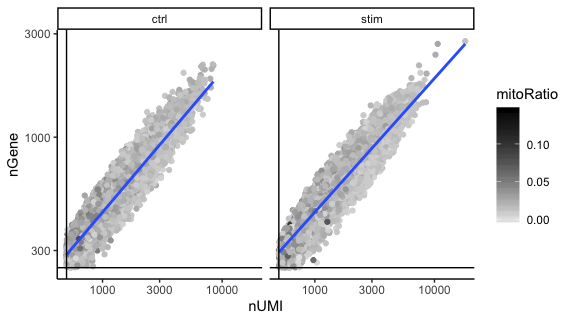
UMIs vs genes
# UMIs vs genes
metadata_clean %>%
  ggplot(aes(x=nUMI, y=nGene, color=mitoRatio)) +
  geom_point() +
  scale_colour_gradient(low = "gray90", high = "black") +
  stat_smooth(method=lm) +
  scale_x_log10() +
  scale_y_log10() +
  theme_classic() +
  geom_vline(xintercept = 500) +
  geom_hline(yintercept = 250) +
  facet_wrap(~sample)
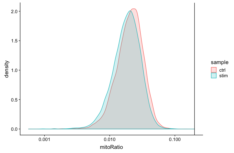
Mitochondrial counts ratio
# Mitochondrial counts ratio
metadata_clean %>%
  	ggplot(aes(color=sample, x=mitoRatio, fill=sample)) +
  	geom_density(alpha = 0.2) +
  	scale_x_log10() +
  	theme_classic() +
  	geom_vline(xintercept = 0.2)
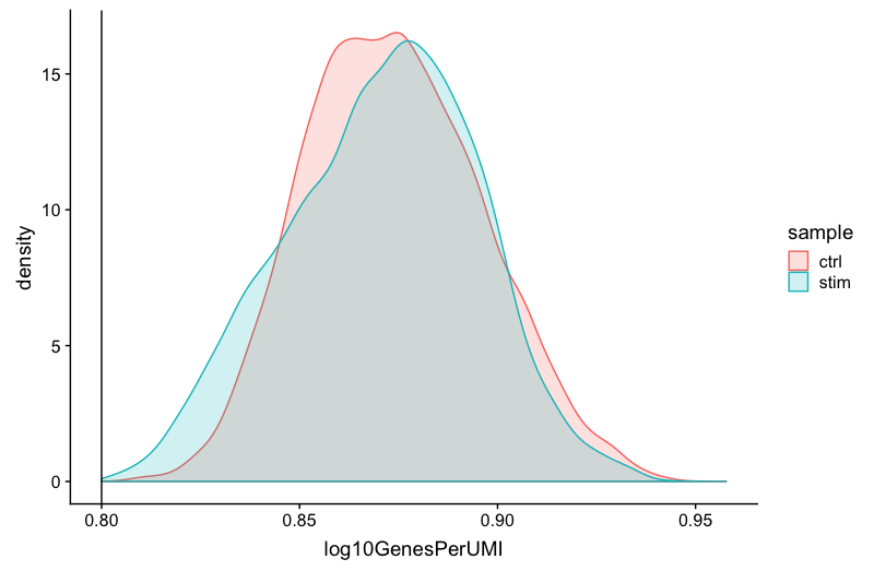
Novelty
# Novelty
metadata_clean %>%
  	ggplot(aes(x=log10GenesPerUMI, color = sample, fill=sample)) +
  	geom_density(alpha = 0.2) +
  	theme_classic() +
  	geom_vline(xintercept = 0.8)
3. Report the number of cells left for each sample, and comment on whether the number of cells removed is high or low. Can you give reasons why this number is still not ~12K (which is how many cells were loaded for the experiment)?
There are just under 15K cells left for both the control and stim cells. The number of cells removed is reasonably low.
While it would be ideal to have 12K cells, we do not expect that due to:
- barcoded beads in the droplet with no actual cell present
- more than one barcode in the droplet; results in a single cell’s mRNA represented as two cells
- dead or dying cells encapsulated into the droplet
If we still see higher than expected numbers of cells after filtering, this means we could afford to filter more stringently (but we don’t necessarily have to).
4. After filtering for nGene per cell, you should still observe a small shoulder to the right of the main peak. What might this shoulder represent?
This peak could represent a biologically distinct population of cells. It could be a set a of cells that share some properties and as a consequence exhibit more diversity in its transcriptome (with the larger number of genes detected).
5. When plotting the nGene against nUMI do you observe any data points in the bottom right quadrant of the plot? What can you say about these cells that have been removed?
The cells that were removed were those with high nUMI but low numbers of genes detected. These cells had many captured transcripts but represent only a small number of genes. These low complexity cells could represent a specific cell type (i.e. red blood cells which lack a typical transcriptome), or could be due to some other strange artifact or contamination.
SCT, regression and normalization
1. First, turn the mitochondrial ratio variable into a new categorical variable based on quartiles (using the code below)::
# Check quartile values
summary(seurat_phase@meta.data$mitoRatio)

# Turn mitoRatio into categorical factor vector based on quartile values
seurat_phase@meta.data$mitoFr <- cut(seurat_phase@meta.data$mitoRatio,
                   breaks=c(-Inf, 0.0144, 0.0199, 0.0267, Inf),
                   labels=c("Low","Medium","Medium high", "High"))
2. Next, plot the PCA similar to how we did with cell cycle regression. Hint: use the new mitoFr variable to split cells and color them accordingly.
# Plot the PCA colored by mitoFr
DimPlot(seurat_phase,
        reduction = "pca",
        group.by= "mitoFr",
        split.by = "mitoFr")
3. Evaluate the PCA plot generated in #2.
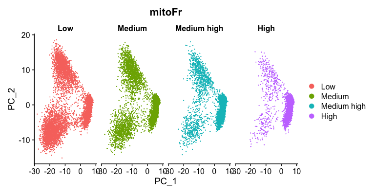
b. Describe what you see.
Based on this plot, we can see that there is a different pattern of scatter for the plot containing cells with “High” mitochondrial expression. We observe that the lobe of cells on the left-hand side of the plot is where most of the cells with high mitochondrial expression are. For all other levels of mitochondrial expression we see a more even distribution of cells across the PCA plot.
c. Would you regress out mitochndrial fraction as a source of unwanted variation?
Since we see this clear difference, we will regress out the ‘mitoRatio’ when we identify the most variant genes.
4. Are the same assays available for the “stim” samples within the split_seurat object? What is the code you used to check that?
Yes they are available. The code use is:
split_seurat$stim@assays
5. Any observations for the genes or features listed under “First 10 features:” and the “Top 10 variable features:” for “ctrl” versus “stim”?
For the first 10 features, it appears that the same genes are present in both “ctrl” and “stim”
For the top 10 variable features, these are different in the the 2 conditions with some overlap between them.