Now that we have learned the basics of ggplot2 and how to combine different images using cowplot, let’s create the bar plot figures in the publication (Figs 4I and 4J). We will complete this as an exercise and have the answers available.
Set up
- Let’s read in our gene ontology data.
  # Read in data for bar plot
  enriched_go_results <- read.csv("data/pp_gene_ontology_results.csv")

- Now, let’s split the dataset into the Pax6 up-regulated, Pax6 down-regulated, Tbr2 up-regulated and Tbr2 down-regulated.
  # Separate into the four datasets for the figure
  pax6_up_go <- enriched_go_results %>%
  filter(regulated == "up" &
           cell.type == "Radial glia")

  pax6_down_go <- enriched_go_results %>%
    filter(regulated == "down" &
             cell.type == "Radial glia")

  tbr2_up_go <- enriched_go_results %>%
    filter(regulated == "up" &
             cell.type == "Intermediate progenitors")

  tbr2_down_go <- enriched_go_results %>%
    filter(regulated == "down" &
             cell.type == "Intermediate progenitors")
- Order the factor levels for the term names in the order you would like them to appear in the plot (from bottom to top) based on the
p.value.
  # Order terms
  ## Pax6 up
  pax6_up_order_levels <- pax6_up_go %>%
    arrange(p.value) %>%
    pull(term.name)

  pax6_up_go$term.name <- factor(pax6_up_go$term.name,
                                 levels = rev(pax6_up_order_levels))

  ## Pax6 down
  pax6_down_order_levels <- pax6_down_go %>%
    arrange(p.value) %>%
    pull(term.name)

  pax6_down_go$term.name <- factor(pax6_down_go$term.name,
                                 levels = rev(pax6_down_order_levels))

  ## Tbr2 up
  tbr2_up_order_levels <- tbr2_up_go %>%
    arrange(p.value) %>%
    pull(term.name)

  tbr2_up_go$term.name <- factor(tbr2_up_go$term.name,
                                 levels = rev(tbr2_up_order_levels))

  ## Tbr2 down
  tbr2_down_order_levels <- tbr2_down_go %>%
    arrange(p.value) %>%
    pull(term.name)

  tbr2_down_go$term.name <- factor(tbr2_down_go$term.name,
                                   levels = rev(tbr2_down_order_levels))
Basic plot
- Create a basic bar plot for the Pax6 up-regulated genes using
geom_col(). Use thecoord_flip()function as a layer to get the bars to go horizontally.

Solution
  # Create the base of the bar plot
  ggplot(pax6_up_go) +
    geom_col(aes(x = term.name,
                 y = -log10(p.value))) +
    coord_flip()
Add layers
- Alter the color of the bars to be yellowish-orange inside and black outside.
- Remove the title of the flipped x-axis
- For the flipped y-axis, do the following:
- Change the title to be
"-Log(P)". - Set the limits to be 0 and 20.
- Remove any expansion of the plot past the limits by adding the argument
expand(0,0).
- Change the title to be
- Add the plot title of “Up-regulated genes”.
- Alter the thematic elements as follows:
- Add your personal theme to ensure consistency of font sizing and background, etc.
- Within the
theme()function:
- Remove the panel border
- Make the x- and y-axis lines black and of 0.5 size
- Remove the y-axis text and ticks
- Make the x-axis title be italics and size 8.
- Make the x-axis text be size 6.
- Change the plot title to be size 9.
- Add the term names to the bars by adding a
geom_text()layer with the samexandyaesthetics as thegeom_col()layer. The label aesthetics should map toterm.name.
Solution
  # Pax6 up-regulated
  ggplot(pax6_up_go) +
    geom_col(aes(x = term.name,
                 y = -log10(p.value)),
             fill = "peachpuff",
             color = "black") +
    coord_flip() +
    scale_x_discrete(name = "") +
    scale_y_continuous(name = "-Log(P)",
                       limits = c(0, 20),
                       expand = c(0, 0)) +
    ggtitle("Up-regulated genes") +
    personal_theme() +
    theme(panel.border = element_blank(),
            axis.line = element_line(color = 'black',
                                     size = 0.5),
            axis.text.y = element_blank(),
            axis.ticks.y = element_blank(),
            axis.title.x = element_text(size = 8,
                                        face = "italic"),
            axis.text.x = element_text(size = 6),
            plot.title = element_text(size = 9)) +
    geom_text(aes(x = term.name,
                  y = -log10(p.value),
                  label = term.name))
Refine plot
- Notice the terms are centered at the value we give to
yin thegeom_text()function. We can provide a different value to center the terms inside the bars. Let’s instead makey = -log10(p.value) / 2. - Change the appearance of the term names within the
geom_text()layer by doing the following:- Change the terms to sentence case (capital letter at the beginning) by changing the
labelargument in aesthetics tolabel = str_to_sentence(term.name). Thestr_to_sentence()function is from thestringrpackage from the Tidyverse. - Change the size of the terms to be 6pt by using
size = 6 / .pt. The size argument forgeom_text()has units of ‘mm’ while thesizeargument fortheme()has units of points. One point is ~0.35mm, which is supplied as a conversion factor withinggplot2called.pt. If we want the text to be size 6 pt in thegeom_text()function, to look the same as our size 6 text in thetheme(), then we should divide 6 by.pt.
- Change the terms to sentence case (capital letter at the beginning) by changing the
- Change the appearance of the bars within the
geom_col()layer by doing the following:- Create smaller bars using argument:
width = 0.6 - Add spacing between the bars using argument:
position = position_dodge(width=0.4)
- Create smaller bars using argument:
Solution
# Pax6 up-regulated
pax6_up_plot <- ggplot(pax6_up_go) +
  geom_col(aes(x = term.name,
               y = -log10(p.value)),
           fill = "peachpuff",
           color = "black",
           width=0.6,
           position = position_dodge(width=0.4)) +
  coord_flip() +
  scale_x_discrete(name = "") +
  scale_y_continuous(name = "-Log(P)",
                     limits = c(0, 20),
                     expand = c(0, 0)) +
  ggtitle("Up-regulated genes") +
  personal_theme() +
  theme(panel.border = element_blank(),
        axis.line = element_line(color = 'black',
                                 size = 0.5),
        axis.text.y = element_blank(),
        axis.ticks.y = element_blank(),
        axis.title.x = element_text(size = 8,
                                    face = "italic"),
        axis.text.x = element_text(size = 6),
        plot.title = element_text(size = 9) +
  geom_text(aes(x = term.name,
                y = -log10(p.value)/2,
                label = str_to_sentence(term.name)),
            size = 6 *.36)
Add space for annotations
- Move down the plot title using the
vjust = -5argument within theplot.title(). - Add a
theme()layer to add a bit of extra space to the top and right margins and remove a bit from the left margin - remember the word ‘trouble’ (t,r,b,l) for adjusting the margins:theme(plot.margin = unit(c(0.3, 0.1, 0, -0.3), "cm") - Assign to variable
pax6_up_plotso that we can use in to combine with the Pax6 down-regulated plot and add annotations to in cowplot.
Solution
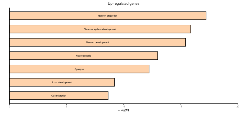
# Pax6 up-regulated
pax6_up_plot <- ggplot(pax6_up_go) +
  geom_col(aes(x = term.name,
               y = -log10(p.value)),
           fill = "peachpuff",
           color = "black",
           width=0.6,
           position = position_dodge(width=0.4)) +
  coord_flip() +
  scale_x_discrete(name = "") +
  scale_y_continuous(name = "-Log(P)",
                     limits = c(0, 20),
                     expand = c(0, 0)) +
  ggtitle("Up-regulated genes") +
  personal_theme() +
  theme(panel.border = element_blank(),
        axis.line = element_line(color = 'black',
                                 size = 0.5),
        axis.text.y = element_blank(),
        axis.ticks.y = element_blank(),
        axis.title.x = element_text(size = 8,
                                    face = "italic"),
        axis.text.x = element_text(size = 6),
        plot.title = element_text(size = 9,
                                  vjust = -3)) +
  geom_text(aes(x = term.name,
                y = -log10(p.value)/2,
                label = str_to_sentence(term.name)),
            size = 6 / .pt) +
  theme(plot.margin = unit(c(0.3, 0.1, 0, -0.3), "cm"))
Adapt for the other three plots
-
Adapt the code from the Pax6 up-regulated genes to create the three other plots.
-
If we want the labels to fit the plot for the down-regulated plots, we need to adjust them a bit by adding in the following code:
# Create labels for down Pax6 pax_down_labels <- str_to_sentence(pax6_down_go$term.name) pax_down_labels[c(5,7)] <- c("Neg reg of neurogenesis", "Metabolic reg ") # Change the geom_text() to incorporate new labels geom_text(aes(x = term.name, y = -log10(p.value)/2, label = pax_down_labels), size = 6 / .pt) # Create labels for down Tbr2 tbr2_down_labels <- str_to_sentence(tbr2_down_go$term.name) tbr2_down_labels[7] <- "Metabolic reg " # Change the geom_text() to incorporate new labels geom_text(aes(x = term.name, y = -log10(p.value)/2, label = tbr2_down_labels), size = 6 / .pt) -
For the ‘down-regulated’ plots, we need an axis on the right side of the plot and the bottom axis to be reversed - remember that we flipped the axis coordinates:
# Add axis to right side of plot (b/c of flipped coordinates, this is the x-axis)
scale_x_discrete(name = "",
             position = "top")

# Change the bottom axis to be in reverse ((b/c of flipped coordinates, this is the y-axis). Adjust the breaks as needed.
scale_y_reverse(name = "-Log(P)",
            expand = c(0, 0),
            breaks = c(0, 2, 4, 6, 8, 10))
-
Solution
# Pax6 down-regulated
pax6_down_plot <- ggplot(pax6_down_go) +
geom_col(aes(x = term.name,
y = -log10(p.value)),
fill = "peachpuff",
color = "black",
width=0.6,
position = position_dodge(width=0.4)) +
coord_flip() +
scale_x_discrete(name = "",
position = "top") +
scale_y_continuous(name = "-Log(P)",
limits = c(0, 10)) +
scale_y_reverse(name = "-Log(P)",
expand = c(0, 0),
breaks = c(0, 2, 4, 6, 8, 10)) +
ggtitle("Down-regulated genes") +
personal_theme() +
theme(panel.border = element_blank(),
axis.line.x = element_line(color = 'black', size = 0.5),
axis.line.y.right = element_line(colour = 'black', size = 0.5),
axis.text.y = element_blank(),
axis.text.x = element_text(size = 6),
axis.title.x = element_text(size = 8,
face = "italic"),
axis.ticks.y = element_blank(),
plot.title = element_text(size = 9,
vjust = -3)) +
geom_text(aes(x = term.name,
y = -log10(p.value)/2,
label = pax_down_labels),
size = 6 / .pt) +
theme(plot.margin = unit(c(0.3, -0.3, 0, 0), "cm"))
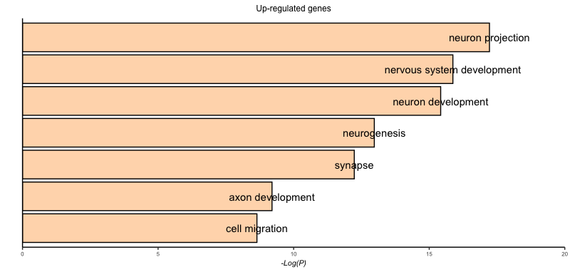
# Tbr2 up-regulated
tbr2_up_plot <- ggplot(tbr2_up_go) +
geom_col(aes(x = term.name,
y = -log10(p.value)),
fill = "darkseagreen",
color = "black",
width=0.6,
position = position_dodge(width=0.4)) +
coord_flip() +
scale_x_discrete(name = "") +
scale_y_continuous(name = "-Log(P)",
limits = c(0, 20),
expand = c(0, 0)) +
ggtitle("Up-regulated genes") +
personal_theme() +
theme(panel.border = element_blank(),
axis.line = element_line(color = 'black',
size = 0.5),
axis.text.y = element_blank(),
axis.ticks.y = element_blank(),
axis.title.x = element_text(size = 8,
face = "italic"),
axis.text.x = element_text(size = 6),
plot.title = element_text(size = 9,
vjust = -3)) +
geom_text(aes(x = term.name,
y = -log10(p.value)/2,
label = str_to_sentence(term.name)),
size = 6 / .pt) +
theme(plot.margin = unit(c(0.3, 0.1, 0, -0.3), "cm"))
# Tbr2 down-regulated
tbr2_down_plot <- ggplot(tbr2_down_go) +
geom_col(aes(x = term.name,
y = -log10(p.value)),
fill = "darkseagreen",
color = "black",
width=0.6,
position = position_dodge(width=0.4)) +
coord_flip() +
scale_x_discrete(name = "",
position = "top") +
scale_y_continuous(name = "-Log(P)",
limits = c(0, 10)) +
scale_y_reverse(name = "-Log(P)",
expand = c(0, 0),
breaks = c(0, 2, 4, 6, 8, 10, 12, 14, 16, 18, 20)) +
ggtitle("Down-regulated genes") +
personal_theme() +
theme(panel.border = element_blank(),
axis.line.x = element_line(color = 'black', size = 0.5),
axis.line.y.right = element_line(colour = 'black', size = 0.5),
axis.text.y = element_blank(),
axis.text.x = element_text(size = 6),
axis.title.x = element_text(size = 8,
face = "italic"),
axis.ticks.y = element_blank(),
plot.title = element_text(size = 9,
vjust = -3)) +
geom_text(aes(x = term.name,
y = -log10(p.value)/2,
label = tbr2_down_labels),
size = 6 / .pt) +
theme(plot.margin = unit(c(0.3, -0.3, 0, 0), "cm"))
- The last step is to use
cowplotto put the remaining annotations into the images and align them into a single row in the figure.
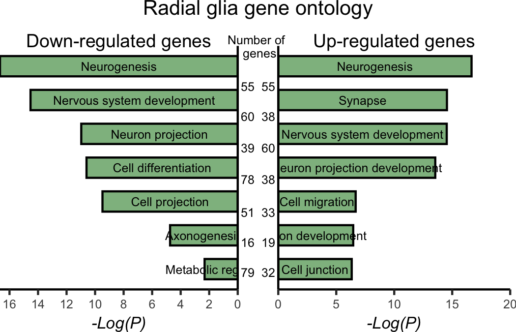
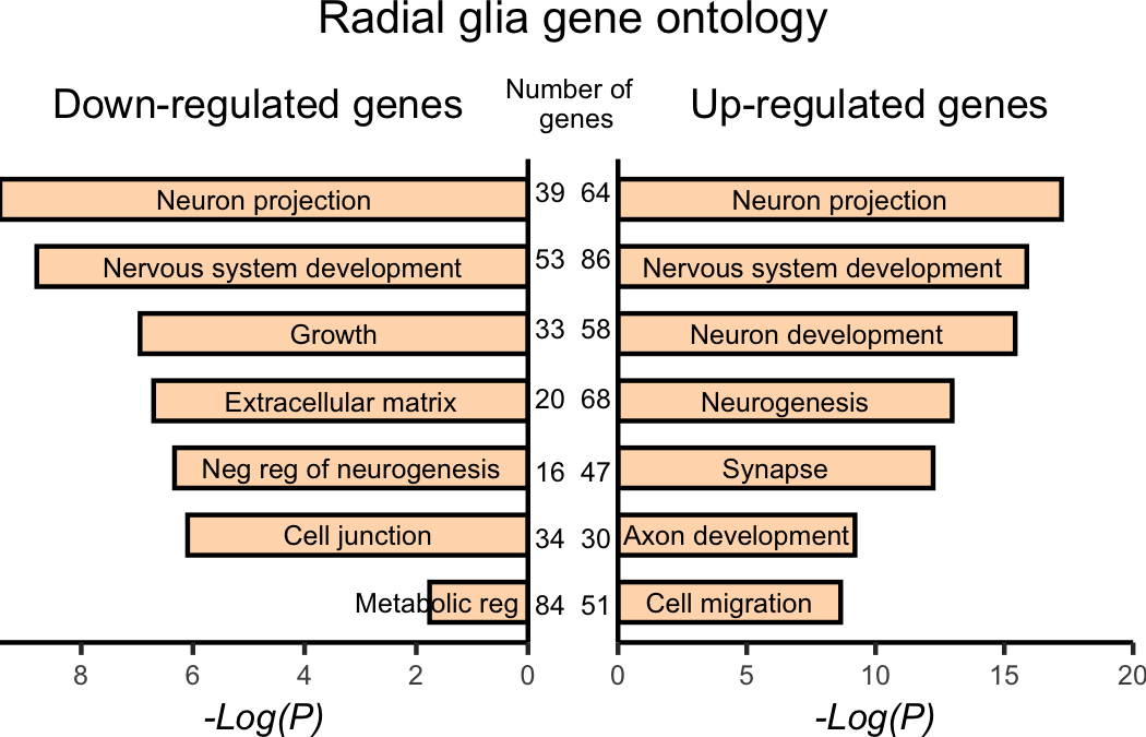
Solution Radial glia (Fig4I)
  # Pax 6 grid
  pax6 <- plot_grid(pax6_down_plot,
          pax6_up_plot)

  # Adding annotations
  annotated_pax6 <- pax6 +
    draw_label(label = "Number of \n genes",
               x = 0.5,
               y = 0.86,
               size = 6) +
    draw_label(label = "39",
               x = 0.48,
               y = 0.74,
               size = 6) +
    draw_label(label = "53",
               x = 0.48,
               y = 0.65,
               size = 6) +
    draw_label(label = "33",
               x = 0.48,
               y = 0.555,
               size = 6) +
    draw_label(label = "20",
               x = 0.48,
               y = 0.46,
               size = 6) +
    draw_label(label = "16",
               x = 0.48,
               y = 0.36,
               size = 6) +
    draw_label(label = "34",
               x = 0.48,
               y = 0.27,
               size = 6) +
    draw_label(label = "84",
               x = 0.48,
               y = 0.18,
               size = 6)  +
    draw_label(label = "64",
               x = 0.52,
               y = 0.74,
               size = 6) +
    draw_label(label = "86",
               x = 0.52,
               y = 0.65,
               size = 6) +
    draw_label(label = "58",
               x = 0.52,
               y = 0.555,
               size = 6) +
    draw_label(label = "68",
               x = 0.52,
               y = 0.46,
               size = 6) +
    draw_label(label = "47",
               x = 0.52,
               y = 0.36,
               size = 6) +
    draw_label(label = "30",
               x = 0.52,
               y = 0.27,
               size = 6) +
    draw_label(label = "51",
               x = 0.52,
               y = 0.18,
               size = 6)  +
    draw_label(label = "Radial glia gene ontology",
               x = 0.5,
               y = 1,
               hjust = 0.5,
               vjust = 1,
               size = 10)

  # Saving plot as figure
  ggsave(plot = annotated_pax6,
         device = "png",
         filename = "results/fig4I.png",
         width = 3.5,
         height = 2.25,
         units = "in",
         dpi = 300)
- Adapt the code for the Tbr2 up- and downregulated genes.
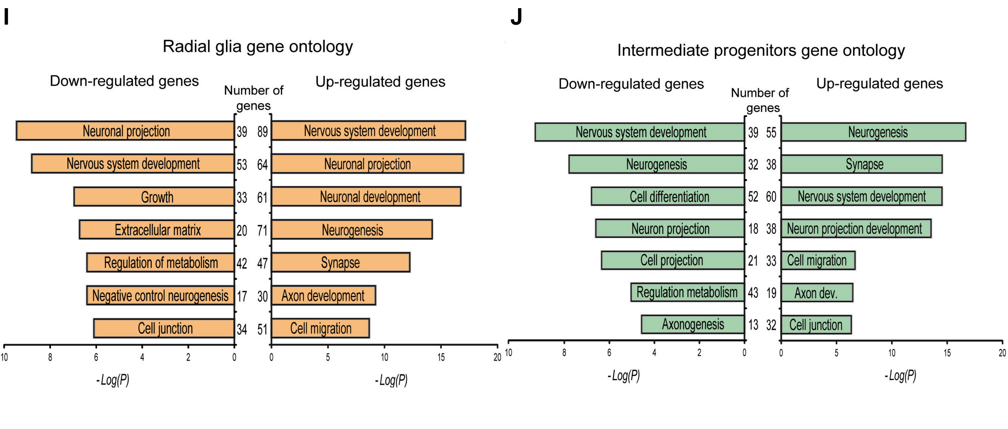
Solution Intermediate Progenitors (Fig4J)
  # Tbr2 grid
  tbr2 <- plot_grid(tbr2_down_plot,
          tbr2_up_plot)

  # Adding annotations
  annotated_tbr2 <- tbr2 +
    draw_label(label = "Number of \n genes",
               x = 0.5,
               y = 0.86,
               size = 6) +
    draw_label(label = "55",
               x = 0.48,
               y = 0.74,
               size = 6) +
    draw_label(label = "60",
               x = 0.48,
               y = 0.65,
               size = 6) +
    draw_label(label = "39",
               x = 0.48,
               y = 0.555,
               size = 6) +
    draw_label(label = "78",
               x = 0.48,
               y = 0.46,
               size = 6) +
    draw_label(label = "51",
               x = 0.48,
               y = 0.36,
               size = 6) +
    draw_label(label = "16",
               x = 0.48,
               y = 0.27,
               size = 6) +
    draw_label(label = "79",
               x = 0.48,
               y = 0.18,
               size = 6)  +
    draw_label(label = "55",
               x = 0.52,
               y = 0.74,
               size = 6) +
    draw_label(label = "38",
               x = 0.52,
               y = 0.65,
               size = 6) +
    draw_label(label = "60",
               x = 0.52,
               y = 0.555,
               size = 6) +
    draw_label(label = "38",
               x = 0.52,
               y = 0.46,
               size = 6) +
    draw_label(label = "33",
               x = 0.52,
               y = 0.36,
               size = 6) +
    draw_label(label = "19",
               x = 0.52,
               y = 0.27,
               size = 6) +
    draw_label(label = "32",
               x = 0.52,
               y = 0.18,
               size = 6)  +
    draw_label(label = "Radial glia gene ontology",
               x = 0.5,
               y = 1,
               hjust = 0.5,
               vjust = 1,
               size = 10)

  # Saving plot as figure
  ggsave(plot = annotated_tbr2,
         device = "png",
         filename = "results/fig4J.png",
         width = 3.5,
         height = 2.25,
         units = "in",
         dpi = 300)