Learning Objective
- Label values in a plot
- Add custom text to a figure
- Implement statistical comparisons wihtin a plot
Labeling all values
If you would like to label all values on the plot, this can easily be done by adding another layer to the ggplot with geom_text() or geom_label(). The ggplot2 book provides a nice resource for exploring the functionality of these geoms.
# Adding labels to all values with geom_text
ggplot(pax6_exp) +
  geom_point(aes(x=group,
                   y=normalized_counts,
                   color=group)) +
  geom_text(aes(x=group,
                y=normalized_counts,
                label=samples)) +
  ggtitle("Pax6") +
  personal_theme() +
  theme(axis.text.x = element_text(angle = 45,
                                   vjust = 1,
                                   hjust = 1)) +
  scale_x_discrete(name = "",
                   labels=c("Pax6:WT" = "Radial glia",
                            "neg:WT" = "Neurons",
                            "Tbr2:WT" = "Progenitors")) +
  scale_y_continuous(name = "Normalized counts")
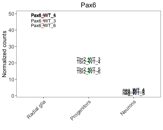
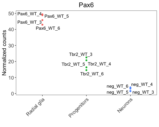
We notice that labels overlap with the data points, making it hard to visualize. To solve the issue, we could use the ggrepel, a ggplot2 extension package that is helpful to prevent the overlap of labels. It can be added as a layer, similar to geom_text.
library(ggrepel)

ggplot(pax6_exp) +
  geom_point(aes(x=group,
                   y=normalized_counts,
                   color=group)) +
  geom_text_repel(aes(x=group,
                y=normalized_counts,
                label=samples)) +
  ggtitle("Pax6") +
  personal_theme() +
  theme(axis.text.x = element_text(angle = 45,
                                   vjust = 1,
                                   hjust = 1)) +
  scale_x_discrete(name = "",
                   labels=c("Pax6:WT" = "Radial glia",
                            "neg:WT" = "Neurons",
                            "Tbr2:WT" = "Progenitors")) +
  scale_y_continuous(name = "Normalized counts") +
  scale_fill_viridis(discrete = TRUE,
                     option = "viridis",
                     begin = 0.2 )
Adding custom text
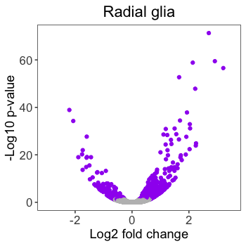
Let’s adding some custom text to our plot by finishing up the volcano plots we created previously. Here is the current volcano plot for Pax6.
# Create volcano plot
volcano_RG <- ggplot(results) +
  geom_point(aes(x = pax6_log2FoldChange,
                 y = -log10(pax6_padj),
                 color = pax6_threshold)) +
  personal_theme() +
  ggtitle("Radial glia") +
  scale_color_manual(values = c("grey", "purple")) +
  scale_x_continuous(name = "Log2 fold change",
                     limits = c(-3, 3.5)) +
  scale_y_continuous(name = "-Log10 p-value")

# Pax6 volcano plot
volcano_RG
Previously, we used cowplot to align plots and draw images. We can also use additional functionality from the cowplot package, draw_label() function, to add custom text to our figures. We will use the ggdraw() function to draw the ggplot2 image to the canvas, and then the draw_label() function to add the text on top.
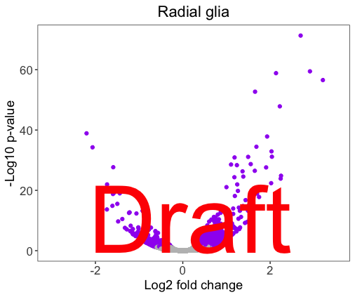
Let’s practice by adding ‘Draft’ on top of our volcano plot. We can customize the appearance of the text within the draw_label() function.
# Explore the arguments for draw_label
?draw_label
Exercise
Customize the ‘Draft’ text appearance, so that the figure looks like below. Hint: you will need the below arguments from draw_label(): color, size, angle.
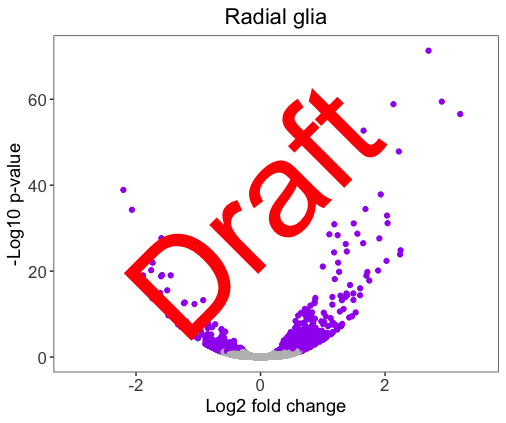
Solution
  # Practicing adding custom text to images
  ggdraw(volcano_RG) +
         draw_label("Draft",
                     color = "#FF0000",
                     size = 100,
                     angle = 45)
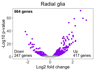
We could also specify the x- and y-coordinates for where we would like the labels to appear on the image. The coordinates span from 0 to 1, with (0,0) located at the lower left-hand corner. We would need some trial and error to put the label to the desired position.
Center the ‘Draft’ in the mid-bottom of the image. The x- and y-coordinates appropriate may be different, depending on the size of your plotting window.
# Use the x, y, hjust and vjust arguments to center the text
ggdraw(volcano_RG) +
  draw_label("Draft",
             color = "#FF0000",
             size = 100,
             angle = 0,
             x = 0.25,
             y = 0.15,
             hjust = 0,
             vjust = 0)
Now that we know how to add text to an image, let’s add the annotations to our volcano plot to match the published figure.
# Add annotations to the RG volcano plot

ggdraw(volcano_RG) +
  draw_label("664 genes",
             x = 0.15,
             y = 0.82,
             size = 12,
             hjust = 0,
             vjust = 0,
             fontface = "bold") +
  draw_label("Down \n247 genes",
             x = 0.15,
             y = 0.2,
             size = 12,
             hjust = 0,
             vjust = 0) +
  draw_label("Up \n417 genes",
             x = 0.77,
             y = 0.2,
             size = 12,
             hjust = 0,
             vjust = 0)
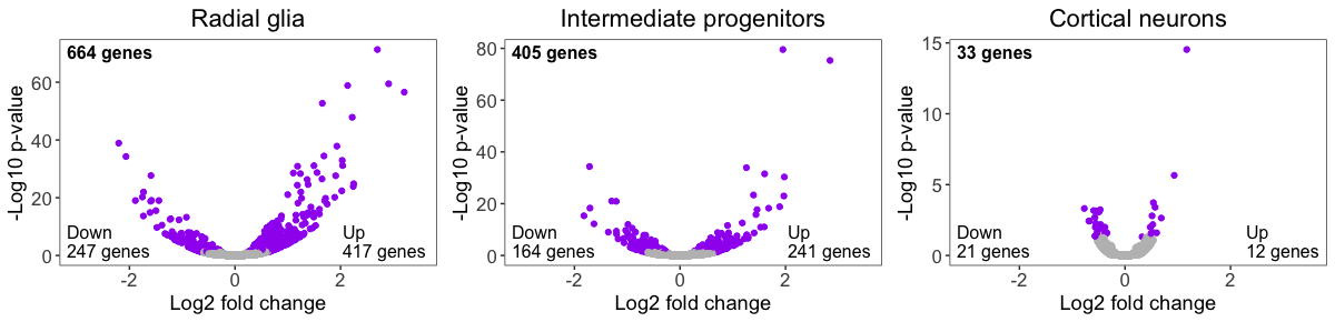
To compile the whole figure, we first save each of the annotated volcano plots to variables.
# Create annotations for all desired volcano plots, and save them to variables

## 1st plot
volcano_panel1 <- ggdraw(volcano_RG) +
  draw_label("664 genes",
             x = 0.15,
             y = 0.82,
             size = 12,
             hjust = 0,
             vjust = 0,
             fontface = "bold") +
  draw_label("Down \n247 genes",
             x = 0.15,
             y = 0.2,
             size = 12,
             hjust = 0,
             vjust = 0) +
  draw_label("Up \n417 genes",
             x = 0.77,
             y = 0.2,
             size = 12,
             hjust = 0,
             vjust = 0)

# Create IP volcano plot
volcano_IP <- ggplot(results) +
  geom_point(aes(x = tbr2_log2FoldChange,
                 y = -log10(tbr2_padj),
                 color = tbr2_threshold)) +
  personal_theme() +
  ggtitle("Intermediate Progenitors") +
  scale_color_manual(values = c("grey", "purple")) +
  scale_x_continuous(name = "Log2 fold change",
                     limits = c(-3, 3.5)) +
  scale_y_continuous(name = "-Log10 p-value")

## 2nd plot
volcano_panel2 <- ggdraw(volcano_IP) +
  draw_label("405 genes",
             x = 0.15,
             y = 0.82,
             size = 12,
             hjust = 0,
             vjust = 0,
             fontface = "bold") +
  draw_label("Down \n164 genes",
             x = 0.15,
             y = 0.2,
             size = 12,
             hjust = 0,
             vjust = 0) +
  draw_label("Up \n241 genes",
             x = 0.77,
             y = 0.2,
             size = 12,
             hjust = 0,
             vjust = 0)

# Create neurons volcano plot
volcano_neu <- ggplot(results) +
  geom_point(aes(x = neg_log2FoldChange,
                 y = -log10(neg_padj),
                 color = neg_threshold)) +
  personal_theme() +
  ggtitle("Cortical neurons") +
  scale_color_manual(values = c("grey", "purple")) +
  scale_x_continuous(name = "Log2 fold change",
                     limits = c(-1.5, 1.5)) +
  scale_y_continuous(name = "-Log10 p-value")

## 3rd plot
volcano_panel3 <- ggdraw(volcano_neu) +
  draw_label("33 genes",
             x = 0.15,
             y = 0.82,
             size = 12,
             hjust = 0,
             vjust = 0,
             fontface = "bold") +
  draw_label("Down \n21 genes",
             x = 0.15,
             y = 0.2,
             size = 12,
             hjust = 0,
             vjust = 0) +
  draw_label("Up \n12 genes",
             x = 0.8,
             y = 0.2,
             size = 12,
             hjust = 0,
             vjust = 0)
We then align these variables using plot_grid() from the cowplot package, and save the image.
# Align volcano plots
volcano_grid <- plot_grid(volcano_panel1,
                          volcano_panel2,
                          volcano_panel3,
                          ncol = 3)

# Save as image
ggsave(plot = volcano_grid,
       filename = "results/fig4G.png",
       width = 14,
       height = 3,
       dpi = 500)
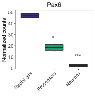
Adding statistical comparisons
We could add statistical comparisons similar to annotating custom text as above. Let’s take our Pax6 boxplot (boxplot_pax6) as an example. We could add statistical annotations by using the ggdraw() and draw_label() functions:
# Drawing significance on plots
ggdraw(boxplot_pax6) +
  draw_label("***",
             x = 0.82,
             y = 0.44) +
  draw_label("*",
             x = 0.58,
             y = 0.62)
The above code achieves our goal, but it requires some trial and error with x- and y-coordinates. Alternatively, the ggpubr package allows a quicker and easier method to add statistical annotations to a plot. The ggpubr package extends ggplot2’s functionality and provides statistical comparisons between groups and customizable annotations.
Let’s explore how we could use ggpubr, stat_pvalue_manual() function specifically, to add pre-computed statistical annotations to our boxplot. The stat_pvalue_manual() function can be added to a ggplot2 figure as a layer. This function requires the x and y arguments of the aesthetics (aes()) to be specified in the ggplot() layer, which applies to all mappings (including stat_pvalue_manual()) in the plot. However, we cannot include fill argument in the ggplot() layer (otherwise it will raise error message). So we will leave the fill argument within the geom_boxplot layer.
First, let’s create the ‘stat.test’ to add to the figure. The table requires the columns group1, group2, and p.adj at the minimum. We will also include p.adj.signif for later use. This resource has additional information about other columns that can be added.
# Create ggpubr stat table
stat.test <- tibble::tribble(
  ~group1, ~group2,   ~p.adj, ~p.adj.signif,
  "Pax6:WT",     "Tbr2:WT", 0.003, "**",
  "Pax6:WT",     "neg:WT", 0.0007, "**",
  "Tbr2:WT",     "neg:WT", 0.01, "*")
Now we can add the statistical annotations to the plot by adding the stat_pvalue_manual() function as a layer and specifying the stats table as the input. We also need to denote the name of the column to use as the source of annotations.
# Load library for ggpubr
library(ggpubr)

# Add stats to plot
ggplot(pax6_exp,
       aes(x=group,
           y=normalized_counts)) +
  geom_boxplot(aes(fill=group)) +
  ggtitle("Pax6") +
  personal_theme() +
  theme(axis.text.x = element_text(angle = 45,
                                   vjust = 1,
                                   hjust = 1)) +
  scale_x_discrete(name = "",
                   labels=c("Pax6:WT" = "Radial glia",
                            "neg:WT" = "Neurons",
                            "Tbr2:WT" = "Progenitors")) +
  scale_y_continuous(name = "Normalized counts") +
  scale_fill_viridis(discrete = TRUE,
                     option = "viridis",
                     begin = 0.2 ) +
  stat_pvalue_manual(
    stat.test,
    label = "p.adj",
    y.position = 55,
    step.increase = 0.15)
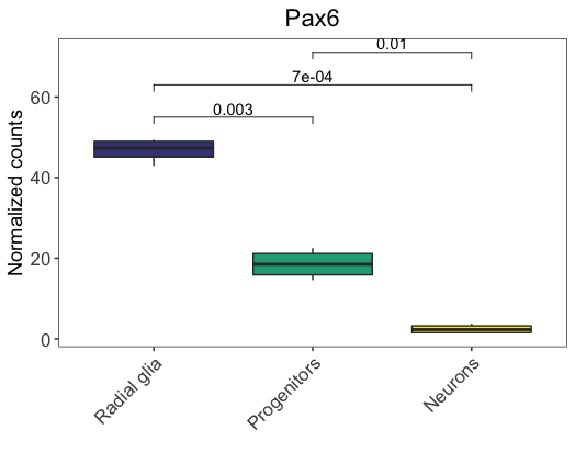
Note: In the above figure, we use the
y.positionargument to specify the absolute position of the first label, and then thestep.increaseargument to indicate the increase of height for every additional comparisons (to avoid annotation overlap). Alternatively, we could just specify the absolute positions of each label using a numeric vector. For example, check what you get if specifyingy.position = c(60, 30, 70)(nostep.increaseargument is needed).
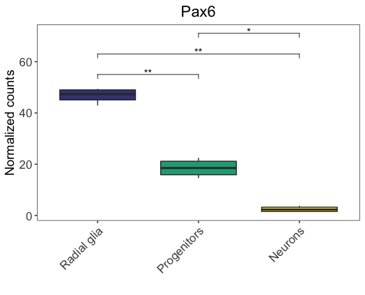
In the above figure, we annotated the absolute p-values. Alternatively, we could annotate the significance level, using the p.adj.signif column. We just need to specify the label argument as p.adj.signif, and keep everything else the same.
# Add significance level to plot
ggplot(pax6_exp,
       aes(x=group,
           y=normalized_counts)) +
  geom_boxplot(aes(fill=group)) +
  ggtitle("Pax6") +
  personal_theme() +
  theme(axis.text.x = element_text(angle = 45,
                                   vjust = 1,
                                   hjust = 1)) +
  scale_x_discrete(name = "",
                   labels=c("Pax6:WT" = "Radial glia",
                            "neg:WT" = "Neurons",
                            "Tbr2:WT" = "Progenitors")) +
  scale_y_continuous(name = "Normalized counts") +
  scale_fill_viridis(discrete = TRUE,
                     option = "viridis",
                     begin = 0.2 ) +
  stat_pvalue_manual(
    stat.test,
    label = "p.adj.signif",
    y.position = 55,
    step.increase = 0.15)
Note:
ggpubrhas many more functionalities than what we covered here. If you are interested in learning more, please check this tutorial, as well as the package webpage.