Learning Objectives
- Customize the scales and labels for a plot
- Implement accessible color schemes using
RColorBrewerandViridispackages
Customizing plots using scales and colors
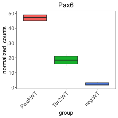
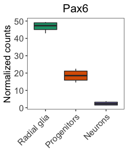
Thus far, when plotting with ggplot2, we have observed default values incorporated in the aesthetic mappings. For example, by default in our boxplot, the column values in our data frame become the x- and y-axis labels and the colors assigned default to a standard set used by ggplot2.
# Our current plot
ggplot(pax6_exp) +
  geom_boxplot(aes(x=group,
                   y=normalized_counts,
                   fill=group)) +
  ggtitle("Pax6") +
  personal_theme() +
  theme(axis.text.x = element_text(angle = 45,
                                   vjust = 1,
                                   hjust = 1))
While the defaults tend to look okay, we often desire to customize these values. To customize the aesthetic mappings (specifications made within the aes() function), we can use scales, which are available for every mapping and data type.
Scales
In ggplot2, scales control the content that is displayed on the plot, including how the data points look (size, shape, transparency, color, fill, etc), as well as, the values of the axes and legends. The ggplot2 book devotes an entire section to scales and understanding them will help make the ggplot2 syntax more intuitive.
Position and axes
The first set of scales we will discuss correspond to plot position and axes. The x- and y-axis scales allow us to alter the axis titles, limits, breaks (at which values the ticks are labeled), and tick mark labels. The most common scales are for discrete and continuous data:
scale_x_continuous(): for continuous x-axis valuesscale_y_continuous(): for continuous y-axis valuesscale_x_discrete(): for categorical or qualitative x-axis valuesscale_y_discrete(): for categorical or qualitative y-axis values
There are also scales for common transformations and modifications often used when visualizing data, including the following x-axis scales (also available for the y-axis):
scale_x_log10()scale_x_reverse()scale_x_sqrt()scale_x_binned()
Using these position or axis scales, we can customize the axis titles (name), axis limits (limits), axis breaks (breaks), and tick labels (labels). Using these scale_ functions, we can alter the values of the axes and ticks; however, it is worth noting that the look and style (e.g. size, thickness, font, text style, angle, justification, etc.) of the axes and labels are still altered within the theme() function.
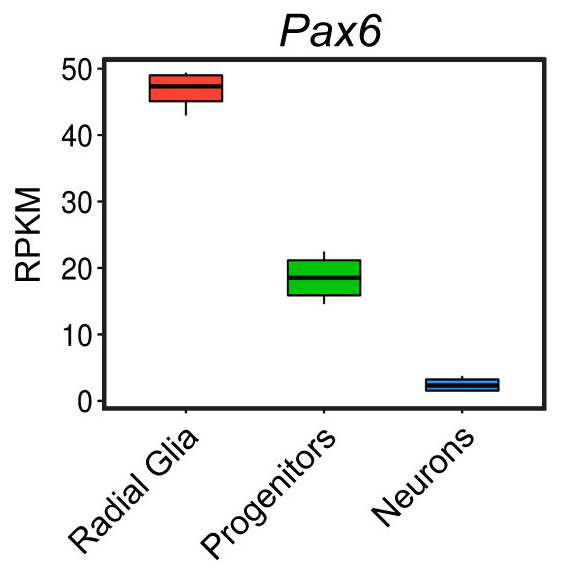
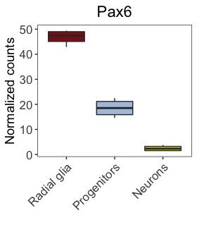
Let’s change the names of the x-axis labels to match the figure in the paper shown below.
Let’s add a layer to our ggplot code to remove the x-axis title and rename the x-axis tick labels. What scale_ function do you think we should use?
# Check the scale_ function arguments using the ?
?scale_<tab>
When providing tick labels, we can either provide a vector of names, which are applied based on factor levels, or we can provide the names using the format shown below (e.g. “current label” = “new label”) to ensure proper labeling.
# Boxplot with renamed x-axis values
ggplot(pax6_exp) +
  geom_boxplot(aes(x=group,
                   y=normalized_counts,
                   fill=group)) +
  ggtitle("Pax6") +
  personal_theme() +
  theme(axis.text.x = element_text(angle = 45,
                                   vjust = 1,
                                   hjust = 1)) +
  scale_x_discrete(name = "",
                   labels=c("Pax6:WT" = "Radial Glia",
                            "neg:WT" = "Neurons",
                            "Tbr2:WT" = "Progenitors"))
Now, let’s also rename the y-axis title to be “Normalized counts” as in the publication. What scale_ function do you think we should use?
Our plot should now resemble closely the published figure. The only differences are some of the text on the image that we will learn about in later lessons.
NOTE: There are several ‘helper’ functions to make editing the axis labels and limits a bit easier, including
xlab(),ylab(),xlim(), andylim().
Let’s explore the other graphical elements using the position scales.
- Change the limits of the y-axis to range from 0 to 100 and have breaks (where the ticks are labeled) to be every 20 instead of every 10.
- Use a log10 scale for the y-axis using a
scale_function.
Differential mapping scales
Aside from the axis data, the other data included in our aesthetic mappings (within the aes() function) correspond to variables from which we want to observe differences using visible output, such as color, fill, shape, size, line type, transparency, etc. Each of these mappings has an associated scale in which you can customize the output.
For example, when we run the code below, additional layers are added under the hood.
# Example plot code
ggplot(pax6_exp) +
  geom_boxplot(aes(x=group,
                   y=normalized_counts,
                   fill=group))
The additional layers in the code below were automatically added to our code to create the plot:
# Example plot code showing all scales run under the hood
ggplot(pax6_exp) +
  geom_boxplot(aes(x = group,
                   y = normalized_counts,
                   fill = group)) +
  scale_x_discrete() +
  scale_y_continuous() +
  scale_fill_discrete()
All defaults for these additional layers were used, so we do not notice that they are added. However, it is important to know that for every argument in our aes() function, a corresponding scale is created and run along with our input code.
For example, if we wanted to alter the linetype based on group, we could add another layer using the linetype argument. We know that a scale_linetype_discrete() layer is added when we run the code below.
# Adding an aes() for linetype
ggplot(pax6_exp) +
  geom_boxplot(aes(x = group,
                   y = normalized_counts,
                   fill = group,
		   linetype = group))
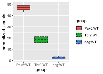
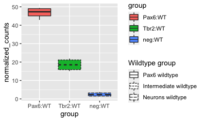
Since the fill and linetype arguments are mapped to the same variable, group, by default, the legends for these two mappings are combined into a single legend called ‘group’. If we alter the name or labels of the fill or linetype scales, we will see the legend split. Let’s test it out by customizing the scale_linetype_discrete() layer.
# Adjusting scale for linetype
ggplot(pax6_exp) +
  geom_boxplot(aes(x = group,
                   y = normalized_counts,
                   fill = group,
                   linetype = group)) +
  scale_linetype_discrete(name = "Wildtype group",
                          labels = c("Pax6 wildtype", "Intermediate wildtype", "Neurons wildtype"))
Using these scale_ layers with our differential aesthetics allow us to easily change the titles, text, and display within the legends. For additional customization of the style or position of the legends, we can use the theme() function. In addition, ggplot2 offers an additional quick way to alter the appearance of legends by using the helper function, guides(). We aren’t going to go into depth into this function, but more details can be found here.
Color scales
While the default colors may be fine for many applications, they are often not sufficient to highlight the relationships of interest or are not optimal for the intended audience/publication.
For our boxplot, the default colors look great; however, they are not optimal for color-blind viewers. Since we are preparing for publication, we would like our figures to be interpretable for all readers. To determine palatable palettes, we should consider features of the colors that affect human perception, specifically:
- Hue: type of color (e.g. pink, red, blue)
- Chroma: colorfulness ranging from gray (no color) to full color
- Luminance: brightness
There are cheatsheets available for specifying the base R colors by name or hexadecimal code, and there are these websites here and here for picking colors or palettes of interest and returning the hexadecimal code(s). To apply any of these colors to our plot, we can individually specify the colors by providing them within a scale_ layer.
To alter the colors in our plot that map to our data, we use the color or fill options within the aes() function. We used the fill argument to color our boxplot by group. To change the color of our fill, we can add a fill scale layer, and most often one of the following two scales will work:
scale_fill_manual(): for categorical data or quantilesscale_fill_gradient()family: for continuous data.
For our categorical group data, we will add the scale_fill_manual() layer, specifying the desired color values. Pick whichever colors you like.
# Visualize the Pax6 boxplot with custom colors
ggplot(pax6_exp) +
  geom_boxplot(aes(x=group,
                   y=normalized_counts,
                   fill=group)) +
  ggtitle("Pax6") +
  personal_theme() +
  theme(axis.text.x = element_text(angle = 45,
                                   vjust = 1,
                                   hjust = 1)) +
  scale_x_discrete(name = "",
                   labels=c("Pax6:WT" = "Radial glia",
                            "neg:WT" = "Neurons",
                            "Tbr2:WT" = "Progenitors")) +
  scale_y_continuous(name = "Normalized counts") +
  scale_fill_manual(values = c("firebrick4", "lightsteelblue", "yellow2"))
We can also use pre-created color palettes from external R packages. This R Graph Gallery site has a nice interactive app for exploring how to find and incorporate desired colors into your plots.
Since the goal of this workshop is ‘publication quality’ plots, we should be aware of the significant portion of our population who are color-blind. To encourage the use of color-blind friendly selections, we will focus our attention on these palettes. We will identify those palettes from the packages RColorBrewer and viridis.
RColorBrewer palettes
We will start by exploring the RColorBrewer library, which contains color palettes designed specifically for the different types of data being compared, with palettes specifically highlighting sequential, qualitative, and diverging data.
# Load the RColorBrewer library
library(RColorBrewer)
The available palettes can be viewed using the display.brewer.all() function:
# Check the available color palettes
display.brewer.all()
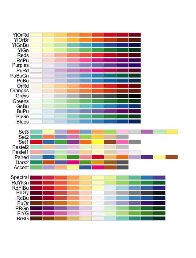
The palettes are separated into three sections based on the type of data:
- Sequential palettes (top): For sequential data, with lighter colors for low values and darker colors for high values.
- Qualitative palettes (middle): For categorical data, where the color does not denote differences in magnitude or value.
- Diverging palettes (bottom): For data with emphasis on mid-range values and extremes.
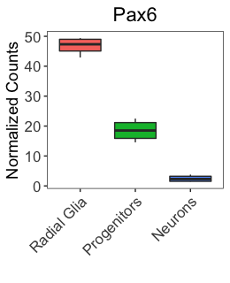
Let’s explore changing the colors of our boxplot (shown below), created earlier using default colors.
The boxplot is colored by group, which is a categorical variable. Therefore, we will choose a Qualitative palette to assign contrasting colors to the groups. We can choose how many colors from the palette to include, which for our data will be three colors (one for each group). Let’s choose the Set1 palette and see how we like it. We can view the colors included in a palette by using the display.brewer.pal() function:
# Viewing the Set1 palette with three colors
display.brewer.pal(3, "Set1")
These colors do a nice job of differentiating between groups; however, they are not color-blind friendly. There is an argument within the display.brewer.all() function called colorblindFriendly. We can set this to TRUE to return the color-blind friendly palettes, and choose from there.
# Finding color-blind friendly palettes
display.brewer.all(colorblindFriendly = TRUE)
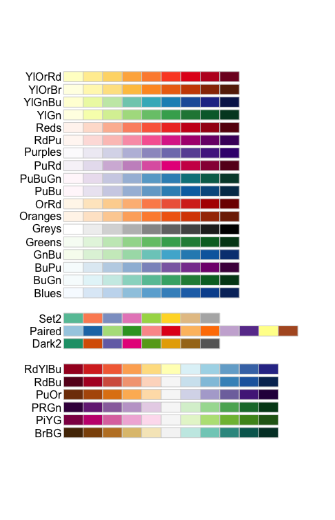
We have a much more limited set of Qualitative palettes to choose from for our categorical data, and we no longer see the ‘Set1’ as an option to choose. Let’s choose the ‘Dark2’ color-blind friendly palette.
# Viewing a color-blind friendly palette with three colors
display.brewer.pal(3, "Dark2")
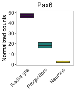
To use this palette in our plots, we need to define it with brewer.pal() and we’ll save it to a variable called mypalette.
# Define a palette
mypalette <- brewer.pal(3, "Dark2")

# how are the colors represented in the mypalette vector?
mypalette
Those colors look okay, so let’s test them in our plot.
# Visualize the Pax6 boxplot with RColorBrewer palette
ggplot(pax6_exp) +
  geom_boxplot(aes(x=group,
                   y=normalized_counts,
                   fill=group)) +
  ggtitle("Pax6") +
  personal_theme() +
  theme(axis.text.x = element_text(angle = 45,
                                   vjust = 1,
                                   hjust = 1)) +
  scale_x_discrete(name = "",
                   labels=c("Pax6:WT" = "Radial glia",
                            "neg:WT" = "Neurons",
                            "Tbr2:WT" = "Progenitors")) +
  scale_y_continuous(name = "Normalized counts") +
  scale_fill_manual(values = mypalette)
These colors look nice and are color-blind friendly, so would be great for publication and presentations; however, often readers will print out our articles in black and white. The chosen palette is unlikely to show much difference in color for black-and-white publication.
NOTE: When we created our plot, we used the
fillargument within theaes()function; therefore, to change the colors of these groups, we need to use thescale_fill_manual(). If we had used thecolorargument within theaes()function, we would use thescale_color_manual().Let’s see how it would change our plot if we had used the
colorargument instead:# Visualize the Pax6 boxplot ggplot(pax6_exp) + geom_boxplot(aes(x=group, y=normalized_counts, color=group)) + theme_bw() + ylab('Normalized counts') + xlab('') + ggtitle("Pax6") + personal_theme() + scale_x_discrete(labels=c("Pax6:WT" = "Radial glia", "neg:WT" = "Neurons", "Tbr2:WT" = "Progenitors")) + theme(axis.text.x = element_text(angle = 45, vjust = 1, hjust = 1)) + scale_color_manual(values = mypalette)
Exercise
Color the boxplot by choosing 3 colors from a RColorBrewer palette of your choice.
Viridis palettes
The viridis R package contain palettes that represent good choices for color-blind friendly palettes and printing in gray scale. The developers provide additional information about each of the eight color palettes available, including how it is visualized with different types of color-blindness and in gray scale.
Usage of the viridis palettes is straight-forward, and the package provides ggplot2 scale functions to easily switch to these palettes. Let’s use the default color palette, viridis.
# Load the viridis library
library(viridis)

# Visualize the Pax6 boxplot with the viridis palette
ggplot(pax6_exp) +
  geom_boxplot(aes(x=group,
                   y=normalized_counts,
                   fill=group)) +
  ggtitle("Pax6") +
  personal_theme() +
  theme(axis.text.x = element_text(angle = 45,
                                   vjust = 1,
                                   hjust = 1)) +
  scale_x_discrete(name = "",
                   labels=c("Pax6:WT" = "Radial glia",
                            "neg:WT" = "Neurons",
                            "Tbr2:WT" = "Progenitors")) +
  scale_y_continuous(name = "Normalized counts") +
  scale_fill_viridis()
Did that work? The viridis scale function has different options available than ggplot2’s scale functions. Let’s check them out:
# Check out arguments for the viridis color scale
?scale_fill_viridis
We find quite a few useful options, including the argument discrete. By default, viridis assumes the data is continuous, so for discrete or categorical data, we need to specify discrete = TRUE. Other arguments that might be helpful include the option argument where you can specify the palette and the beginning and end arguments, which can narrow the range of colors from any of the palettes. Let’s try again, only this time with the discrete = TRUE option.
# Visualize the Pax6 boxplot with the viridis palette specifying discrete data
ggplot(pax6_exp) +
  geom_boxplot(aes(x=group,
                   y=normalized_counts,
                   fill=group)) +
  ggtitle("Pax6") +
  personal_theme() +
  theme(axis.text.x = element_text(angle = 45,
                                   vjust = 1,
                                   hjust = 1)) +
  scale_x_discrete(name = "",
                   labels=c("Pax6:WT" = "Radial glia",
                            "neg:WT" = "Neurons",
                            "Tbr2:WT" = "Progenitors")) +
  scale_y_continuous(name = "Normalized counts") +
  scale_fill_viridis(discrete = TRUE)
Overall, the plot looks nice, and it is color-blind friendly and distinguishable on a gray scale. We could specify the palette manually using the hexadecimal code. The hexadecimal codes for each color can be identified using the viridis_pal() and show_col() functions from the scales package.
# Load scales library
library(scales)

# Get hexadecimal codes for viridis palette
show_col(viridis_pal(option = "viridis")(30))
Exercises
- Adjust the
scale_fill_viridis()function to make begin the palette at a bit lighter color. - Try out another
viridispalette of your choice.
To improve upon the published figure for our color-blind and black-and-white printing colleagues, let’s use the following adjusted viridis palette for our figures:
# Visualize the Pax6 boxplot with viridis palettes
ggplot(pax6_exp) +
  geom_boxplot(aes(x=group,
                   y=normalized_counts,
                   fill=group)) +
  ggtitle("Pax6") +
  personal_theme() +
  theme(axis.text.x = element_text(angle = 45,
                                   vjust = 1,
                                   hjust = 1)) +
  scale_x_discrete(name = "",
                   labels=c("Pax6:WT" = "Radial glia",
                            "neg:WT" = "Neurons",
                            "Tbr2:WT" = "Progenitors")) +
  scale_y_continuous(name = "Normalized counts") +
  scale_fill_viridis(discrete = TRUE,
                     option = "viridis",
                     begin = 0.2 )
NOTE: For continuous data, the
scale_color_gradient()andscale_fill_gradient()family of functions are used, which create two color gradients from low to high. Thescale_color_gradient2()creates a diverging color gradient with a midpoint color, whilescale_color_gradientn()creates an n-color gradient. You can specify your palette of colors similar to the discrete color scales (e.g.scale_fill_gradient2(colors = mypalette)).
We have limited our exploration of palettes to a couple of the most popular packages, but there are many others that are worth exploring, including colorspace. Extensive documentation is also available regarding color specifications in ggplot2, and we have listed some favorite resources below:
This lesson has been developed by members of the teaching team at the Harvard Chan Bioinformatics Core (HBC). These are open access materials distributed under the terms of the Creative Commons Attribution license (CC BY 4.0), which permits unrestricted use, distribution, and reproduction in any medium, provided the original author and source are credited.