Approximate time: 60 minutes
Learning Objective
- Create a custom boxplot using
ggplot2
Application of plotting basics
We are going to use what we learned about ggplot2 syntax and consistent themes to create the following boxplots from the paper:
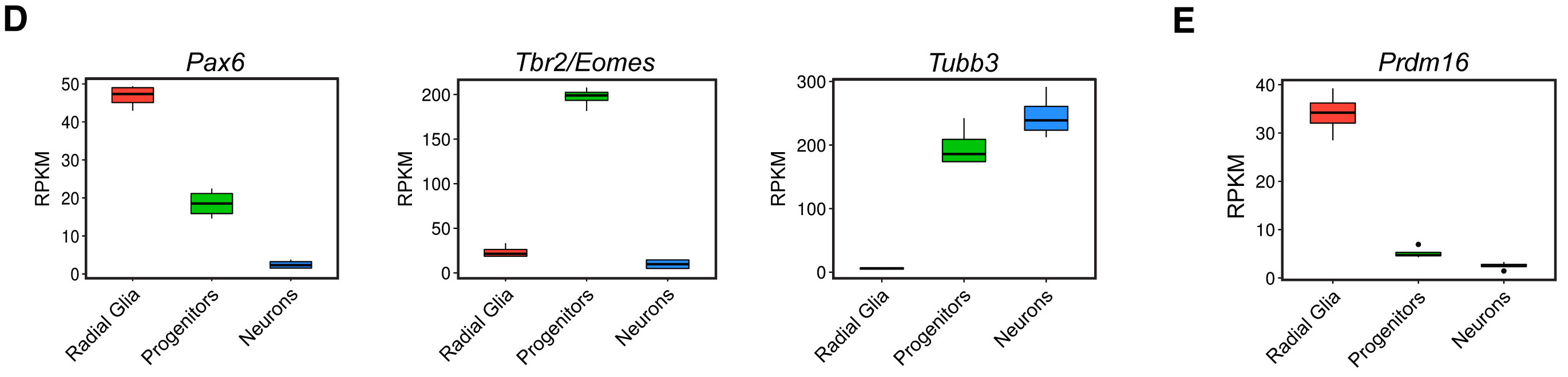
We want to look at the distribution in the normalized counts (y-axis) between our replicates for each cell type (radial glia (Pax6), intermediate progenitors (Tbr2/Eomes), and the cortical neurons (neg)) for only the wild type (WT) groups.
A boxplot provides a graphical view of the distribution of data based on a five number summary:
- The top and bottom of the box represent the (1) first and (2) third quartiles (25th and 75th percentiles, respectively).
- The line inside the box represents the (3) median (50th percentile).
- The whiskers extending above and below the box represent the (4) maximum, and (5) minimum of a data set.
- The whiskers of the plot reach the minimum and maximum values that are not outliers.
In this case, outliers are determined using the interquartile range (IQR), which is defined as: Q3 - Q1. Any values that exceeds 1.5 x IQR below Q1 or above Q3 are considered outliers and are represented as points above or below the whiskers.
Set up
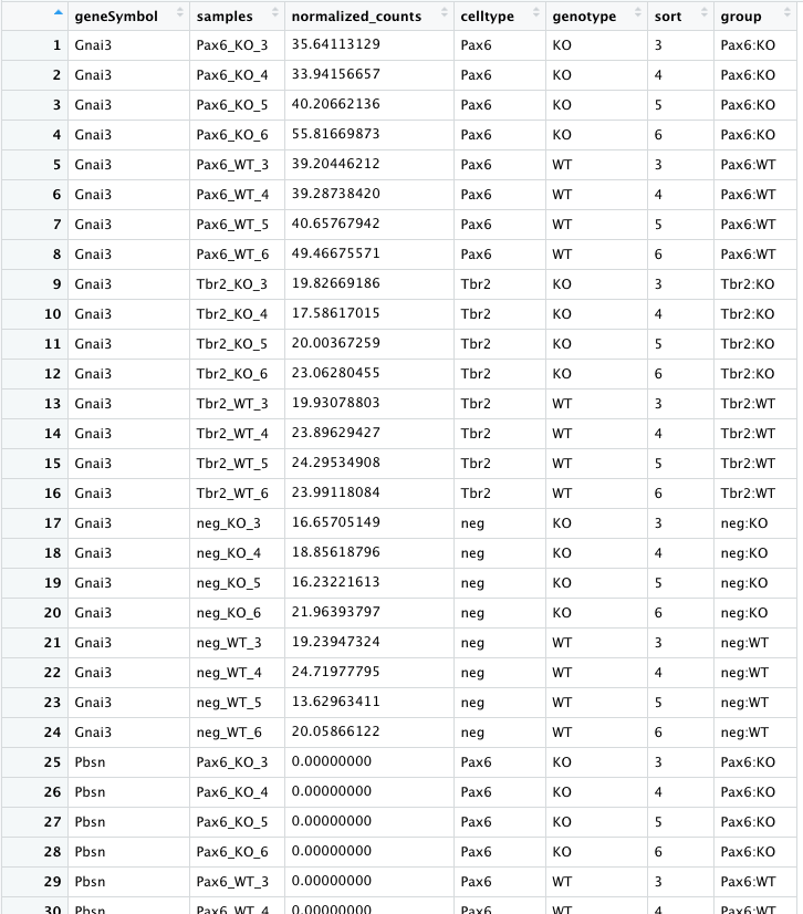
To create this visualization, we need our normalized_counts data. Let’s take a quick look at our normalized_counts.
# View normalized counts table
View(normalized_counts)
We see that each sample is a column in the data frame and every gene is a row. We want to compare the normalized counts between samples using the boxplot, but it is important to note that ggplot2 requires data assigned to x- or y-coordinates (or any other plotting variable) is stored as a single column in the data frame. Since the normalized counts values of each sample is stored in a different column, we need to ‘gather’ these columns together into a single column before we can plot them. To do this we can use a handy tidyr function called pivot_longer().
The syntax for pivot_longer() is:
# DO NOT RUN
# Syntax for `pivot_longer()` function
pivot_longer(input_data_frame,
             cols = columns_to_gather_together,
             names_to = "name_for_column_of_gathered_column_names",
             values_to = "name_for_column_of_gathered_values")
For our normalized_counts data frame, we want to gather all of the normalized counts into a single column (all columns except for geneSymbol. Therefore, our gathering of columns from a wide to long format is:
# Gather values to plot into a single column
expression_plot <- pivot_longer(normalized_counts,
                                cols = 2:25,
                                names_to = "samples",
                                values_to = "normalized_counts")
We can look at what pivot_longer did a bit more closely. Instead of each gene taking a single row and having 24 columns of expression data in it. Our pivot_longer command gave us 24 rows of expression data in a single column for each gene.
# Examine data frame
View(expression_plot)
Finally, we want to color our plot with information about the cell types/groups of our samples. Currently we have only the expression data (normalized counts). We need to merge the expression data with the metadata information for each of our samples. We can use a _join function from the Tidyverse. Both data frames have their unique sample IDs in a column called samples, so we will join the datasets using these columns.
# Join metadata for visualizing groups or features
expression_plot <- left_join(x = expression_plot,
                             y = meta,
                             by = "samples")

# Examine the contents of the expression_plot data frame
View(expression_plot)
Lastly, we need to filter expression_plot for the genes of interest: Pax6, Eomes, Tubb3 and Prdm16, to create separate plots for each gene. We will start to create the boxplot for the Pax6 gene in this lesson, then finish the Pax6 boxplot in subsequent lessons, followed with boxplots for the other genes.
### Extract normalized counts for specific genes to plot
pax6_exp <- expression_plot %>%
filter(geneSymbol == "Pax6" &
       genotype == "WT")

eomes_exp <- expression_plot %>%
filter(geneSymbol == "Eomes" &
       genotype == "WT")

tubb3_exp <- expression_plot %>%
filter(geneSymbol == "Tubb3" &
       genotype == "WT")

prdm16_exp <- expression_plot %>%
filter(geneSymbol == "Prdm16" &
       genotype == "WT")
Now we should be ready to create our Pax6 boxplot. Let’s make sure we have all information for normalized counts and sample groups (group) each in a single column before we proceed:
View(pax6_exp)
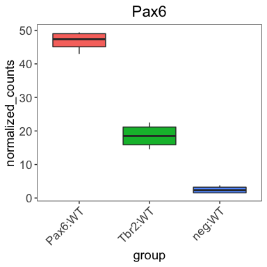
Looks good! Let’s make our boxplot!
Boxplot!
Create the Pax6 boxplot by following the instructions below:
- Create a boxplot using the
geom_boxplot()layer to plot the normalized counts of the different groups (neg:WT, Pax6:WT, Tbr2:WT). - Use the
fillaesthetic to look at differences between groups (neg:WT, Pax6:WT, Tbr2:WT). - Add a title matching the published figure.
-
Re-factor the x-axis variable ‘group’ to be in the same order as the paper using the following code:
### Re-factor the x-axis variable 'group' to be in the correct order pax6_exp$group <- factor(pax6_exp$group, levels = c("Pax6:WT", "Tbr2:WT", "neg:WT")) - Change the angle of the x-axis labels to match the figure below using a theme element: the
hjustandvjustarguments can also help your plot look more appealing. - Use your
personal_theme()function to keep your plots consistent.
After running the above code the boxplot should look something like the plot below.
Detailed code used to create the boxplot can be found in the answer key.
This lesson has been developed by members of the teaching team at the Harvard Chan Bioinformatics Core (HBC). These are open access materials distributed under the terms of the Creative Commons Attribution license (CC BY 4.0), which permits unrestricted use, distribution, and reproduction in any medium, provided the original author and source are credited.