Approximate time: 60 minutes
Learning Objectives
- Customize a plot’s attributes, such as colors, point size and axes labels using
ggplot2
Graphical syntax of ggplot2
In this lesson, we will be introducing the syntax for the popular package for visualization, ggplot2. The ggplot2 package approaches visualization using principles from the Grammar of Graphics, a pivotal book describing quantitative graphics. The developers of ggplot2 describe their approach to the Grammer of Graphics in a free, online book, which can be a helpful resource for understanding the theory and organization of the ggplot2 package.
We will focus the majority of the first half of this workshop on creating plots with ggplot2 due to it’s versatility, ease of customization, and adherence to visualization theory. Once you learn the ggplot2 syntax, you will have laid the foundation for creating a plethora of graphics.
Set up
Let’s load the library for tidyverse, which is a suite of packages that includes ggplot2 for visualization, as well as some useful packages for wrangling (dplyr), parsing (stringr) and tidying (tidyr) data, among others.
# Load the Tidyverse suite of packages
library(tidyverse)
NOTE: Don’t be alarmed by any conflict statements when loading this library, these statements are just informing you of packages that are currently loaded that have functions with the same name.
The ggplot2 syntax takes some getting used to, but once you become comfortable with it, you will find it’s extremely powerful and flexible. To start learning about ggplot2 syntax we are going to re-create the scatterplot from figure 4 of the Baizabal et al. (2018) paper. We will build the figure below using the layering approach employed by ggplot2. We will highlight the purpose and utility of each layer we add, while highlighting it’s flexibility and customization options.
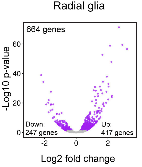
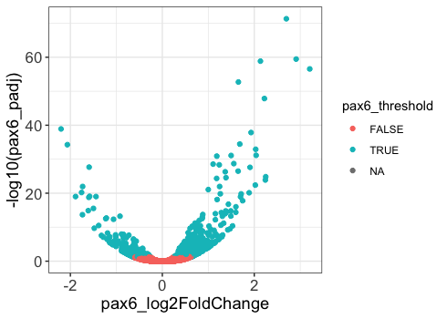
Please note that ggplot2 expects as input either a “data frame” or Tidyverse’s version of a data frame called a “tibble” (you can find out more about tibbles here). To create this figure we will need the data present in our results data frame. This plot examines the magnitude(log2 fold changes) on the x-axis and significance (p-adjusted values) on the y-axis of the differences in gene expression between the Prdm16 KO and WT samples for every gene in radial glia cells (Pax6+ cells). This plot is called a “volcano plot”, but it is essentially a simple X-Y scatterplot with each data point representing a gene. Let’s take a look at the results data frame and look for the columns we are interest in.
# Inspect the results data frame
View(results)
We see that each gene is a different row and each column corresponds to different statistics regarding the differences in gene expression between the KO and WT samples within the radial glia (pax6_ columns), intermediate progenitors (tbr2_ columns) and neurons (neg_ columns). For this plot, we are interested in the radial glia, which correspond to the pax6 columns. Specifically, we are interested in plotting the Pax6 log2 fold changes (pax6_log2FoldChanges) on the x-axis and the -log10 Pax6 p-adjusted values (pax6_padj) on the y-axis.
Creating a basic plot
The ggplot() function is used to initialize the basic graph structure, then we add to it. The basic idea is that you specify different parts of the plot using additional functions one after the other and combine them into a “code chunk” using the + operator; the functions in the resulting code chunk are called layers.
Let’s start:
# Initialize plot
ggplot(results) # what happens?
You get an blank plot, because you need to specify additional layers using the + operator. The ggplot function does not know what type of plot you want to draw or the columns in your data frame to compare visually. At the very least, we need to provide this information.
The geom (geometric) object is the layer that specifies what kind of plot we want to draw. A plot must have at least one geom; there is no upper limit. Examples include:
- points (
geom_point,geom_jitterfor scatter plots, dot plots, etc) - lines (
geom_line, for time series, trend lines, etc) - boxplot (
geom_boxplot, for, well, boxplots!) - many others
When attempting to select the appropriate visualization for your data, it can be helpful to use the Data to Viz website. It provides nice decision trees for visualization methods depending on your data along with examples and code for the examples. With two continuous numeric variables, we will choose to use geom_point(). Let’s add a “geom” layer to our plot using the + operator.
# Initializing plot
ggplot(results) +
  geom_point() # note what happens here
Why do we get an error? Is the error message easy to decipher?
We get an error because each type of geom usually has a required set of aesthetics to be set. “Aesthetics” are set with the aes() function and can be set either nested within geom_point() (applies only to that layer) or within ggplot() (applies to the whole plot).
The aes() function has many different arguments, and all of those arguments take columns from the original data frame as input. It can be used to specify many plot elements including the following:
- Position (i.e., on the x and y axes)
- Color (“outside” color) and Fill (“inside” color)
- Shape (of points)
- Line type
- Size (measured in millimeters (mm))
- Alpha (level of transparency)
To determine the aesthetics available to us with geom_point(), we can explore the ggplot2 reference documentation and scroll down to click on geom_point(). As you scroll down the documentation on geom_point() you will find the aesthetics available for this geom. The required aesthetics are bolded.
NOTE: Also, note the other information available on this reference page, including the code for the function with defaults, description of arguments, common plotting mistakes, and example code/plots.
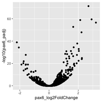
To start, we will specify x- and y-axis since geom_point() requires the most basic information about a scatterplot, i.e. what you want to plot on the x and y axes. All of the other plot elements mentioned above are optional.
# Adding geom layer with required aesthetics mapping to columns in data frame
ggplot(results) +
  geom_point(aes(x = pax6_log2FoldChange,
                 y = -log10(pax6_padj)))
Customizing the appearance of the data points on the plot
Now that we have the required aesthetics, let’s add some extras like color to the plot. We can color the points (representing genes) on the plot based on the whether the genes are significant using the pax6_threshold column and specifying it within the aes() function.
# Adding geom layer with additional aesthetics
ggplot(results) +
  geom_point(aes(x = pax6_log2FoldChange,
                 y = -log10(pax6_padj),
                 color = pax6_threshold))
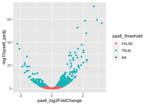
You will notice that there are a default set of colors that will be used so we do not have to specify. We will explore later how to change the colors, as well as, incorporate pre-designed color palettes. Also, note that the legend has been plotted for us.
NOTE: The legend has 3 values because the
pax6_thresholdcolumn is a logical vector with 3 valuesTRUE,FALSEandNA. TheNAvalues represent those genes that were filtered out of the dataset prior to performing the statistical analysis due to low counts or severe inconsistency among replicates.
If we wanted to modify the size of the data points we can use the size argument.
- If we add
sizeinsideaes()we could assign a numeric column to it and the size of the data points would change according to that column. - However, if we add
sizeoutsideaes()(but still insidegeom_point()) we can’t assign a column to it, instead we have to give it a numeric value. This use ofsizewill uniformly change the size of all the data points.
Note: This is true for several arguments, including
color,shape,alpha, etc. For example, we can change all shapes to square by adding this argument to be outside theaes()function; if we put the argument inside theaes()function we could change the shape according to a (categorical) variable in our data frame or tibble.
We have decided that we want to change the size of all the data points to a uniform size instead of mapping it to a numeric column in the input tibble. Add in the size argument by specifying a number for the size of the data point:
# Changing size to a constant (do not change with columns in data frame)
ggplot(results) +
  geom_point(aes(x = pax6_log2FoldChange,
                 y = -log10(pax6_padj),
                 color = pax6_threshold),
             size = 2.0)
Note: The size of the points is personal preference, and you may need to play around with the parameter to decide which size is best. That seems a bit too big, so we can return to our default size.
Let’s explore how to change the aesthetics of the data points. We can find the aesthetics associated with any geometric object using the Tidyverse ggplot2 reference and clicking on a the desired geometric object. To gain more detailed information about some of the aesthetics, there is a vignette, which provides rich information about the different colors, lines, and shapes that are available.
- Change the geom argument
shapeto “square” to alter the shape of all points to squares. - Change the aesthetic transparency of the points (
alpha) to change with the base mean ofPax6.
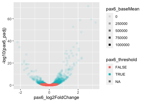
We aren’t interested in keeping the points as squares or altering their transparency, but it can be helpful to change shapes, size, transparency, etc. when visualizing different groups or conditions, similar to using the color argument.
Customizing the appearance of the non-data points on the plot
Now that we know how to alter and customize the look of the data points on our plot within the geom layer, let’s explore how to change the look or style of the non-data plotting elements, such as the plotting grid and labels. Many of these non-data elements can be altered within a theme() layer.
The ggplot2 theme system handles non-data plot elements such as:
- Axis title and label style
- Plot background
- Presence of major or minor gridlines
- Legend appearance
There are built-in themes we can use (i.e. theme_bw()) that mostly change the background/foreground colors, by adding it as an additional layer. A nice resource for exploring pre-set themes is available from the Tidyverse ggplot2 reference.
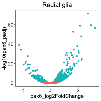
Let’s add a layer theme_bw().
# Add a pre-built theme
ggplot(results) +
  geom_point(aes(x = pax6_log2FoldChange,
                 y = -log10(pax6_padj),
                 color = pax6_threshold))  +
  theme_bw()
Let’s look at the paper figure again:
How are these plots different?
We see the colors are different, but we will explore customizing those in the next lesson. Many of the other changes are to the non-data elements of the plot, like legend and size of the axis titles. To explore the different non-data components customizable within the theme() function, let’s look at the documentation.
Notice the options for customizing the axes, titles, tick marks, and legends, among others. Everything is customizable, you just have to know what to customize. The examples given in the documentation can help determine what specifications might achieve your desired changes.
We can adjust specific elements of the current default theme by adding the theme() layer and passing in arguments for the things we wish to change. Since we will be adding this layer “on top”, or after theme_bw(), any features we change will override what is set by the theme_bw() layer.
Let’s increase the size of both axis titles to be 1.25 times the default size and the text labels to be 1.15 times the default. When modifying the size of text the rel() function is commonly used to specify a change relative to the default.
# Adjust theme elements - axis size
ggplot(results) +
  geom_point(aes(x = pax6_log2FoldChange,
                 y = -log10(pax6_padj),
                 color = pax6_threshold))  +
  theme_bw() +
  theme(axis.title = element_text(size = rel(1.25)),
        axis.text = element_text(size = rel(1.15)))
In the above code, you can see that we used a theme element, element_text(). The ggplot2 reference documentation discusses element_text() along with other theme elements like element_line(), element_rect() and element_blank(). Each of these has their own parameters that you can explore, but they can control things like size, font, angle, color, etc. In the case of element_text(), it controls size, font, angle, color, and how the text is aligned, among others. Also helpful to know, the theme element element_blank() will remove the corresponding element from the figure.
# Testing out element_blank()
ggplot(results) +
  geom_point(aes(x = pax6_log2FoldChange,
                 y = -log10(pax6_padj),
                 color = pax6_threshold))  +
  theme_bw() +
  theme(axis.title = element_blank(),
        axis.text = element_blank())
NOTE: You can use the
example("geom_point")function here to explore a multitude of different aesthetics and layers that can be added to your plot. As you scroll through the different plots, take note of how the code is modified. You can use this with any of the different geometric object layers available in ggplot2 to learn how you can easily modify your plots!
Complete the following exercise questions. Looking up help documentation using ?theme() or the online ggplot2 reference may help.
- Add a
ggtitlelayer to add a title to the plot. Don’t worry about the alignment quite yet. - After adding a title, add the following new theme layer to the code:
theme(plot.title=element_text(hjust=0.5)).- What does it change?
- How many
theme()layers can be added to a ggplot code chunk, in your estimation?
- Using a theme element, increase the size of the plot title to be 1.5 times the default value.
- Using a theme element, remove the gridlines by adding another
theme()layer with the argumentpanel.grid. - Remove the legend by adding a
theme()layer with the argumentlegend.position.
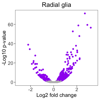
How does the plot compare to the published figure now?
It’s quite close. Most noticably, the colors are different, the axes need proper titles, the x-axis scale is slightly different and the annotations on the plot are missing. We will finish this plot using the code below to add colors and alter the axes, but we will discuss these topics in much greater detail in future lessons.
scale_color_manual(): colors the points based on groups present inpax6_thresholdassigned to thecolorargument within theaes()function.scale_x_continuous()andscale_y_continuous(): allows specification of the axis names and minimum and maximum axis values to be displayed on the plot.
# Finished plot without annotations
ggplot(results) +
  geom_point(aes(x = pax6_log2FoldChange,
                 y = -log10(pax6_padj),
                 color = pax6_threshold))  +
  ggtitle("Radial glia") +
  theme_bw() +
  theme(axis.title = element_text(size = rel(1.25)),
        axis.text = element_text(size = rel(1.15))) +
  theme(plot.title = element_text(size = rel(1.5))) +
  theme(legend.position = "none") +
  theme(panel.grid = element_blank()) +
  theme(plot.title=element_text(hjust=0.5)) +
  scale_color_manual(values = c("grey", "purple")) +
  scale_x_continuous(name = "Log2 fold change",
                     limits = c(-3, 3.5)) +
  scale_y_continuous(name = "-Log10 p-value")
This lesson has been developed by members of the teaching team at the Harvard Chan Bioinformatics Core (HBC). These are open access materials distributed under the terms of the Creative Commons Attribution license (CC BY 4.0), which permits unrestricted use, distribution, and reproduction in any medium, provided the original author and source are credited.