Approximate time: 20 minutes
Learning objectives
- Explain the goals of this workshop
- Describe the dataset being used for the workshop
Introduction to the dataset
For this workshop we will be working with RNA-seq data from a recent publication in Neuron by Baizabal et al. (2018) [1]. We will learn about how to use the ggplot2 package and other related packages to recreate a figure from this publication. In addition, we will also learn how to modify the figure to fit the submission criteria of a different journal.
The publication
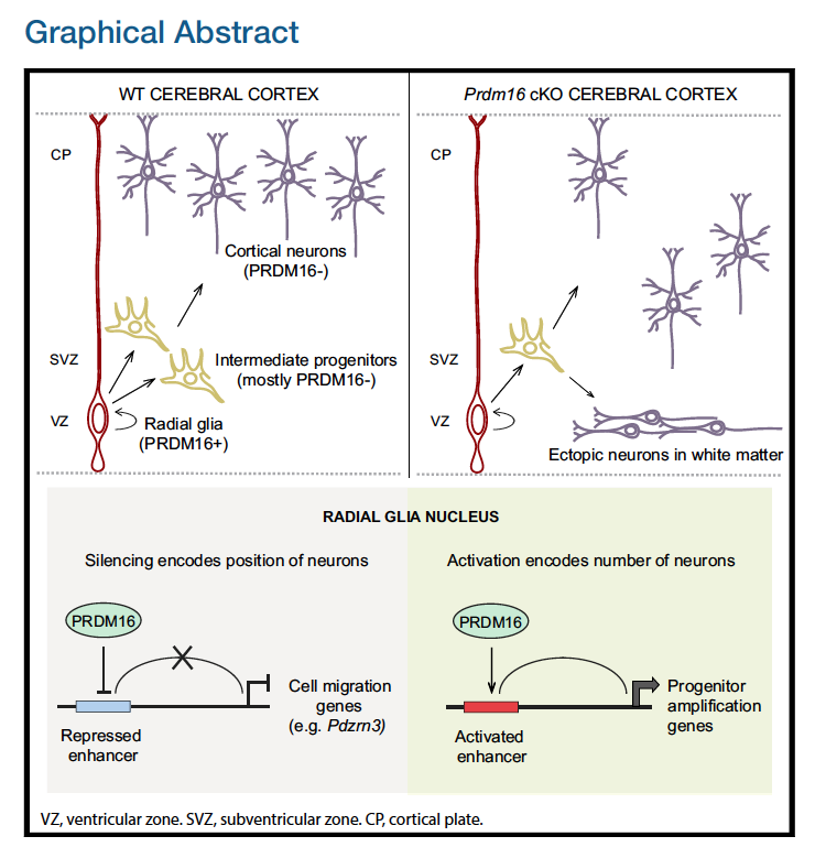
The authors in this paper discover an epigenetic mechanism that controls the number and positioning of cortical neurons. They discover that the histone methyltransferase PRDM16 works with enhancer elements to either silence or activate expression of sets of genes that impact the organization of the cerebral cortex.
The authors use various techniques to identify and validate the targets and activities of PRDM16, including ChIP-seq, bulk RNA-seq, FACS, in-situ hybridization and immunofluorescent microscopy on brain samples from embryonic mice, generation of conditional knockout mice, etc. Majority of the figures in this publication are a combination of the evidence gathered from several of these techniques.
The figure
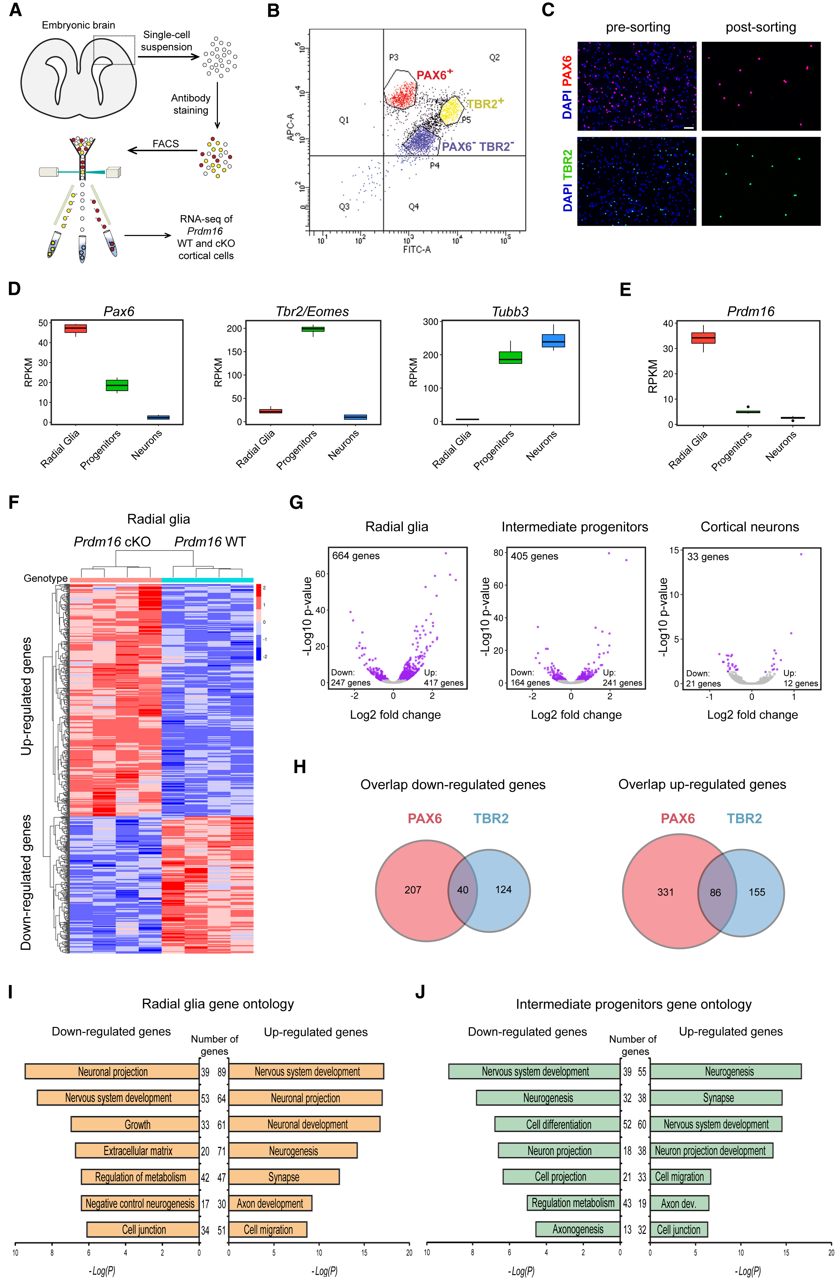
In this workshop, we will focus on recreating Figure 4. This figure demonstrates how knocking out PRDM16 impacts gene expression in three different cell populations in the developing brains of mouse enbryos.
The different types of plots here are:
- Box plots to show expression (normalized counts) of the Pdrm16 gene, which is the gene of interest, and 3 genes that help identify the different cell types:
- Radial glia: should exhibit high Pax6 counts
- Intermediate progenitors: should exhibit high Tbr2/Eomes counts
- Cortical neurons: should exhibit high Tubb3 counts
- Heatmap to show the expression of the significantly up- and down-regulated genes in the PRDM knock-out (KO) Radial Glia versus the wildtype (WT) Radial Glia
- Volcano plots (essentially a scatter plot) to show the significance (adjusted p-value) and magnitude (log2FoldChange) of expression change between the WT samples versus the PRDM16 KO samples in 3 different cell types. This plot demonstrates the impact of knocking out the PRDM16 gene.
- Venn diagrams to demonstrate the overlap in the list of differentially expressed genes in 2 different cell populations (Radial Glia and Intermediate progenitors)
- Bar plots to show the number of genes associated with specific biological pathways/processes. In each case the number of significantly up- or down- regulated genes are listed in the middle.
In addition to the plots listed above, there is (a) a very helpful schematic of the experiment, (b) the FACS output and (c) an immunofluorescence image to show the how well the cell populations were separated from each other.
Reading in the data
In the first half of this workshop, we will be focusing on creating those plots that use the ggplot2 package. In the second half of this workshop, we will (1) explore ggplot2 extensions and external packages to complete the plots in the figure, (2) we will also add the schematics and create a figure with the same layout as in the Neuron paper, and finally, (3) we will show you how to change the layout for a different journal.
First though we need to bring the data into R!
Here is the link to the GEO submission for these data.
- We will start by downloading a basic project folder with the data by right-clicking on this link. We recommend that you place this zipped folder on your Desktop for the duration of the workshop.
- Unzip the folder, and navigate into the
publication_perfectfolder. Inside this folder you will find a .Rproj file. Double-click on this to open the project in RStudio. - From the menu bar select ‘File’ –> ‘New File’ –> ‘Rscript’. This will open up the script editor, so you have a place to write and save your code.
- Copy and paste the following code into your script. Run the code in the console to read in the data and create three data frames.
# read in the metadata file
meta <- read.csv("data/pp_all_meta.csv", row.names=1)

# read in the normalized gene expression values
normalized_counts <- read.csv("data/pp_all_normalized_counts.csv", row.names=1)

# read in the results of the differential gene expression analysis
results <- read.csv("data/pp_all_results.csv", row.names=1)
Downloaded data
The data we have downloaded and read into R above represents the following 3 files from the larger analysis described in the paper:
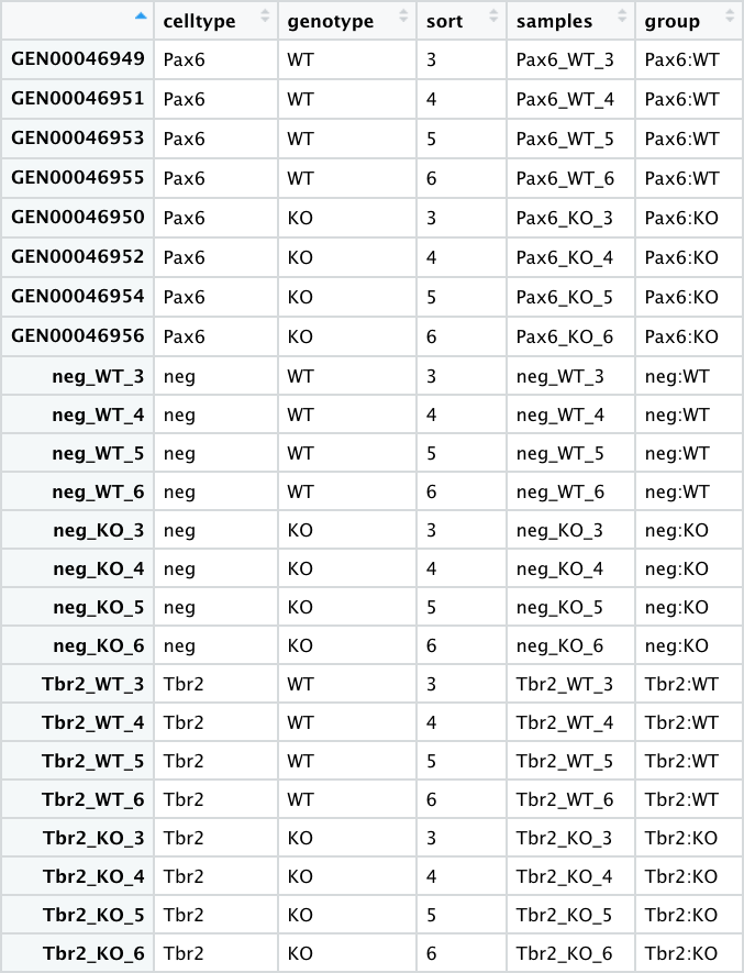
- pp_all_meta.csv - The metadata for the experiment. This experiment has 24 samples:
- 4 replicates for each sample group
- 6 sample groups (3 pairs) -
"Pax6:WT", "Pax6:KO","Tbr2:WT", "Tbr2:KO","neg:WT", "neg:KO" - The Pax6+ samples correspond to Radial Glia
- The Tbr2+ samples correspond to Intermediate Progenitors
- The neg (Pax6- Tbr2-) samples correspond to post-mitotic neurons
- pp_all_normalized_counts.csv - The normalized counts for all the samples.
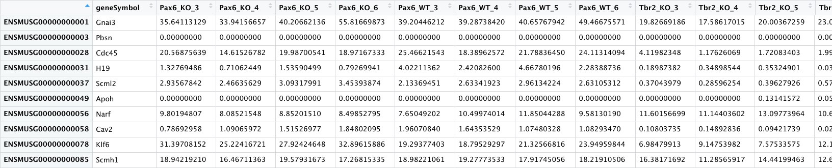
This data frame has 25 columns - in addition to the gene name column, there is a column for each sample.
- pp_all_results.csv - The results from DESeq2 for the comparisons between WT and PRDM16 knockout for the 3 cell types. We have combined the results from 3 separate comparisons into a single file to make it easier to create the Volcano plots. An excerpt is displayed below with the Pax6 results columns circled in green and the Tbr2 results columns circled in blue.
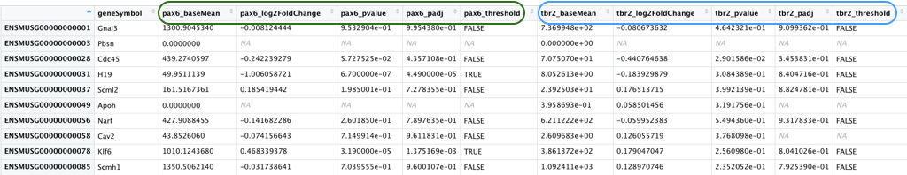
This data frame has 16 columns - in addition to the gene name column, each of the comparisons have 5 columns of results as described below.
_baseMean- Mean of the normalized counts for all samples in the comparison, for a given gene_log2FoldChange- log2 fold change between WT and PRDM16 KO_pvalue- Wald test P value_padj- Benjamini-Hochberg adjusted Wald test P value (P-value after multiple test correction)_threshold- Logical vector withTRUEvalues for significantly differentially expressed (DE) genes,FALSEfor not DE genes,NAfor untested genes. We will be using this column in the next lecture to color the significant genes one color and the non-significant genes a different color.
Making figures for a publication: Art or Science?
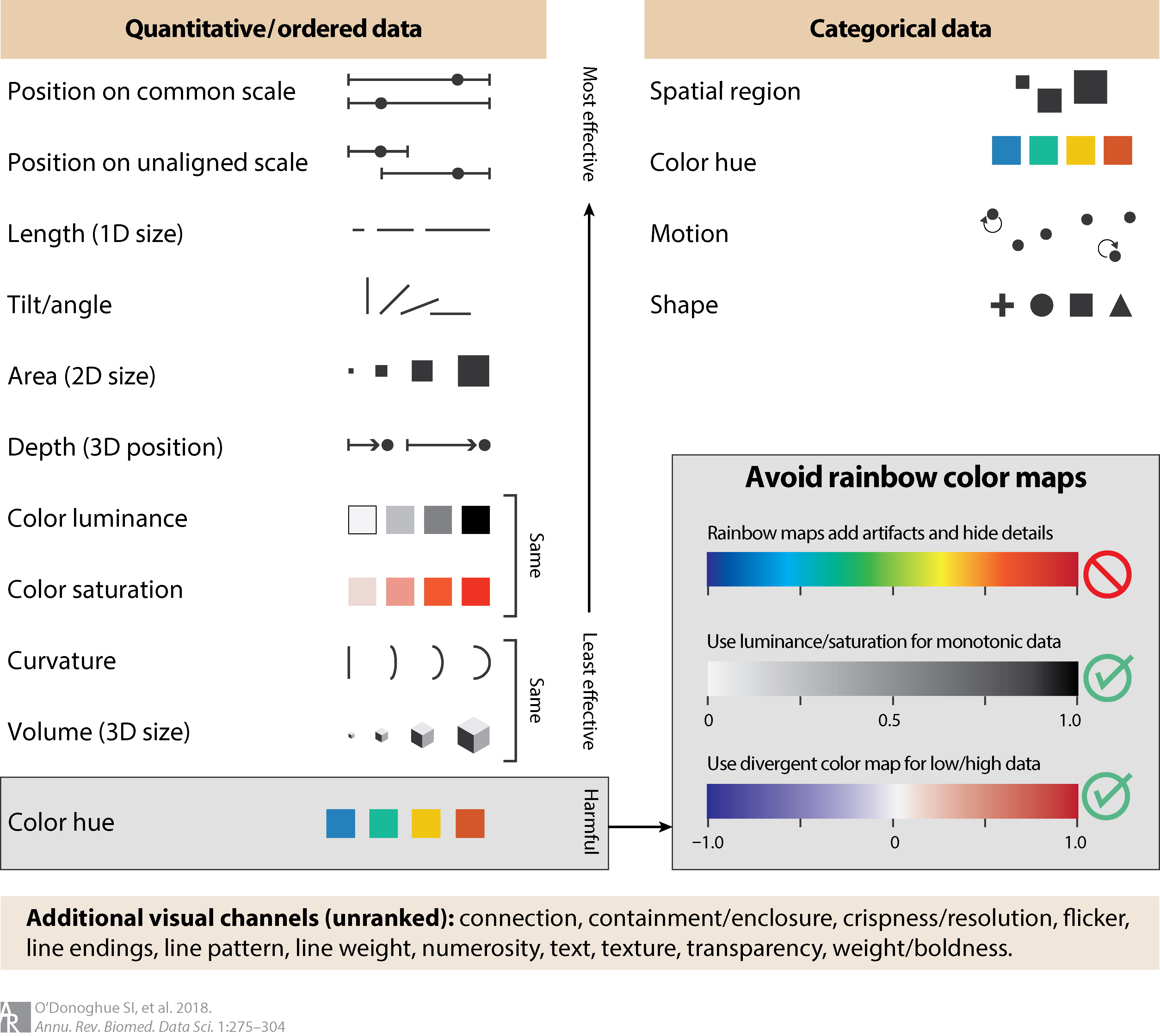
Creating plots and figures that convey complex information accurately and in an accessible manner is not easy. Data visualization for biomedical data takes a lot more thinking and planning that we usually set aside time for. A recent paper by O’Donoghue et al. (2018) [2] is a good reference for do’s and dont’s when thinking about displaying information from various types of biomedical experiments. They highlight common practices that create misinterpretation of data, often caused by the human brain’s inability to catch information and process it as we are viewing something.
In the following figure from O’Donoghue et al. (2018) [2] they highlight the shapes and colors that are most effective when plotting.
For the purposes of this workshop, we are focusing on reproducing a well-made, existing figure; but, as we go through both parts of this workshop, we will be highlighting considerations as we encounter various types of data representations.
Having said that, with specific types of biological datasets many good data visualization methods already exist. And it should be realtively simple to emulate a visualization with your dataset. However, you will also encounter datasets that are unique, or you may want to visualize an aspect of the data that is not commonly displayed. In those scenarios, we recommend testing a few visualizations, including different color palettes before settling on the best one. The data-to-viz.com website offers an interactive decision tree to help you identify the best way to display certain dataset formats.
There have been many books written over the years, many papers published, and there is an endless supply of online information about data visualization. In this workshop we are looking to highlight that creating visualization can often take careful consideration of the input data and the final conclusion you want the viewer to reach (quickly). This is, of course, in addition to discussin various R packages that you can use to create a publication-ready figure.
References:
- Baizabal et al., 2018, Neuron 98, 945–962. The Epigenetic State of PRDM16-Regulated Enhancers in Radial Glia Controls Cortical Neuron Position
- O’Donoghue et al., 2018, Annual Review of Biomedical Data Science 1:1, 275-304. Visualization of Biomedical Data
- Betsy Mason, Knowable Magazine 2019. Why scientists need to be better at data visualization
This lesson has been developed by members of the teaching team at the Harvard Chan Bioinformatics Core (HBC). These are open access materials distributed under the terms of the Creative Commons Attribution license (CC BY 4.0), which permits unrestricted use, distribution, and reproduction in any medium, provided the original author and source are credited.