Learning Objectives
- Describe common plots for visualizing results of a DGE analysis
Visualizing the results of a DGE experiment
Plotting signicantly differentially expressed genes
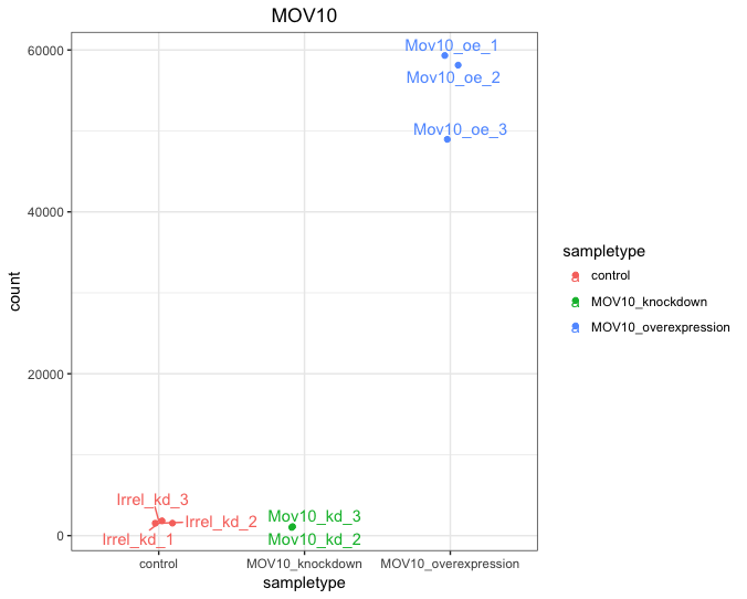
One way to visualize results would be to simply plot the expression data for a handful of genes across the various sample groups.
This can be implemented in R (usually) for multiple genes of interest or a single gene using functions associated with
- the package used to perform the statistical analysis (e.g. DESeq2’s
plotCounts()function) or - an external package created for this purpose (e.g. pheatmap, DEGreport) or
- using the
ggplot2package.
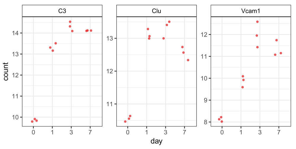
Plotting expression of a single gene across sample groups:
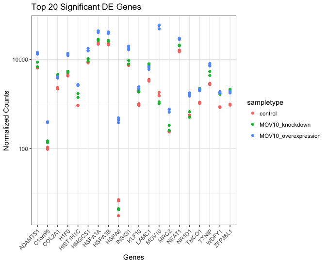
Plotting expression of multiple genes across sample groups :
One way to visualize results would be to simply plot the expression data for a handful of genes across the various sample groups.
The plot below displays the top 20 significantly differentially expressed genes. Please note that the normalized counts on the Y axis are logged (log10) to ensure that the any large differences in expression are plotted without compromising the quality of the visualization.
Heatmap
In addition to plotting subsets, we could also extract the normalized values of all the significant genes and plot a heatmap of their expression using pheatmap().
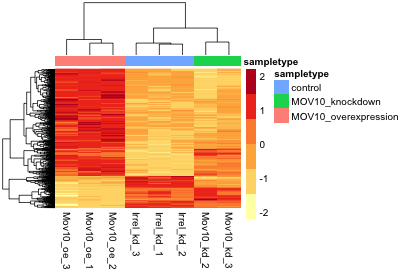
In this heatmap Z-scores are calculated for each row (each gene) and these are plotted instead of the normalized expression values; this ensures that the expression patterns/trends that we want to visualize are not overwhelmed by the expression values.
Z-scores are computed on a gene-by-gene basis by subtracting the mean and then dividing by the standard deviation. The Z-scores are computed after the clustering, so that it only affects the graphical aesthetics and the color visualization is improved.
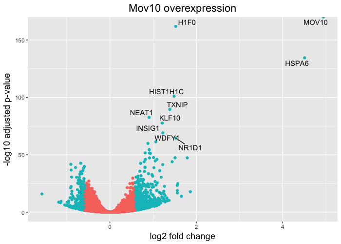
Volcano plot
The above plot would be great to look at the expression levels of a good number of genes, but for more of a global view there are other plots. A commonly used one is a volcano plot; in which you have the log transformed adjusted p-values are plotted on the y-axis and log2 fold change values on the x-axis.
DEGreport
If you do use the DESeq2 package for differential expression analysis, the package ‘DEGreport’ has a lot of great functions to draw a lot of the above plots in addition to several others. Some examples are available in this vignette, and some of them are shown below.
Plot 1: An easy and clean way to visualize expression of genes of interest.
Plot 2: When performing DE analysis on several groups, e.g. a time course experiment, grouping together genes that have similar patterns of expression and visualizing these patterns can be very helpful. The degPatterns() function in the DEGreport package performs the analysis and creates a display with this information.
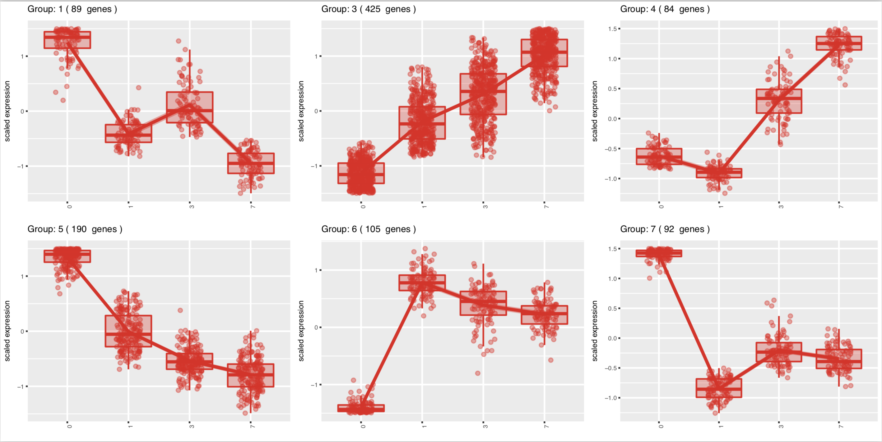
Images adapted from doi: 10.12688/f1000research.12093.2.
In addition to displaying the patterns,
degPatterns()outputs a list to enable the user to extract the genes in each grouping.
This lesson has been developed by members of the teaching team at the Harvard Chan Bioinformatics Core (HBC). These are open access materials distributed under the terms of the Creative Commons Attribution license (CC BY 4.0), which permits unrestricted use, distribution, and reproduction in any medium, provided the original author and source are credited.
- Materials and hands-on activities were adapted from RNA-seq workflow on the Bioconductor website