Learning Objectives
In this lesson, you will:
- Manage the layout of your Shiny app
- Implement different shinythemes
Introduction
Until now most of our work has focused on server side implementations of concepts. We have discussed the UI components required to carry the tasks that we want, but we haven’t discussed how we want to arrange them. This section will almost exclusively focus on the UI and how to arrange and organize the components of the UI into a visually appealing app.
Sidebars
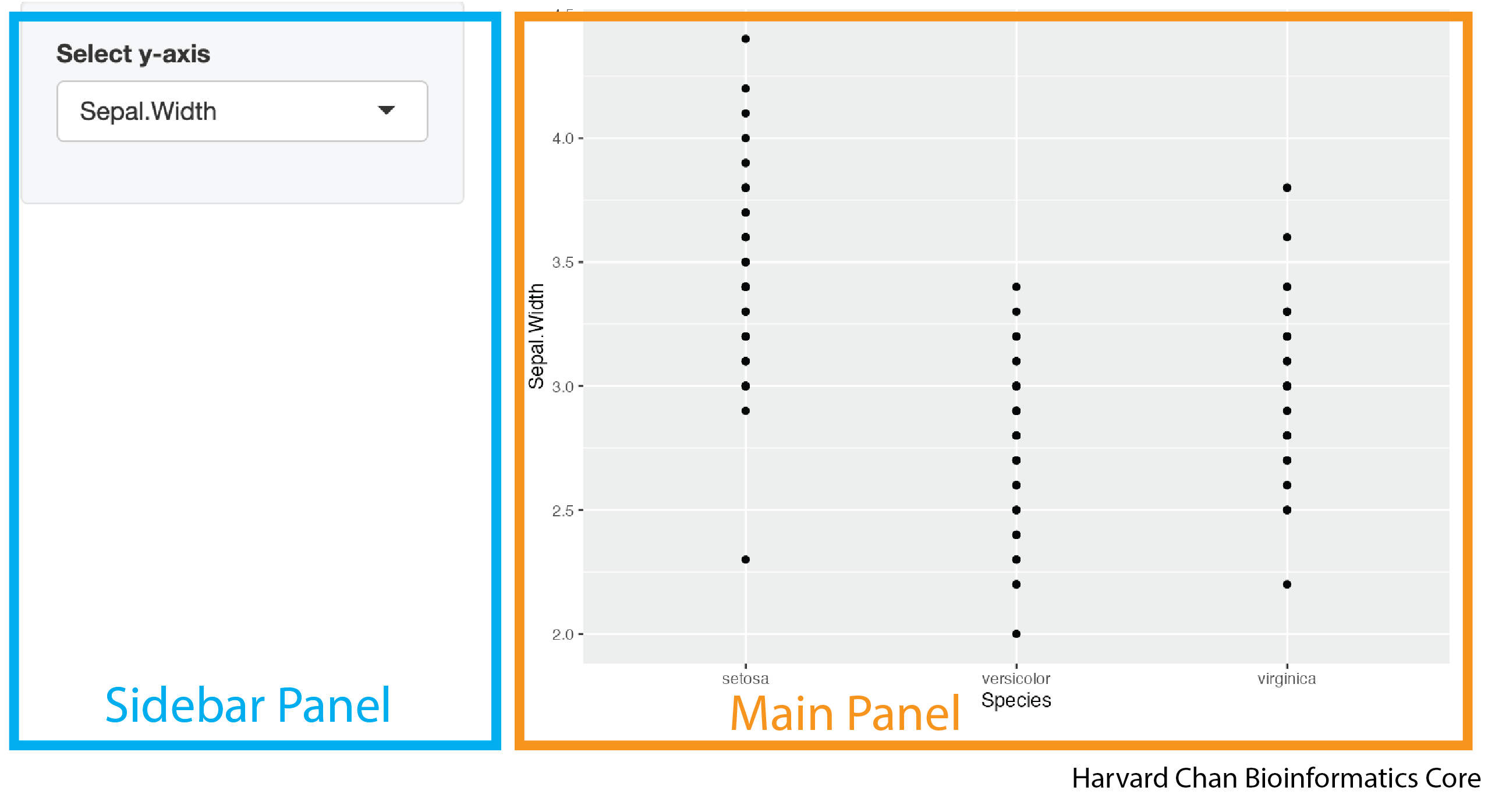
It is common in many apps to have the user defined input control on a sidebar to the left and the rendered plots and tables on the right. In the image below we have highlighted what a sidebar panel and main panel might look like in a Shiny App.
Creating this structure within a Shiny app utilizes the sidebarLayout() function. The sidebarLayout() function in your UI defines that your app is using a sidebar panel defined by sidebarPanel() and a main panel defined by mainPanel(). The sidebarPanel() and mainPanel() functions are nested inside of your sidebarLayout() function. Let’s look at the syntax for how to implement this:
# DO NOT RUN
ui <- fluidPage(
  sidebarLayout(
    sidebarPanel(
      <objects_in_your_sidebar_panel>
    ),
    mainPanel(
      <objects_in_your_main_panel>
    )
  )
)
A sample app demostrating this syntax would look like:
# Load libraries
library(shiny)
library(ggplot2)

ui <- fluidPage(
  sidebarLayout(
    sidebarPanel(
      selectInput(inputId = "y_axis_input",
                  label = "Select y-axis",
                  choices = c("Sepal.Length", "Sepal.Width", "Petal.Length", "Petal.Width"))
    ),
    mainPanel(
      plotOutput(outputId = "plot")
    )
  )
)

server <- function(input, output) {
  output$plot <- renderPlot({
    ggplot(iris) +
      geom_point(aes(x = Species,
                     y = .data[[input$y_axis_input]]))
  })
}

shinyApp(ui = ui, server = server)
This app would look like:
If your sidebar panel appears on top of your main panel, you may need to increase the size of the window your app is in a bit.
Adding a title
You may want your app to have a title. You can add this with the titlePanel() function. The syntax for doing this looks like:
# DO NOT RUN
titlePanel("<title_of_your_app>")
The default behavior of titlePanel() is to left-align the title. If you would like center your title you will need to use an h1() function within your titlePanel() function. The h1() function is borrowed from HTML nomenclature and refers to the largest sized header. The smallest sized header in HTML is h6() and the values in between h1() and h6() (h2(), h3(), h4(), h5()) span the range of sizes between h1() and h6(). Within the h[1-6]() family of function, there is an align argument that accepts the ("left", "center", and "right") for the alignment. So a center aligned title could look like:
# DO NOT RUN
titlePanel(
  h1("<title_of_your_app>", align = "center")
)
We can add this title to our previous app:
# Load libraries
library(shiny)
library(ggplot2)

ui <- fluidPage(
  titlePanel(
    h1("My iris Shiny App", align = "center")
  ),
  sidebarLayout(
    sidebarPanel(
      selectInput(inputId = "y_axis_input",
                  label = "Select y-axis",
                  choices = c("Sepal.Length", "Sepal.Width", "Petal.Length", "Petal.Width"))
    ),
    mainPanel(
      plotOutput(outputId = "plot")
    )
  )
)

server <- function(input, output) {
  output$plot <- renderPlot({
    ggplot(iris) +
      geom_point(aes(x = Species,
                     y = .data[[input$y_axis_input]]))
  })
}

shinyApp(ui = ui, server = server)
This app would now look like:
Creating columns
We have shown how to use the sidebarLayout() function, but we may want to have multiple columns in our app and the sidebarLayout() function can’t help to much with that. Fortunately, there is the fluidRow() function that allows us to divide up the row into columns using the column() function nested within it. The first argument within the column() function defines the width of the column and the sum of all of the widths of the columns for a given fluidRow() function should sum to 12. An example of this syntax would be:
# DO NOT RUN
fluidRow(
  column(<width_of_first_column>,
    <objects_in_first_column>
  ),
  column(<width_of_second_column>,
    <objects_in_second_column>
  )
)
We could make equally sized columns in our app like:
# Load libraries
library(shiny)
library(ggplot2)

ui <- fluidPage(
  titlePanel(
    h1("My iris Shiny App", align = "center")
  ),
  fluidRow(
    column(width = 6,
           h3("First column"),
           selectInput(inputId = "y_axis_input",
                       label = "Select y-axis",
                       choices = c("Sepal.Length", "Sepal.Width", "Petal.Length", "Petal.Width"))
    ),
    column(width = 6,
           h3("Second column"),
           plotOutput(outputId = "plot")
    )
  )
)

server <- function(input, output) {
  output$plot <- renderPlot({
    ggplot(iris) +
      geom_point(aes(x = Species,
                     y = .data[[input$y_axis_input]]))
  })
}

shinyApp(ui = ui, server = server)
This app would look like:
Within the
column()function, you can also specify the alignment within the column by using thealignoption. When using thealignoption, you can specify the alignment be"left","right"or"center". The syntax for this would look like:column(width = <width_of_column>, align = "center", <content_of_column>)
Nested columns
You can also nest fluidRow() functions within the column() function of another fluidRow() function. Once again, the important rule when using fluidRow() is that the sum of the column()s’ width value within each fluidRow() sums to 12. Let’s take a look at some example syntax of how this would look:
# DO NOT RUN
fluidRow(
  column(width = <width_of_first_main_column>,
         fluidRow(
           column(width = <width_of_first_subcolumn_of_the_first_main_column>,
                  <objects_in_first_column_first_subcolumn>
           ),
           column(width = <width_of_second_subcolumn_of_the_first_main_column>,
                  <objects_in_first_column_second_subcolumn>
           )
         )
  ),
  column(width = <width_of_second_main_column>,
         <objects_in_second_column>
  )
)
We can apply these principles to our app:
# Load libraries
library(shiny)
library(ggplot2)

ui <- fluidPage(
  titlePanel(
    h1("My iris Shiny App", align = "center")
  ),
  fluidRow(
    column(width = 7,
           fluidRow(
              column(width = 6,
                     h3("First column: First subcolumn"),
                     selectInput(inputId = "x_axis_input",
                                 label = "Select x-axis",
                                 choices = c("Sepal.Length", "Sepal.Width", "Petal.Length", "Petal.Width"))
              ),
              column(width = 6,
                     h3("First column: Second subcolumn"),
                     selectInput(inputId = "y_axis_input",
                                 label = "Select y-axis",
                                 choices = c("Sepal.Length", "Sepal.Width", "Petal.Length", "Petal.Width"))
              )
           )
    ),
    column(width = 5,
           h3("Second column"),
           plotOutput(outputId = "plot")
    )
  )
)

server <- function(input, output) {
  output$plot <- renderPlot({
    ggplot(iris) +
      geom_point(aes(x = .data[[input$x_axis_input]],
                     y = .data[[input$y_axis_input]]))
  })
}

shinyApp(ui = ui, server = server)
This app would look like:
Multiple Rows
Now that we’ve seen how to make multiple columns, let’s briefly talk about multiple rows. We will treat them like we’ve treated objects that go underneath one another, by putting complete fluidRow() functions underneath each other in our code. An example of this syntax can be seen below:
# DO NOT RUN
fluidRow(
  column(width = <width_of_first_column_in_the_first_row>,
         <objects_in_first_column_first_row>
  ),
  column(width = <width_of_second_column_in_the_first_row>,
         <objects_in_second_column_first_row>
  )
),
fluidRow(
  column(width = <width_of_first_column_in_the_second_row>,
         <objects_in_first_column_second_row>
  ),
  column(width = <width_of_second_column_in_the_second_row>,
         <objects_in_second_column_second_row>
  )
)
We can apply the concept of multiple rows to our app:
# Load libraries
library(shiny)
library(ggplot2)

ui <- fluidPage(
  titlePanel(
    h1("My iris Shiny App", align = "center")
  ),
  fluidRow(
    column(width = 6,
           h3("First Row: First column"),
           selectInput(inputId = "x_axis_input",
                       label = "Select x-axis",
                       choices = c("Sepal.Length", "Sepal.Width", "Petal.Length", "Petal.Width"))
    ),
      column(width = 6,
             h3("First Row: Second column"),
             selectInput(inputId = "y_axis_input",
                         label = "Select y-axis",
                         choices = c("Sepal.Length", "Sepal.Width", "Petal.Length", "Petal.Width"))
    )
  ),
  fluidRow(
      h3("Second Row"),
      plotOutput(outputId = "plot")
  )
)

server <- function(input, output) {
  output$plot <- renderPlot({
    ggplot(iris) +
      geom_point(aes(x = .data[[input$x_axis_input]],
                     y = .data[[input$y_axis_input]]))
  })
}

shinyApp(ui = ui, server = server)
This app would look like:
Thematic Breaks
Thematic breaks are a great way to break-up different parts of an app. The function to add a themetic break is also borrowed from HTML and it is called hr(). The syntax for using it is very simple:
# DO NOT RUN
hr()
In the previous example, if we wanted to break up the selectInput() functions from the plotOutput() function, then we could add a thematic break like:
# Load libraries
library(shiny)
library(ggplot2)

ui <- fluidPage(
  titlePanel(
    h1("My iris Shiny App", align = "center")
  ),
  fluidRow(
    column(width = 6,
           h3("First Row: First column"),
           selectInput(inputId = "x_axis_input",
                       label = "Select x-axis",
                       choices = c("Sepal.Length", "Sepal.Width", "Petal.Length", "Petal.Width"))
    ),
    column(width = 6,
           h3("First Row: Second column"),
           selectInput(inputId = "y_axis_input",
                       label = "Select y-axis",
                       choices = c("Sepal.Length", "Sepal.Width", "Petal.Length", "Petal.Width"))
    )
  ),
  hr(),
  fluidRow(
    h3("Second Row"),
    plotOutput(outputId = "plot")
  )
)

server <- function(input, output) {
  output$plot <- renderPlot({
    ggplot(iris) +
      geom_point(aes(x = .data[[input$x_axis_input]],
                     y = .data[[input$y_axis_input]]))
  })
}

shinyApp(ui = ui, server = server)
This app would now look like:
Navbar
Within an app, adding a navigation bar can help users more easily move around an app. The syntax for adding a navigation bar looks like:
# DO NOT RUN
navbarPage(title = "<title_of_navigation_bar>",
           tabPanel(title = "<title_of_tab_1>",
                    <content_of_tab_1>
           ),
           tabPanel(title = "<title_of_tab_2>",
                    <content_of_tab_2>
           ),
)
The use of the navbarPage() function lets the Shiny UI know that there will be a nagivation bar on the app. The tabPanel() is used within the navbarPage() function along with a few other functions that we will explore to define the contents of each tab. An example of this code is shown below:
# Load libraries
library(shiny)
library(ggplot2)

ui <- fluidPage(
  navbarPage(title = "My iris dataset",
             tabPanel(title = "Inputs",
                      selectInput(inputId = "x_axis_input",
                                  label = "Select x-axis",
                                  choices = c("Sepal.Length", "Sepal.Width", "Petal.Length", "Petal.Width")),
                      selectInput(inputId = "y_axis_input",
                                  label = "Select y-axis",
                                  choices = c("Sepal.Length", "Sepal.Width", "Petal.Length", "Petal.Width"))
             ),
             tabPanel(title = "Output Plot",
                      plotOutput(outputId = "plot")
             ),
  )
)

server <- function(input, output) {
  output$plot <- renderPlot({
    ggplot(iris) +
      geom_point(aes(x = .data[[input$x_axis_input]],
                     y = .data[[input$y_axis_input]]))
  })
}

shinyApp(ui = ui, server = server)
This app would look like:
Within the navbarPage() function there is a position argument, with three options:
| Argument | Description |
|---|---|
position = "static-top" |
The navigation bar is at the top of the app and when you scroll down it disappears |
position = "fixed-top" |
The navigation bar is at the top of the app and when you scroll down it stays in the frame for the browser window |
position = "fixed-bottom" |
The navigation bar is at the bottom of the app and when you scroll down it stays in the frame for the browser window |
Navigation Bar Menu
Within the navigation bar, we can have a dropdown menu that gives us more options in a list. This would be accomplished using the navbarMenu() function, which also utilizes tabPanel() function that navbarPage() uses. The syntax for using a dropdown menu navigation bar menu is:
# DO NOT RUN
navbarPage(title = "<title_of_navigation_bar>",
           navbarMenu(title = "<name_for_dropdown_menu>",
                      tabPanel(title = "<title_of_option_1_in_menu>",
                               <content_of_option_1_in_menu>
                      ),
                      tabPanel(title = "<title_of_option_2_in_menu>",
                               <content_of_option_2_in_menu>
                      )
           )
)
A code example of the navbarMenu() function can be seen below:
# Load libraries
library(shiny)
library(ggplot2)
library(DT)

ui <- fluidPage(
  navbarPage(title = "My iris dataset",
             tabPanel(title = "Inputs",
                      selectInput(inputId = "x_axis_input",
                                  label = "Select x-axis",
                                  choices = c("Sepal.Length", "Sepal.Width", "Petal.Length", "Petal.Width")),
                      selectInput(inputId = "y_axis_input",
                                  label = "Select y-axis",
                                  choices = c("Sepal.Length", "Sepal.Width", "Petal.Length", "Petal.Width"))
             ),
             navbarMenu(title = "Outputs",
                        tabPanel(title = "Plot",
                                 plotOutput(outputId = "plot")
                        ),
                        tabPanel(title = "Table",
                                 DTOutput(outputId = "table")
                        )
             )
  )
)

server <- function(input, output) {
  output$plot <- renderPlot({
    ggplot(iris) +
      geom_point(aes(x = .data[[input$x_axis_input]],
                     y = .data[[input$y_axis_input]]))
  })
  output$table <- renderDT({
    iris[,c(input$x_axis_input, input$y_axis_input), drop = FALSE]
  })
}

shinyApp(ui = ui, server = server)
This app would look like:
Navigation List
In place of of a navigation bar along the top of the window, you can also opt for a list down the side of the app using the navlistPanel() in place of the navbarPage() function. The syntax for using this style of list looks like:
# DO NOT RUN
navlistPanel("<title_of_navigation_list>",
             tabPanel(title = "<title_of_tab_1>",
                      <content_of_tab_1>
             ),
             tabPanel(title = "<title_of_tab_2>",
                      <content_of_tab_2>
             ),
)
An example for this code is below:
# Load libraries
library(shiny)
library(ggplot2)
library(DT)

ui <- fluidPage(
  navlistPanel("My iris dataset",
               tabPanel(title = "Inputs",
                        selectInput(inputId = "x_axis_input",
                                    label = "Select x-axis",
                                    choices = c("Sepal.Length", "Sepal.Width", "Petal.Length", "Petal.Width")),
                        selectInput(inputId = "y_axis_input",
                                    label = "Select y-axis",
                                    choices = c("Sepal.Length", "Sepal.Width", "Petal.Length", "Petal.Width"))
               ),
               navbarMenu(title = "Outputs",
                          tabPanel(title = "Plot",
                                   plotOutput(outputId = "plot")
                          ),
                          tabPanel(title = "Table",
                                 DTOutput(outputId = "table")
                          )
               )
  )
)

server <- function(input, output) {
  output$plot <- renderPlot({
    ggplot(iris) +
      geom_point(aes(x = .data[[input$x_axis_input]],
                     y = .data[[input$y_axis_input]]))
  })
  output$table <- renderDT({
    iris[,c(input$x_axis_input, input$y_axis_input), drop = FALSE]
  })
}

shinyApp(ui = ui, server = server)
This would create an app that looks like:
The
navbarMenu()function also works withinnavlistPanel()just like it works withinnavbarPage().
Creating tabs without a navigation bar
An app might require that the user can click on various tabs on a single page. While this could be accomplished with the navigation bar, this can be accomplished by providing different tabs that can easily be embedded within parts of an app using tabsetPanel(). The syntax looks like:
# DO NOT RUN
tabsetPanel(
  tabPanel(title = "<title_of_tab_1>",
           <content_of_tab_1>
  ),
  tabPanel(title = "<title_of_tab_2>",
           <content_of_tab_2>
  ),
)
We will embed this within mainPanel() function below, but it doesn’t necessarily need to be that way:
# Load libraries
library(shiny)
library(ggplot2)
library(DT)

ui <- fluidPage(
  sidebarLayout(
    sidebarPanel(
      selectInput(inputId = "x_axis_input",
                  label = "Select x-axis",
                  choices = c("Sepal.Length", "Sepal.Width", "Petal.Length", "Petal.Width")),
      selectInput(inputId = "y_axis_input",
                  label = "Select y-axis",
                  choices = c("Sepal.Length", "Sepal.Width", "Petal.Length", "Petal.Width"))
    ),
    mainPanel(
      tabsetPanel(
        tabPanel(title = "Plot",
                 plotOutput(outputId = "plot")
        ),
        tabPanel(title = "Table",
                 DTOutput(outputId = "table")
        )
      )
    )
  )
)

server <- function(input, output) {
  output$plot <- renderPlot({
    ggplot(iris) +
      geom_point(aes(x = .data[[input$x_axis_input]],
                     y = .data[[input$y_axis_input]]))
  })
  output$table <- renderDT({
    iris[,c(input$x_axis_input, input$y_axis_input), drop = FALSE]
  })
}

shinyApp(ui = ui, server = server)
This app would look like:
The
navbarPage()function can also be embedded withinmainPanel(). However, traditionally you will seenavbarPage()be used to as the banner at the top of the app whiletabsetPanel()will be used as different tabs within a single tab ofnavbarPage().
Shiny Themes
Until now we have used the default UI color scheme within Shiny. However, that is not the only option. There is a package of preset themes that app developers can choose from to make their apps more visually appealing. This package is called shinythemes and it has over a dozen different themes that app developers can choose from. Implementing a theme is straightforward once you’ve loaded the shinythemes package:
ui <- fluidPage(
  theme = shinytheme("<name_of_shiny_theme>"),
  <rest_of_the_ui>
)
We can add this to the previous app we made:
# Load libraries
library(shiny)
library(ggplot2)
library(DT)
library(shinythemes)

ui <- fluidPage(
  theme = shinytheme("cerulean"),
  navbarPage(title = "My iris dataset",
             tabPanel(title = "Inputs",
             selectInput(inputId = "x_axis_input",
                         label = "Select x-axis",
                         choices = c("Sepal.Length", "Sepal.Width", "Petal.Length", "Petal.Width")),
             selectInput(inputId = "y_axis_input",
                         label = "Select y-axis",
                         choices = c("Sepal.Length", "Sepal.Width", "Petal.Length", "Petal.Width"))
             ),
             navbarMenu(title = "Outputs",
                        tabPanel(title = "Plot",
                                 plotOutput(outputId = "plot")
                        ),
                        tabPanel(title = "Table",
                                 DTOutput(outputId = "table")
                        )
             )
  )
)

server <- function(input, output) {
  output$plot <- renderPlot({
    ggplot(iris) +
      geom_point(aes(x = .data[[input$x_axis_input]],
                     y = .data[[input$y_axis_input]]))
  })
  output$table <- renderDT({
    iris[,c(input$x_axis_input, input$y_axis_input), drop = FALSE]
  })
}

shinyApp(ui = ui, server = server)
This app would look like:
If you wanted to see how various themes might look on your specific app, instead of in the gallery provided by shinythemes, then you can apply them from a selection menu by adding this code to your app:
# DO NOT RUN
ui <- fluidPage(
  themeSelector(),
  <rest_of_the_ui>
)
Exercise 1
Lets add a layout to the R Shiny app from the exercise a previous lesson. That app should look like:
# Load libraries
library(shiny)
library(DT)
library(tidyverse)

# User Interface
ui <- fluidPage(
  # Upload the file
  fileInput(inputId = "input_file",
            label = "Upload file"),
  # Select from the dropdown menu the column you want on the x-axis
  selectInput(inputId = "x_axis_input",
              label = "Select x-axis",
              choices = c("Sepal.Length", "Sepal.Width", "Petal.Length", "Petal.Width")
  ),
  # Select from the dropdown menu the column you want on the y-axis
  selectInput(inputId = "y_axis_input",
              label = "Select y-axis",
              choices = c("Sepal.Length", "Sepal.Width", "Petal.Length", "Petal.Width")
  ),
  # The output plot
  plotOutput(outputId = "plot"),
  # The download plot button
  downloadButton(outputId = "download_button",
                 label = "Download the data .png")
)

# Server
server <- function(input, output) {
  # Reactive expression to hold the uploaded data
  iris_data <- reactive({
    req(input$input_file)
    read.csv(input$input_file$datapath)
  })
  # Reactive expression to create a scatterplot from the uploaded data and user selected axes
  iris_plot <- reactive ({
  ggplot(iris_data()) +
    geom_point(aes(x = .data[[input$x_axis_input]],
                   y = .data[[input$y_axis_input]]))
  })
  # Render the plot from the iris_plot() reactive expression
  output$plot <- renderPlot({
    iris_plot()
  })
  # Download the data
  output$download_button <- downloadHandler(
    # The placeholder name for the file will be called iris_plot.png
    filename = function() {
      "iris_plot.png"
    },
    # The content of the file will be the contents of the iris_plot() reactive expression
    content = function(file) {
      ggsave(
        filename = file,
        plot = iris_plot()
      )
    }
  )
}

# Run the app
shinyApp(ui = ui, server = server)
We are going to try to create an app that looks like:
-
Place the
fileInput()andselectInput()s within a sidebar with the plot in themainPanel(). Underneath thesidepanelLayout(), place a themetic break and underneath that place a right aligneddownloadButton(). -
Add the
"superhero"theme fromshinythemesto the app.
Hint: Be sure to add library(shinythemes) and make sure it is loaded.