Plotting Practical
-
Add an additional column, called
animal_names, in theanimalsdata frame. This column stores the row names of theanimalsdata frame. (NOTE: the original row names could stay as it is.)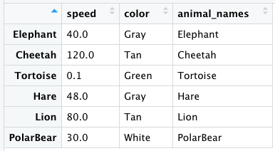
-
Use ggplot2 to plot the animal names (x-axis) versus the speed of the animal (y-axis) in
animalsusing a scatterplot. Customize the plot to display as shown below.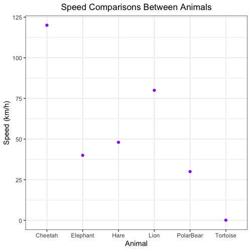
-
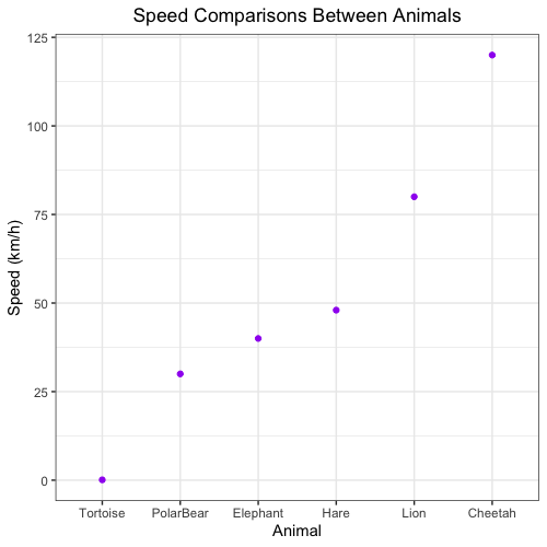
We decide that our plot would look better with the animal names ordered from slowest to fastest. Using the
animalsdata frame, reorder the animals on the x-axis to start with the slowest animal on the left-hand side of the plot to the fastest animal on the right-hand side of the plot by completing the following steps:a. We want to turn the
animal_namescolumn ofanimalsinto a factor and specify the levels as from slowest to fastest. Note: this step is crucial, because ggplot2 usesfactoras plotting order, instead of the order we observe in data frame. To do this, use thereorder()function to order the rows by speed from slowest to fastest.Note1: In the
reorder()function, the first argument is the categorical variable to be reordered (in our case,animal_names), and the second argument is the variable in which the ordering is based on (in our case,speed). Thereorder()function is used together withwithfunction here (check the example ofreorder()function).Note2: An alternative solution is to manually specify the levels, based on the speed. However, when the dataset is big, this method is not feasible.
b. Re-plot the scatterplot with the animal names in order from slowest to fastest.
Note: If you are interested in exploring other ways to reorder a variable in ggplot2, refer to this post.
-
Save the plot as a PDF called
animals_by_speed_scatterplot.pdfto theresultsfolder.