Contributors: Heather Wick, Upendra Bhattarai, Meeta Mistry
Approximate time: 45 minutes
Learning objectives
- Annotate peaks with genomic features using ChIPseeker
- Visualize annotations and compare peak coverage between experimental groups
Peak annotation
Understanding the biological questions addressed by ChIP-seq experiments begins with annotating the genomic regions we have identifed as peaks with genomic context.
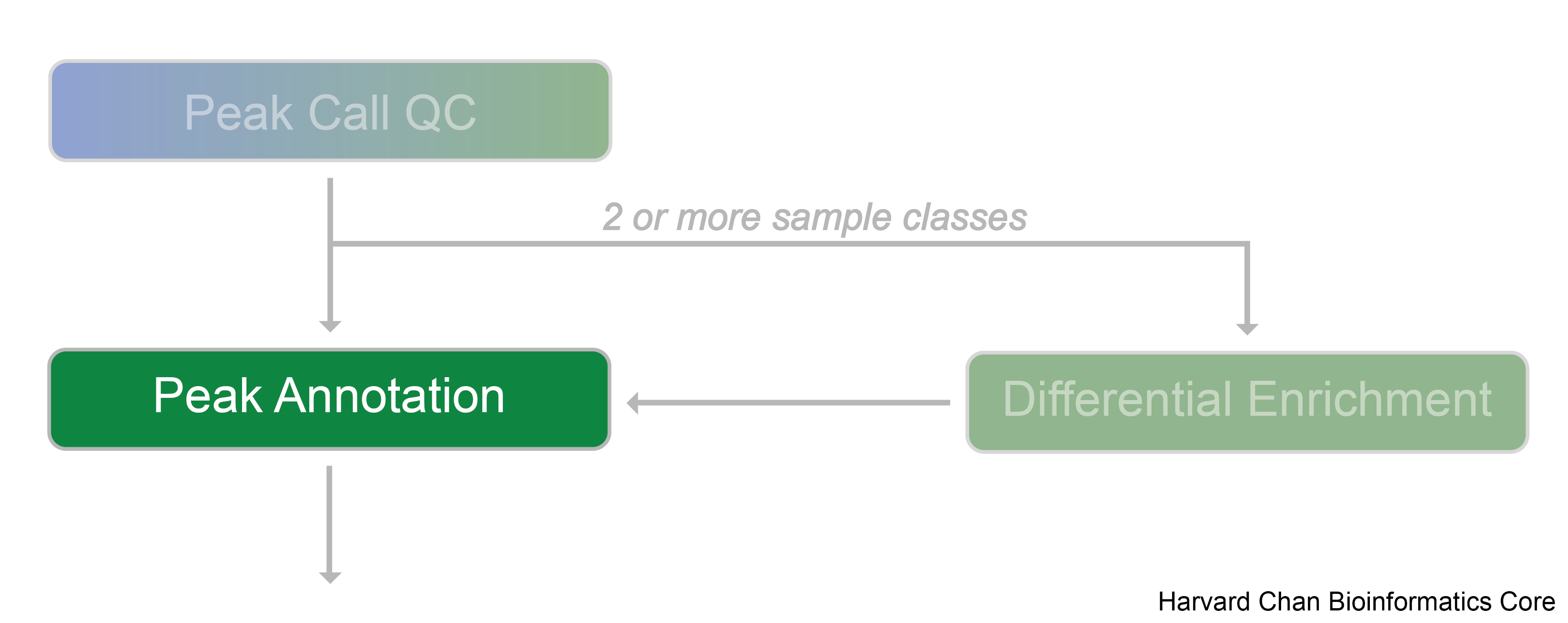
In order to interpret these binding regions, a number of different peak annotation tools exist. Some examples include Homer, GREAT (a web-based tool), ChIPpeakAnno, and ChIPseeker.
How do peak annotation tools work?
Because many cis-regulatory elements are close to transcription start sites of their targets, it is common to associate each peak to its nearest gene, either upstream or downstream. Annotation tools apply methods to calculate the nearest TSS to the given genomic coordinates and annotate the peak with that gene. However, problems exist in regions where multiple genes are located in close proximity. Different tools address this complex issue using different approaches and this can result in varying results.

Image source: Welch R.P. et al, Nucleic Acids Research, 2014 doi: 10.1093/nar/gku463ChIP
Annotating peaks
In this workshop we will use an R Bioconductor package called ChIPseeker to annotate peaks, visualize features, and compare profiles. Some features of ChIPseeker include:
- Comparing results in batch; across replicates or between experimental groups.
- Perform functional annotations and infer cooperative regulation.
- Support querying the GEO database to compare experimental datasets with publicly available ChIP-seq data and offer statistical testing for significant overlaps among datasets.
Setting up
Let’s open up a new script file and call it peak_annotation.R. Add a title to the script and as usual we will begin with loading required libraries:
# Peak Annotation using ChIPseeker

# Load libraries
library(ChIPseeker)
library(clusterProfiler)
library(TxDb.Mmusculus.UCSC.mm10.knownGene)
library(tidyverse)
NOTE: The
readPeakFile()function allows us to load peaks from a BED file. It will convert the BED file into GRanges object. However, we already have all of our peak data loaded in our environment as GRanges object from the previous lesson.
First, we will need to assign the annotation database to a variable. Bioconductor provides a whole host of different annotation packages that range across many organisms. The specific database that is required by ChIPseeker is the TxDb family of annotation databases. For commonly used genome versions and organisms there are options available for use (for example, TxDb.Mmusculus.UCSC.mm10.knownGene for mouse, and TxDb.Hsapiens.UCSC.hg38.knownGene for human). However, there is also an option for users to prepare prepare their own database object using UCSC Genome Bioinformatics and BioMart database in R with makeTxDbFromBiomart() and makeTxDbFromUCSC.TxDb() functions.
# Set the annotation database
txdb <- TxDb.Mmusculus.UCSC.mm10.knownGene
Now let’s annotate our peaks! Annotation of the peaks to the nearest gene and for various genomic characteristics is performed by the annotatePeak() function. By default, the TSS region is defined as -3kb to +3kb; however, users can define this region as desired. The result of the annotation comes in csAnno (a special format for ChIP-seq annotation). This can be converted to GRanges with the as.GRanges() function and to data frame with the as.data.frame() function. We will begin with annotating peaks from a single sample:
# Annotate peaks
annot_WT1 <- annotatePeak(WT_H3K27ac_ChIPseq_REP1, tssRegion=c(-3000, 3000), TxDb=txdb, annoDb="org.Mm.eg.db")

# View the result
annot_WT1@anno %>%
  data.frame() %>% View()
Note: The parameter
annoDbis optional; if provided, extra information about the annotation including gene symbol, gene name, and ensembl/entrez id will be added in extra columns.

The annotation output file retains all the information from the peak file and also reports the annotation information. The nearest genes, their position and strand information, along with the distance from peak to the TSS of its nearest gene is also reported. For annotating genomic regions, annotatePeak() will not only give the gene information but also reports detailed information when genomic regions are exonic or intronic. For example, ‘Exon (ENSMUST00000144339.1/ENSMUST00000144339.1, exon 1 of 3’, means that the peak overlaps with the first of 3 exons that transcript possesses.
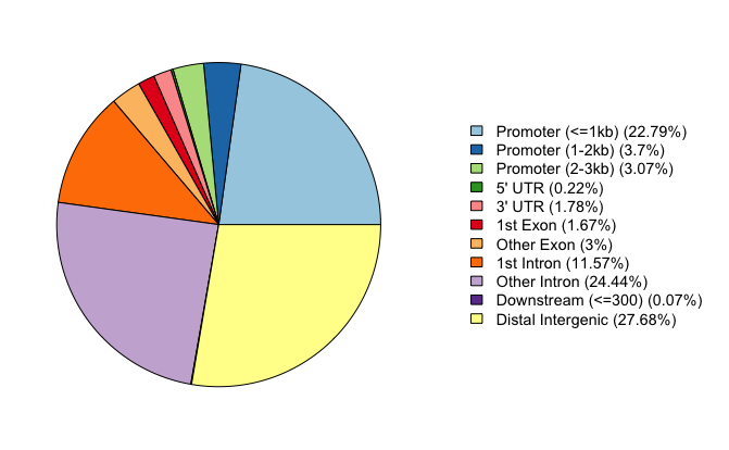
To view a genomic annotation summary, we can just type out the variable name. We see that a fairly large proportion of our peaks for WT replicate 1 are in promoter regions, but there are also equally high percentages in intronic and distal intergenic regions. This result is in line with what we know about the H3K27Ac mark; studies have shown that it localizes to active enhancers, super enhancers, and promoters to activate gene expression.
annot_WT1
Annotated peaks generated by ChIPseeker
100559/100570  peaks were annotated
Genomic Annotation Summary:
              Feature   Frequency
9    Promoter (<=1kb) 20.81862389
10   Promoter (1-2kb)  3.84848696
11   Promoter (2-3kb)  3.17226703
4              5' UTR  0.20982707
3              3' UTR  1.83374934
1            1st Exon  1.59806681
7          Other Exon  2.97437325
2          1st Intron 11.96809833
8        Other Intron 25.65061307
6  Downstream (<=300)  0.07856084
5   Distal Intergenic 27.84733341
Annotation visualization
There are several functions for visualization provided by ChIPseeker package to effectively visualize annotation of various genomic features. We will go through some of these options below.
Piechart
This function provides a visualization of the summary we generated earlier, in the form of a pie chart.
# Piechart
plotAnnoPie(annot_WT1)
Barplot
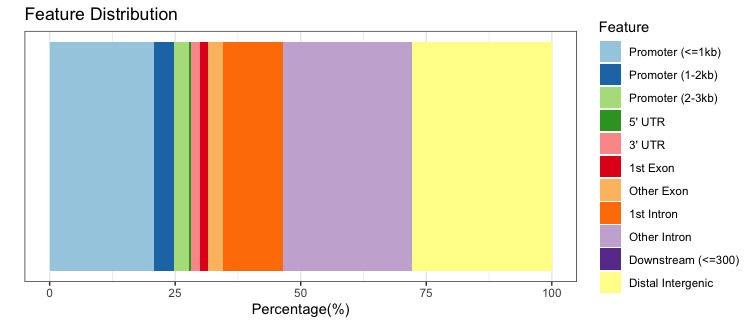
We can plot the exact same data, but using a stacked barplot instead.
# Barplot
plotAnnoBar(annot_WT1)
UpsetR
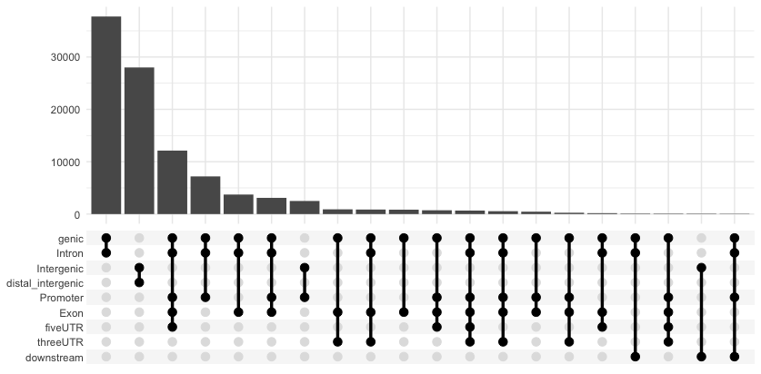
Annotation overlaps can be visualized by upsetR plot. Here, we use a function from ChIPseeker that grabs the required data and formats it to be compatible with UpSetR and draws the plot. With this plot we can see that there are many peaks that contain more than one annotation. We can observe the counts for various combinations of annotations.
# UpSet plot
upsetplot(annot_WT1)
Distribution of TF-binding loci with respect to TSS
The distance between the peak and the TSS of the nearest gene is also reported in the annotation output and can be visualzed with a barplot.
# TSS distance plot
plotDistToTSS(annot_WT1)

Visualizing multiple samples
These are all great ways to visualize the information from our annotation table; however, so far we have only done this for a single sample. It would be very helpful to create similar plots after collating annotations across all samples in our dataset. In this way, we can assess consistencies across replicates within a group and compare samples between groups.
In order to do this, we will first combine the GRanges objects for each samples into a list and then annotate each sample using lapply().
# Create a list of GRanges objects
samples_list <- list(
  WT1 = WT_H3K27ac_ChIPseq_REP1,
  WT2 = WT_H3K27ac_ChIPseq_REP2,
  WT3 = WT_H3K27ac_ChIPseq_REP3,
  cKO1 = cKO_H3K27ac_ChIPseq_REP1,
  cKO2 = cKO_H3K27ac_ChIPseq_REP2,
  cKO3 = cKO_H3K27ac_ChIPseq_REP3)

# Annotate each sample
peakAnnoList <- lapply(samples_list, annotatePeak, TxDb=txdb,
                       tssRegion=c(-3000, 3000), annoDb="org.Mm.eg.db", verbose=FALSE)
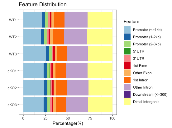
Now, the annotation feature distribution of all the samples can also be plotted together:
# Plot barplot for all samples
plotAnnoBar(peakAnnoList)
Similarly, we can plot the distance to TSS for all samples in one plot:
# Plot distance to TSS for all samples
plotDistToTSS(peakAnnoList)
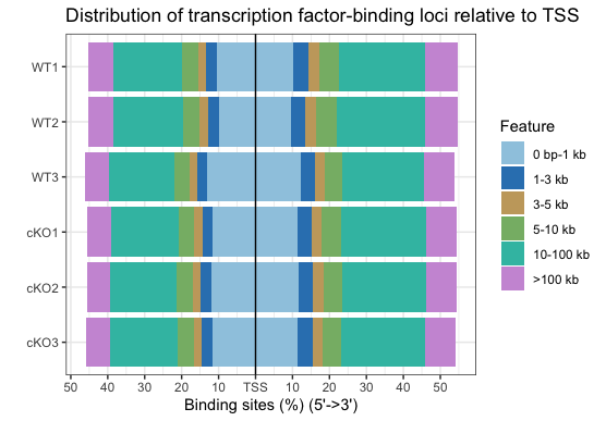
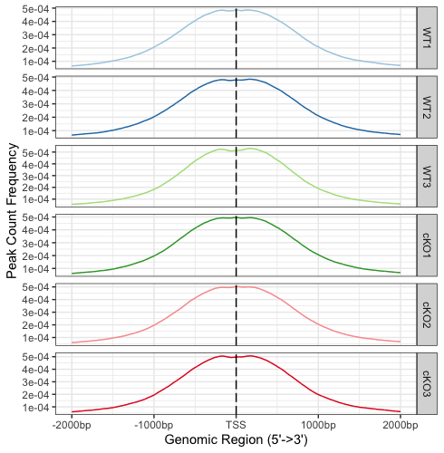
By plotting all samples together, we can easily identify trends. Overall, there are not dramatic differences between the WT and cKO groups. This is not surprising since we are comparing enrichment from the same histone mark with slightly different conditions. We do see a small shift in the promoter regions; that is, less enrichment is observed around the TSS in WT compared to cKO. There may be subtle differences that will be more clearly visible when we drill down to individual regions.
Visualizing enrichment around the TSS
To plot the binding around the TSS region, we need to first prepare the TSS regions using getPromoters(). To identify TSS regions we set up the flanking regions of 2000bp upstream and 2000bp downstream. Take a look at promoter after running the code below. You should see that we have created a GRanges object that contains the start and end location for all TSSs in the mouse genome.
# Get promoters
promoter <- getPromoters(TxDb = txdb, upstream = 2000, downstream = 2000)
promoter
GRanges object with 24514 ranges and 0 metadata columns:
          seqnames              ranges strand
             <Rle>           <IRanges>  <Rle>
      [1]     chr9   21071096-21075096      -
      [2]     chr7   84962115-84966115      -
      [3]    chr10   77709457-77713457      +
      [4]    chr11   45806087-45810087      +
      [5]     chr4 144160663-144164663      -
      ...      ...                 ...    ...
  [24510]     chr3   85885516-85889516      -
  [24511]     chr3 110248998-110252998      -
  [24512]     chr3 151747960-151751960      -
  [24513]     chr3   65526410-65530410      +
  [24514]     chr4 136600723-136604723      -
  -------
  seqinfo: 66 sequences from an unspecified genome; no seqlengths
Next, we align the peaks that are mapping to these regions, and generate the tagMatrix. For each of the promoter regions, this function will evaluate the peak overlaps and create an estimate of read count frequency. This tagMatrix will be used as input for various visualizations described below. Let’s begin with WT replicate 1 as an example:
# Create tag matrix
tagMatrix_wt1 <- getTagMatrix(WT_H3K27ac_ChIPseq_REP1, windows = promoter)
NOTE: This tag matrix is an estimate of read count frequency because it is based on peak overlaps. You can create a similar matrix using the actual read pileup data from BAM files using the deepTools suite. The software also has commands for creating the profile plots and heatmaps described below. This is computationally expensive and so you will want to use an HPC to run this. For more information see our materials linked here.
Profile plots
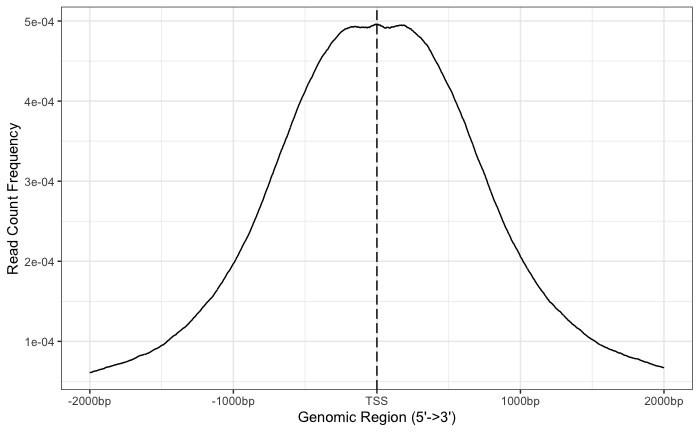
Now that we have a tagMatrix, we can use this to create a profile plot. On the x-axis, we have the genomic region, where the limits will depend on what you set as your flanking regions. On the y-axis, we have the read count for each base within that window, scaled across all promoter regions.
With these plots the confidence interval is estimated by bootstrap method (1000 iterations) and is shown in the grey shading that follows the curve. The WT1 peaks exhibit a nice narrow peak at the TSS with small confidence intervals.
# Draw a profile plot for WT rep1
plotAvgProf(tagMatrix_wt1, xlim=c(-2000, 2000),
            xlab="Genomic Region (5'->3')", ylab = "Read Count Frequency",
            conf = 0.95, resample = 1000)
Heatmaps
The heatmap is another method of visualizing the read count frequency relative to the TSS. This function requires a lot of memory to run. If you are trying it we recommend increasing your maximum memory using memory.limit(size=memory_on_your_laptop).
# Plot heatmap - this may not plot as it requires a lot of memory!
tagHeatmap(tagMatrix_wt1)

NOTE: Heatmaps can also be created for other genomic regions using the
peakHeatmap()function. This function reads directly from the BED file and has parameters to specifybyandtype. An example would be to look at read density across gene bodies. For more information take a look at the ChIPseeker vignette.
Profile plots and heatmaps across multiple samples
As we showed previously with some of the annotation visualizations, we can also plot samples together in a single plot. This provides ease in direct comparisons. In order to do this, we first need to create a list of tagMatrices for ech of our samples.
We suggest not running the code below if you are using your local laptop. It may crash your RStudio session as it requires alot of memory!
# Create a tagMatrix for each sample
tagMatrixList <- lapply(samples_list, getTagMatrix, windows=promoter)
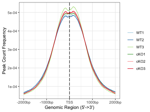
Once we have that, we can create a single plot with each sample line with a different color. Alternatively, we can create each profile plot separately and facet by row as displayed below.
# Plot profile plots, multiple lines in a single plot
plotAvgProf(tagMatrixList, xlim=c(-2000, 2000))
# Plot profile plots, faceted by row
plotAvgProf(tagMatrixList, xlim=c(-2000, 2000), conf=0.95,resample=500, facet="row")
We can also plot multiple heatmaps drawn side by side. The code is shown below, but we will not be running it in class due to the huge memory requirement.
### DO NOT RUN

# Plot multiple heatmaps
tagHeatmap(tagMatrixList)
Summary
Overall, the annotation and visualizations are in line with our expectations for an H3K27ac binding profile. H3K27ac is associated with the higher activation of transcription and is therefore defined as an active enhancer mark. H3K27ac is found at both proximal and distal regions of transcription start site (TSS), and we saw high percentages of peaks annotated at both regions. The ChIPseeker package has additional functionality that we did not explore due to limits in computational resources. We encourage you to peruse the vignette for more information and explore other tools for visualization.
This lesson has been developed by members of the teaching team at the Harvard Chan Bioinformatics Core (HBC). These are open access materials distributed under the terms of the Creative Commons Attribution license (CC BY 4.0), which permits unrestricted use, distribution, and reproduction in any medium, provided the original author and source are credited.