Contributors: Heather Wick, Upendra Bhattarai, Meeta Mistry, Will Gammerdinger
Approximate time: 45 minutes
Learning Objectives
- Interpret various metrics for peak quality
- Evaluate metrics for assessing the quality of peaks called
Quality Control
In our peak files we have genomic coordinates identifying regions of the genome where there is a significant amount of enrichment in our samples. A good quality ChIP-seq experiment will have high enrichment over background, and so for each of our samples we will use quality metrics to assess this. In this lesson, we describe the different ways in which we can quantify the quality and we also present the tools (and associated commands) to compute them for your own dataset.
Load libraries
First we need to set up our environment by loading required libraries to help us process our data. In this lesson we are mostly creating figures using data contained in metrics.csv. These figures will be created using ggplot2 and so we load the tidyverse suite, which provides additional functionality for data wrangling should we need it.
# Load libraries
library(tidyverse)
Load data
Locate the metrics summary file called metrics.csv, which is located in the meta folder of your working directory. It is a CSV file in which each row corresponds to a sample, and each column contains information for either metadata or a quality metric.
# Load QC metrics file
metrics <- read.csv("meta/metrics.csv")
View(metrics)
How was
metrics.csvgenerated?As discussed in the pre-reading lesson, this dataset was run through the nf-core/chipseq pipeline. All of the outputs from the pipeline are used as input to various parts of this workshop. The
metrics.csvwas compiled using an R package calledbcbioR. This package takes the output folder from an nf-core run and compiles data and code into a .Rmd template that can be used to look at the same QC metrics that we discuss in this workshop.We acknowledge that most participants of this workshop will not be using nf-core. As such, for each metric, we will describe what it represents and how it is computed. We provide code for you such that you may use it to compute similar metrics for your own dataset and create your own CSV.
Note that the majority of the code we provide is for command-line tools, not R. If you are attempting to run this on your own data, it may be beneficial to run this on a high performance computing cluster where these tools are commonly pre-installed for you.
Total reads
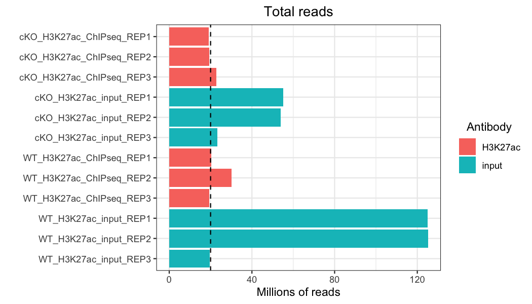
One of the most basic quality evaluations we can make for any genomic (or transcriptomic) data set is to look at the total number of reads in each sample. Ideally, we want to see consistency across samples, and especially across any treatment groups we might compare. We also want to see a minimum of about 20 million reads (represented by the black dashed line).
# Plot total reads
metrics %>%
  ggplot(aes(x = sample,
             y = total_reads/1e6,
             fill = antibody)) +
  geom_bar(stat = "identity") +
  theme_bw() +
  coord_flip() +
  scale_y_continuous(name = "Millions of reads") +
  scale_x_discrete(limits = rev) +
  xlab("") +
  ggtitle("Total reads") +
  theme(plot.title = element_text(hjust = 0.5)) +
  labs(fill = "Antibody") +
  theme(legend.title = element_text(hjust = 0.5)) +
  geom_hline(yintercept=20, color = "black", linetype = "dashed", linewidth=.5)
This data set isn’t perfect – while most of our samples have close to or more than 20 million reads, we have some variation between samples. In particular, some of our our input samples, especially two of the WT samples, have many more reads than the other samples. If input reads have many more reads in peaks than their antibody counterparts, this can skew or reduce the number of peaks identified in those samples. However, if these reads are scattered throughout the genome, they may just be background noise and the sample was simply sequenced more deeply. By looking at other quality control metrics, we can determine how this might affect the data set and, if necessary, take steps to reduce the impact of this kind of variability, such as through down-sampling.
Click here for the code to compute total reads from your own data
There are a number of ways and programs to ascertain the total number of reads in a sample, but, for this example, we will use Picard.
picard is a tool maintained by the Broad Institute with a wide variety of functions to assist in next-generation sequencing data analysis. picard has multiple functions that can return the total number of reads as part of their analysis, but we will use the CollectAlignmentSummaryMetrics function because we will also need the alignment metrics for the next section on assessing the mapping rate. The command to run picard's CollectAlignmentSummaryMetrics function is:# Run picard CollectAlignmentSummaryMetrics for a sample java -jar picard.jar CollectAlignmentSummaryMetrics \ --INPUT $INPUT_BAM \ --REFERENCE_SEQUENCE $REFERENCE \ --OUTPUT $OUTPUT_METRICS_FILE
The output from
picard can sometimes be difficult to intepret on the command-line, because there are usually many columns in the output file. However, if you are able to import the data into a spreadsheet software package, like Microsoft Excel, it can be a bit easier to intepret. In order to count the number of total reads, we are interested in the column named TOTAL_READS. More detailed information on picard's CollectAlignmentSummaryMetrics can be found here.
Mapping rate
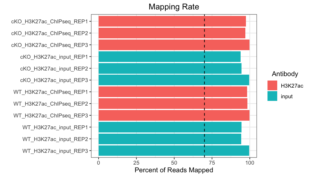
Next, we will look at mapping rate, which is the number of reads that were able to successfully be mapped to a unique region of the reference genome, out of the total number of reads (multi-mapped reads were excluded in our pipeline). We want to see consistent mapping rates between samples and over 70% mapping (the black dashed line).
# Plot mapping rate
metrics %>%
  ggplot(aes(x = sample,
             y = mapped_reads_pct,
             fill = antibody)) +
  geom_bar(stat = "identity") +
  theme_bw() +
  coord_flip() +
  scale_y_continuous(name = "Percent of Reads Mapped") +
  scale_x_discrete(limits = rev) +
  xlab("") +
  ggtitle("Mapping Rate") +
  theme(plot.title = element_text(hjust = 0.5)) +
  labs(fill = "Antibody") +
  theme(legend.title = element_text(hjust = 0.5)) +
  geom_hline(yintercept=70, color = "black", linetype = "dashed", linewidth=.5)
Our samples all have a mapping rate well above the minimum, and the samples are consistent across the dataset.
Click here for the code to compute mapping rate from your own data
In order to collect the mapping rate for a sample, we will use information from
picard's CollectAlignmentSummaryMetrics output that we ran in the previous dropdown, which helped us count the number of total reads. As a reminder, the code to run this would be:# Run picard CollectAlignmentSummaryMetrics for a sample java -jar picard.jar CollectAlignmentSummaryMetrics \ --INPUT $INPUT_BAM \ --REFERENCE_SEQUENCE $REFERENCE \ --OUTPUT $OUTPUT_METRICS_FILE
The output column that we are interested in is called
PCT_PF_READS_ALIGNED. More detailed information on picard's CollectAlignmentSummaryMetrics can be found here.
Strand cross-correlation
A high-quality ChIP-seq experiment will produce significant clustering of enriched DNA sequence tags/reads at locations bound by the protein of interest; the expectation is that we can observe a bimodal enrichment of reads (sequence tags) on both the forward and the reverse strands.
How are the Cross-Correlation scores calculated?
Using a small genomic window as an example, let’s walk through the details of the cross-correlation below. It is important to note that the cross-correlation metric is computed as the Pearson’s linear correlation between coverage for each complementary base (i.e., on the minus strand and the plus strand), by systematically shifting minus strand by k base pairs at a time. This shift is performed over and over again to obtain the correlations for a given area of the genome.
Plot 1: At strand shift of zero, the Pearson correlation between the two vectors is 0.
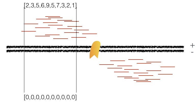
Plot 2: At strand shift of 100bp, the Pearson correlation between the two vectors is 0.389.
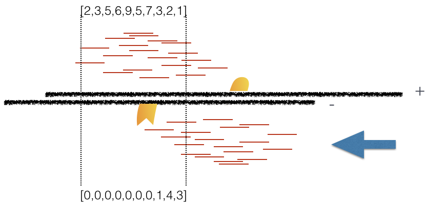
Plot 3: At strand shift of 175bp, the Pearson correlation between the two vectors is 0.831.
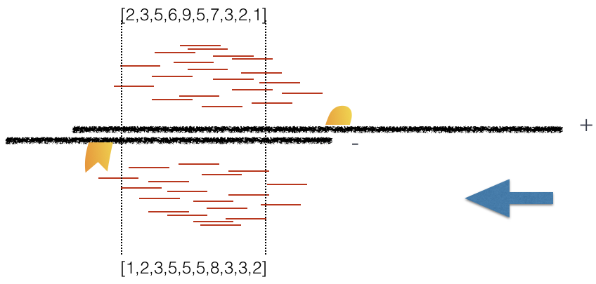
When this process is completed we will have a table of values mapping each base pair shift to a Pearson correlation value. These Pearson correlation values are computed for every peak for each chromosome and values are multiplied by a scaling factor and then summed across all chromosomes.
In the end we will have a cross-correlation value for each shift value, and they can be plotted against each other to generate a cross-correlation plot as shown below. The cross-correlation plot typically produces two peaks: a peak of enrichment corresponding to the predominant fragment length (highest correlation value) and a peak corresponding to the read length (“phantom” peak).
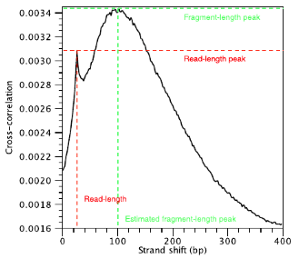
There are two metrics that are computed using the cross-correlation described below. These metrics are a representation of the quality of signal to noise for the peaks of each sample. This is typically only computed for the IP sample and it is derived without dependence on prior determination of enriched regions/peaks.
How do we compute strand cross-correlation metrics?
In order to compute strand cross-correlation metrics we will use an R package called
phantompeakqualtools. We have also set the package up for use on HMS-RC's O2 cluster. The command to run this on O2 is:# Run phantompeakqualtools for a sample R_LIBS_USER=/n/groups/hbctraining/phantompeakqualtools/ \ Rscript --no-environ /n/groups/hbctraining/phantompeakqualtools/run_spp.R \ -c="$COORDINATE_SORTED_BAM" \ -savp="$OUTPUT_PDF" \ -savd="$OUTPUT_RDATA" \ -out="$OUTPUT_FILE" \ -p=$CORES
This code will generate the cross-correlation plot along with both NSC and RSC scores (described below). The output PDF will look like:
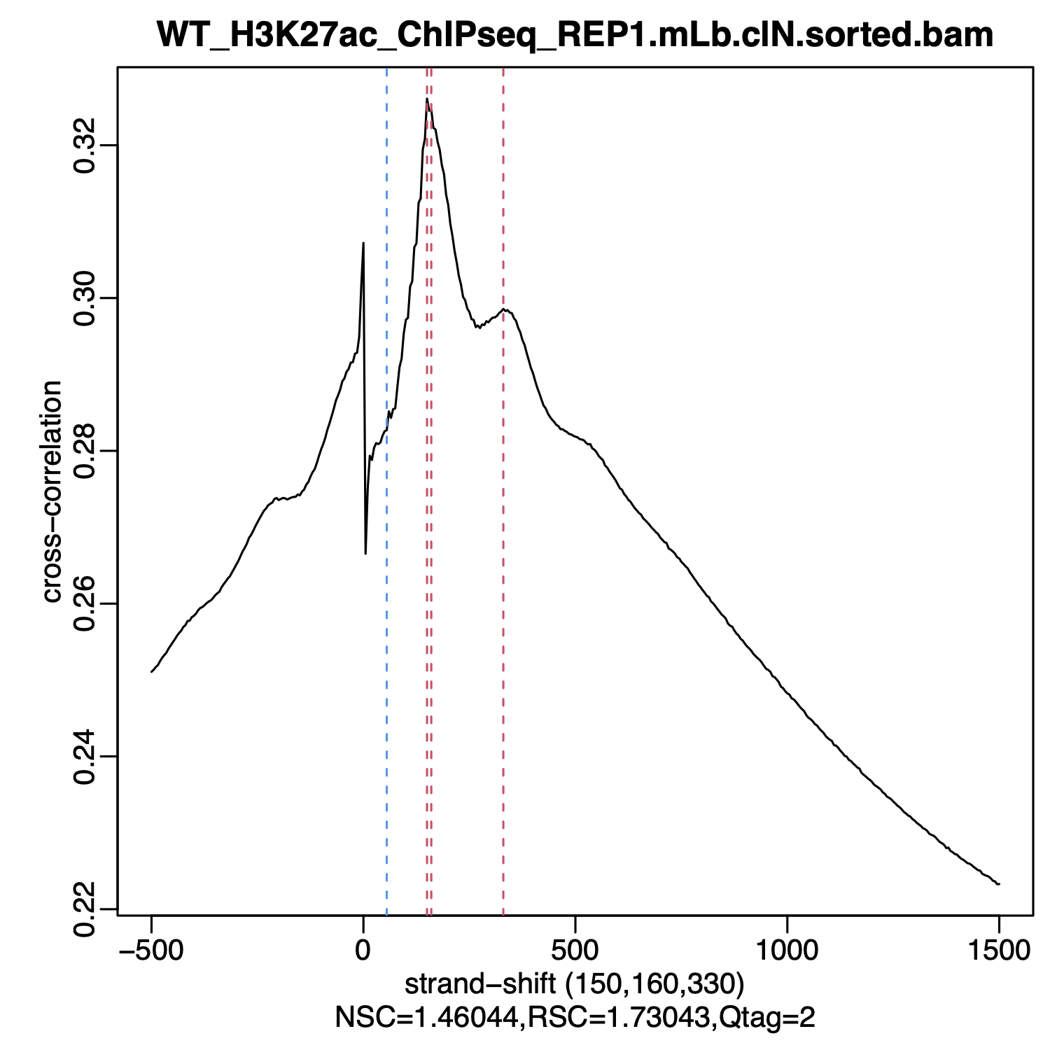
phantompeakqualtools can be found here.
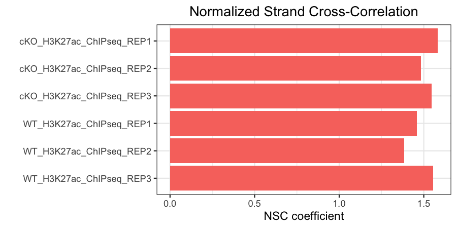
Normalized strand cross-correlation coefficient (NSC)
The NSC is the ratio of the maximal cross-correlation value (which occurs at strand shift equal to fragment length) divided by the background cross-correlation (minimum cross-correlation value over all possible strand shifts).
- Higher NSC values indicate more enrichment (better signal:noise)
- Low signal-to-noise: NSC values < 1.1
- Minimum possible NSC value: 1 (no enrichment)
NOTE: This metric is sensitive to technical effects (e.g., high quality antibodies will generate higher scores) and biological effects (e.g., narrow peaks typically score higher than broad peaks).
# Plot NSC
metrics %>%
  filter(antibody != "input") %>%
  ggplot(aes(x = sample,
             y = nsc,
             fill = antibody)) +
  geom_bar(stat = "identity") +
  theme_bw() +
  coord_flip() +
  scale_y_continuous(name = "NSC coefficient") +
  scale_x_discrete(limits = rev) +
  xlab("") +
  ggtitle("Normalized Strand Cross-Correlation") +
  theme(plot.title = element_text(hjust = 0.5)) +
  theme(legend.position = "none")
In our data, you can see that our antibody samples all have NSC values >1.
Click here for the code to extract NSC from your phantompeakqualtools Rdata object
In order extract the NSC value from the Rdata object that was created by
phantompeakqualtools, you will need to load the phantompeakqualtools Rdata object into your R environment and call the variable crosscorr$phantom.coeff:
load("SAMPLE_PHANTOMPEAKQUALTOOLS_OUTPUT.Rdata")
crosscorr$phantom.coeff
More detailed information on
phantompeakqualtools can be found here.
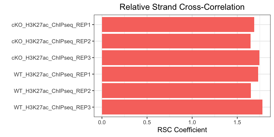
Relative strand cross-correlation coefficient (RSC)
This is the ratio of the fragment-length correlation value minus the background (minimum) cross-correlation value, divided by the phantom-peak cross-correlation value minus the background cross-correlation value.
- High enrichment: RSC values > 1
- Low signal-to-noise: RSC values < 0.8
- Minimum possible RSC value: 0 (no enrichment)
# Plot RSC
metrics %>%
  filter(antibody != "input") %>%
  ggplot(aes(x = sample,
             y = rsc,
             fill = antibody)) +
  geom_bar(stat = "identity") +
  theme_bw() +
  coord_flip() +
  scale_y_continuous(name = "RSC Coefficient") +
  scale_x_discrete(limits = rev) +
  xlab("") +
  ggtitle("Relative Strand Cross-Correlation") +
  theme(plot.title = element_text(hjust = 0.5)) +
  theme(legend.position = "none")
Click here for the code to extract RSC from your phantompeakqualtools Rdata object
In order extract the RSC value from the Rdata object that was created by
phantompeakqualtools, you will need to load the phantompeakqualtools Rdata object into your R environment and call the variable crosscorr$rel.phantom.coeff:
load("SAMPLE_PHANTOMPEAKQUALTOOLS_OUTPUT.Rdata")
crosscorr$rel.phantom.coeff
More detailed information on
phantompeakqualtools can be found here.
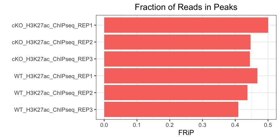
Fraction of reads in peaks (FRiP)
This represents the fraction of mapped reads that are mapped to peaks (as opposed to elsewhere in the genome). This is only calculated for antibody samples in our data set. The expected fraction of reads in peaks will vary by protein. Histone marks, which usually have broader peaks, often have higher FRiPs than transcription factors, which usually have much narrower peaks.
# Plot FRiP
metrics %>%
  filter(antibody != "input") %>%
  ggplot(aes(x = sample,
             y = frip,
             fill = antibody)) +
  geom_bar(stat = "identity") +
  theme_bw() +
  coord_flip() +
  scale_y_continuous(name = "FRiP") +
  scale_x_discrete(limits = rev) +
  xlab("") +
  ggtitle("Fraction of Reads in Peaks") +
  theme(plot.title = element_text(hjust = 0.5)) +
  theme(legend.position = "none")
Our samples have FRiPs in line with what we might expect for narrow histone marks, and they are fairly consistent.
Click here for the code to compute FRiP for your own samples
In order to determine the fraction of reads in peaks (FRiP), we can run a custom shell script. The script requires
bedtools in order to run and documentation for bedtools can be found here. The command to run this script to calculate the fraction of reads in peaks is:# Calculate the fraction of reads in peaks # Requires bedtools to run sh calculate_frip.sh \ $DIRECTORY_WITH_BAM_FILES \ $DIRECTORY_WITH_PEAK_FILES \ $OUTPUT_FILE
Non-redundant fraction (NRF)
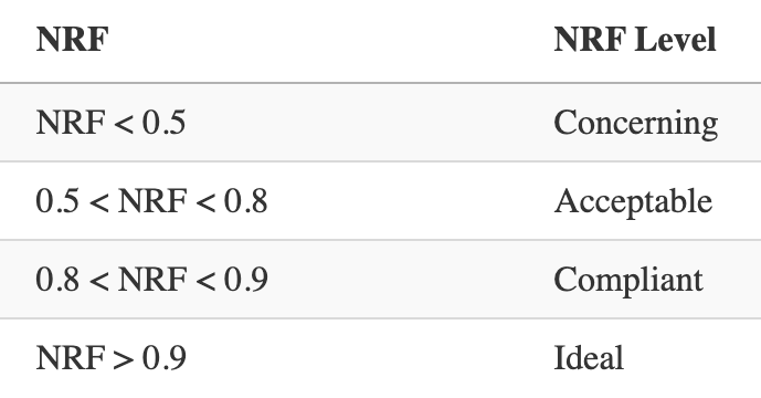
The non-redundant fraction of reads is the number of distinct uniquely mapping reads (i.e., after removing duplicates and unmapped) divided by the total number of mapped reads. It is a measure of library complexity. This value is 0-1 and, ideally, we would want to see values close to 1. Generally, an NRF of 0.8 and higher indicates acceptable data. The ENCODE website also sets out standardized thresholds for this and those are summarized in the table below. In our plot, we use a green, orange, and red dashed line to represent Ideal, Compliant, and Acceptable NRF cutoffs, respectively.
Click here for the code to compute NRF values from your own data
In order to determine the number of uniquely mapping reads, we can runPicard's MarkDuplicates function. It will mark duplicate reads and also output a metrics file containing the number of total reads, unmapped reads and duplicated reads. The command to run this is:# Mark duplicates and create metrics file java -jar picard.jar MarkDuplicates \ --INPUT <SORTED_BAM_FILE> \ --OUTPUT <REMOVE_DUPLICATES_BAM_FILE> \ --METRICS_FILE <METRICS_FILE>
From this we can derive our NRF:
Below are the ENCODE guidelines for NRF:
# Plot NRF
metrics %>%
  ggplot(aes(x = sample,
             y = nrf,
             fill = antibody)) +
  geom_bar(stat = "identity") +
  theme_bw() +
  coord_flip() +
  scale_y_continuous(name = "Non-Redundant Fraction") +
  scale_x_discrete(limits = rev) +
  xlab("") +
  ggtitle("Non-Redundant Fraction") +
  theme(plot.title = element_text(hjust = 0.5)) +
  labs(fill = "Antibody") +
  theme(legend.title = element_text(hjust = 0.5)) +
  geom_hline(yintercept = 0.9, linetype = "dashed", color="green") +
  geom_hline(yintercept = 0.8, linetype = "dashed", color="orange") +
  geom_hline(yintercept = 0.5, linetype = "dashed", color="red")
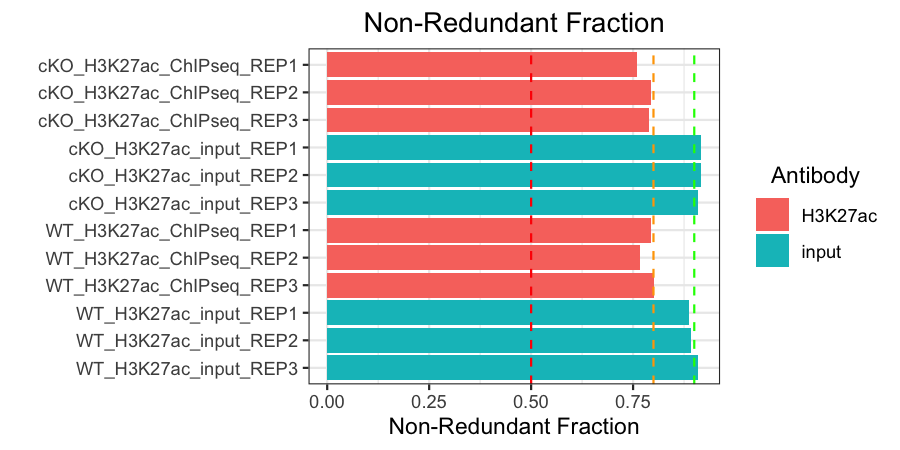
All of our samples are at least acceptable, and hover around or surpass the compliant or ideal thresholds.
Number of peaks
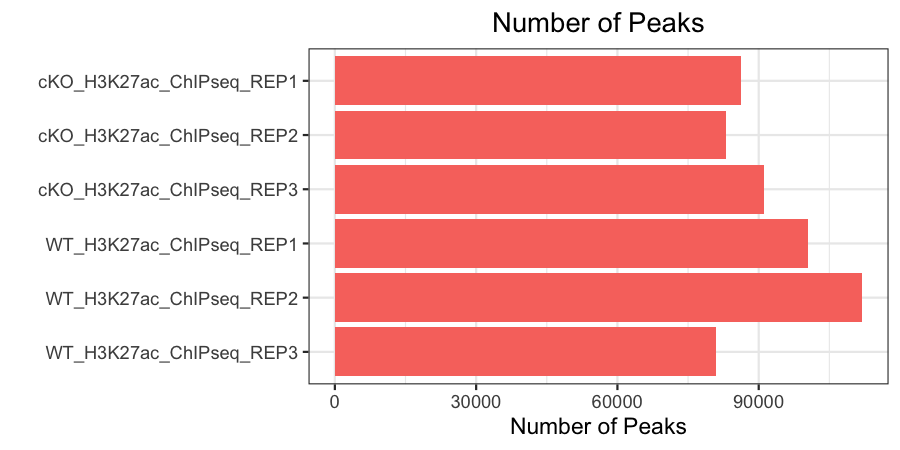
Finally, we want to see a consistent number of peaks between our samples (we only have this metric for our antibody samples). This is computed by taking the narrowPeak files for each sample and counting the total number of lines in it (as each corresponds to a new peak that was called). We can do this on the command-line using wc -l or simply opening each file manually.
# Plot number of peaks
metrics %>%
  filter(antibody != "input") %>%
  ggplot(aes(x = sample,
             y = peak_count,
             fill = antibody)) +
  geom_bar(stat = "identity") +
  theme_bw() +
  coord_flip() +
  scale_y_continuous(name = "Number of Peaks") +
  scale_x_discrete(limits = rev) +
  xlab("") +
  ggtitle("Number of Peaks") +
  theme(plot.title = element_text(hjust = 0.5)) +
  theme(legend.position = "none")
Summary
Overall, our data looks pretty good. We do have a large number of reads in some of our input samples, but all of the other QC metrics look acceptable. We can go ahead and take a look at some additional QC metrics in our next lesson, where we will examine more closely the relationship between samples.
This lesson has been developed by members of the teaching team at the Harvard Chan Bioinformatics Core (HBC). These are open access materials distributed under the terms of the Creative Commons Attribution license (CC BY 4.0), which permits unrestricted use, distribution, and reproduction in any medium, provided the original author and source are credited.