/* Slider Label */
.shiny-input-container:has(.js-range-slider) > label{
  height: 100px;
  width: 200px;
  background-color: red;
  color: orange;
  font-family: Monospace;
  font-size: 20px;
  font-style: italic;
  font-weight: 100;
  border-color: green;
  border-radius: 10px;
  border-style: dashed;
  border-width: 5px;
  padding: 1px 2px 3px 4px;
  opacity: 50%;
  box-shadow: inset 0 0 10px rgba(0, 0, 0, 0.5);
  text-shadow: -3px -3px 2px tomato;
}sliderInput
Below is a key for the many of the elements that can be altered within the sliderInput():
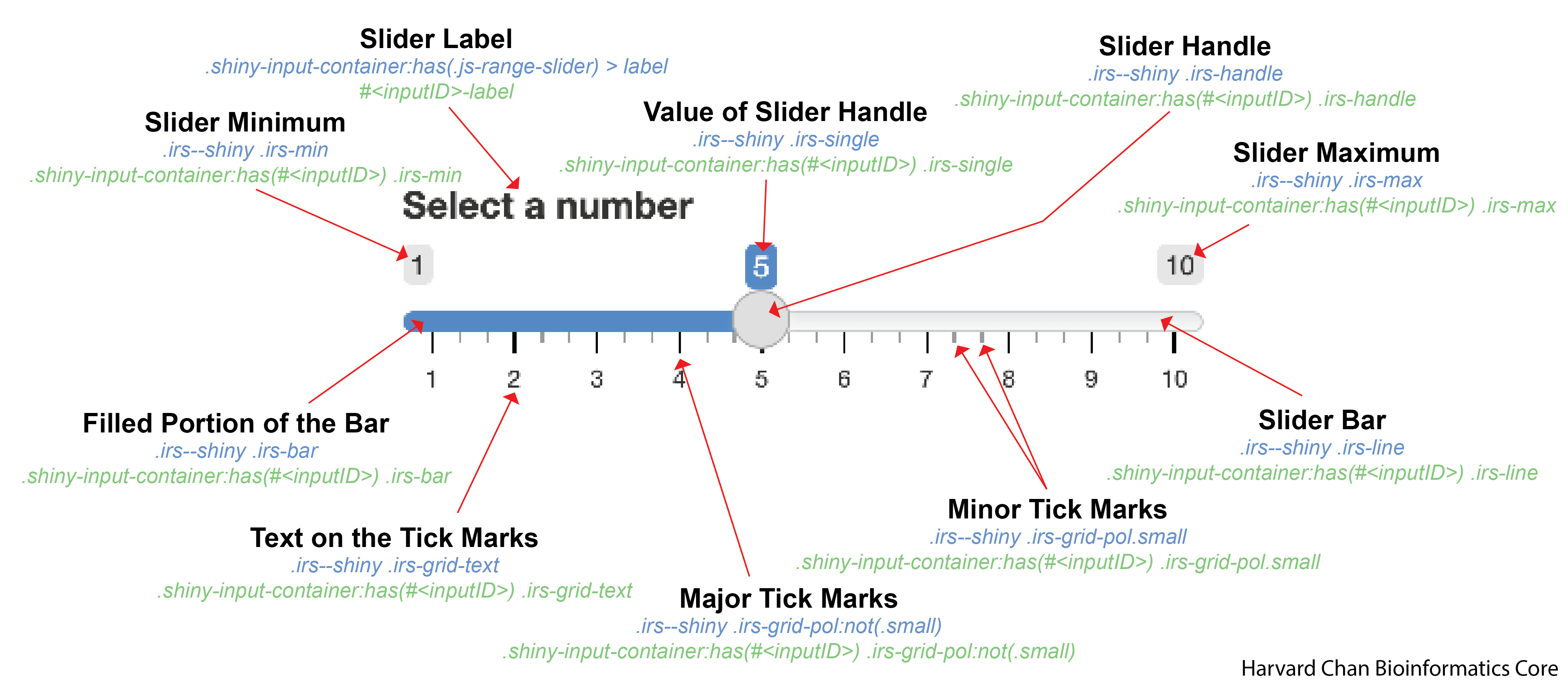
inputID. To do this, you would replace <inputID> with a input widget’s inputID.It gets slightly more complicated with a slider range within the sliderInput():
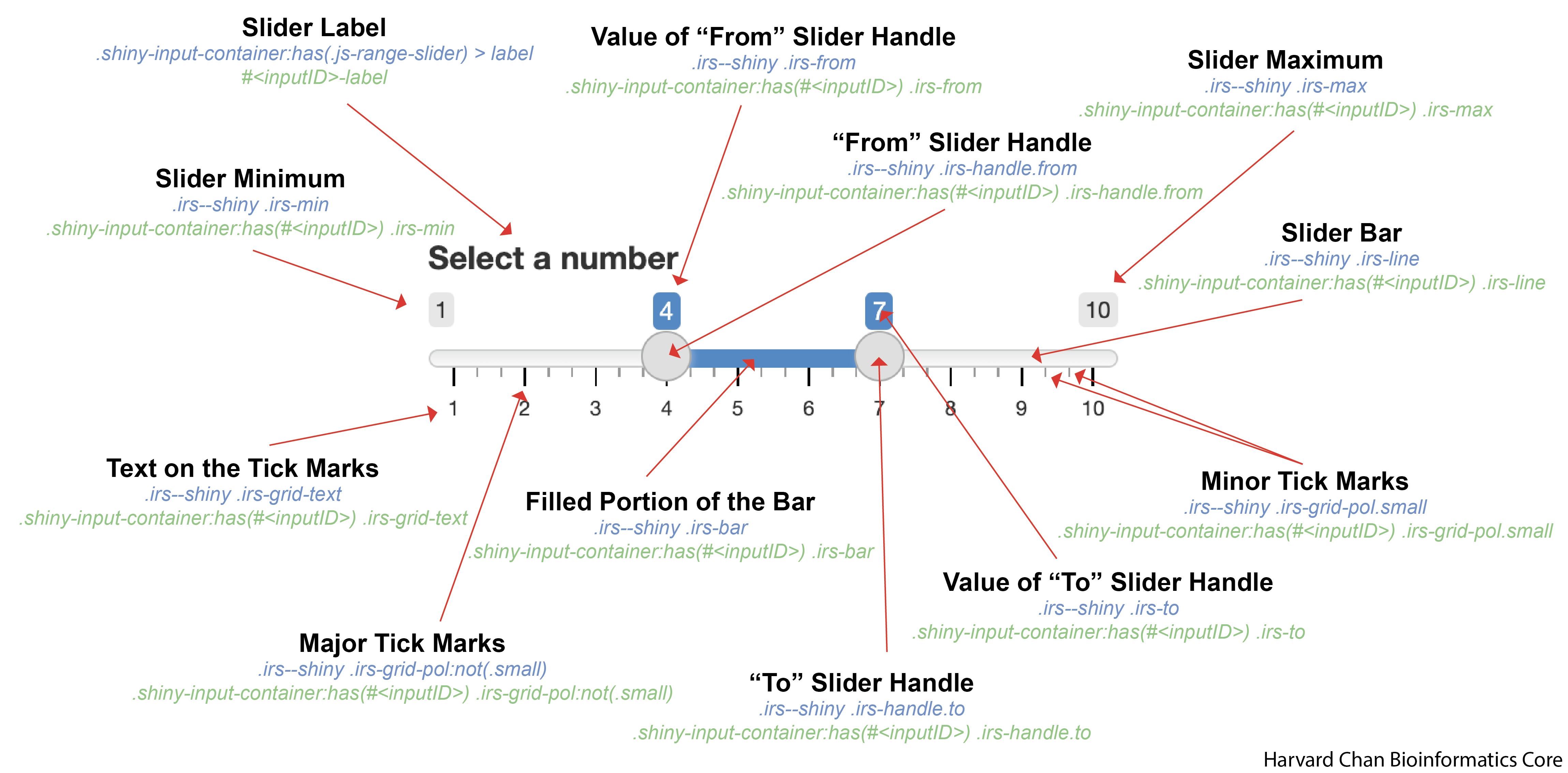
inputID. To do this, you would replace <inputID> with a input widget’s inputID.Jump to the following sections:
- Slider Label
- Slider Handle
- Slider Handles with Range
- Slider Minimum
- Slider Maximum
- Slider Minimum and Maximum
- Value of Slider Handle
- Value of Slider Handle with Range
- Slider Bar
- Filled Portion of the Bar
- Text on the Tick Marks
- Major Tick Marks
- Minor Tick Marks
Slider Label
An example CSS entry for the slider label is below:
Note
In order to target a single inputID, replace <inputID> with the input widgets inputID below:
/* Slider Label for a specific <inputID> */
#<inputID>-label{
  ...
}| Argument | Note |
|---|---|
height |
Height of the slider label box (reference) |
width |
Width of the slider label box (reference) |
background-color |
The background color for the text space (reference) |
color |
The color of the text (reference) |
font-family |
The font used (reference) |
font-size |
The size of the font (reference) |
font-style |
Whether the font is normal or italic (reference) |
font-weight |
How thick or bold the font is (reference) |
border-color |
Color of the border (reference) |
border-radius |
How curved the radius of the corners are (reference) |
border-style |
Style of the border (reference) |
border-width |
Width of the border (reference) |
padding |
How much space to leave around the text(reference) |
opacity |
Opacity of the label (reference) |
box-shadow |
The shadow of the box outlining the text space (reference) |
text-shadow |
The shadow of the text within the text space (reference) |
Slider Handle
An example CSS entry for the slider handle is below:
/* Slider Handle */
.irs--shiny .irs-handle{
  height: 22px;
  width: 22px;
  background-color: pink;
  border-width: 2px;
  border-radius: 10px;
  border-style: solid;
  border-color: green;
  opacity: 70%;
  cursor: pointer;
  box-shadow: 4px 4px 8px purple;
}
Note
In order to target a single inputID, replace <inputID> with the input widgets inputID below:
/* Slider Handle for a specific <inputID> */
.shiny-input-container:has(#<inputID>) .irs-handle{
  ...
}| Argument | Note |
|---|---|
height |
Height of the slider handle (reference) |
width |
Width of the slider handle (reference) |
background-color |
Color of the inner circle of the slider handle (reference) |
border-width |
Width of the border (reference) |
border-radius |
How curved the radius of the slider handle is (reference) |
border-style |
Style of the border (reference) |
border-color |
Color of the corder (reference) |
opacity |
Opacity of the slider handle (reference) |
cursor |
Image of cursor (reference) |
box-shadow |
The shadow of the slider handle (reference) |
Hover pseudo-class
The default sliderInput() changes slight shades as you hover over it. If you would like to edit this behavior you will need to use the :hover pseudo-class:
/* While hovering over the slider handle*/
.irs--shiny .irs-handle:hover{
  cursor: grab;
}
The options available to the hover pseudo-class are the same as for the normal slider handle.
Active pseudo-class
You can also alter the the slider handle while you are dragging it by using the :active pseudoclass:
/* While grabbing a hold to the slider handle */
.irs--shiny .irs-handle:active{
  cursor: grabbing;
}
The options available to the active pseudo-class are the same as for the normal slider handle.
Slider Handles with Range
Slider handles within ranges work the same as single slider handles except the class is either appended with .from or .to to the end. The options you have are consistent the same as with what you have within Slider Handle and anything not specific for the .from or .to slider will be inherited from the general .irs--shiny .irs-handle which will apply to both.
“From” Slider Handle
An example CSS entry for the “from” slider handle is below:
/* "From" slider handle in a range */
.irs--shiny .irs-handle.from{
  background-color: black;
}
Note
In order to target a single inputID, replace <inputID> with the input widgets inputID below:
/* "From" slider handle in a range for a specific <inputID> */
.shiny-input-container:has(#<inputID>) .irs-handle.from{
  ...
}
“To” Slider Handle
An example CSS entry for the “to” slider handle is below:
/* "To" slider handle in a range */
.irs--shiny .irs-handle.to{
  background-color: pink;
}
Note
In order to target a single inputID, replace <inputID> with the input widgets inputID below:
/* "To" slider handle in a range for a specific <inputID> */
.shiny-input-container:has(#<inputID>) .irs-handle.to{
  ...
}
“From” and “To” Slider Handle
An example CSS entry for controlling the “from” and “to” slider handles is below:
/* "From" and "To" slider handle in a range */
.irs--shiny .irs-handle.to,
.irs--shiny .irs-handle.from{
  background-color: orange;
}
Note
In order to target a single inputID, replace <inputID> with the input widgets inputID below:
/* "From" and "To" slider handle in a range for a specific <inputID> */
.shiny-input-container:has(#<inputID>) .irs-handle.from,
.shiny-input-container:has(#<inputID>) .irs-handle.to{
  ...
}
Slider Minimum
An example CSS entry for the slider minimum label is below:
/* Slider Minimum Value */
.irs--shiny .irs-min{
  height: 22px;
  width: 22px;
  background-color: blue;
  color: white;
  font-family: sans-serif;
  font-size: 10px;
  font-style: italic;
  font-weight: 100;
  border-color: green;
  border-radius: 10px;
  border-style: dashed;
  border-width: 5px;
  padding: 1px 2px 3px 4px;
  opacity: 70%;
  box-shadow: inset 0 0 10px rgba(0, 0, 0, 0.5);
  text-shadow: -3px -3px 2px tomato;
}
Note
In order to target a single inputID, replace <inputID> with the input widgets inputID below:
/* Slider Minimum Value for a specific inputID */
.shiny-input-container:has(#<inputID>) .irs-min{
  ...
}| Argument | Note |
|---|---|
height |
Height of the slider minimum box (reference) |
width |
Width of the slider minimum box (reference) |
background-color |
The background color for the text (reference) |
color |
The color of the text (reference) |
font-family |
The font used (reference) |
font-size |
The size of the font (reference) |
font-style |
Whether the font is normal or italic (reference) |
font-weight |
How thick or bold the font is (reference) |
border-color |
Color of the border (reference) |
border-radius |
How curved the radius of the corners of box are (reference) |
border-style |
Style of the border (reference) |
border-width |
Width of the border (reference) |
padding |
How much space to leave around the text(reference) |
opacity |
The opacity of the slider minimum box (reference) |
box-shadow |
The shadow of the slider minimum (reference) |
text-shadow |
The shadow of the text within the slider minimum (reference) |
Slider Maximum
An example CSS entry for the slider maximum label is below:
/* Slider Maximum Value */
.irs--shiny .irs-max{
  height: 22px;
  width: 22px;
  background-color: yellow;
  color: green;
  font-family: sans-serif;
  font-size: 10px;
  font-style: italic;
  font-weight: 100;
  border-color: green;
  border-radius: 10px;
  border-style: dashed;
  border-width: 5px;
  padding: 1px 2px 3px 4px;
  opacity: 60%;
  box-shadow: 4px 4px 8px rgba(0, 0, 0, 0.2);
  text-shadow: -3px -3px 2px tomato;
}
Note
In order to target a single inputID, replace <inputID> with the input widgets inputID below:
/* Slider Maximum Value for a specific inputID */
.shiny-input-container:has(#<inputID>) .irs-max{
  ...
}| Argument | Note |
|---|---|
height |
Height of the slider maximum box (reference) |
width |
Width of the slider maximum box (reference) |
background-color |
The background color for the text (reference) |
color |
The color of the text (reference) |
font-family |
The font used (reference) |
font-size |
The size of the font (reference) |
font-style |
Whether the font is normal or italic (reference) |
font-weight |
How thick or bold the font is (reference) |
border-color |
Color of the border (reference) |
border-radius |
How curved the radius of the corners of box are (reference) |
border-style |
Style of the border (reference) |
border-width |
Width of the border (reference) |
padding |
How much space to leave around the text (reference) |
opacity |
Opacity of the slider maximum (reference) |
box-shadow |
The shadow of the slider maximum (reference) |
text-shadow |
The shadow of the text within the slider maximum (reference) |
Slider Minimum and Maximum
Likely, we want want the slider’s minimum and maximum to be identical and this can be accomplished by separating .irs--shiny .irs-min and .irs--shiny .irs-max with a comma.
/* Slider Minimum and Maximum Value */
.irs--shiny .irs-min,
.irs--shiny .irs-max{
  height: 22px;
  width: 22px;
  background-color: yellow;
  color: green;
  font-family: sans-serif;
  font-size: 10px;
  font-style: italic;
  font-weight: 100;
  border-color: green;
  border-radius: 10px;
  border-style: dashed;
  border-width: 5px;
  padding: 1px 2px 3px 4px;
  opacity: 30%;
  box-shadow: 2px -2px 10px green;
  text-shadow: -3px -3px 2px rgba(0, 0, 0, 0.8);
}
Note
In order to target a single inputID, replace <inputID> with the input widgets inputID below:
/* Slider Minimum and Maximum Value for a specific <inputID> */
.shiny-input-container:has(#<inputID>) .irs-min,
.shiny-input-container:has(#<inputID>) .irs-max{
  ...
}| Argument | Note |
|---|---|
height |
Height of the slider minimum and maximum box (reference) |
width |
Width of the slider minimum and maximum box (reference) |
background-color |
The background color for the text (reference) |
color |
The color of the text (reference) |
font-family |
The font used (reference) |
font-size |
The size of the font (reference) |
font-style |
Whether the font is normal or italic (reference) |
font-weight |
How thick or bold the font is (reference) |
border-color |
Color of the border (reference) |
border-radius |
How curved the radius of the corners of box are (reference) |
border-style |
Style of the border (reference) |
border-width |
Width of the border (reference) |
padding |
How much space to leave around the text (reference) |
opacity |
Opacity of the slider minimum and maximum (reference) |
box-shadow |
The shadow of the slider minimum and maximum (reference) |
text-shadow |
The shadow of the text within the slider minimum and maximum (reference) |
Value of Slider Handle
An example CSS entry for the value of the slider handle is below:
/* Value of slider handle */
.irs--shiny .irs-single{
  background-color: orange;
  color: rgb(0, 0, 0);
  font-family: sans-serif;
  font-size: 12px;
  font-style: normal;
  font-weight: 200;
  border-color: #E3E3E3;
  border-radius: 2px;
  border-style: dotted;
  border-width: 3px;
  padding: 4px 3px 2px 1px;
  opacity: 90%;
  box-shadow: -4px -4px 6px rgba(255,0, 255, 0.8);
  text-shadow: -3px -3px 2px black;
}
Note
In order to target a single inputID, replace <inputID> with the input widgets inputID below:
/* Value of slider handle for a specific <inputID> */
.shiny-input-container:has(#<inputID>) .irs-single{
  ...
}| Argument | Note |
|---|---|
background-color |
The background color for the text (reference) |
color |
The color of the text (reference) |
font-family |
The font used (reference) |
font-size |
The size of the font (reference) |
font-style |
Whether the font is normal or italic (reference) |
font-weight |
How thick or bold the font is (reference) |
border-color |
Color of the border (reference) |
border-radius |
How curved the radius of the corners of box are (reference) |
border-style |
Style of the border (reference) |
border-width |
Width of the border (reference) |
padding |
How much space to leave around the text (reference) |
opacity |
Opacity of the value box (reference) |
box-shadow |
The shadow of the value box (reference) |
text-shadow |
The shadow of the text within the value box (reference) |
Value of Slider Handle with Range
The values of the slider handles within ranges work the same as the value of a single slider handle except the classes have different names. The options you have are consistent the same as with what you have within Value of Slider Handle.
Value of “From” Slider Handle
An example CSS entry for the value of the “from” slider handle is below:
/* Value of "From" slider handle in a range */
.irs--shiny .irs-from{
  background-color: blue;
}
Note
In order to target a single inputID, replace <inputID> with the input widgets inputID below:
/* Value of "From" slider handle in a range for a specific <inputID> */
.shiny-input-container:has(#<inputID>) .irs-from{
  ...
}
Value of “To” Slider Handle
An example CSS entry for the value of the “to” slider handle is below:
/* Value of "To" slider handle in a range */
.irs--shiny .irs-to{
  background-color: red;
}
Note
In order to target a single inputID, replace <inputID> with the input widgets inputID below:
/* Value of "To" slider handle in a range for a specific <inputID> */
.shiny-input-container:has(#<inputID>) .irs-to{
  ...
}
Value of “From” and “To” Slider Handle
There could be cases where you want both slider handle to be the same. You could make separate .irs--shiny .irs-from and .irs--shiny .irs-to CSS entries, or you can make a single one for both:
/* Values of "To" and "From" slider handle in a range */
.irs--shiny .irs-to,
.irs--shiny .irs-from{
  background-color: pink;
}
Note
In order to target a single inputID, replace <inputID> with the input widgets inputID below:
/* Values of "To" and "From" slider handle in a range for a specific <inputID> */
.shiny-input-container:has(#<inputID>) .irs-from,
.shiny-input-container:has(#<inputID>) .irs-to{
  ...
}
Slider Bar
An example CSS entry for the background bar is below:
/* Background bar */
.irs--shiny .irs-line{
  background: violet;
  border-color: red;
  border-radius: 1px;
  border-style: double;
  border-width: 2px;
  opacity: 70%;
  box-shadow: 4px -4px 6px rgba(0, 0, 255, 0.8);
}
Note
In order to target a single inputID, replace <inputID> with the input widgets inputID below:
/* Background bar for a specific <inputID> */
.shiny-input-container:has(#<inputID>) .irs-line{
  ...
}| Argument | Note |
|---|---|
background |
The color for the filled portion of the bar (reference) |
border-color |
Color of the border (reference) |
border-radius |
How curved the radius of the corners of box are (reference) |
border-style |
Style of the border (reference) |
border-width |
Width of the border (reference) |
opacity |
Opacity of the value box (reference) |
box-shadow |
The shadow of the value box (reference) |
Filled Portion of the Bar
An example CSS entry for the filled portion of the bar is below:
/* Filled portion of the bar in the foreground */
.irs--shiny .irs-bar{
  background-color: orange;
  border-color: green;
  border-radius: 2px;
  border-style: dashed;
  border-width: 2px;
  opacity: 90%;
  box-shadow: 4px -4px 6px rgba(0, 255, 255, 0.8);
}
Note
In order to target a single inputID, replace <inputID> with the input widgets inputID below:
/* Filled portion of the bar in the foreground for a specific <inputID> */
.shiny-input-container:has(#<inputID>) .irs-bar{
  ...
}| Argument | Note |
|---|---|
background-color |
The color for the filled portion of the bar (reference) |
border-color |
Color of the border (reference) |
border-radius |
How curved the radius of the corners of box are (reference) |
border-style |
Style of the border (reference) |
border-width |
Width of the border (reference) |
opacity |
Opacity of the value box (reference) |
box-shadow |
The shadow of the value box (reference) |
Text on the Tick Marks
Control across all of the text on tick marks
An example CSS entry for the value of the filled portion of the bar is below:
/* Text on the tick marks */
.irs--shiny .irs-grid-text{
  height: 30px;
  width: 30px;
  background-color: green;
  color: white;
  font-family: sans-serif;
  font-size: 12px;
  font-style: italic;
  font-weight: 800;
  border-color: orange;
  border-radius: 5px;
  border-style: dotted;
  border-width: 3px;
  padding: 1px 2px 3px 4px;
  opacity: 80%;
  box-shadow: inset 0 0 10px rgba(0, 255, 0, 0.6);
  text-shadow: -3px -3px 2px purple;
}
Note
In order to target a single inputID, replace <inputID> with the input widgets inputID below:
/* Text on the tick marks for a specific <inputID> */
.shiny-input-container:has(#<inputID>) .irs-grid-text{
  ...
}| Argument | Note |
|---|---|
height |
Height of the slider minimum box (reference) |
width |
Width of the slider minimum box (reference) |
background-color |
The background color for the text (reference) |
color |
The color of the text (reference) |
font-family |
The font used (reference) |
font-size |
The size of the font (reference) |
font-style |
Whether the font is normal or italic (reference) |
font-weight |
How thick or bold the font is (reference) |
border-color |
Color of the border (reference) |
border-radius |
How curved the radius of the corners of box are (reference) |
border-style |
Style of the border (reference) |
border-width |
Width of the border (reference) |
padding |
How much space to leave around the text(reference) |
opacity |
The opacity of the slider minimum box (reference) |
box-shadow |
The shadow of the slider minimum (reference) |
text-shadow |
The shadow of the text within the slider minimum (reference) |
Control over specific text on the tick marks
If you would like to have finer control over the text on the tick mark and assign different CSS input for different text you can modify the CSS entry to be:
/* Text on the <insert_integer> tick marks */
.irs--shiny .irs-grid-text.js-grid-text-<insert_integer>{
  ...
}
In this above example, replace <insert_integer> with a zero-indexed integer associated with the text.
Note
In order to target a single inputID, replace <inputID> with the input widgets inputID below:
/* Text on the <insert_integer> tick marks for a specific <inputID> */
.shiny-input-container:has(#<inputID>) .irs-grid-text.js-grid-text-<insert_integer>{
  ...
}
For example, if you wanted the first text element to be different than the rest than you would use:
/* Text on the first tick marks */
.irs--shiny .irs-grid-text.js-grid-text-0{
  ...
}
And if you wanted to modify the fourth text element then you would use:
/* Text on the fourth tick marks */
.irs--shiny .irs-grid-text.js-grid-text-3{
  ...
}
Note
Remember the indexing is zero-indexed!
Major Tick Marks
An example CSS entry for the values of the major tick marks is below:
/* Major tick marks */
.irs--shiny .irs-grid-pol:not(.small){
  height: 15px;
  width: 4px;
  background-color: green;
  border-color: pink;
  border-radius: 3px;
  border-style: solid;
  border-width: 1px;
  opacity: 80%;
}
Note
In order to target a single inputID, replace <inputID> with the input widgets inputID below:
/* Major tick marks for a specific <inputID> */
.shiny-input-container:has(#<inputID>) .irs-grid-pol:not(.small){
  ...
}| Argument | Note |
|---|---|
height |
Height of the major tick mark (reference) |
width |
Width of the major tick mark (reference) |
background-color |
The color for the major tick mark (reference) |
border-color |
Color of the border (reference) |
border-radius |
How curved the radius of the corners of tick mark are (reference) |
border-style |
Style of the border (reference) |
border-width |
Width of the border (reference) |
opacity |
Opacity of the major tick marks (reference) |
Minor Tick Marks
An example CSS entry for the values of the major tick marks is below:
/* Minor tick marks */
.irs--shiny .irs-grid-pol.small{
  height: 10px;
  width: 5px;
  background-color: blue;
  border-color: red;
  border-radius: 4px;
  border-style: dotted;
  border-width: 2px;
  opacity: 90%;
}
Note
In order to target a single inputID, replace <inputID> with the input widgets inputID below:
/* Minor tick marks for a specific <inputID> */
.shiny-input-container:has(#<inputID>) .irs-grid-pol.small{
  ...
}| Argument | Note |
|---|---|
height |
Height of the minor tick mark (reference) |
width |
Width of the minor tick mark (reference) |
background-color |
The color for the minor tick mark (reference) |
border-color |
Color of the border (reference) |
border-radius |
How curved the radius of the corners of tick mark are (reference) |
border-style |
Style of the border (reference) |
border-width |
Width of the border (reference) |
opacity |
Opacity of the minor tick marks (reference) |