# Order results by padj values
top20_sigOE_genes <- res_tableOE_tb %>%
  arrange(padj) %>% # Arrange rows by padj values
  pull(gene) %>%        # Extract character vector of ordered genes
head(n=20) # Extract the first 20 genesUsing ggplot2 to plot multiple genes (e.g. top 20)
Often it is helpful to check the expression of multiple genes of interest at the same time. This often first requires some data wrangling.
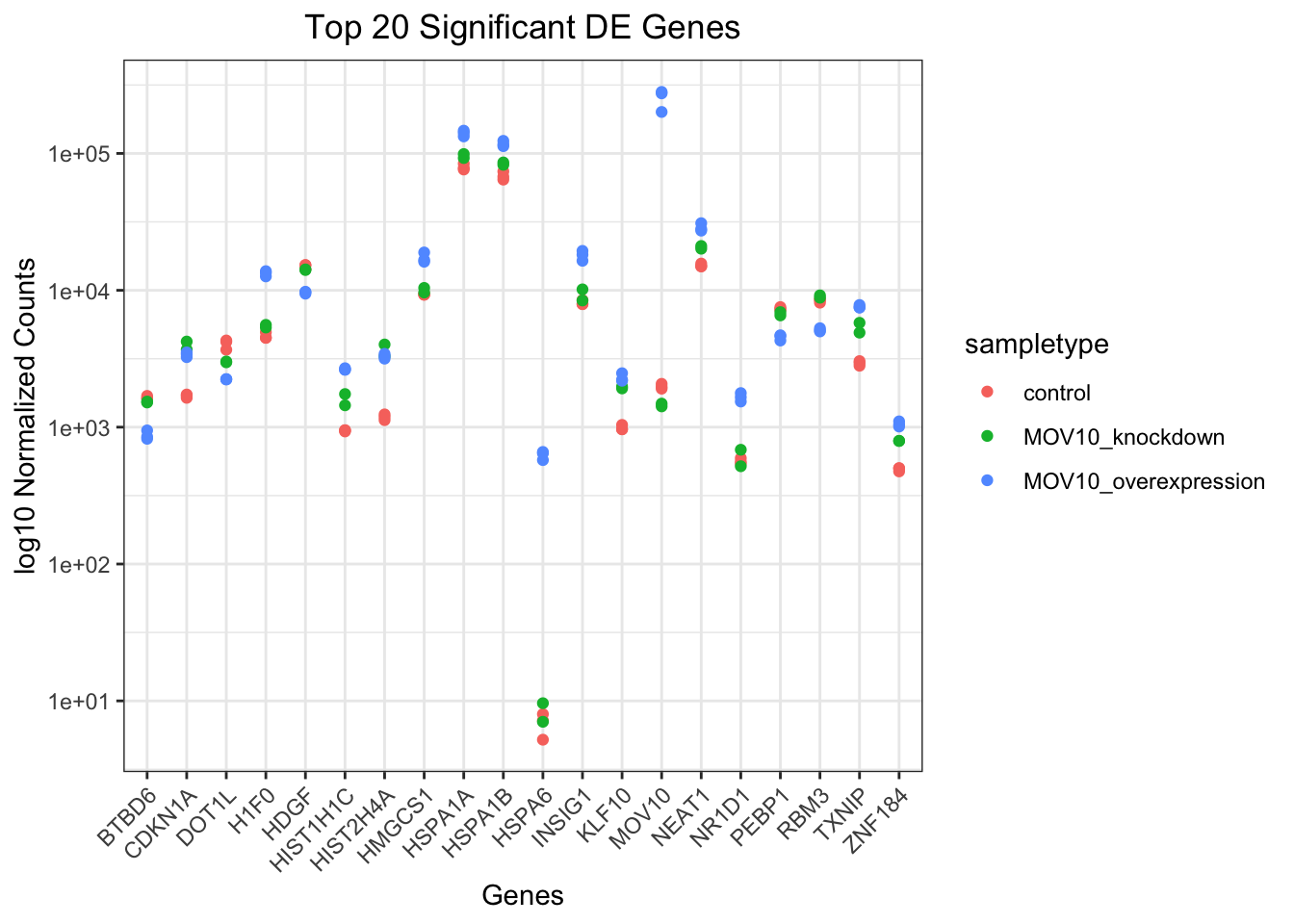
We are going to plot the normalized count values for the top 20 differentially expressed genes (by padj values). To do this, we first need to determine the gene names of our top 20 genes by ordering our results and extracting the top 20 genes (by padj values):
Then, we can extract the normalized count values for these top 20 genes:
# Get normalized counts for top 20 significant genes
top20_sigOE_norm <- normalized_counts %>%
  filter(gene %in% top20_sigOE_genes)
Now that we have the normalized counts for each of the top 20 genes for all 8 samples, to plot using ggplot(), we need to gather the counts for all samples into a single column to allow us to give ggplot the one column with the values we want it to plot.
The gather() function in the tidyr package will perform this operation and will output the normalized counts for all genes for Mov10_oe_1 listed in the first 20 rows, followed by the normalized counts for Mov10_oe_2 in the next 20 rows, so on and so forth.
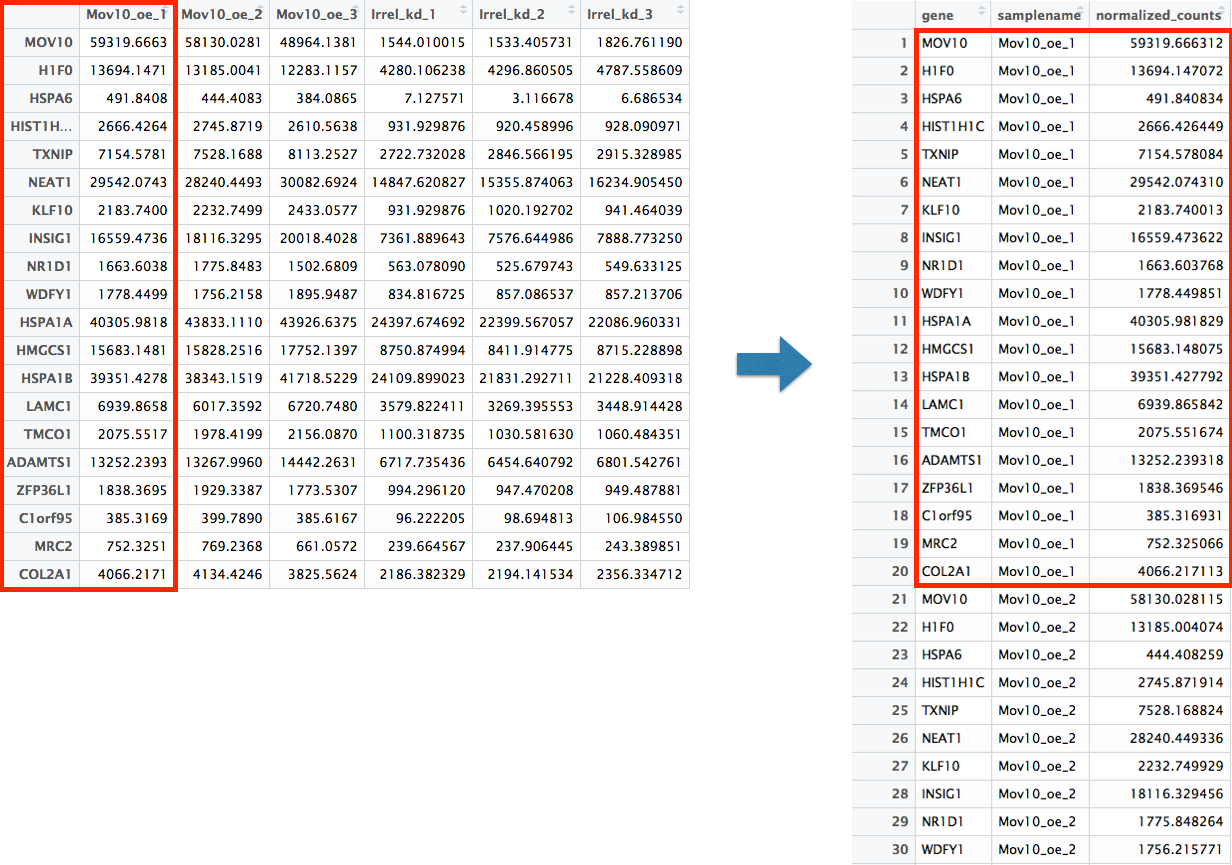
# Gathering the columns to have normalized counts to a single column
gathered_top20_sigOE <- top20_sigOE_norm %>%
  gather(colnames(top20_sigOE_norm)[2:9], key = "samplename", value = "normalized_counts")

# Check the column header in the "gathered" data frame
head(gathered_top20_sigOE)
# A tibble: 6 × 4
gene symbol samplename normalized_counts
<chr> <chr> <chr> <dbl>
1 ENSG00000089220 PEBP1 Irrel_kd_1 7289.
2 ENSG00000096654 ZNF184 Irrel_kd_1 502.
3 ENSG00000102317 RBM3 Irrel_kd_1 8550.
4 ENSG00000104885 DOT1L Irrel_kd_1 3680.
5 ENSG00000112972 HMGCS1 Irrel_kd_1 9310.
6 ENSG00000124762 CDKN1A Irrel_kd_1 1639.Now, if we want our counts colored by sample group, then we need to combine the metadata information with the melted normalized counts data into the same data frame for input to ggplot():
# Add metadata
gathered_top20_sigOE <- inner_join(mov10_meta, gathered_top20_sigOE)
The inner_join() will merge 2 data frames with respect to any column with the same column name in both data frames: in this case, the “samplename” column.
Now that we have a data frame in a format that can be utilized by ggplot easily, let’s plot!
# Plot using ggplot2
ggplot(gathered_top20_sigOE) +
  geom_point(aes(x = symbol, y = normalized_counts, color = sampletype)) +
  scale_y_log10() +
  # Add title and plot tweaks
  xlab("Genes") +
  ylab("log10 Normalized Counts") +
  ggtitle("Top 20 Significant DE Genes") +
  theme_bw() +
  theme(axis.text.x = element_text(angle = 45, hjust = 1)) +
  theme(plot.title = element_text(hjust = 0.5))