Contributors: Mary Piper, Meeta Mistry and Radhika Khetani
Approximate time: 1.5 hours
Learning Objectives
- Generate a report containing QC metrics using
ChIPQC - Describe QC metrics
- Identify sources of low quality data
ChIP-seq quality assessment using ChIPQC
Prior to performing any downstream analyses with the results from a peak caller, it is best practice to assess the quality of your ChIP-seq data. What we are looking for is good quality ChIP enrichment over background.
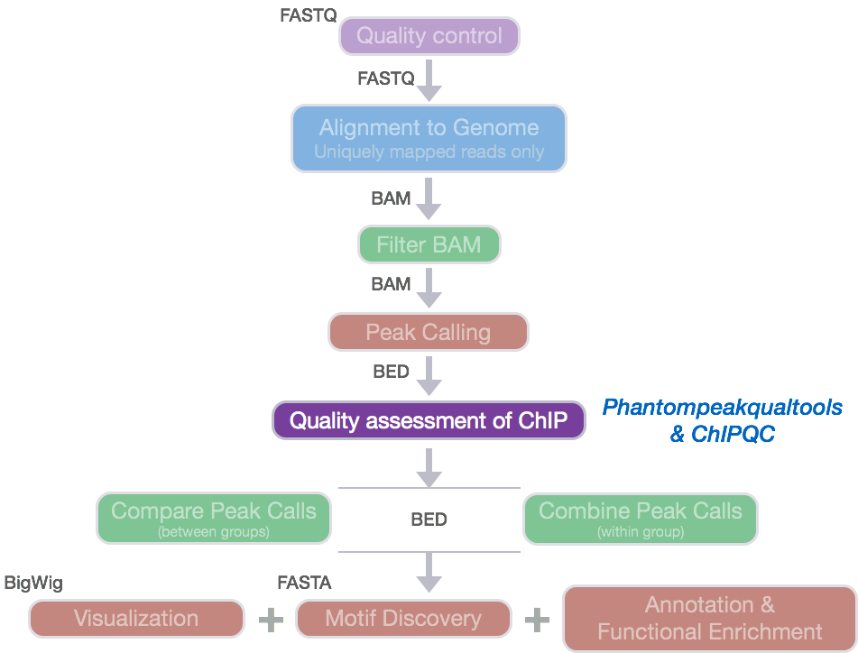
Today, we will be using ChIPQC, a Bioconductor package that takes as input BAM files and peak calls to automatically compute a number of quality metrics and generates a ChIPseq
experiment quality report. We are going to use this package to generate a report for our Nanog and Pou5f1 samples.
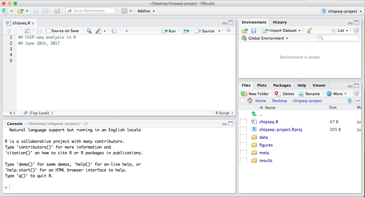
Setting up
- Open up RStudio and create a new project for your ChIP-seq analyses on your Desktop. Select ‘File’ -> ‘New Project’ -> ‘New directory’ and call the new directory
chipseq-project. - Create a directory structure for your analyses. You will want to create four directories:
data,meta,results, andfigures. - Inside
datacreate two subdirectories: one for your BAM files calledbamsand one for the MACS2 peak calls calledpeakcalls. - Open up a new R script (‘File’ -> ‘New File’ -> ‘Rscript’), and save it as chipQC.R
Your Rstudio interface should look something like the screenshot below:
NOTE: This next section assumes you have the most up-to-date
ChIPQCpackage. If you haven’t done this please run the following lines of code before proceeding.library(BiocManager) install("ChIPQC")
Get data
Now let’s move over the appropriate files from O2 to our laptop. You can do this using FileZilla or the scp command.
- Move over the BAM files (
_aln.bam) and the corresponding indices (_aln.bam.bai) from~/chipseq/results/bowtie2to your laptop. You will want to copy these files into your chipseq-project into thedata/bamsfolder.
NOTE: Do not copy over the input file that we initially ran QC and alignment on (i.e
H1hesc_Input_Rep1_chr12_aln_sorted.bam). Only the files you had copied over to your home directory is what you need.
-
Move over the narrowPeak files (
.narrowPeak)~/chipseq/results/macs2to your laptop. You will want to copy these files into your chipseq-project into thedata/peakcallsfolder. -
Download the sample data sheet available from this link. Move the samplesheet into the
metafolder.
Run ChIPQC
Let’s start by loading the ChIPQC library and the samplesheet into R. Use the View() function to take a look at what the samplesheet contains.
## Load libraries
library(ChIPQC)

## Load sample data
samples <- read.csv('meta/samplesheet_chr12.csv')
View(samples)
The sample sheet contains metadata information for our dataset.Each row represents a peak set (which in most cases is every ChIP sample) and several columns of required information, which allows us to easily load the associated data in one single command. NOTE: The column headers have specific names that are expected by ChIPQC!!.
- SampleID: Identifier string for sample
- Tissue, Factor, Condition: Identifier strings for up to three different factors (You will need to have all columns listed. If you don’t have infomation, then set values to NA)
- Replicate: Replicate number of sample
- bamReads: file path for BAM file containing aligned reads for ChIP sample
- ControlID: an identifier string for the control sample
- bamControl: file path for bam file containing aligned reads for control sample
- Peaks: path for file containing peaks for sample
- PeakCaller: Identifier string for peak caller used. Possible values include “raw”, “bed”, “narrow”, “macs”
Next we will create a ChIPQC object which might take a few minutes to run. ChIPQC will use the samplesheet read in the data for each sample (BAMs and narrowPeak files) and compute quality metrics. The results will be stored into the object.
## Create ChIPQC object
chipObj <- ChIPQC(samples, annotation="hg19")
NOTE: For PC users
BiocParallelcan be problematic. To avoid this conflict, run the code below first to indicate that you would like to run the process in serial.
register(SerialParam())
Now let’s take those quality metrics and summarize information into an HTML report with tables and figures.
## Create ChIPQC report
ChIPQCreport(chipObj, reportName="ChIP QC report: Nanog and Pou5f1", reportFolder="ChIPQCreport")
If you were unable to run the code successfully you download this zipped folder, and open the html within. However, it may be better to download the report for the full dataset linked below instead.
ChIPQC report
Since our report is based only on a small subset of data, the figures will not be as meaningful. Take a look at the report generated using the full dataset instead. Download this zip archive, uncompress it and you should find an html file in the resulting directory. Double click it and it will open in your browser. At the top left you should see a button labeled “Expand All”, click on that to expand all sections.
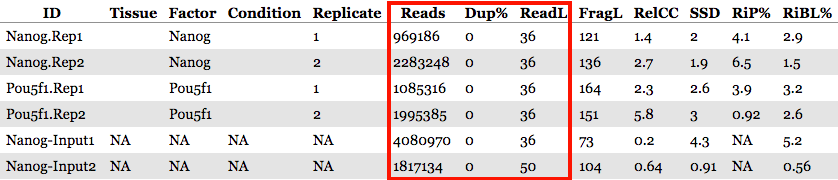
The QC summary table:
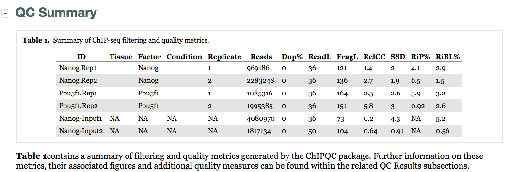
Here, we see a table with some known columns and some columns that we have not talked about before. The information under the SSD, RiP and RiBL columns are metrics developed and described by the ENCODE consortium, and calculated for us by ChIPQC. These will allow us to assess the distribution of signal within enriched regions, within/across expected annotations, across the whole genome, and within known artefact regions. These metrics can be generally categorized as relating to:
- Read characteristics
- Enrichment of reads in peaks
- Peak signal strength
- Peak profiles
NOTE: For some of the metrics we give examples of what is considered a ‘good measure’ indicative of good quality data. Keep in mind that passing this threshold does not automatically mean that an experiment is successful and a values that fall below the threshold does not automatically mean failure!
Metrics: Read characteristics
These metrics include read depth, read length, and duplication rate. The read depth and length can be useful to note, especially if there appear to be large differences across samples. However, since we have already filtered our BAM files we find the duplication rate numbers are not very meaningful for us.
Metrics: Enrichment of reads in peaks
There are a few metrics that we usually explore when determining whether we have a strong enrichment of reads in peaks, including RiP, SSD, and RiBL.
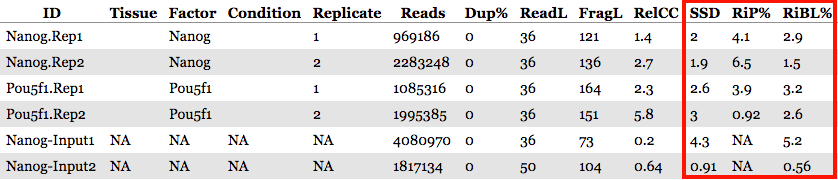
RiP (Reads in Peaks)
This metric represents the percentage of reads that overlap ‘called peaks’. It can be considered a “signal-to-noise” measure of what proportion of the library consists of fragments from binding sites vs. background reads.
- RiP (also called FRiP) values will vary depending on the protein of interest:
- A typical good quality TF (sharp/narrow peaks) with successful enrichment would exhibit a RiP around 5% or higher.
- A good quality Pol2 (mix of sharp/narrow and dispersed/broad peaks) would exhibit a RiP of 30% or higher.
- There are also known examples of good datasets with RiP < 1% (i.e. RNAPIII or a protein that binds few sites).
In our dataset, RiP percentages are higher for the Nanog replicates as compared to Pou5f1, with Pou5f1-rep2 being very low. This could suggest that we have better enrichment for the Nanog replicates, but we still need to explore in more detail the other metrics.
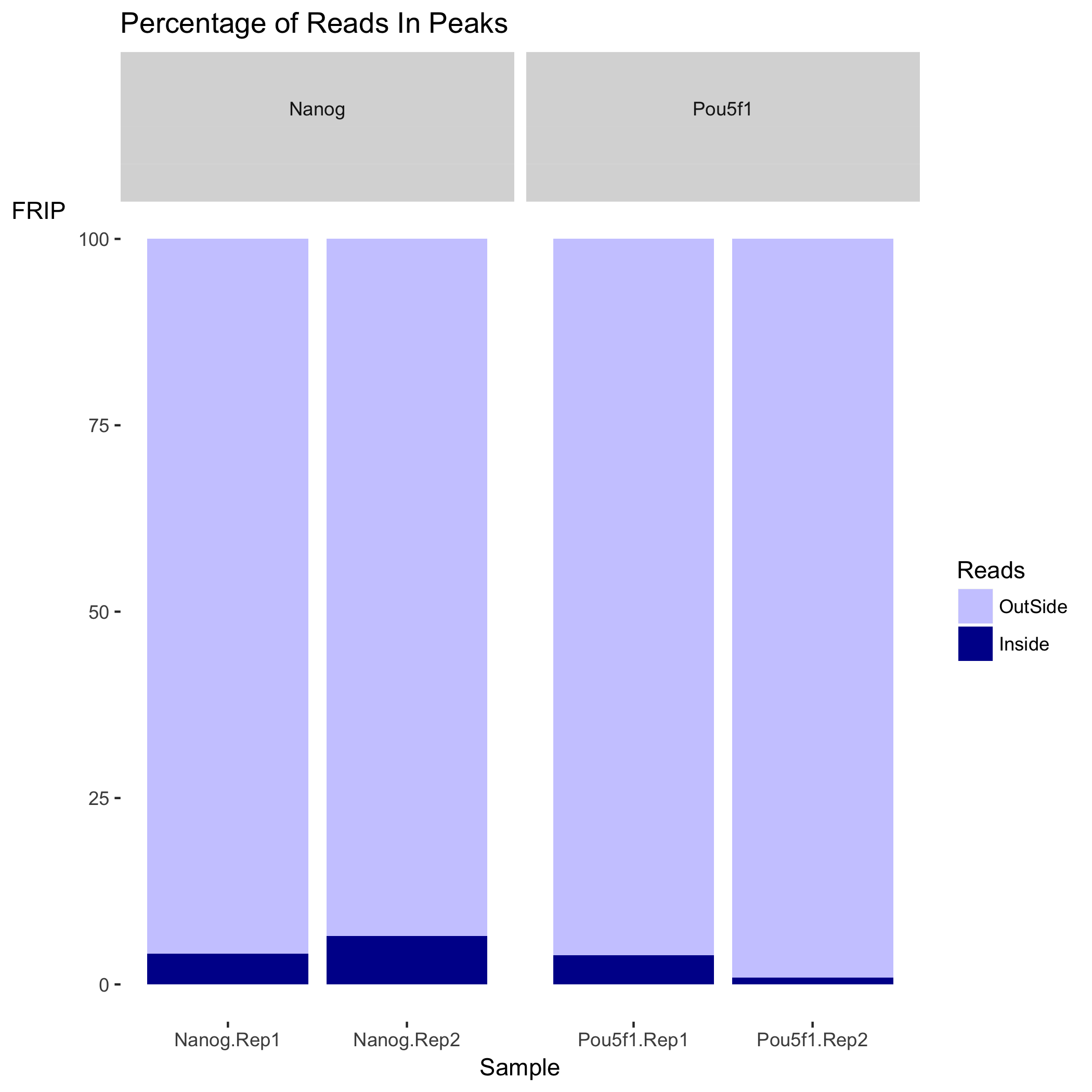
We have two plots that summarize the number of Reads in Peaks. ChIP samples with good enrichment will have a higher proportion of their reads overlapping called peaks. Although RiP is higher in Nanog, the boxplot for the Nanog samples shows quite different distributions between the replicates compared to Pou5f1, which could perhaps be explained by the differences in read length and depth of sequencing.
SSD
This metric represents the uniformity of coverage of reads across the genome. Specificly, it determines the standard deviation of signal pile-up along the genome normalized to the total number of reads.
-
For IP’d samples we would expect areas with enrichment of reads, or high coverage, and other regions with lower coverage. Whereas for control samples, we would expect less difference in coverage across the genome. A “good” or enriched sample typically has regions of significant read pile-up (larger differences in coverage) so a higher SSD is more indicative of better enrichment.
-
SSD scores are sensitive to regions of artificially high signal in addition to genuine ChIP enrichment. Therefore, a high SSD could be the result of ChIP enrichment or some artifically high signal in blacklisted regions.
In our dataset, higher scores are observed for the Pou5f1 replicates compared to the Nanog replicates. This might suggest that there is greater enrichment in the Pou5f1 samples, but we need to look closely at the rest of the output of ChIPQC to be sure that the high SSD in Pou5f1 is not due to some unknown artifact.
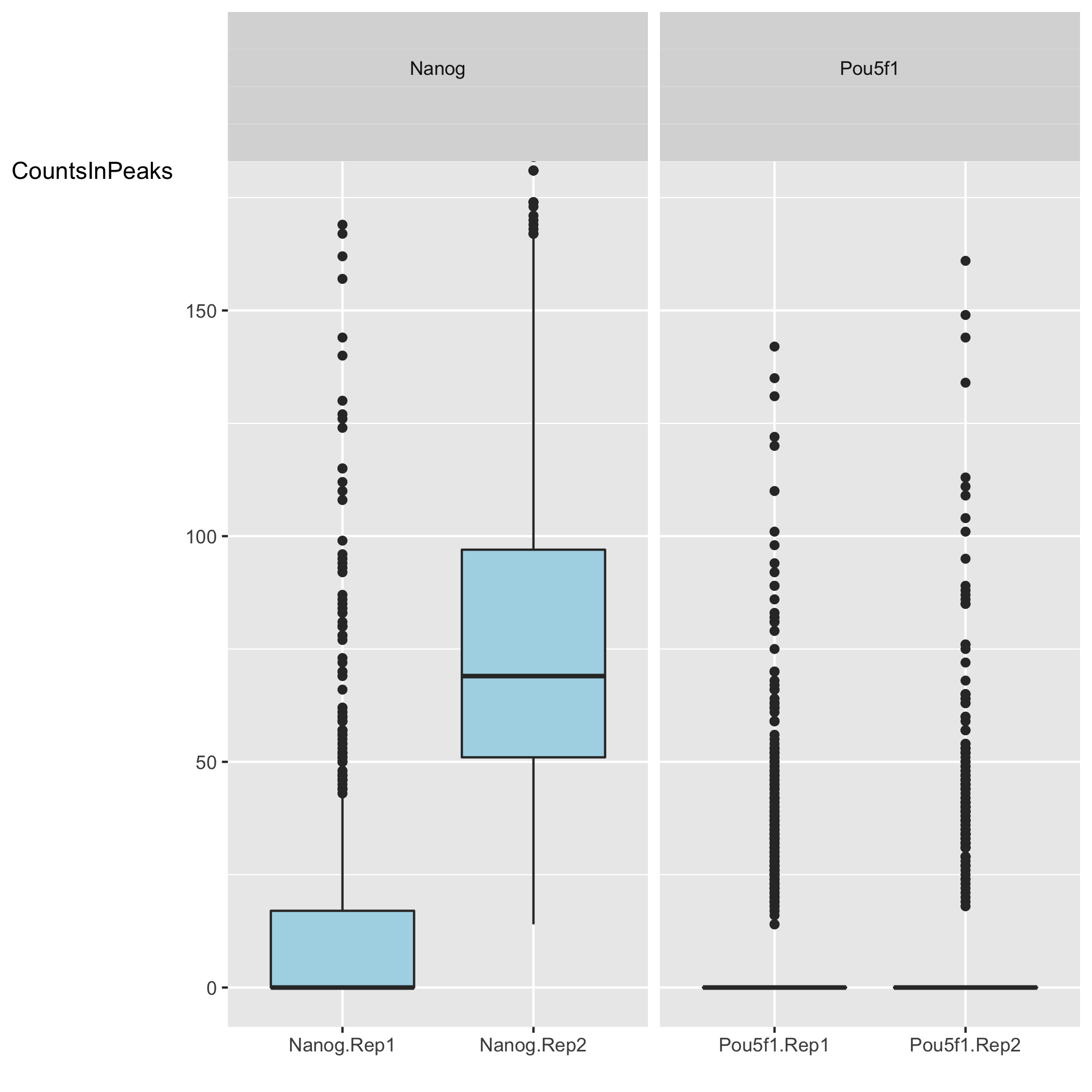
The coverage uniformity explored with the SSD can be visualized using the ‘Coverage histogram’ in the report. The x-axis represents the read pileup height at a basepair position, and the y-axis represents how many positions have this pileup height. This is on a log scale.
- A ChIP sample with good enrichment should have a reasonable ”tail”, or more positions (higher values on the y-axis) having higher sequencing depth. Samples with low enrichment (i.e input), consisting of mostly background reads will have most positions (high values on y-axis) in the genome with low pile-up (low x-axis values).
In our dataset, the Nanog samples have quite heavy tails compared to Pou5f1, especially replicate 2. “Heavy tail” refers to the curve being heavier than an exponential curve, with more bulk under the curve. It shows that Nanog samples have more positions in the genome with higher depth. The SSD scores, however, are higher for Pou5f1. When SSD is high but coverage looks low it is possibly due to the presence of large regions of high depth and a flag for blacklisting of genomic regions.
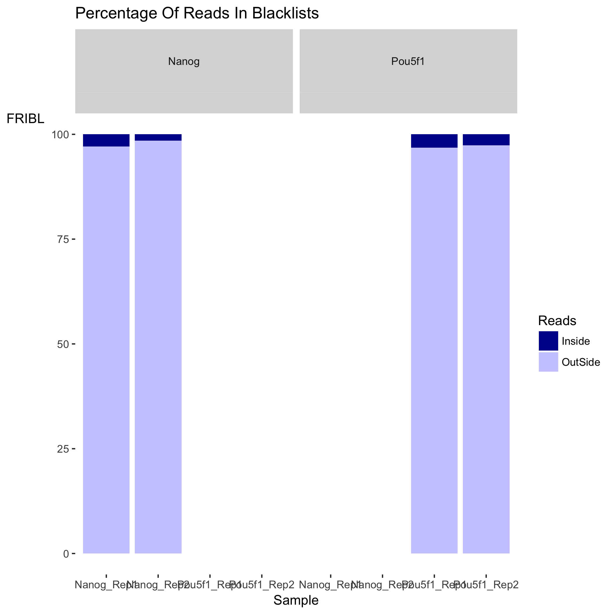
RiBL (Reads overlapping in Blacklisted Regions)
The percentage of reads overlapping regions with known artificially high signal (likely due to excessive unstructured anomalous reads mapping). Lower RiBL percentages are better than higher.
-
The blacklisted regions typically appear uniquely mappable so simple mappability filters do not remove them. These regions are often found at specific types of repeats such as centromeres, telomeres and satellite repeats.
-
The RiBL score acts as a guide for the level of background signal in a ChIP or input. These regions represent around 0.5% of genome, yet can account for high proportion of total signal (> 10%).
-
The signal from blacklisted regions has been shown to contribute to confound peak callers and fragment length estimation. We should keep track and filter reads mapping to these areas.
In our experiment, the RiBL percentages look reasonable since they not incredibly high. It is possible that the higher SSD values could be due to open chromatin regions that fragment more easily or hyper-ChIPable regions, which are highly expressed loci enriched in ChIP-seq experiments of many unrelated proteins - systematic false positives.
NOTE: If you had filtered out blacklisted regions before peak calling, and those filtered BAM files are used as input to
ChIPQCyou will not need to evaluate this metric.
How were the ‘blacklists compiled? These blacklists were empirically derived from large compendia of data using a combination of automated heuristics and manual curation. Blacklists were generated for various species and genome versions including human, mouse, worm and fly. The lists can be downloaded here.. For human, they used 80 open chromatin tracks (DNase and FAIRE datasets) and 12 ChIP-seq input/control tracks spanning ~60 cell lines in total. These blacklists are applicable to functional genomic data based on short-read sequencing (20-100bp reads). These are not directly applicable to RNA-seq or any other transcriptome data types.
The plot below shows the effect of blacklisting, with the proportion of reads that are either inside (dark blue) or outside (lighter blue) the blacklisted regions. If the black listed regions had already been filtered out before peak calling, this plot would not be informative.
Metrics: Peak signal strength
The metrics related to the peak signal strength are FragLength and RelCC (also called Relative strand cross-correlation coefficient or RSC). Both of these values are determined from calculating the strand cross-correlation, which is a quality metric that is independent of peak calling.
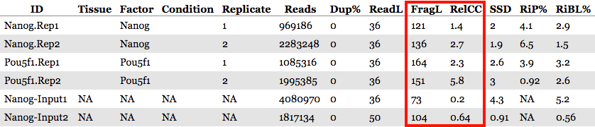
- RelCC values larger than 1 for all ChIP samples suggest good signal-to-noise & the FragL values should be roughly the same as the fragment length you picked in the size selection step during library prepation.
Strand cross-correlation
A high-quality ChIP-seq experiment will produce significant clustering of enriched DNA sequence tags/reads at locations bound by the protein of interest; the expectation is that we can observe a bimodal enrichment of reads (sequence tags) on both the forward and the reverse strands.
How are the Cross-Correlation scores calculated?
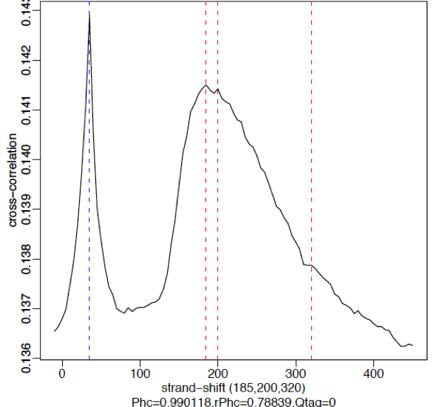
Using a small genomic window as an example, let’s walk through the details of the cross-correlation below. It is important to note that the cross-correlation metric is computed as the Pearson’s linear correlation between coverage for each complementary base (i.e. on the minus strand and the plus strands), by systematically shifting minus strand by k base pairs at a time. This shift is performed over and over again to obtain the correlations for a given area of the genome.
Plot 1: At strand shift of zero, the Pearson correlation between the two vectors is 0.
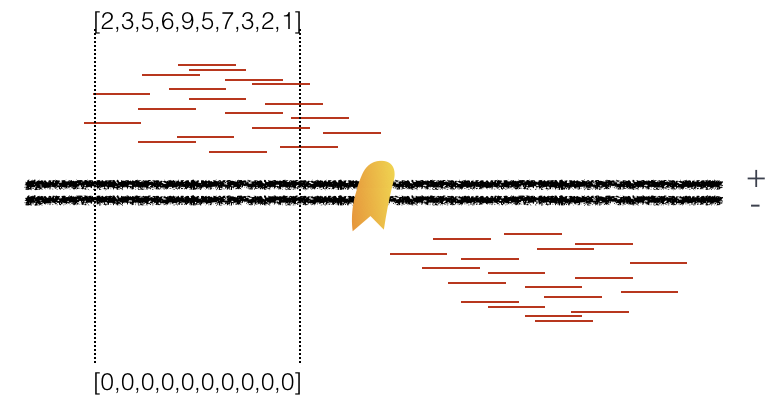
Plot 2: At strand shift of 100bp, the Pearson correlation between the two vectors is 0.389.
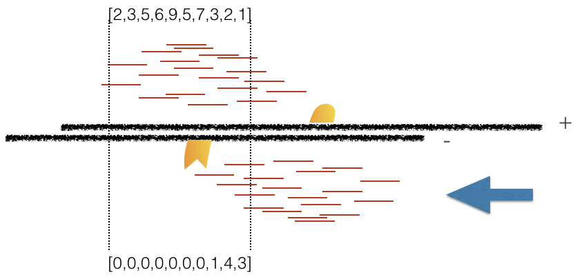
Plot 3: At strand shift of 175bp, the Pearson correlation between the two vectors is 0.831.
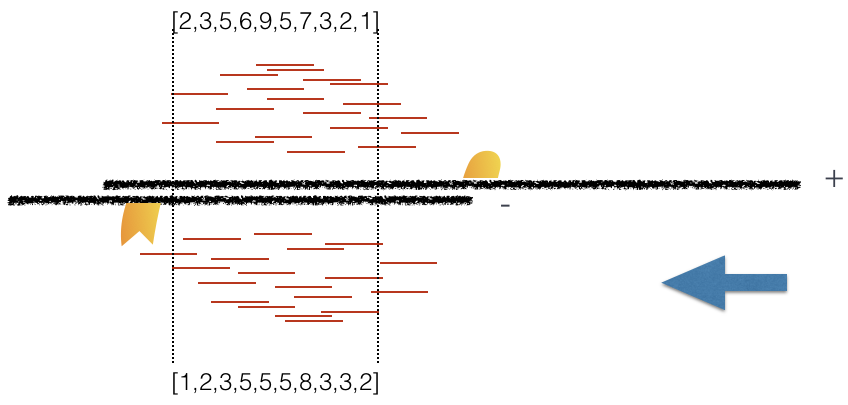
When this process is completed we will have a table of values mapping each base pair shift to a Pearson correlation value. These Pearson correlation values are computed for every peak for each chromosome and values are multiplied by a scaling factor and then summed across all chromosomes.
Once the final cross-correlation values have been calculated, they can be plotted (Y-axis) against the shift value (X-axis) to generate a cross-correlation plot!
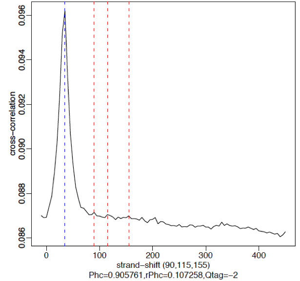
The cross-correlation plot typically produces two peaks: a peak of enrichment corresponding to the predominant fragment length (highest correlation value) and a peak corresponding to the read length (“phantom” peak). Let’s take a look at the cross-correlation plot ChIPQC generated for us:
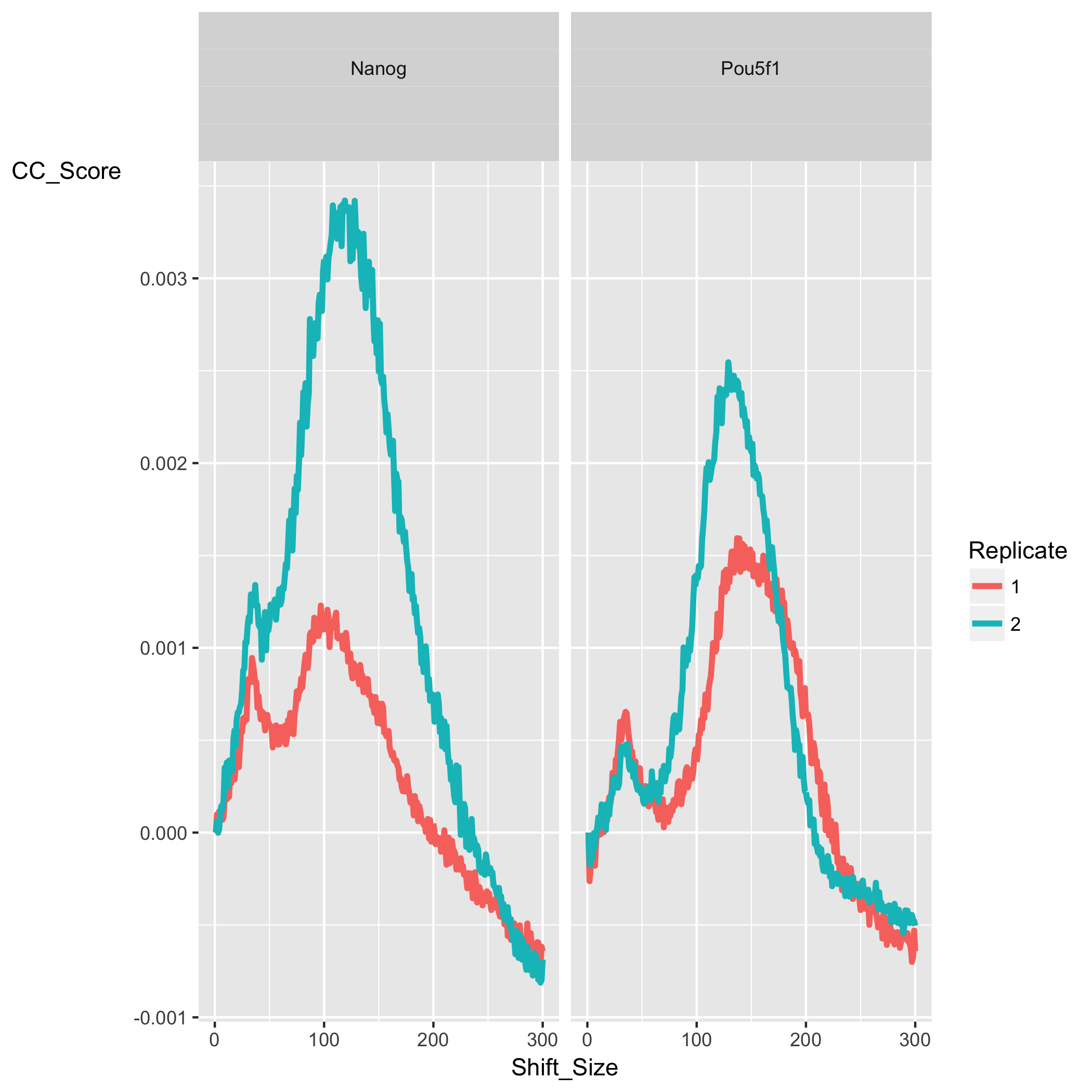
In our dataset, for both Nanog and Pou5f1 samples we observe a characteristic cross-correlation curve as described above with the two peaks. The maximum corrleation value (the highest point of the larger peak) is higher in Nanog then in Pou5f1 suggesting a higher amount of signal. The corresponding shift value (x-axis) for that maximum correlation gives us the estimated fragment length. Since this data was obtained from ENCODE and we do not have information at the level of library preparation we have nothing to cross-reference fragment length (FragL) with.
The RelCC (or RSC) value is computed using the minimum and maximum cross-correlation values. To get more detail on how the RSC and NSC (another cross-correlation based metric) are computed, in addition a discussion surrounding the “phantom peak” phenomenon please take a look at these materials. Low RSC values can be due to failed or poor quality ChIP, low read sequence quality and hence lots of mismappings, shallow sequencing depth or a combination of these. Also, datasets with few binding sites (< 200) which could be due to biological reasons (i.e. a factor that truly binds only a few sites in a particular tissue type) would output low RSC scores.
Examples of Cross-Correlation Plots
Strong signal:
High-quality ChIP-seq data sets tend to have a larger fragment-length peak compared with the read-length peak. An example of a strong signal is shown below using data from CTCF (zinc-finger transcription factor) in human cells. With a good antibody, transcription factors will typically result in 45,000 - 60,000 peaks. The red vertical line shows the dominant peak at the true peak shift, with a small bump at the blue vertical line representing the read length.
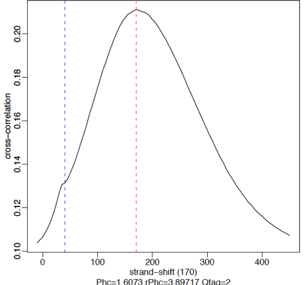
Weak signal:
An example of weaker signal is demonstrated below with a Pol2 data. Here, this particular antibody is not very efficient and these are broad scattered peaks. We observe two peaks in the cross-correlation profile: one at the true peak shift (~185-200 bp) and the other at read length. For weak signal datasets, the read-length peak will start to dominate.
*No signal:**
A failed experiment will resemble a cross-correlation plot using input only, in which we observe little or no peak for fragment length. Note in the example below the strongest peak is the blue line (read length) and there is basically no other significant peak in the profile. The absence of a peak is expected since there should be no significant clustering of fragments around specific target sites (except potentially weak biases in open chromatin regions depending on the protocol used).
Metrics: Peak profiles
Relative Enrichment of Genomic Intervals (REGI)
Using the genomic regions identified as called peaks along with genome annotation information, we can obtain see where reads map in terms of various genomic features. We then evaluate the relative enrichment across these regions and make note of how this compares to what we expect for enrichment for our protein of interest.
This is represented as a heatmap showing the enrichment of reads compared to the background levels of the feature. This plot is useful when you expect enrichment of specific genomic regions.
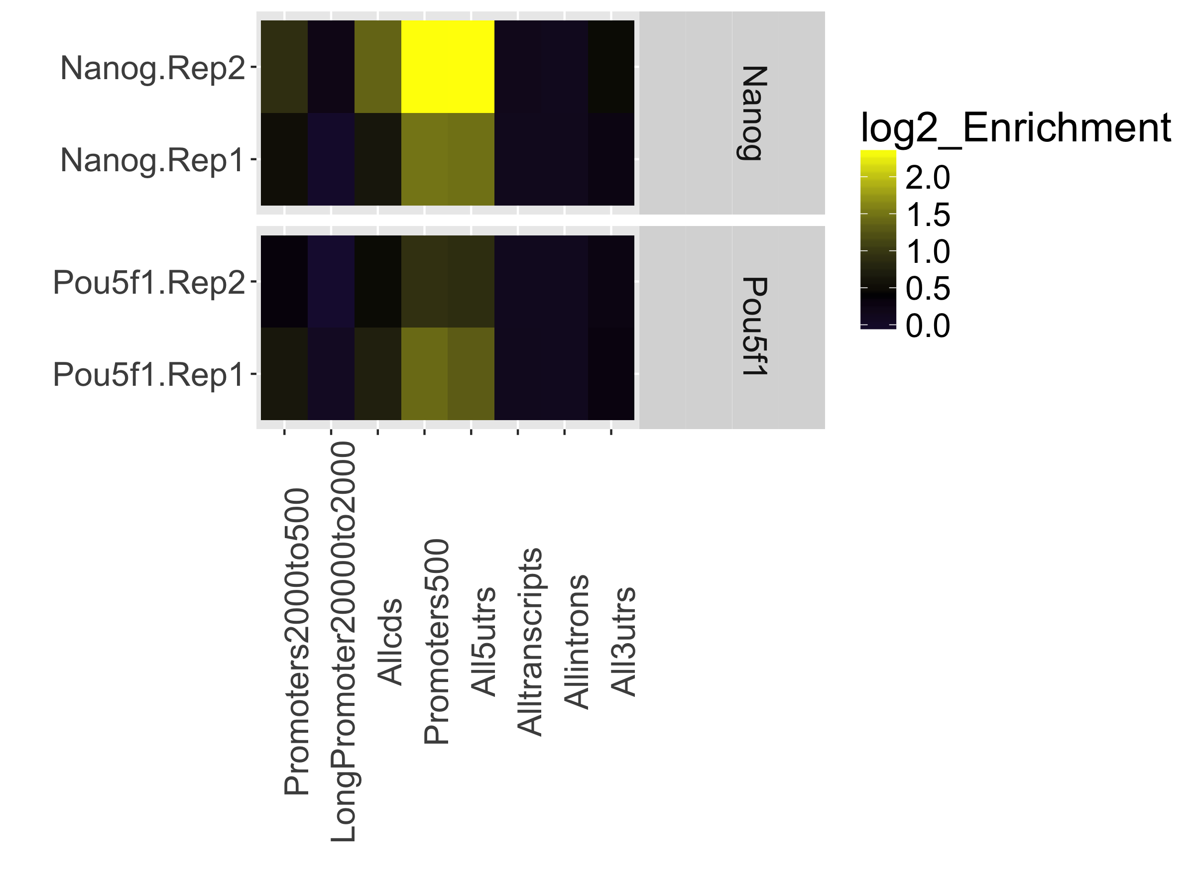
In our dataset, the “Promoters500” and “All5UTRs” categories have the highest levels of enrichment, which is great since it meets our expectations of where Nanog and Pou5f1 should be binding as transcription factors.
Peak Profile
The peak profile plot shows the average peak profiles, centered on the summit (point of highest pileup) for each peak.
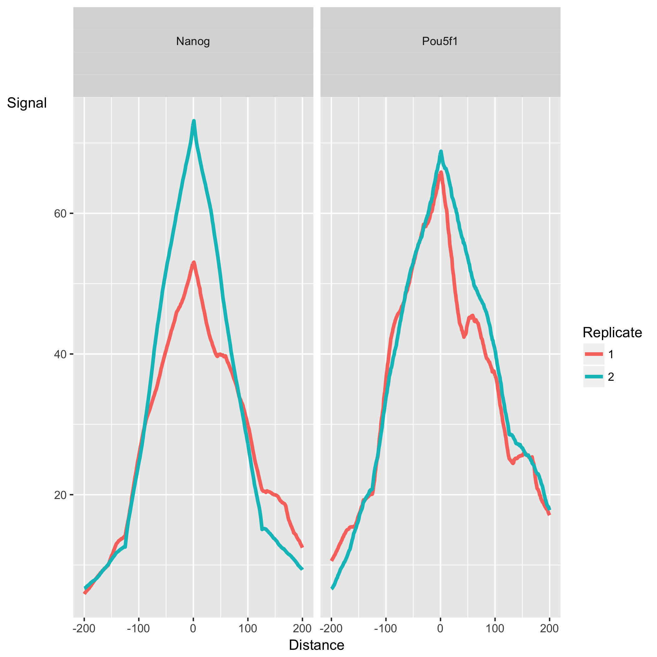
The shape of these profiles can vary depending on what type of mark is being studied – transcription factor, histone mark, or other DNA-binding protein such as a polymerase – but similar marks usually have a distinctive profile in successful ChIPs.
Sample similarity
Finally, there are plots to show how similar the samples are. We will take a closer look at these when we plot them during differential enrichment analysis.
Running ChIPQC on your own data
Since we are working with a small subset of data, it was feasible to move over the data to our computers and run it locally. However, when you are working with your own data which will be much larger in size (and therefore require much more intensive compute time and resources) we recommend working on the cluster.
In order to generate the report on O2 you require the X11 system, which we are currently not setup to do with the training accounts. If you are interested in learning more about using X11 applications you can find out more on the O2 wiki page. Additionally, you will need to install the
ChIPQCpackage and all required dependencies on the cluster.
Final takehome from ChIPQC
In general, taking all of the evaluated metrics together our data look good even though individually they may not fall within the thresholds we have outlined earlier. This type of QC is first and foremost used to evaluate each sample on it’s own to ensure that we are observing values that are good enough that we are comfortable moving forward with. Below, we briefly we compare and contrast these metrics between replicates and the 2 for added discussion.
Within sample group: Each sample group appears to have one replicate exhibiting stronger signal than the other. This difference is more pronounced with the Nanog replicates based on the cross-correlation plots and coverage plots. Although there is a difference in the amount of signal/enrichment between the replicates, it is encouraging to see similar trends. For example, two replicates that displayed totally different cross-correlation plots would suggest something went wrong.
Between sample groups: Comparing the metrics from one sample group to one another, it is difficult to conclude whether one is better than the other. The SSD and RelCC scores appear to be higher for Pou5f1 indicating good enrichment, yet the coverage plots and cross-correlation plots suggest more signal in the Nanog samples. The difference between the groups is something to take note of and we will revisit this later during differential enrichment and visualization.
What are possible sources of low quality data?
Once you have identified low quality samples based on some of the quality metrics discussed above, the next logical step is to troubleshoot what might be causing it.
- Strength/efficiency and specificity of the immunoprecipitation
The quality of a ChIP experiment is ultimately dictated by the specificity of the antibody and the degree of enrichment achieved in the affinity precipitation step [1]. Antibody deficiencies are of two main types:
- Poor reactivity against the intended target
- Non-specific antibody, causing cross-reactivity with other DNA-associated proteins
- Fragmentation/digestion
The way in which sonication is carried out can result in different fragment size distributions and, consequently, sample-specific chromatin configuration induced biases. As a result, it is not recommended to use a single input sample as a control for ChIP-seq peak calling if it is not sonicated together with the ChIP sample.
This lesson has been developed by members of the teaching team at the Harvard Chan Bioinformatics Core (HBC). These are open access materials distributed under the terms of the Creative Commons Attribution license (CC BY 4.0), which permits unrestricted use, distribution, and reproduction in any medium, provided the original author and source are credited.
Details on ChIPQC plots was taken from the ChIPQC vignette, which provides a walkthrough with examples and thorough explanations.