Approximate time: 60 minutes
Learning Objectives
- Explain the experiment and its objectives
- Describe how to set up an RNA-seq project in R
- Describe the RNA-seq and the differential gene expression analysis workflow
- Explain why negative binomial distribution is used to model RNA-seq count data
Differential gene expression (DGE) analysis overview
The goal of RNA-seq is often to perform differential expression testing to determine which genes or transcripts are expressed at different levels between conditions. These findings can offer biological insight into the processes affected by the condition(s) of interest.
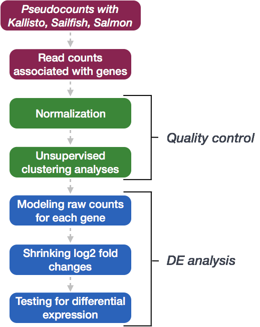
To determine the abundance estimates of transcripts, our RNA-seq workflow followed the steps detailed in the image below. All steps were performed on the command line (Linux/Unix), resulting in directories of output from the Salmon tool. These transcript abundance estimates, often referred to as ‘pseudocounts’, can be converted for use with DGE tools like DESeq2 or the estimates can be used directly for isoform-level differential expression using a tool like Sleuth.
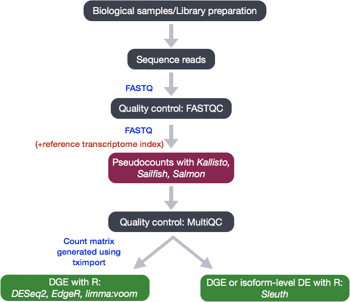
In the next few lessons, we will walk you through an end-to-end gene-level RNA-seq differential expression workflow using various R packages. We will start with reading in data obtained from Salmon, convert pseudocounts to counts, perform exploratory data analysis for quality assessment and to explore the relationship between samples, perform differential expression analysis, and visually explore the results prior to performing downstream functional analysis.
Review of the dataset
We will be using the Salmon abundance estimates from the RNA-Seq dataset that is part of a larger study described in Kenny PJ et al, Cell Rep 2014.
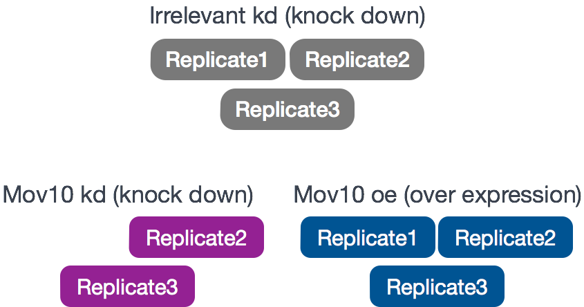
The RNA-Seq was performed on HEK293F cells that were either transfected with a MOV10 transgene, or siRNA to knock down Mov10 expression, or non-specific (irrelevant) siRNA. This resulted in 3 conditions Mov10 oe (over expression), Mov10 kd (knock down) and Irrelevant kd, respectively. The number of replicates is as shown below.
Using these data, we will evaluate transcriptional patterns associated with perturbation of MOV10 expression. Please note that the irrelevant siRNA will be treated as our control condition.
What is the purpose of these datasets? What does Mov10 do?
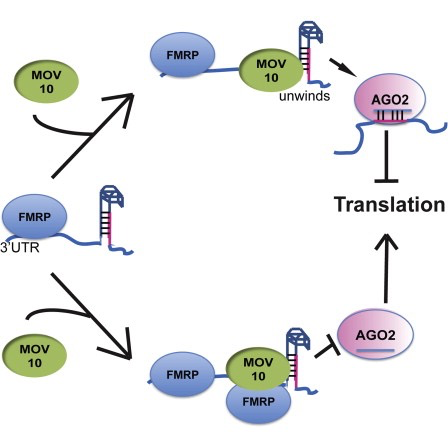
The authors are investigating interactions between various genes involved in Fragile X syndrome, a disease in which there is aberrant production of the FMRP protein.
FMRP is “most commonly found in the brain, is essential for normal cognitive development and female reproductive function. Mutations of this gene can lead to fragile X syndrome, mental retardation, premature ovarian failure, autism, Parkinson’s disease, developmental delays and other cognitive deficits.” - from wikipedia
MOV10, is a putative RNA helicase that is also associated with FMRP in the context of the microRNA pathway.
The hypothesis the paper is testing is that FMRP and MOV10 associate and regulate the translation of a subset of RNAs.
Our questions:
- What patterns of expression can we identify with the loss or gain of MOV10?
- Are there any genes shared between the two conditions?
Setting up
Before we get into the details of the analysis, let’s get started by opening up RStudio and setting up a new project for this analysis.
- Go to the
Filemenu and selectNew Project. - In the
New Projectwindow, chooseNew Directory. Then, chooseNew Project. Name your new directoryDEanalysisand then “Create the project as subdirectory of:” the Desktop (or location of your choice). - The new project should automatically open in RStudio.
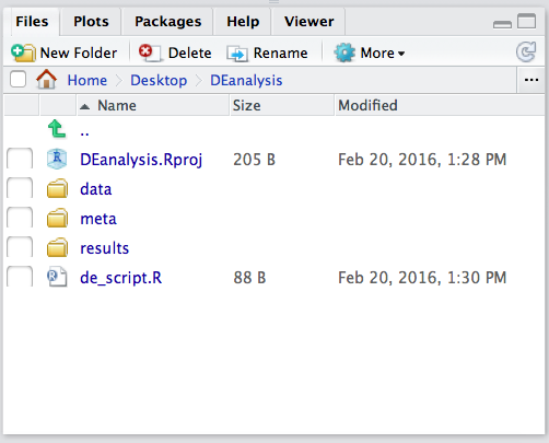
To check whether or not you are in the correct working directory, use getwd(). The path Desktop/DEanalysis should be returned to you in the console. Within your working directory use the New folder button in the bottom right panel to create two new directories: meta and results. Remember the key to a good analysis is keeping organized from the start! (NOTE: we will be downloading our data folder`)
Now we need to grab the files that we will be working with for the analysis. There are two things we need to download.
- First we need the Salmon results for the full dataset. Right click on the links below, and choose the “Save link as …” option to download directly into your project directory:
- Salmon data for the Mov10 full dataset
Once you have the zip file downloaded you will want to decompress it. This will create a data directory with sub-directories that correspond to each of the samples in our dataset.
- Next, we need the annotation file which maps our transcript identifiers to gene identifiers. We have created this file for you using the R Bioconductor package AnnotationHub. For now, we will use it as is but later in the workshop we will spend some time showing you how to create one for yourself. Right click on the links below, and choose the “Save link as …” option to download directly into your project directory.
Finally, go to the File menu and select New File, then select R Script. This should open up a script editor in the top left hand corner. This is where we will be typing and saving all commands required for this analysis. In the script editor type in header lines:
## Gene-level differential expression analysis using DESeq2
Now save the file as de_script.R. When finished your working directory should now look similar to this:
Loading libraries
For this analysis we will be using several R packages, some which have been installed from CRAN and others from Bioconductor. To use these packages (and the functions contained within them), we need to load the libraries. Add the following to your script and don’t forget to comment liberally!
## Setup
### Bioconductor and CRAN libraries used
library(DESeq2)
library(tidyverse)
library(RColorBrewer)
library(pheatmap)
library(DEGreport)
library(tximport)
library(ggplot2)
library(ggrepel)
Loading data
The main output of Salmon is a quant.sf file, and we have one of these for each individual sample in our dataset. An screenshot of the file is displayed below:
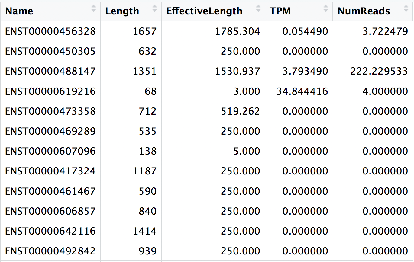
NOTE: The effective gene length in a sample is then the average of the transcript lengths after weighting for their relative expression. You may see effective lengths that are larger than the physical length. The interpretation would be that in this case, given the sequence composition of these transcripts (including both the sequence-specific and fragment GC biases), you’d expect a priori to sample more reads from them — thus they have a longer estimated effective length.
The pseudocounts generated by Salmon are represented as normalized TPM (transcripts per million) counts and map to transcripts. These need to be converted into non-normalized count estimates for performing DESeq2 analysis. To use DESeq2 we also need to collapse our abundance estimates from the transcript level to the gene-level. We will be using the R Bioconductor package tximport to do all of the above and get set up for DESeq2.
The first thing we need to do is create a variable that contains the paths to each of our quant.sf files. Then we will add names to our quant files which will allow us to easily discriminate between samples in the final output matrix.
## List all directories containing data
samples <- list.files(path = "./data", full.names = T, pattern="salmon$")

## Obtain a vector of all filenames including the path
files <- file.path(samples, "quant.sf")

## Since all quant files have the same name it is useful to have names for each element
names(files) <- str_replace(samples, "./data/", "") %>%
                str_replace(".salmon", "")
Our Salmon index was generated with transcript sequences listed by Ensembl IDs, but tximport needs to know which genes these transcripts came from. We will use the annotation table that we downloaded to extract transcript to gene information.
# Load the annotation table for GrCh38
tx2gene <- read.delim("tx2gene_grch38_ens94.txt")

# Take a look at it
tx2gene %>% View()
tx2gene is a three-column dataframe linking transcript ID (column 1) to gene ID (column 2) to gene symbol (column 3). We will take the first two columns as input to tximport. The column names are not relevant, but the column order is (i.e trasncript ID must be first).
Now we are ready to run tximport. Note that although there is a column in our quant.sf files that corresponds to the estimated count value for each transcript, those valuse are correlated by effective length. What we want to do is use the countsFromAbundance=“lengthScaledTPM” argument. This will use the TPM column, and compute quantities that are on the same scale as original counts, except no longer correlated with transcript length across samples.
?tximport   # let's take a look at the arguments for the tximport function

# Run tximport
txi <- tximport(files, type="salmon", tx2gene=tx2gene[,c("tx_id", "ensgene")], countsFromAbundance="lengthScaledTPM")
NOTE: When performing your own analysis you may find that the reference transcriptome file you obtain from Ensembl will have version numbers included on your identifiers (i.e ENSG00000265439.2). This will cause a discrepancy with the tx2gene file since the annotation databases don’t usually contain version numbers (i.e ENSG00000265439). To get around this issue you can use the argument
ignoreTxVersion = TRUE. The logical value indicates whether to split the tx id on the ‘.’ character to remove version information, for easier matching.
Viewing data
The txi object is a simple list containing matrices of the abundance, counts, length. Another list element ‘countsFromAbundance’ carries through the character argument used in the tximport call. The length matrix contains the average transcript length for each gene which can be used as an offset for gene-level analysis.
attributes(txi)

$names
[1] "abundance"           "counts"              "length"
[4] "countsFromAbundance"
We will be using the txi object as is, for input into DESeq2 but will save it until the next lesson. For now let’s take a look at the count matrix. You will notice that there are decimal values, so let’s round to the nearest whole number and convert it into a dataframe. We wil save it to a variable called data that we can play with.
# Look at the counts
txi$counts %>% View()

# Write the counts to an object
data <- txi$counts %>%
  round() %>%
  data.frame()
Creating metadata
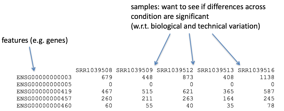
Of great importance is keeping track of the information about our data. At minimum, we need to atleast have a file which maps our samples to the corresponding sample groups that we are investigating. We will use the columns headers from the counts matrix as the row names of our metadata file and have single column to identify each sample as “MOV10_overexpression”, “MOV10_knockdown”, or “control”.
## Create a sampletable/metadata
sampletype <- factor(c(rep("control",3), rep("MOV10_knockdown", 2), rep("MOV10_overexpression", 3)))
meta <- data.frame(sampletype, row.names = colnames(txi$counts))
Differential gene expression analysis overview
So what does this count data actually represent? The count data used for differential expression analysis represents the number of sequence reads that originated from a particular gene. The higher the number of counts, the more reads associated with that gene, and the assumption that there was a higher level of expression of that gene in the sample.
With differential expression analysis, we are looking for genes that change in expression between two or more groups (defined in the metadata)
- case vs. control
- correlation of expression with some variable or clinical outcome
Why does it not work to identify differentially expressed gene by ranking the genes by how different they are between the two groups (based on fold change values)?
More often than not, there is much more going on with your data than what you are anticipating. Genes that vary in expression level between samples is a consequence of not only the experimental variables of interest but also due to extraneous sources. The goal of differential expression analysis to determine the relative role of these effects, and to separate the “interesting” from the “uninteresting”.
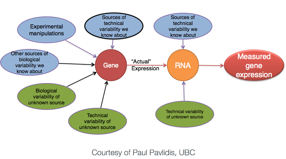
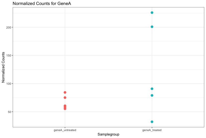
Even though the mean expression levels between sample groups may appear to be quite different, it is possible that the difference is not actually significant. This is illustrated for ‘GeneA’ expression between ‘untreated’ and ‘treated’ groups in the figure below. The mean expression level of geneA for the ‘treated’ group is twice as large as for the ‘untreated’ group. But is the difference in expression (counts) between groups significant given the amount of variation observed within groups (replicates)?
We need to take into account the variation in the data (and where it might be coming from) when determining whether genes are differentially expressed.
RNA-seq count distribution
To test for significance, we need an appropriate statistical model that accurately performs normalization (to account for differences in sequencing depth, etc.) and variance modeling (to account for few numbers of replicates and large dynamic expression range).
To determine the appropriate statistical model, we need information about the distribution of counts. To get an idea about how RNA-seq counts are distributed, let’s plot the counts for a single sample, ‘Mov10_oe_1’:
ggplot(data) +
  geom_histogram(aes(x = Mov10_oe_1), stat = "bin", bins = 200) +
  xlab("Raw expression counts") +
  ylab("Number of genes")
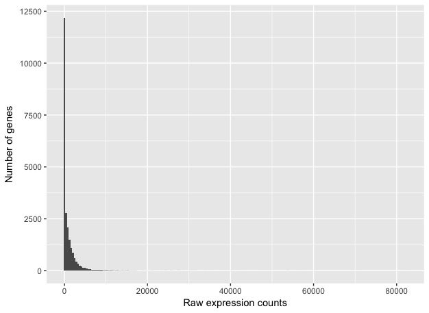
This plot illustrates some common features of RNA-seq count data:
- a low number of counts associated with a large proportion of genes
- a long right tail due to the lack of any upper limit for expression
- large dynamic range
NOTE: The log intensities of the microarray data approximate a normal distribution. However, due to the different properties of the of RNA-seq count data, such as integer counts instead of continuous measurements and non-normally distributed data, the normal distribution does not accurately model RNA-seq counts [1].
Modeling count data
Count data in general can be modeled with various distributions:
-
Binomial distribution: Gives you the probability of getting a number of heads upon tossing a coin a number of times. Based on discrete events and used in situations when you have a certain number of cases.
-
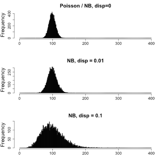
Poisson distribution: For use, when the number of cases is very large (i.e. people who buy lottery tickets), but the probability of an event is very small (probability of winning). The Poisson is similar to the binomial, but is based on continuous events. Appropriate for data where mean == variance.
-
Negative binomial distribution: An approximation of the Poisson, but has an additional parameter that adjusts the variance independently from the mean.
So what do we use for RNA-seq count data?
With RNA-Seq data, a very large number of RNAs are represented and the probability of pulling out a particular transcript is very small. Thus, it would be an appropriate situation to use the Poisson or Negative binomial distribution. Choosing one over the other will depend on the relationship between mean and variance in our data.
Run the following code to plot the mean versus variance for the ‘Mov10 overexpression’ replicates:
mean_counts <- apply(data[,6:8], 1, mean)        #The second argument '1' of 'apply' function indicates the function being applied to rows. Use '2' if applied to columns
variance_counts <- apply(data[,6:8], 1, var)
df <- data.frame(mean_counts, variance_counts)

ggplot(df) +
        geom_point(aes(x=mean_counts, y=variance_counts)) +
        scale_y_log10(limits = c(1,1e9)) +
        scale_x_log10(limits = c(1,1e9)) +
        geom_abline(intercept = 0, slope = 1, color="red")
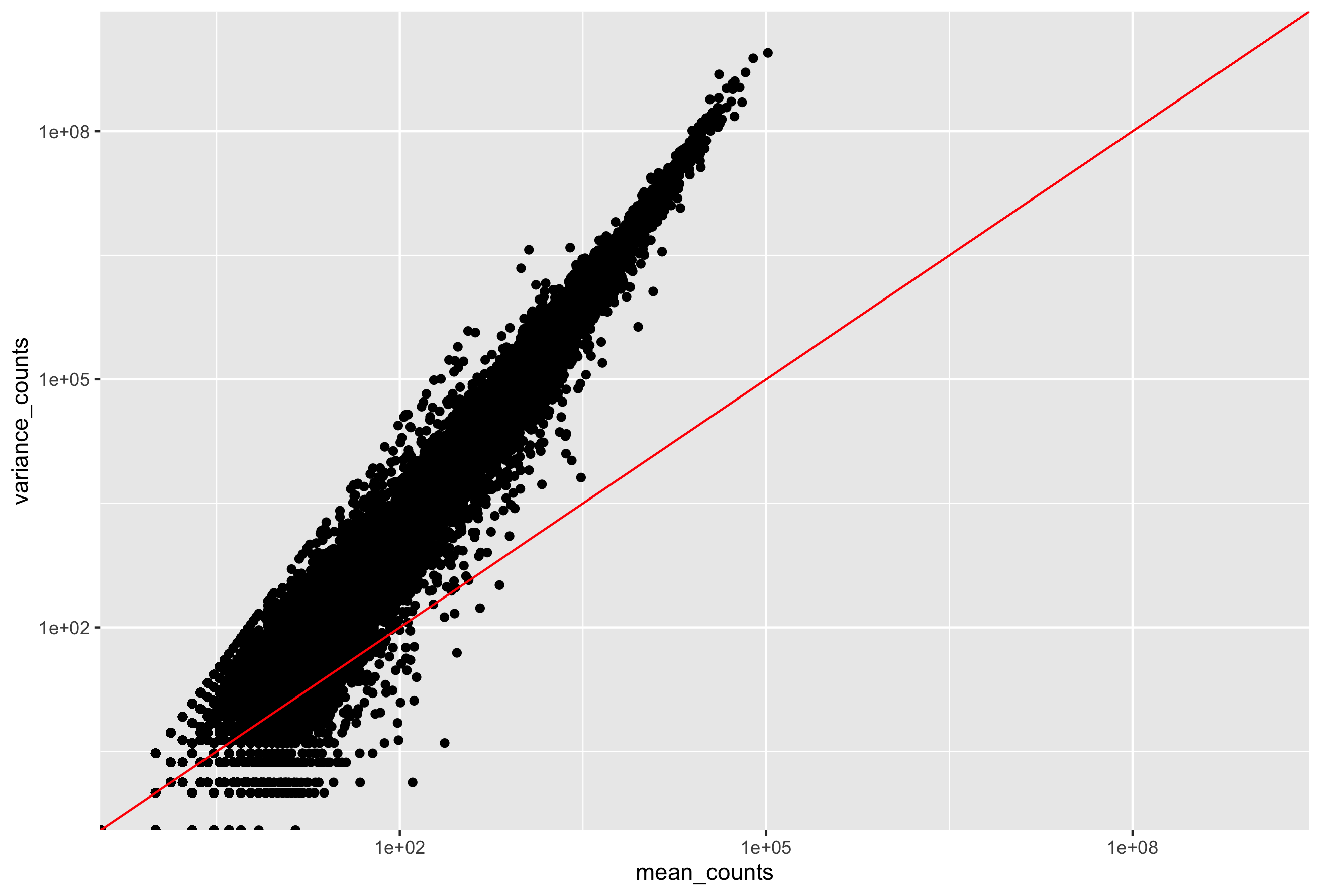
In the figure above, ach data point represents a gene and the red line represents x = y. There are a few important things to note here:
- The variance across replicates tends to be greater than the mean (red line), especially for genes with large mean expression levels.
- For the lowly expressed genes we see quite a bit of scatter. We usually refer to this as “heteroscedasticity”. That is, for a given expression level we observe a lot of variation in the amount of variance.
This is a good indication that our data do not fit the Poisson distribution. If the proportions of mRNA stayed exactly constant between the biological replicates for a sample group, we could expect Poisson distribution (where mean == variance). Alternatively, if we continued to add more replicates (i.e. > 20) we should eventually see the scatter start to reduce and the high expression data points move closer to the red line. So in theory, if we had enough replicates we could use the Poisson.
However, in practice a large number of replicates can be either hard to obtain (depending on how samples are obtained) and/or can be unaffordable. It is more common to see datasets with only a handful of replicates (~3-5) and reasonable amount of variation between them. The model that fits best, given this type of variability between replicates, is the Negative Binomial (NB) model. Essentially, the NB model is a good approximation for data where the mean < variance, as is the case with RNA-Seq count data.
NOTE: If we use the Poisson this will underestimate variability leading to an increase in false positive DE genes.
Improving mean estimates with biological replicates
The value of additional replicates is that as you add more data, you get increasingly precise estimates of group means, and ultimately greater confidence in the ability to distinguish differences between sample classes (i.e. more DE genes).
- Biological replicates represent multiple samples (i.e. RNA from different mice) representing the same sample class
- Technical replicates represent the same sample (i.e. RNA from the same mouse) but with technical steps replicated
- Usually biological variance is much greater than technical variance, so we do not need to account for technical variance to identify biological differences in expression
- Don’t spend money on technical replicates - biological replicates are much more useful
NOTE: If you are using cell lines and are unsure whether or not you have prepared biological or technical replicates, take a look at this link. This is a useful resource in helping you determine how best to set up your in-vitro experiment.
The figure below illustrates the relationship between sequencing depth and number of replicates on the number of differentially expressed genes identified [1].
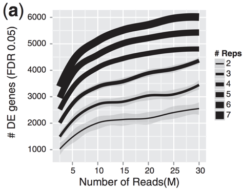
Note that an increase in the number of replicates tends to return more DE genes than increasing the sequencing depth. Therefore, generally more replicates are better than higher sequencing depth, with the caveat that higher depth is required for detection of lowly expressed DE genes and for performing isoform-level differential expression.
Differential expression analysis workflow
To model counts appropriately when performing a differential expression analysis, there are a number of software packages that have been developed for differential expression analysis of RNA-seq data. Even as new methods are continuously being developed a few tools are generally recommended as best practice, e.g. DESeq2 and EdgeR. Both these tools use the negative binomial model, employ similar methods, and typically, yield similar results. They are pretty stringent, and have a good balance between sensitivity and specificity (reducing both false positives and false negatives).
Limma-Voom is another set of tools often used together for DE analysis, but this method may be less sensitive for small sample sizes. This method is recommended when the number of biological replicates per group grows large (> 20).
Many studies describing comparisons between these methods show that while there is some agreement, there is also much variability between tools. Additionally, there is no one method that performs optimally under all conditions (Soneson and Dleorenzi, 2013).
We will be using DESeq2 for the DE analysis, and the analysis steps with DESeq2 are shown in the flowchart below in green. DESeq2 first normalizes the count data to account for differences in library sizes and RNA composition between samples. Then, we will use the normalized counts to make some plots for QC at the gene and sample level. The final step is to use the appropriate functions from the DESeq2 package to perform the differential expression analysis. We will go in-depth into each of these steps in the following lessons, but additional details and helpful suggestions regarding DESeq2 can be found in the DESeq2 vignette.
This lesson has been developed by members of the teaching team at the Harvard Chan Bioinformatics Core (HBC). These are open access materials distributed under the terms of the Creative Commons Attribution license (CC BY 4.0), which permits unrestricted use, distribution, and reproduction in any medium, provided the original author and source are credited.